
Written by Marvin Danig✏️
This is my first article for LogRocket and the third in my series on Toucaan CSS — a mutative design system for the web applications of 2020 and beyond. I hope you will find it interesting and help me with your insightful comments to build a better system.
A quick recap
In the first article, we introduced the Toucaan Switch Media Query (TSMQ), which allows us to isolate our web designs according to device orientation. The test of orientation is only the first level of “environment determination” for which we intend to do our web designs, and knowing it beforehand helps us to choose the right layout model for each state of initial render independently and deterministically.
In the second article, we went on to develop a fundamentally new kind of baseline reset with block-scoped typography for intrinsically scalable web applications. Intrinsic web design is slightly different from responsive web design, but we will talk about that in a later post.

Going ‘watch-first’ instead of mobile-first
Chances are, your existing web app or website is mobile-friendly and responsive already. Great news! Apple will render it correctly on the Apple Watch by scaling it down by a factor of 0.49 to avoid the horizontal scroll.
Apple does this to fit your mobile content into this new form factor. It works for the most part, but frankly, even a mobile UI can be way too complicated on the watch. The physical size of the device is only about an inch, and it’d be so much better to give watch users viewing your page via WebKit a better experience instead — an interface that belongs to the watch intrinsically.
In this post, we will take a look at how we can use the Toucaan Switch Media Query to organize our CSS and design a practical and accessible webpage for the Apple Watch Series 5. We can then go upwards on our UI from there, i.e., separately develop designs for mobile, tablets, desktop, TVs, etc., in that order.
First off, here’s what the Toucaan Switch Media Query looks like:
/* Portrait ⇋ landscape Toucaan Switch Media Query. */

@import url('path/to/css/app/portrait/portrait.css') only screen and (orientation: portrait);

@import url('path/to/css/app/landscape/landscape.css') only screen and (orientation: landscape);


@media only screen and (orientation: portrait) {
    :root {
        --bu: calc(100vw/100); /* Base Unit (bu) for the device. */
    }
}

@media only screen and (orientation: landscape) {
    :root {
        --bu: calc(100vh/100);
    }
}

/* Other resets and variables go below */
In the code above, two external CSS files (portrait.css or landscape.css) are imported via a switch statement, but only one of those two files is fetched for our app according to the orientation of the browser.
If a user opens the website on their watch or smartphone, they get only the portrait.css portion of our app layout. Similarly, if the user opens the site on their desktop, they get only the landscape portion of the application layout. The amount of CSS delivered to the client is always relevant to the context of the browser window.
Notice that we are using a standard asynchronous @import call to request CSS and not SCSS!
Since landscape mode is always orthogonal to portrait, there is no reason for our app to serve twice the amount of code on every device and client on the web. Again, since WebKit on Apple Watch Series 5 renders pages in portrait mode only, we will write all our CSS code on portrait.css only. We don’t have to worry about how the site will appear or behave on other clients with larger screens or higher resolution or in landscape mode.
/* vi path/to/css/app/portrait/portrait.css */

/* Notice the use of `in` (inches) in the media query below
instead of pixels. Physical size of the watch is too small
to arrive at a correct layout using pixels. Hardcoding pixel
values on @media-query breakpoints is an antipattern that
should be avoided. */

/* Read more at https://bubblin.io/blog/toucaan-introduction */

@media only screen and (max-width: 2in) {
  body{
    /*  All the style for smart watch or really
          tiny mobile screens goes in here. */
  }
}

@media only screen and (min-width: 2.000000000001in) and (max-width: 4in) {
  body{
    /* Smartphones and phablets in portrait mode.*/
  }
}

@media only screen and (min-width: 4.000000000001in) and (max-width: 8in) {
  body{
    /* Tablets and pro tablets in portrait mode.*/
  }
}

/* and so on…*/
portrait.css is that kitchen sink file with which we can scale up our application UI from Apple’s watchOS to LG’s webOS and everything in between — in portrait mode specifically. The size and type of screen is targeted using physical inches of available real estate and matched to the use case, segment, or audience. It is a good way to encapsulate away only the CSS that is required on a particular class of devices.
Let’s do the first encapsulation for WatchOS next.
A micro-optimization for the Apple Watch
In my opinion, TSMQ is a very clean and modular approach to organize all of the application CSS. It doesn’t restrict us to follow design patterns from 10 years ago when the web was a very different place and yet it makes it possible to use what is best for our app. Therefore, a mutative CSS framework.
In many ways, TSMQ is like the “microservices manager” for CSS that serves layouts for specific viewports according to orientation, physical size, space, and resolution of the user’s device, i.e., the rendering environment.
Since I like to keep all my environment-specific styles in one place, we will create watch.css in which to put all our styles specific to the watch. Import it into portrait.css like so:
/* vi path/to/css/app/portrait/portrait.css */

/*  All watch specific styles goes inside watch.css. */
@import url('path/to/css/app/portrait/watch.css') only screen and (max-width: 2in);

@media only screen and (min-width: 2.000000000001in) and (max-width: 4in) {
  body{
    /* Smartphones and phablets in portrait mode.*/
  }
}

@media only screen and (min-width: 4.000000000001in) and (max-width: 8in) {
  body{
    /* Tablets and desktops in portrait mode…*/
  }
}
/* and so on… */
A few tips and caveats about designing for the Apple Watch
There are quite a few important things to note about designing for the tiniest form factor on the web.
1. Extreme minimalism
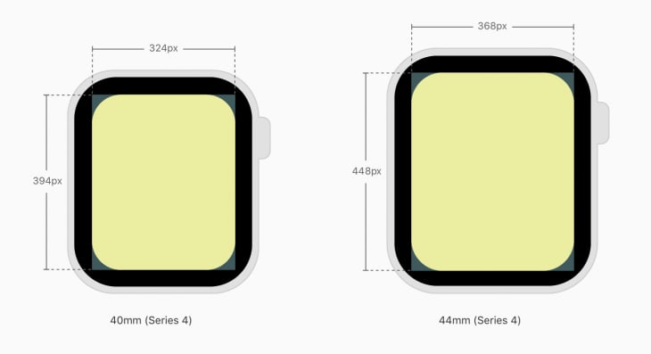
The first thing to internalize about designing webpages (or apps) for an Apple Watch is that it is the tiniest screen connected to the web with a decent browser. Even though the resolution of the Apple Watch is similar to that of a mobile in absolute pixels, a petite Apple Watch, for example, is only 40mm in size — roughly 1.57in along the diagonal.
Therefore, exercise extreme minimalism while designing for the watch. More generally:
- Avoid displaying too much information on the screen at once
- Create visual groupings to help users find the information they want
- Use the full width of the screen
- Use a menu with circular tips to replace buttons where possible
- Avoid use of side-by-side controls on your interface
- If text-heavy, left-align the content and HTML elements
2. Portrait mode only
The Apple Watch display lights up only in portrait mode, but this could change in the future, and the watch might start displaying content in landscape mode as well. This is not a problem because we have the TSMQ to handle such a scenario easily. Our Toucaan Switch Media Query is future-proof — yay!
3. Pixels no longer scale
Resolution on a petite Apple Watch is 324 x 394px. It is about the same resolution as that of the first-generation iPhones, but don’t be mistaken: using pixels the old-fashioned way to scale up on an Apple Watch will not give the best results.
If not executed carefully, almost all of your UI would be so small that it would be nearly inaccessible. We cannot ignore the fact that the viewable area on a watch is only about 1.18 x 1.25 inches, and pixel-based UI does not scale properly at that level.
Actually, the light-up area on an Apple Watch is even smaller than 34 x 40mm due to rounded corners on the Apple Watch Series 5 and because it is easy for content to be obscured by the viewing distance and viewing angle.
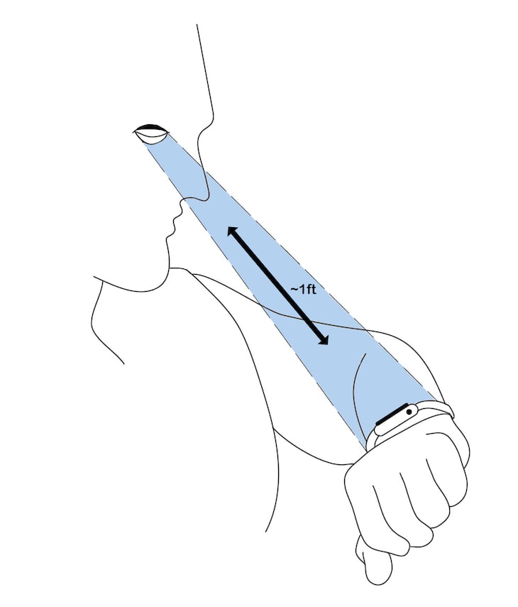
4. Short viewing distance, shorter attention span
The viewing distance on an Apple Watch is approximately 7–12in from the face, depending on user preference. In contrast, a smartphone is normally viewed at more than a foot and a half away.
In general, you want to optimize for both shorter viewing distance and short attention span. Use a large font size to present a minimum set of functionalities to the user. Allow the user to be able to pinch-zoom if your page is text-heavy, even with decently sized type.
5. No web fonts
Avoid using Google Fonts or any type of hosted typography. Toucaan recommends use of system fonts for most web applications. On the Apple Watch, this tip becomes rather mandatory.
/* Use system fonts. */
body {
    font-family: system-ui, -apple-system, BlinkMacSystemFont, Segoe UI, Roboto, Oxygen, Ubuntu, Cantarell, Droid Sans, Helvetica Neue, Fira Sans, sans-serif!important;
}
Interestingly, Apple recommends using relative sizing and dynamic type to ensure that items expand or contract naturally to fit the available space. This is great because we do just that with block-scoped typography on Toucaan!
6. Add the WatchOS meta tag
To take control of how your website will appear on the Apple Watch, add the following meta tag on the head of your page:
<meta name="disabled-adaptations" content="watch">
WebKit will now know that it doesn’t need to scale down your content and will render the page as you instruct it to.
In general, Apple recommends you the same content as on your mobile, regardless of the display size — which is exactly how mobile web was scaled initially, before the concept of responsive web design came into being. This will work for the most part, but it is far from ideal because even mobile UI can be fairly complicated on the watch.
Unless your app has been designed specifically for the watch, Apple will automatically scale down your mobile layout by factor of 0.49 to fit the content as is, without a horizontal scroll or reflow.
7. No service workers
No PWA, so no offline-first enhancement on the Apple Watch — yet. In fact, you might want to try and keep your JavaScript to a minimum as well. I have started avoiding React and Vue.js ecosystems completely to reduce the JavaScript pollution on my web apps lately. But there is some good news as well.
Apple mentions in their WatchOS documentation that webkit “doesn’t support service workers at this time.” This could mean that the watch might support offline-first web apps at a later date. Fingers crossed, but for now, there is no possibility for progressive enhancement using a service worker on the series 5 Apple Watch.
8. No inline video playback
There is no video support on the Apple watch at this time.
9. Handling images
Use a single autoscaling image through 100 percent of the screen width. Multiple versions of the same image will require more space, and that’s generally not recommended on the watch.
<img src="resource_url" width="100%" style="max-width:100%;" />
10. Form handling and accessibility
Unless absolutely necessary, avoid form submissions over the watch interface. But if you must, know that some form elements have been optimized for the watch, which relies on you using these new, specific kinds of form type controls to take advantage of these fields.
The Apple Watch supports number (type="tel"), date (type="date"), and select (<select>) types, and using these ARIA labels will inform WebKit to provide the right kind of interface to the users.
As expected from the tiny form factor of the watch, the form controls move you into full-screen mode for each input. This means it is important to label your form elements correctly and have the appropriate ARIA roles attached to the fields so that users know what they’re doing while filling up the form.
Use a menu in place of buttons when appropriate. Menus offer a dedicated place to list actions, and you can free up space on your UI by removing buttons and replacing those with menus. Opt for extreme minimalism in most situations.
Conclusion
Now that you understand the Apple Watch better, you can design a better-looking page for your users on Apple Watch. Go for it, because with that extra mile and a cool design that belongs to the watch naturally, your users will only thank you for it!
Feel free to follow me on Twitter or on GitHub, and thanks to the amazing Somya Garg for helping me with the artwork on the viewing distance from an Apple Watch.
Is your frontend hogging your users' CPU?
As web frontends get increasingly complex, resource-greedy features demand more and more from the browser. If you’re interested in monitoring and tracking client-side CPU usage, memory usage, and more for all of your users in production, try LogRocket.

LogRocket is like a DVR for web apps, recording everything that happens in your web app or site. Instead of guessing why problems happen, you can aggregate and report on key frontend performance metrics, replay user sessions along with application state, log network requests, and automatically surface all errors.
Modernize how you debug web apps — Start monitoring for free.
The post Web design for the Apple Watch with Toucaan CSS appeared first on LogRocket Blog.


Top comments (0)