
Material Design is a design language that was first introduced by Google in 2014. It’s a visual language that makes use of grid-based layouts, responsive animations and transitions, padding, and depth effects such as lighting and shadows.
The goal for Material Design is down to three things: Create , Unify and Customize.
With Create , Material Design aims to provide a visual language that synthesizes the classic principles of good design. With Unify, it aims to develop a single underlying system that unifies the user experience across platforms, devices, and input methods and with Customize, it provides a visual language and a flexible foundation for innovation and brand expression.
In this article, we’ll explore how to create React apps with a Material Design theme. There are various libraries that help with this but for this article, the material-ui library will be used.
Getting started
material-ui is a set of React components that implements Google’s Material Design (material-ui recently released a v1 of the library.). These components work in isolation, that means they are self-supporting and will inject only the styles they need to display.
To get started with material-ui, all you need do is run the terminal command below.
npm install @material-ui/core
Next, let’s look at some of the fundamentals of material-ui as it relates to Material Design and see how it sets up for the rest of the post.
Typography
When it comes to Material Design, the font choice defaults to Roboto. However, material-ui doesn’t ship with the Roboto fault. The font can be imported into a React project using any of the two methods below.
From a CDN
<link rel="stylesheet" href="https://fonts.googleapis.com/css?family=Roboto:300,400,500">
Install with NPM
You can install it as an npm package by typing the below command in your terminal:
npm install typeface-roboto --save
Then, you can import it in your project like this:
import 'typeface-roboto'
material-ui also provides a component called Typography. The Typography component basically allows you to display text in the app. It’s written like this:
<Typography variant="title" color="inherit">Some text in here</Typography>
The variant props help to apply the theme typography styles and color is the color of the component. It supports theme colors that are suitable for the component.
CSS Baseline
If you’ve been writing front-end code, you should already know what aboutnormalize.css. If not, it’s a collection of HTML element and attribute style normalizations. Material-UI provides its own version of normalize.css which is CssBaseline, a component that provides an elegant, consistent, and simple baseline to build upon.
The CSSBaseline does the following:
- The margin in all browsers is removed
- The default Material Design background color is applied
- Font antialiasing is enabled for better display of the Roboto font
- No base font-size is declared on the , but 16px is assumed (browser default)
Grid
Material Design’s responsive UI is based on a 12-column grid layout. This grid creates visual consistency between layouts.
The grid system features the following:
- It uses Flexbox
- There are two types of layout: containers and items
- Item widths are set in percentages, so they’re always fluid and sized relative to their parent element
- Items have padding to create the spacing between individual items.
- There are five grid breakpoints: xs, sm, md, lg, and xl
Icons
Icons are a huge part of material design, they are used in buttons to convey an action, to convey information e.t.c. It’s used to symbolize a command, file, device, or directory.
Icons are also used to represent actions like trash, print, and save, and are commonly found in app bars, toolbars, buttons, and lists.
Icons in Material-UI can be rendered using two methods; Icon for rendering font icons, and SvgIcon for rendering SVG paths.
The SvgIcon component takes an SVG path element as its child and converts it to a React component that displays the path, and allows the icon to be styled and respond to mouse events. That can be seen in the example below:
https://medium.com/media/d56a0e81c1c79b07aadd81c9228ce6e5/href
Material-UI also has a package that ships with preset icons to be used in your React app. It’s a different package entirely, and it includes the official Material icons converted to SvgIcon components. You can install with the terminal command below:
npm install @material-ui/icons
Buttons
Buttons allow users to take actions, and make choices, with a single tap. They help communicate an action a user can take.
Since material-ui components are in isolation, you’ll need to import the Button component.
import Button from '@material-ui/core/Button';


<Button _color_="primary">Hello World</Button>
The Button component can take on many props such as color, variant, size e.t.c. You can check out the full list here.
Buttons in material-ui and Material Design at large can take on any of the following forms:
Flat buttons
Flat buttons are buttons with just text. They have no background color and no border. They may be used in dialogs, toolbars, or inline. They do not lift but fill with color on press.
<Button color="primary">Primary</Button>
https://medium.com/media/da5e7d467259640d5e5ddcc7d3478b6b/href
Outlined buttons
Outlined buttons are text-only buttons with medium emphasis. They behave like flat buttons but have an outline and are typically used for actions that are important but aren’t the primary action in an app.
Their appearance is usually characterized by a border and a background color on hover.
<Button variant="outlined">Default</Button>
https://medium.com/media/4330b561d2c74e5f65162d125467e4a5/href
Raised buttons
Raised buttons are rectangular-shaped buttons. They lift and display ink reactions on press.
<Button variant="raised" color="secondary">Secondary</Button>
https://medium.com/media/22bc78370f40df1a3f05fa2477357a88/href
Floating action button
A floating action button (FAB) represents the primary action in a screen, actions like, composing a new email, adding a new contact or deleting an image entry.
It’s shaped like a circle and it floats above every other view, a background color is applied upon focus and it lifts upon tap or click. It can also be set to reveal more actions or content upon clicking.
<Button variant="fab" color="primary" aria-label="add"><AddIcon /</Button>
https://medium.com/media/a3d288e88c7bc12b6199483953b62d4d/href
Material-UI components
material-ui has a lot of UI components that helps to build a material design themed React app. Let’s go over some of the material-ui components. Each of the components has an example and you can click on their respective CodeSandbox links to see the code.
App bars
The App bar, formerly known as the action bar in Android, it acts as a header navigation menu. It is a toolbar that’s used for branding, navigation, search, and actions. To use the App bar, these two components are needed from material-ui:
import AppBar from '@material-ui/core/AppBar';
import Toolbar from '@material-ui/core/Toolbar';
https://medium.com/media/1685ebea545650e9b9e8b9799364b96a/href
Navigation
Bottom navigation menus are placed at the bottom and they make it easy to switch between top-level views in a single tap.
The navigation menu is characterized by three to five actions, each containing an icon and a label. Although it’s important to note that only navigation bars with three actions should contain both an icon and a label.
https://medium.com/media/82ed4df438ecfdfea80193148b7bbde0/href
Tabs
Tabs make it easy to explore and switch between different views. A tab component can be a simple tab with no additions as seen in the first example below or a scrollable tab with multiple tabs.
A tab can also just consist of icons as titles/labels.
https://medium.com/media/7d122329ee447fd0b0a6a807597b9347/href
Lists
Lists present multiple line items vertically as a single continuous element.
Lists are made up of a continuous column of rows. Each row contains a tile. Primary actions fill the tile, and supplemental actions are represented by icons and text.
https://medium.com/media/84c83b8f6b0e2a95dcd03a71781d45a7/href
Cards
A card is a sheet of material that serves as an entry point to more detailed information.
Cards are a convenient means of displaying content composed of different elements. Cards are used to display information that can be easily glanced at and usually has a Call To Action.
https://medium.com/media/18e7b2a641792d63a0d591b0ae86839e/href
Modal
The modal component provides a solid foundation for creating dialogs, popovers, lightboxes e.t.c
Whenever a modal button is clicked on, it does the following:
- Manages dialog stacking when one-at-a-time just isn’t enough
- Creates a backdrop, for disabling interaction below the modal
- It properly manages focus; moving to the modal content, and keeping it there until the modal is closed
- It disables scrolling of the page content while open
- Adds the appropriate ARIA roles are automatically https://medium.com/media/6609756a92c7c39ae2d3e65c85e20862/href ### Grid list
Grid lists are an alternative to standard list views seen above. A grid list consists of a repeated pattern of cells arrayed in a vertical and horizontal layout and it usually prominently features images.
https://medium.com/media/b47c2709a35c811a1bf1163998986f01/href
An advanced example of a Grid list can be seen below, it features the use of the GridListTileBar to add an overlay to each GridListTile. The overlay can accommodate a title, subtitle and secondary action - in this example an IconButton which could be used to convey more information.
https://medium.com/media/47d6b5ecd920e441fb5baf767bb1a618/href
Tables
Data tables display sets of raw data. They usually appear in desktop enterprise products.
A data table contains a header row at the top that lists column names, followed by rows for data.
For accessibility, the first column is set to be a
An advanced usage of Tables can be seen in the example below. It uses checkboxes, which accompanies each row, if the user needs to select or manipulate data. It also uses clickable rows for selection.
https://medium.com/media/c9de96ef5628478e8c1ff21c4e63e8a4/href
Conclusion
Now the question is should you use Material Design in your React project?
The answer to that question depends on your project’s use case and what you’re trying to achieve. Material Design can give you guidelines to make better user interfaces for your applications. It can inspire your designers to think about the hierarchy of information based on the guidelines.
At the same time, if you’re trying to carry out a brand redesign, Material Design might not be what you’re looking for. Do you want your brand to look like hundreds of other websites on the internet?
You can also explore other Material Design libraries such as react-md, materialize (a CSS framework).
Plug: LogRocket, a DVR for web apps
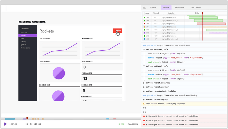
LogRocket is a frontend logging tool that lets you replay problems as if they happened in your own browser. Instead of guessing why errors happen, or asking users for screenshots and log dumps, LogRocket lets you replay the session to quickly understand what went wrong. It works perfectly with any app, regardless of framework, and has plugins to log additional context from Redux, Vuex, and @ngrx/store.
In addition to logging Redux actions and state, LogRocket records console logs, JavaScript errors, stacktraces, network requests/responses with headers + bodies, browser metadata, and custom logs. It also instruments the DOM to record the HTML and CSS on the page, recreating pixel-perfect videos of even the most complex single page apps.
Try it for free.

Top comments (0)