
Written by Kapeel Kokane✏️
Introduction
In a discussion about top frontend design languages, Material Design by Google is one of the most popular contenders for the favorite spot, but there is a close, maybe lesser-known, competitor, that is Ant Design. With some of the big players in their respective industries like Alibaba, Tencent, Baidu all using Ant Design, let’s explore some of the key features that make Ant Design special compared to others.
The design principles of Ant Design
Ant design, according to its own design values page, focusses on a user experience that is:
- Natural— a visual interaction that is devoid of complexity and feels natural to use
- Certain— establish design rules such that it avoids low-efficiency & difficult-to-maintain products
- Meaningful— design interfaces keeping the needs of the end-user in mind
- Growing— design interfaces that improve the discoverability of functions and values of the product
Strongly opinionated
While providing guides on most of the styling needs for user interface design like colors, layout, font, icons, Ant Design also lays down certain best practices with respect to several visual design principles and clearly marks out the good from the bad ones. Here are a couple of examples from their reference docs:

Text alignment

Contrast

Iconography & typography
Ant Design also provides full-fledged in-house support for icons and typography and it’s quite easy to incorporate in the project too. For instance, in order to use the provided icons in your project, all that needs to be done is:
npm install --save @ant-design/icons
to install the icon pack:
import { HomeOutlined } from '@ant-design/icons'
ReactDOM.render(<div><HomeOutlined /></div>, mountNode);
Layout support
Ant Design provides its own alternatives to CSS Flexbox implementation for laying out UI items and to maintain a fluid and responsive user interface. For the same purpose, Ant Design provides row and column components that can be used as alternatives to equivalent divs with flex-direction row and column respectively. For managing size, it accepts a span prop similar to what Bootstrap does:
<Row>
  <Col span={12}>col-12</Col>
  <Col span={12}>col-12</Col>
</Row>
In addition to that, Ant design provides some of the most common layouts, with Navigation Bar, Side Menu, BreadCrumbs, and the main layout area (with different styles) as standard boilerplate that one can use straight away in the project. For example, the layout below can be easily achieved by copying the boilerplate code from their official docs page.

Extensive component support
Common components
Some of the most widely used form elements are of course available for use with a huge variety of customization options. Here are a few examples along with the code to create generic versions of them.
Text input

// component code
<Input
  size="large"
  value={this.state.inputVal}
  placeholder="large size"
  onChange={(e) => this.setState({ inputVal: e.target.value })}
  prefix={<UserOutlined />} // prefixes the user image at the beginning
/>
Checkbox

// on change handler
onChange = e => {
  this.setState({
    checked: e.target.checked,
  });
};
// checkbox component
<Checkbox
checked={this.state.checked}
disabled={this.state.disabled} // can be managed via state independently
onChange={this.onChange}
>
{label}
</Checkbox>
Radio buttons

// on change handler
onChange = e => {
  this.setState({
    value: e.target.value,
  });
};

// radio component, manage the ‘disabled’ boolean separately
<>
  <Radio value={1} disabled={this.state.disabled}>
    Value 1
  </Radio>
  <br />
  <Radio value={2} disabled={this.state.disabled}>
    Value 2
  </Radio>
</>
Slider

// on change handler
onChange = value => {
  this.setState({
    inputValue: value,
  });
};

// slider component
<Slider
  min={1} // define a range
  max={20}
  disabled={this.state.disabled} // manage ‘disabled’ separately
  onChange={this.onChange}
  value={typeof inputValue === 'number' ? inputValue : 0}
/>
And, the best part is, all the code for using any variation of these components is available on the same page. You can easily access it by clicking the <> button like so:

Compound components
In addition to the basic components mentioned above, there is also a broad range of compound components that Ant Design provides, which supports rapid prototyping and development. These are the components which are widely used in modern user interfaces but take quite an effort to code from scratch. Here are some examples along with Ant Design equivalent code:
Comment

<Comment
  actions={actions} // the action button settings
  author={<a>Han Solo</a>} // the name of comment author
  avatar={
    <Avatar src="source_for_avatar.png" alt="Han Solo"/>
  }
  content={// content here} // main comment
/>
Card

<div className="site-card-border-less-wrapper"> // the css class
  <Card title="Card title" bordered={false} style={{ width: 300 }}>
    <p>Card content</p>
    <p>Card content</p>
    <p>Card content</p>
  </Card>
</div>
Carousel

// Carousel with autoplay enabled
<Carousel autoplay>
  <div>
    <h3>1</h3>
  </div>
  <div>
    <h3>2</h3>
  </div>
  <div>
    <h3>2</h3>
  </div>
</Carousel>
Timeline

<Timeline>
  <Timeline.Item>Create a services site 2015-09-01</Timeline.Item>
  <Timeline.Item>Solve initial network problems 2015-09-01</Timeline.Item>
  <Timeline.Item>Technical testing 2015-09-01</Timeline.Item>
  <Timeline.Item>Network problems being solved 2015-09-01</Timeline.Item>
</Timeline>
React support & documentation
The Ant design framework is designed from the ground up keeping in mind the React methodologies. All the components mentioned above have direct support for incorporation with React components available. Also, support for other popular frameworks like Angular and Vue are being developed by the community.
Conclusion
With a fluid, responsive UI, clean design language, and also visualization support through AntV, Ant Design is surely on the way to grab a huge chunk of the market share when it comes to Industry grade dashboards. Given the extensive list of components, features, and customizations provided by Ant Design, it counts as a worthy candidate when it comes to the selection of your next frontend design framework.
Full visibility into production React apps
Debugging React applications can be difficult, especially when users experience issues that are difficult to reproduce. If you’re interested in monitoring and tracking Redux state, automatically surfacing JavaScript errors, and tracking slow network requests and component load time, try LogRocket.
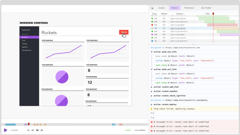
LogRocket is like a DVR for web apps, recording literally everything that happens on your React app. Instead of guessing why problems happen, you can aggregate and report on what state your application was in when an issue occurred. LogRocket also monitors your app's performance, reporting with metrics like client CPU load, client memory usage, and more.
The LogRocket Redux middleware package adds an extra layer of visibility into your user sessions. LogRocket logs all actions and state from your Redux stores.
Modernize how you debug your React apps — start monitoring for free.
The post Introduction to Ant Design appeared first on LogRocket Blog.


Top comments (0)