TLDR; I made Poly Capture, an app that makes screen time-lapses, over the course of two months. It's in the Mac App Store if you want to check it out.
A little over two months ago, without having any SwiftUI or Xcode experience, I decided to make my first macOS app.
The idea was simple: I wanted a tool to make time-lapses of my screen activity. Whenever I'd made screen time-lapses in the past, I'd use QuickTime to record my entire screen, then imported that to a video editor. This was always irritating - the QuickTime clip was always giant, and the extra editing step took longer than I wanted. It was also wasteful, especially when my storage was running low, or my iCloud/Dropbox accounts were filling up.
I looked around for apps similar to what I wanted. Of course they existed, but most were packages you have to run from the terminal, or had bad reviews in the App Store. Yes, they were free. But I wanted something really easy to use. I want to open it, click Start, and go back to my work (or hobby).
I was also looking for a challenge - I love learning new languages and tools. And after seeing Jordan Singer and others show off the flexibility of SwiftUI, I was already looking for an excuse to try it.
So, on September 22, I started:
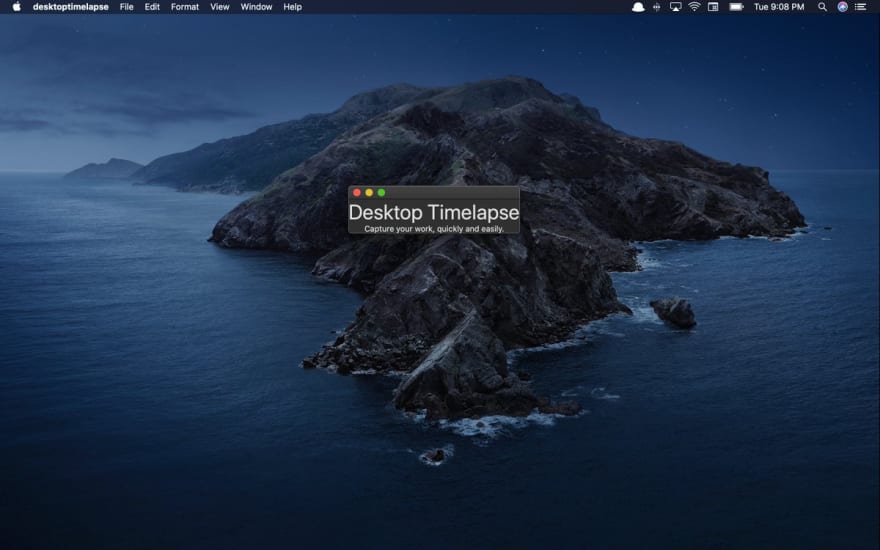 Trying something new: a macOS app that lets you make screen time lapses.01:09 AM - 23 Sep 2020
0
3


Design
This was the easiest part, and can be broken up into two steps: the app UX, and the accompanying icons and promotional imagery.
Full disclosure: I have experience in native app design from my last job. I'd spent a lot of time at my last job adapting Apple's Human Interface Guidelines to our apps, and debating the merits of their various system UI elements.
UX
When it came to UX/UI, I used system UI styles about half the time, then customized styles where I thought they could use extra emphasis.
Starting with Apple's readymade UI elements: I happily used macOS's NSPopover to create the app view itself, which opens when you click the menu bar icon.
NSPopover interacts comfortably with whatever else you're doing - you can change its toggle sensitivity to automatically close when you click outside its bounds, or have it close itself based on your behavior elsewhere in the app.
I also appreciated how easy it was to create dropdown menus using SwiftUI Picker control. After reading up on how to bind the user's selection to a state, I was able to build out the screenshot interval and time-lapse length pickers in a relatively short amount of time.
I added my own visual preferences to the rest of the app. Namely, I chose to customize the buttons and progress bar. After spending the summer setting up TVs and computers for various family members, I was newly sensitive to how difficult it can be for technological newcomers to interpret most user interfaces. I wanted a large, clear call to action on every view, and a progress bar to show users how long the process was going to take.
Icons and Promotional Imagery
I won't get into branding or copy writing here - others know more about this than I do. But to enter the App Store, you need to export icons at sizes ranging from 16x16pt all the way up to 1024x1024pt. You also need screenshots and preferably a video of your app to populate your App Store page.
You'll be competing with other services in the App Store, and most of the time others will already do what your app does (as was the case for me - I found direct competitors in the App Store and outside of it as I worked on the project). To differentiate yourself, it helps to have appealing icons and imagery.

 Making a timelapse of my app icon designs for my timelapse app01:12 AM - 21 Oct 2020
Follow the guidelines and don't put this off until the last minute.
Code
I hadn't spent more than ten minutes in Xcode before starting this project, and never studied Objective-C or Swift. But I do know JavaScript and a little Python, and that helped me immensely.
Had I come to this with no programming experience, Poly Capture wouldn't have taken two months to make, it would have taken a year. I would have been forced to learn basic programming fundamentals - objects, arrays, if statements, loops, functions, variables, and so on. So, depending on how you measure it, I either worked on this app for two months or 6 years (back when I first opened Code Academy in 2014).
Measuring of the time my JS knowledge saved me in terms of hourly wages, I probably saved more money here than I made at my last freelance gig. Despite having no experience with Swift, I quickly recognized how to do the basics - making variables, functions, debugging in the console, etc. There was a lot to get used to, but the fundamentals felt immediately familiar to me.
User Interface
I was also thrilled by how easy it is to create simple buttons and other UI elements. Because Apple owns its design system and maintains Swift, they've made it easy to create the UI elements they want you to use. Sure, you can customize the look of your button, but the default also looks good.
For example, this is all you need to create a button in SwiftUI:
Button(action: {
  Print("Clicked")
}) {
  Text("Start")
}
This is far easier than the myriad ways developers handle button clicks in web applications. Someone who learned JavaScript in in the early 2010s probably handles click functions differently from someone who learned by taking React tutorials over the last few years. Especially if, like me, you took a two year detour in jQuery before learning to appreciate vanilla JS.
SwiftUI handles state far better, too. I still have trouble working with state in React after taking time away from it. In SwiftUI, you can easily make one source of truth and use it everywhere with environment variables.
One thing I didn't like was styling - I'm used to HTML and CSS's separation of concerns. There may be more sophisticated ways to handle styles in SwiftUI, but the best I came up with were appending them to views.
See the styling here (not my proudest moment):
Button(action: {
  Print("Clicked")
  self.recording.toggle()
}) {
  if !recording {
    Text("Start")
  } else if recording {
    Text("Cancel")
  }
}.frame(width: 220).buttonStyle(BlueButtonStyle()).background(!recording ? Color("ButtonBackground") : Color("Salsa")).cornerRadius(6.0).padding()
To really build out my app, though, I had to do a lot more than build the UI.
Data
I had to write functions to 1) take screenshots at a user-defined interval for a user-defined amount of time and 2) compile those screenshots into a video and export in as an mp4. This was of course the hardest part of the project.
The first part was relatively simple and I was able to figure it out on my own. It involves creating instances of Core Graphic's CGImage class to hold screenshots, which Poly Capture takes at a user-defined interval (2, 5, 10 seconds, etc.) and appends to an array for later use:
struct Screenshot: Identifiable {
  let id = UUID()
  let cgImage: CGImage
  init(cgImage : CGImage) {
    self.cgImage = cgImage
  }
}
var Screenshots: [Screenshot] = []
// A lot of boilerplate code, and then:
Timer.scheduledTimer(withTimeInterval: interval, repeats: true) { timer in
  self.screenshotCount += 1
  self.progress += progressUnit
  let cgimage:CGImage = CGDisplayCreateImage(self.displayID)!
  Screenshots.append(Screenshot(cgImage: cgimage))
}
After Poly Capture takes the necessary number of screenshots, it begins writing the video using AVAssetWriter. This is entirely in the realm of AVFoundation, Swift's video and image framework.
AVFoundation works with media assets and can also create video players. (If Poly Capture gains traction I want to add playback functionality so that users can see their time-lapses and even edit them before saving their videos.)
Anyway, this involved weeks of trial and error and scouring Stack Overflow and Reddit. I took the easy route several times-- instead of allowing users to set the frame rate themselves, I hardcoded it to 30 (I may open it up in the future). And, like I said above, I decided not to let users preview or edit the time-lapse before exporting.
It wasn't until this part of the project that I realized how little attention most developers give to macOS. Most Google searches for AVFoundation (and everything else, really) led me to answers and advice that only apply to iOS developers. I found a lot of help along the way, but often had to tweak things to fit my situation.
Big Sur
Casting a shadow over all this work was the looming release of macOS Big Sur. I hadn't used the beta because I was already stressed about Xcode doing things I didn't understand. But lo and behold, Big Sur was released just as I was finishing work on the app. Once I heard it was officially out, I decided to be an adult about it, install it and deal with whatever would happen - how long would it set me back? There was no way to know.
I installed the upgrade and after admiring the rounded corners I opened Xcode and clicked Run. The app built successfully. I breathed deep and clicked to open the popover.
In the end, the app actually worked better on Big Sur that it had on Catalina. There appears to be a bug in Catalina that treats picker clicks as clicks outside the popover, meaning that every time the user selected a screenshot interval or time-lapse length, they'd close the app view. The only fix was to make the popover semitransient, which meant it would stay open until the user explicitly closed it, which I never liked. I wanted it to close on its own.
Well, Big Sur fixed that. The UI elements also looked better - the pickers were clean and round. And an odd issue with NSSavePanel activation, which previously required the app to be active before a user could save their time-lapse, was suddenly less severe.
I was so thrilled with it that I decided to limit App support to Big Sur only. I'll probably lose potential users, but it will save me headaches and keep maintenance simple.
Mac App Store
Once I finished the app, it took about a week to get it approved in the App Store. After getting a developer account and reading up on how to submit the app itself, I realized I needed a new name. I originally wanted to call the app "Desktop Timelapse" but, like Twitter and AIM, the App Store doesn't allow duplicate naming. It took a while to find a name I liked that was available in the App Store and also had good domain name options.
Apple rejected my first submission due to a bug in my app's main button - parts of the padding were unclickable. I knew it was an issue, but had forgotten about it. That took an hour or two to fix. After that, the App Store rejected it again because they wanted to know how I collected user information, and where I stored it. I explained to them that I don't collect or store any user data - not the screenshots, time-lapses, or any user information. They approved me shortly afterward.
And then, just like that, the app was in the App Store! Just kidding, of course it wasn't. It was "Pending Agreement." I had no idea what that meant - did Apple have to agree or did I? I looked in the App's activity feed and it looked like Apple had do approve something on its end. I logged off for the day.
The next morning, impatient and eager to publish, I Googled more and learned that before launching the app in the App Store, developers have to upload tax and banking information, and select points of contact. I did that in about 15 minutes and then, all of a sudden, the app was live.
I started working on Poly Capture on September 22, and it went live in the App Store on November 21. I wanted to launch it on Product Hunt on Thanksgiving (my thinking was that fewer American companies would launch that day, so competition would be at least a bit thinner), but I decided to enjoy the holiday instead.
Poly Capture is officially available in the Mac App Store 🍎 apps.apple.com/us/app/poly-ca…
Before I promote it, I want to:
- Round the icon corners (I thought Xcode did this on export, but I must have been wrong)
- Refine the promotional text16:58 PM - 23 Nov 2020
I hope you all enjoy this app. If you have any feedback, please send it to me on Twitter.


Top comments (0)