
Animation is an important element of an interactive web page. CSS allows us to create simple movements of HTML objects by using the animation properties. Let us take a look at these properties, and use them to elaborate on our miniature city.
Before we start, I hope you have already built the background of the miniature city by following the previous tutorials in this series, please check out the other bit project blogs! Or you can also check out our YouTube tutorial and get started!
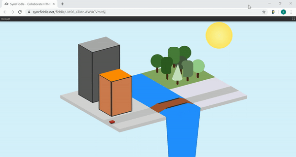
In this tutorial, We will focus on building a car going along the road and the bridge as well as a boat going under the bridge.
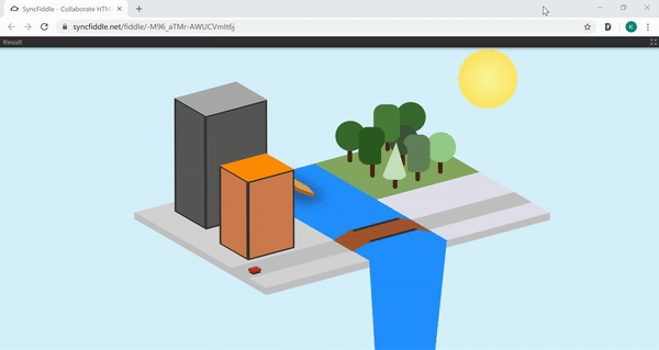
Build the car and the boat
First, let's build our car and boat with HTML and CSS, just like we did for the ground and buildings before.
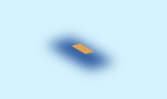
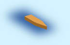
The car is a rectangle box, and the boat is a rectangle box with a triangle in the front. Both of them have a shadow to help show the three-D effect.
So we need to have two divs for the car and the boat, and inside each of them, we will have some children divs. Children divs are divs inside a parent div. They are associated to their parent and can be easily aligned with their parent div. The two children divs under the car are to hold the left and front side rectangles while the three children divs under the boat are to hold the triangle in the front and the left and front side rectangles.
In HTML
<div class = "car">
    <div></div>
    <div></div>
</div>

<div class = "boat">
    <div></div>
    <div></div>
    <div></div>
</div>
In CSS
Now in CSS, try to build the car and the boat on your own by following the similar methods we used for the buildings.
We could build the rectangle body under .car. Remember that the codes under .car{/*codes*/} will be applied to the entire class named car. Use box-shadow: /*styles*/ (refer to box-shadow syntax) to create the shadow both under the car and the boat.

After that, we could work on the child divs. We can refer to the first child and the second child of the car by using .car div:first-child and .car div:nth-child(2). These divs are the two parallelograms on the sides and the additional triangle for the boat. The parallelograms are skewed from rectangles using transform: skew(/*styles*/) (refer to skew() method).
Movements with CSS
Now that we have built our car and boat, we want them to move along the road and the ocean. We will do this by using CSS properties!
CSS is a style sheet with many strong features, and we will be using CSS animation and @keyframes to create our customized movements.
CSS Animation
CSS animations have the following properties:
animation-name
animation-duration
animation-timing-function
animation-delay
animation-iteration-count
animation-direction
We could set these properties of the objects (e.g. the car and the boat) to make them move. The animation will gradually change the object from one set of styles to another, as indicated by the codes associated with the animation-name. This animation will last for the amount of time that you set animation-duration to. Also, we will use @keyframes to create our customized animation.
The above six properties can also be written shortened in one line in that order. For example, animation: example 5s linear 2s infinite alternate;
Therefore, for the boat, we will have
animation: boat 15s linear infinite; in the .boat , which means the boat will change from one style to another as @keyframes boat shows in 15 seconds, and then it will repeat infinite times.
Similarly, the car will have animation: car 9s linear infinite; to change the car as @keyframes car shows in 9 seconds and repeat.
@keyframes
@keyframes will set the specific styles throughout the whole animation process. The whole process is indicated by 100%, so we could set different styles at different stages to create the animation. The 0% {/*starting style*/} shows the starting stage, where we want our boat to start at position top: 60px; left: 20px;. Then, we can set the ending position using 100% {/*ending style*/}, where we are moving it to this position top: 150px; left: 220px;.
Now, we will start to move the car. This is similar to what we did for the boat, but we want the car to go onto the bridge; so, we break its route into five parts.
- go straight along the road:
   0% {
       top: 240px;
       left: -75px;
   }
   39% {
       top: 190px;
     left: 100px;
   }
- climb on to the bridge:
   39% {
       top: 190px;
       left: 100px;
   }
   50% {
    top: 170px;
       left: 150px;
   }
- go along the bridge:
   50% {
       top: 170px;
       left: 150px;
   }
   65% {
    top: 144px;
       left: 240px;
   }
- go down the bridge:
   65% {
       top: 144px;
       left: 240px;
   }
   73% {
       top: 145px;
       left: 280px;
   }
- go along the rest of the road:
   73% {
       top: 145px;
       left: 280px;
   }
   100% {
       top: 95px;
       left: 450px;
   }
Conclusion
By moving the car and the boat, we learned how to use the animation properties in CSS. These properties can help create many interactive and interesting elements in our web pages. There are more CSS properties that you can explore on your own in the future. Moving on, please check out the next tutorial blog about using JavaScript to create a button to change from daytime to night time in our miniature city and get introduced to another interesting and useful tool in web development -- JavaScript!

Top comments (0)