
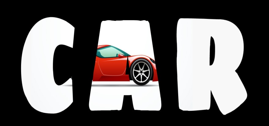
Hola! The other day I came across this new CSS-only animation and I had to try it. You should try it as well!
Here's the markup:
<div class="container">
 <h1>CAR</h1>
</div>
This part is pretty simple, no fuss about it.
Now, comes the CSS:
@import url('https://fonts.googleapis.com/css2?family=Sigmar+One&display=swap');
*{
  padding: 0;
  margin: 0;
  background: #000;
}
.container {
  position: absolute;
  top: 50%;
  left: 50%;
  transform: translate(-50%, -50%);
}
h1{
  font-size: 20rem;
  font-family: Sigmar One;
  letter-spacing: 2rem;
  transform: scale(1, 1.5);
  -webkit-transform: scale(1, 1.5);
  background-color: #F8F8F8;
  background-image: url("https://i.ibb.co/9qXTxjQ/c1.jpg");
  -webkit-background-clip: text;
  -webkit-text-fill-color: transparent;
  background-size: 600px 500px;
  background-repeat: no-repeat;
  animation: drive 8s infinite ease-out;
}
@keyframes drive {
  0% {
    background-position: -500px;
  }
  100%{
    background-position: 800px;
  }

}
One of the primary things to look while recreating it is the type of font you choose. The font has to be thick, so it actually feels like animation. I've used Sigmar One from Google Fonts.
Surprisingly the animation part is pretty simple. The key to achieving this is,
h1{
  ...
  -webkit-background-clip: text;
  -webkit-text-fill-color: transparent;
  ...
}
(These properties are not standard yet.)
The -webkit-background-clip defines how far the background should extend within an element. Without this, you would just see the an image moving and not the text. That's not what we want, do we?
And, -webkit-text-fill-color specifies the fill color of characters of text. If not set, the value of the color property is used.
Here's the final result:
There goes my first post on this website!
I've uploaded the code on Github if you want to check it out!


Top comments (0)