
To make your product stand out from the competition you've got to go above and beyond to impress your users, so that they become customers.
Background
I'm an advocate for progressive enhancement so I believe it's important that we deliver the best possible experience to users. And recently the web has got some superpowers to help us do this in new ways. And by super powers, I mean new CSS media queries for user preferences.
@media (prefers-color-scheme: dark){}
@media (prefers-reduced-motion: reduced){}
Right now these media queries work in around 80% of all browsers which is great. Source - caniuse.com So for dark mode we need to focus on the first, colour scheme.
Prefers Color Scheme
The prefers color scheme media query takes its configuration from the users operating system settings. So that if, as a user, you prefer darker UIs, websites can make adjustments to their designs to respect that.
Adam Argyle did a great job covering off how this works and why we'd use these media queries at the 2019 Chrome Dev Summit.
Here's the video, I'd recommend you watch the whole thing, but if you're only interested in the new media queries jump to 4:10, or skip to the next section below.
Coming soon
There's a bunch of new user preferences that are coming to the web that will fundamentally shift the way web design is done.
@media (prefers-contrast: high){}
@media (prefers-reduced-transparency: reduced){}
@media (forced-colors: high){}
@media (light-level: dim){}
With these new settings, it will be possible to combine user preference settings to deliver the absolute optimum design for our individual users.
Tweaking text contrast levels based on the current light level, respecting a user choice to use specific colours for links, removing transparency effects when they are causing a distraction or performance issues on low end devices... the list goes on. Really exciting stuff!
Who wants Dark Mode
5% of users were already configured and ready
We started tracking the number of users using dark mode when browsing the website. We did this using a custom script in Google Tag manager that uses matchMedia JavaScript API. We discovered around 5% of users were already configured and ready.
if (window.matchMedia && window.matchMedia('(prefers-color-scheme: dark)').matches) {
    // dark mode use recorded
}
Knowing that support for the prefers-colour-scheme media query is going to grow we decided to lay the foundations for these upcoming user preference styles, and bake them directly into the way the website CSS is written.
CSS Custom properties are available in all browsers that support these media queries, so we can leverage these to progressively enhance for any user pretty easily.
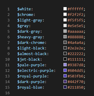
We approached this by using our existing design system colours, and building on the available palette with new variations to reduce saturation and tint where needed.
Then when applying styles we used CSS custom properties as the primary setting for the colour, but also back that up with the SASS variable too, like this example on the body tag.
$white:             #ffffff;
$chrome:            #f2f2f2;
$dark-chrome:       #4a4a4a;
$jet-black:         #111111;
$pale-purple:       #9387d8;
$electric-purple:   #604dd5;

:root{
    --body-color: #{$white};
    --text-color: #{$dark-chrome};
    --text-color-accent: #{$electric-purple};
}

.dark-mode {
    --body-color: #{$jet-black};
    --text-color: #{$chrome};
    --text-color-accent: #{$pale-purple};
}

body {
  background: $white;
  background: var(--body-color);
}
So when a browser that doesn't support CSS custom properties visits it'll fall back to the default colour set. in this case that's the light colour scheme.
For browsers that do support this code, they'll load the light style by default. but we've specifically avoided the media query in this code, why?
Well I wanted to allow users to toggle the dark theme on and off, so for this example we applying the theme with a class dark-mode on the body and avoiding the media query for now.
Detecting dark mode in Vue
Using the mounted lifecycle in App.vue we can add a function to detect prefers-color-scheme when it's set to dark and apply our class dark-mode to update the CSS custom properties on the body, allowing the cascade to do most of the work.
<script>
export default {
  mounted() {
      const darkMode = window.matchMedia("prefers-color-scheme: dark");
      if(darkMode) {
          document.body.classList.add('dark-mode')
      }
  }
}
</script>
By using a well thought out set of CSS custom properties in our components, this one setting can control the look of the entire page.
Designing for Dark Mode
The main challenge for me here was working out where our current design system didn't give me enough flexibility to do what I needed. I found the need to introduce a few new colours just to make the design work.
Those colours are pale-purple, almost-black, and light-black. And yes naming things is really hard, but we already had a dark gray.
Designing in the browser
Most websites are already designed with a light background, so it's easy to call that your light design, look you're halfway there, kinda.
Now that we can tailor the look of our site to a users preference we can make sure user sees the right design for them.
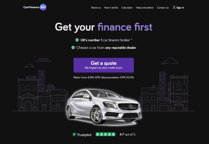
To start designing my dark mode settings I used the Vue-CLI to build a prototype homepage that included the components we have on the homepage. This gives me a starting point which I can tinker with. Oh and if you hadn't already guessed I'm a big fan of designing in the browser.
if you hadn't already guessed I'm a big fan of designing in the browser.
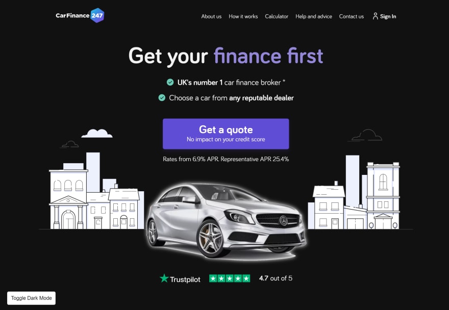
Here's a snippet of the homepage as it existed at the time. I'd updated the bullet point check marks in line with our design system and hollowed out the check mark.

Swapping out the background and text colours goes a long way to setting the scene here. The primary call to action purple stands out equally well on both colours so no big changes are required there, but I did take the saturation down a little, that change is almost invisible to my eyes when toggling between the themes.
I changed was the header title accent colour. I used a de-saturated tint of the existing purple to prevent clashing with the black background like this... 🤮

Along with toning down the text accent colour, I also added a subtle glow to the car image in the main hero. Now this isn't an optimal solution, but the pngs currently in use across the site were never designed to sit on a dark background so are rough around the edges, literally. This softens the edges a little giving us chance to roll out these changes before updating the imagery over time.
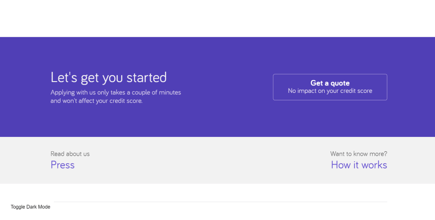
When swapping out the colours using the method detailed above, I started from the darkest colour in the background and used progressively lighter colours in the foreground.
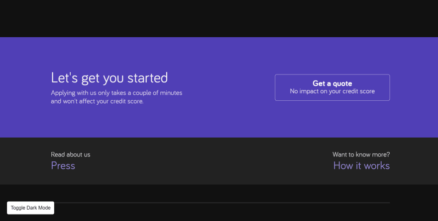
This reverses the way colours are layered currently in the design, as shown here.
Dark mode SVGs
Well you may have noticed in these images that the city scape background didn't change the same way the rest does site. And you're right, it burns me up inside.
I spent some time over the Christmas break to figure out how I can apply my new colours to my SVGs too.
I really wanted to add unique elements for specific themes as that little something extra. Think about it, a moon and stars in dark mode, or perhaps a bird in light mode? A cool way to add a touch of personality into our designs.
I started with the original artwork in Figma and created some color variations I thought might work well.

I toyed with the idea of adding lights that were left on in the foreground buildings but decided that it was too distracting as these are background images. I also found that using these light blue/purple colours on the building made them pop way too much, distracting from the main vehicle image.
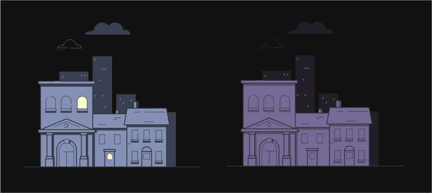
I explored plunging them into almost complete darkness and highlighting the outlines instead, as if moonlight was reflecting off the edges of the buildings and leaving only the lights for the skyscrapers in the backgrounds.

Once I'd settled on a scheme I created a series of CSS classes and manually replaced the inline fills in the SVGs with those classes.
Those classes are used for both color and visibility for the paths in the SVGs
.accent {
  fill: #6accb6;
}
.cloud {
  fill: #333333;
}
.dark-mode .cloud {
  fill: #211e28;
}
.skin{
  fill: #ffffff;
}
.foreground {
  fill: #ffffff;
}
.dark-mode .foreground {
  fill: #151416;
}
.foreground-shadow {
  fill: #c9d3ff;
}
.dark-mode .foreground-shadow {
  fill: #101010;
}
.bg-color {
  fill: #edf1fe;
}
.dark-mode .bg-color {
  fill: #211e28;
}
.outline {
  fill: #333333;
}
.dark-mode .outline {
  fill: #4f4c56;
}
.dark-show {
  opacity: 0;
}
.dark-mode .dark-show {
  opacity: 0.5;
}

.dark-hide {
  opacity: 1;
}
.dark-mode .dark-hide {
  opacity: 0;
}
With a bit of live color tweaking in the browser (as I wasn't 100% happy with the outline colour on the buildings) here is the finished result. It's subtle, blends well with the existing colour scheme and still adds plenty of character above the fold.
Live demo
If you want to have a play with the designs in your browser please feel free, the link to the Live demo is here.


Top comments (0)