
This post was originally published on my blog. I recommend reading it there, mainly because the examples are better embedded.
Introduction
It's no secret that today's websites are increasingly complex. Webpages now more closely resemble dynamic, living applications. Developers combine and style HTML elements to create new user experiences. However, it can be challenging for disabled users' assistive technologies to make sense of this new world.
One tool devised to solve this problem is ARIA. Short for Accessible Rich Internet Applications, ARIA is a subset of HTML attributes (generally prefixed with aria-) that modify how assistive technologies such as screenreaders navigate your page.
Unfortunately, developers often misunderstand ARIA and misapply it, which leads to worse experiences for disabled users. In 2017, the web accessibility resource WebAIM reported:
"When WebAIM evaluates a client’s website for accessibility, we often spend more time evaluating and reporting on ARIA use than any other issue. Almost every report we write includes a section cautioning against ARIA abuse and outlining ARIA uses that need to be corrected or, most often, removed."
—Jon Whiting, To ARIA! The Cause of, and Solution to, All Our Accessibility Problems
In their August 2019 analysis of the one million most popular homepages, WebAIM found that ARIA usage had increased sharply over the previous six months, and that the increased use of ARIA was strongly correlated with an increase in accessibility defects on the page.
 Jared Smith@jared_w_smith
 I’m crunching data for the WebAIM Million re-analysis. The single strongest indicator that a page will have numerous accessibility errors is whether ARIA is present. Pages with ARIA have 65% more issues than those without. And it’s getting worse. This is VERY disturbing!18:50 PM - 29 Aug 2019


The WebAIM report is quick to remind us that correlation does not imply causation. It suggests that more complex homepages and the use of libraries and frameworks could lead to both more situations requiring ARIA and more bugs. That said, it still seems like there's a lack of understanding around what ARIA is and how it should be used well.
This could be because there are a lot of ARIA attributes, each with their own (admittedly, sometimes niche) use cases. This can make ARIA seem unapproachable.
Additionally, ARIA isn't always included in web development resources. When it is, it's often handwaved away as just making the element ✨more accessible✨. A friend of mine admitted to copying ARIA from example code because the docs promised exactly that. Without the context of what ARIA does, it's totally reasonable for developers to assume that more ARIA means better accessibility, so you might as well go all in.
So, today: what ARIA is, what it does, why you should use it, and when you shouldn't.
Revisiting the Accessibility Tree
In my last post, I introduced the accessibility tree: an alternate DOM that browsers create specifically for assistive technologies. These accessibility trees describe the page in terms of accessible objects: data structures provided by the operating system that represent different kinds of UI elements and controls, such as text nodes, checkboxes, or buttons.
Accessible objects describe UI elements as sets of properties. For example, properties that could describe a checkbox include:
- Whether it is checked or unchecked
- Its label
- The fact that it even is a checkbox, as opposed to other elements
- Whether it is enabled or disabled
- Whether it can be focused with the keyboard
- Whether it is currently focused with the keyboard
We can break these attributes into four types:
- Role: What kind of UI element is this? Is it text, a button, a checkbox, or something else? This lays out expectations for what this element is doing here, how to interact with this element, and what will happen if you do interact with it.
- Name: A label or identifier for this element. Names are used by screenreaders to announce an element, and speech recognition users can use names in their voice commands to target specific elements.
- State: What attributes about this element are subject to change? If this element is part of a field, does it have a value? Is the current value invalid? Does this field have a disabled state?
- Properties: Functional aspects of an element that would be relevant to a user or an assistive technology, but aren't as subject to change as state. Is this element focusable with the keyboard? Does it have a longer-form description? Is this element connected to other elements in some way?
These qualities encompass everything a user might want to know about the function of an element, while omitting everything about the element's appearance or presentation.
Good Markup Means Happy Trees
Semantic markup refers to using the native HTML elements that best reflect the desired experience. For instance, if you want an element that, when clicked, submits a form or performs some action on the page, it's usually best to use a <button> tag. When we write semantic HTML, the browser has a much easier time picking out the right accessible objects. Additionally, the browser can do the heavy lifting to make sure the accessible objects have all of the necessary properties, without any extra effort on our part.
However, semantics can only get us so far. Sometimes we want newer, more complex experiences that semantic elements just don't support yet, such as:
- Messaging that is subject to change, including error messages
- Tabs, tablists, and tabpanels
- Tooltips
- Toggle switches
What do we do in these cases? It's still important to engineer these experiences in ways that assistive technologies can understand. First, we get as far as we possibly can with semantic markup. Then, we use HTML's ARIA attributes to tweak the accessibility tree.
ARIA doesn't modify the DOM or add new functionality to elements. It won't change elements' behavior in any way. ARIA exclusively manipulates elements' representation in the accessibility tree. In other words, ARIA is used to modify an element's role, name, state, and properties for assistive technologies.
That's great in theory, but how does it work in practice?
Introducing the Toggle
Take a look at this toggle switch:
If you click the toggle, you'll trigger dark mode. Click it again and you'll go back to light mode. The toggle is even keyboard-navigable—you can tab to it and trigger it by pressing Space.
It does have a bit of a problem, though. If you navigate to it with a screenreader, you'll hear something like this:
Screenreader users will have no idea what this element is, or what it's for, or even that it's clickable. Users of other assistive technologies will be similarly frustrated. This is what we in the business call A Problem™. Fortunately, we can try to fix this with ARIA. We'll explore how ARIA modifies names, roles, states, and properties by adding ARIA attributes to this dark mode toggle.
If you'd like to pull the code locally to follow along, you can clone it from GitHub. If you don't have a screenreader to follow along with, follow these steps to view your browser's accessibility tree.
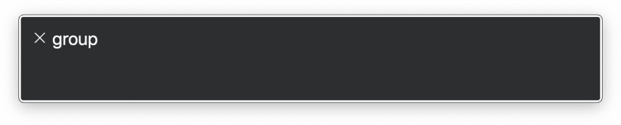
First up, how do we make sure assistive technologies know that our element is a toggle instead of a group?
Role
The browser doesn't really know what to make of our toggle, or how best to expose it to assistive technology. Because our toggle is just a <span> with another <span> inside of it, the browser's best guess is that this is a generic group of elements. Unfortunately, this doesn't help users of assistive technologies understand what this element is or how they should interact with it.
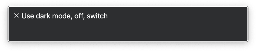
We can help the browser along by providing our toggle with a role attribute. role can take many possible values such as button, link, slider, or table. Some of these values have corresponding semantic HTML elements, but some do not.
We want to pick the role that best describes our toggle element. In our case, there are two roles that describe elements that alternate between two opposite states: checkbox and switch. These roles are functionally very similar, except that checkbox's states are checked and unchecked, and switch uses on and off. The switch role also has weaker support than checkbox. We'll go ahead and use switch, but you're free to use checkbox on your own.
When we navigate to our toggle with a screenreader now, we get a more accurate description of this element:

When I lingered on this element for a bit with VoiceOver active, VoiceOver told me how I could interact with the element using the Space key:

Assistive technologies can now use these roles to provide extra functionalities that make navigating the page easier for disabled users. For instance, when a user issues a "click button" voice command, the Dragon NaturallySpeaking speech recognition software will light up all of the buttons on the page. Screenreaders often provide shortcuts for navigating between different elements of the same role—JAWS provides hotkeys and VoiceOver provides the Rotor for this purpose.
Importantly, a role is a promise. You're promising to users that they can interact with elements in a certain way and that they will behave predictably. For instance, users will expect the following from switches:
- They can be clicked
- They can be focused on with the keyboard
- When the switch is focused, it can be triggered by clicking Space
- Triggering the switch will cause something to toggle
Specifying an element's role will not auto-magically add any of that expected functionality. It won't make our element focusable or add key events. It's up to the developer to follow through on that promise. In the case of our toggle, I've already handled this with tabindex and by adding a keydown event listener.
It's great that users and assistive technologies know our element is a toggle switch. Now, though, they might be asking themselves... a toggle switch for what?
Name
An element's accessible name is its label or identifier. Screenreaders announce an element's name when the user navigates to that element. Speech recognition users may also use an element's name to target that element in a voice command. Images' names come from their alt text, and form fields will get their names from their associated <label> elements. Most elements get their names from their text contents.
Sometimes, the default accessible name isn't good enough. Some cases where manually setting the accessible name would be justified include:
- Short, repeated links like "Read more" whose context is made clear to sighted users, but which need more context to make them distinct to assistive technologies
- Icon buttons that have no meaningful text contents
- Regions of the page that should be labeled so that assistive technologies can build a skimmable page outline
ARIA offers two attributes for modifying an element's name: aria-label and aria-labelledby.
When you specify aria-label on an element, you override any name that element had, and you replace it with the contents of that aria-label attribute. Take a button that just has a magnifying glass icon. We could use aria-label to have screenreaders override the button's contents and announce "Search":
<button aria-label="Search">
    <svg viewBox="0 0 22 22">
        <!-- Some magnifying glass SVG icon -->
    </svg>
</button>
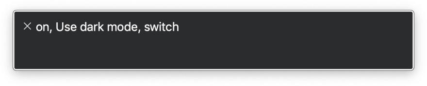
Let's add aria-label to our toggle:
If you navigate to the switch with a screenreader now, you'll hear something like this:
aria-label is best used when there isn't already some visible text label on the page. Alternatively, if we already have a label on the page, we could use aria-labelledby. aria-labelledby takes a text label's id, and uses that label's contents as an accessible name.
For instance, we could use aria-labelledby to use a header as a label for a table of contents section. The <section> uses the heading's id to specify which element should serve as its label. As a result, the whole table of contents section is named "Table of Contents."
<section aria-labelledby="toc-heading">
    <h1 id="toc-heading">
        Table of Contents
    </h1>
    <ol>
        <!-- List items here -->
    </ol>
</section>
This approach is very similar to using a <label> element's for attribute, except it works for all elements, not just form fields.
Here's what our toggle example would look like if we used aria-labelledby instead of aria-label:
Note: While writing this article, I learned that screenreaders may disregard aria-label and aria-labelledby for static elements. If your labels aren't working, make sure your element has either a landmark role or a role that implies interactivity.
State
When I navigate to our toggle with my screenreader, it tells me that it's in an "off" state. However, when I trigger the toggle... it still says it's off. We need a way to let assistive technologies know when the toggle's state has changed.
ARIA state attributes describe properties of an element that are subject to change in ways that are relevant for the user. They're dynamic. For instance, collapsible sections let users click a button to expand or collapse the contents. When a screenreader user is focused on that button, it would probably be helpful if they knew whether the contents were currently expanded or collapsed. We could set aria-expanded="false" on the button and then dynamically change the value whenever the button is clicked.
Another ARIA state attribute worth mentioning is aria-hidden. Whenever an element has aria-hidden="true", it and any of its children are immediately removed from the accessibility tree. Assistive technologies that use the tree will have no idea that this element exists. This is useful for presentational elements that decorate the page but would create a cluttered screenreader experience. aria-hidden can also be dynamically toggled, e.g. to obscure page contents from screenreaders when a modal overlay is open.
Returning to our toggle, elements that have specified role="checkbox" or role="switch" expect that the element will have the aria-checked state attribute, and that it will alternate between "true" and "false" whenever the toggle is triggered.
The following example demonstrates how we can use JavaScript to change aria-checked:
Try navigating to the toggle with your screenreader. Flip the switch to turn dark mode on. Now, the toggle actually announces when it's on:
Properties
ARIA properties are attributes that describes extra context about an element that would be useful for a user to know, but aren't subject to change like state. Some examples include:
- Marking up form fields with
aria-requiredoraria-readonly - Using
aria-haspopupto indicate that a button will open a dropdown menu - Designating an element as a modal with
aria-modal
Some ARIA properties establish relationships between elements. For instance, you can use aria-describedby to link an element to another element that provides a longer-form description:
<form>
    <label for="pass">
        Enter a password:
    </label>
    <input
        id="pass"
        type="password"
        aria-describedby="pass-requirements"
    />
    <p id="pass-requirements">
        Your password must be at least 8 characters long.
    </p>
</form>
In this example, the screenreader would announce "Your password must be at least 8 characters long" as a part of the <input> announcement.
Use Less ARIA.
The World Wide Web Consortium's ARIA specs provide five rules for ARIA use. The first rule isn't quite "Don't use ARIA," as some have quipped, but it's pretty close:
If you can use a native HTML element or attribute with the semantics and behavior you require already built in, instead of re-purposing an element and adding an ARIA role, state or property to make it accessible, then do so.
In other words, ARIA should be a tool in your arsenal, but it shouldn't be the first one you reach for. Instead, your first instinct should be to use semantic elements where possible. In the case of our toggle, that might look like this, which uses a native checkbox and no ARIA at all:
Why should we default to semantic markup over ARIA? Some reasons include:
- Semantic elements provide functionality and expose properties to the accessibility for free, out of the box. This ensures users have a robust and familiar experience across the web. With our semantic toggle, for instance, we didn't have to add tabbing or key events.
- Semantic markup enables progressive enhancement, which means your page is moderately functional, even if CSS or JavaScript resources fail. If either the CSS or the JavaScript were unable to load, our ARIA-only toggle would be toast. Our semantic toggle would at least provide a checkbox with default styles.
- Some assistive technologies maintain off-screen models instead of consuming the accessibility tree, so these tools may not support ARIA.
I really like how Kathleen McMahon put it. If web development is like cooking, then semantic elements are your high-quality ingredients. ARIA attributes, then, are your seasonings. Cook with them, by all means, but you'll only need a touch.
Further Reading
If you'd like to read more about ARIA, I recommend the following resources:
- The World Wide Web Consortium's ARIA specs
- The World Wide Web Consortium's ARIA Authoring Practices
- Kat Shaw's What the Heck is ARIA? A Beginner's Guide to ARIA for Accessibility
- WebAIM's To ARIA! The Cause of, and Solution to, All Our Accessibility Problems, by Jon Whiting


Top comments (0)