Light theme? Dark theme? What fonts?
Let's hear it. Comment below.

Light theme? Dark theme? What fonts?
Let's hear it. Comment below.
For further actions, you may consider blocking this person and/or reporting abuse
Top comments (140)
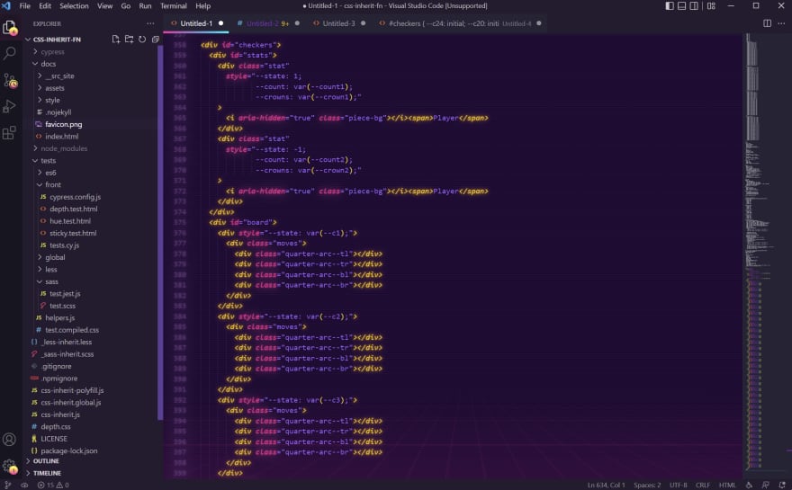
Can't beat synthwave x fluoromachine for VSCode

😈
Trtrerrr
Wow! I'm totally getting synthwave vibes from these colors — awesome. 🙌 That's an aptly named editor theme right there.
ive been using synthwave but not that background. gonna sort that right out! thanks for bettering my life.
This is 🔥
Oh nice! I'm a Sublime girl myself, but this is pretty and the colors make my heart happy. I wonder if there's something similar for Sublime?
bookmarked this comment
Is it simple to set up? Isn't it too harsh for the eyes?
mmmm no, not really. It's got some hoops to jump through... and a lot of the highlighting colors need to be overwritten manually w/o instruction so they're visible at all. Also VSCode will tell you it's corrupt every time it opens a new window...
But it looks great!
Well... So the set up is still the same after the few years I took a look at it. So bad ^^
But it does look great!
you're not half wrong. its quite 'aggressive' but i find a chop/change between colour schemes is really helpful with motivation (i mean you're staring at this a fair bit)
really looking forward to a good 'forest' kinda theme but havent found one just yet. bring on the green.
nice but too distracting, i prefer material theme ocean
Synthwave + Stardew Valley icons
Whaaaaaat, Stardew icons? That's awesome!
marketplace.visualstudio.com/items...
Has a winter and autumn mode too! Totally forgot about that, so now I'm running autumn for pumpkins and sunflowers!
Awesome, I love that video game ! Thanks for sharing.
Awesome theme, I use coder coder theme. Please how do you get your code to look so neat and organized?
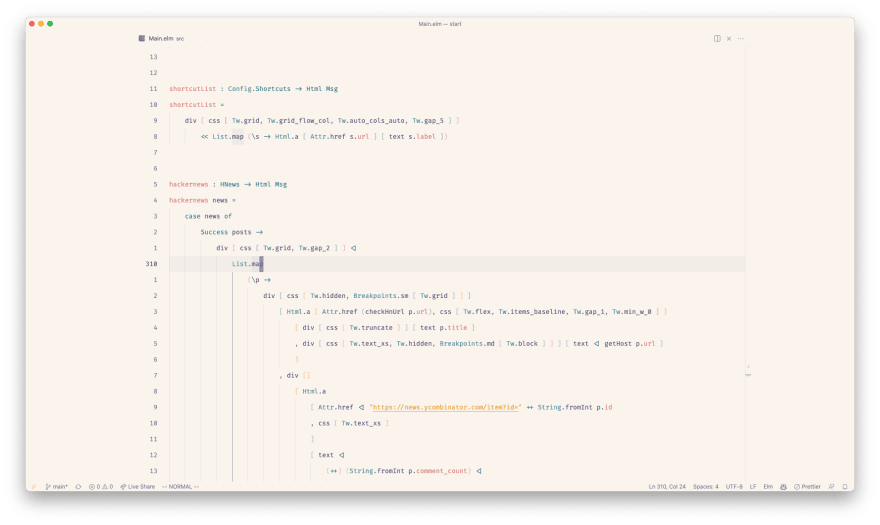
vscode with rosé pine dawn

edit: font is fira code and I usually switch between dark and light mode on os level depending on my surroundings. For dark mode I'm on rosé pine moon.
Whoa
So clean, I love it
Awesome, can you share your editor settings?
Unfortunelty a bit of a mess. These should be the most relevant ones:
Cool, I'll check it out and see how it looks in my vscode.
Thanks!!!
no way xD
I generally switch back and forth between these two (four?) themes whenever I get bored of the one I'm looking at.
Arcadia (Dark)
Arcadia (Light)
Papercolor (Dark)
Papercolor (Light)
These screenshots are sooo crisp. really making vim look good here!
The light ones would look better on my linux mint setup because there the window borders actually change when I switch themes:
The other ones were quickly taken on my work PC during lunch break, where I haven't really wasted that much time making everything just perfect :D
Please share some editorial, how did you do customize vim. Looks very beautiful and eye catchy.
I actually didn't add all that much, it's really just standard neovim with some colour themes in a terminal with some padding.
That Papercolor Dark looks nice!
I love your super minimalistic vim
I put it in zen mode for the screenshots; most of the time it actually looks like this:
Lately I've been using Catpuccin on just about everything the have a plugin for and love it so much!
How nice theme i got! (solarized dark)

How do you like the low-ish contrast personally?
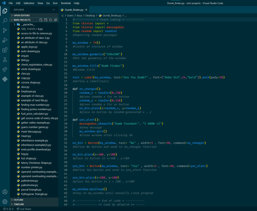
I tried many themes but for 2 weeks I use my VSCode on this theme! I dont know why I like it 🤷🏼♂️
I was considering that too!
Please how do you make your code look so neat and organized?
Is there an extension you use?
i just write my codes clean, there isnt any extension
in every line i wrote, i put a comment for that and it makes my code more beautiful
I'm using the Fortnite theme with the Dank Mono font.
Me too! I love this theme 😄
Love that dark purple!
Link to larger image
Ayu Mirage PowerUp (VS Code)
FairyFloss on VSCode, Dank Mono font ✨
I really want to like FairyFloss but I found I was having to tweak too many things to make it fit my eyes. It looks great in certain screenshots but as soon as I edit something different it becomes a splodge!
That's very fair - the most important thing is for your eyes to like it 😄 Maybe it depends what kind of files you're in most often.