
Table of contents
I. Introduction
II. Getting Started with Tableau
III. Creating Visualizations
IV. Creating a dashboard
V. Sharing and Collaborating
VI. Conclusion
Introduction
Tableau is one of the most popular data visualization platforms out there and for good reason. Tableau was created by a company called Tableau Software, which was founded in 2003 by Chris Stolte, Christian Chabot, and Pat Hanrahan. They developed Tableau as a data visualization tool to help people see and understand their data better. The first version of Tableau was released in 2004. Since then, Tableau has become a leading data visualization tool used by individuals and organizations worldwide.
Data analysts prefer to use Tableau because it has a simple-to-use platform for combining and displaying data without requiring any coding skills. Tableau has many helpful tools that make it quick and effortless to create data visualizations, and its user interface is straightforward to navigate.
By the end of this user guide, you will be able to navigate around the Tableau interface, create data visualizations and join imported data from multiple sources for data analysis.
Getting started with Tableau
The Tableau has both the desktop and web interface which can both be used for data visualizations, which can then be shared to the public through Tableau public. Since Tableau is basically a free and open source platform, they have a large community of Tableau users who share their data visualizations on the platforms for other people in the community to interact with.
To get started navigate to Tableau public on the web and create an account.

Click on the "Sign up for Tableau Public" button to create a new account. After you have filled in your details and you have signed into your account, you will be navigated to the home page.

To get started, click on "create" on the homepage, then select "web authoring". This will take you to the workbook page where you can work with data and make visualizations.

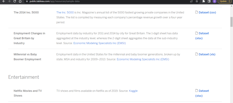
Getting sample data
To use the workbook page, you need a dataset. Here's how to get it:
- Go back to the Tableau public home page.
- Click "resources" on the navbar.
- Select "Sample data".
- Download the "Netflix Movies and TV Shows" dataset.
 The sample data page can be found here
Importing dataset into Tableau
On the workbook page, you will see a small window appear. In this window, click the button that says "upload file from computer." After that, choose the dataset that you just downloaded and add it to the workbook. To inspect the tables in the dataset, click on the table icon that's located on the right of each of the table names, a new web page will open up. This page contains the details of the selected table.

Connect multiple tables
Tableau helps us to connect different tables that have the same keys easily. You don't need to write any code, you just need to select and drag the tables you want to join together and then choose the common key to merge them. You do not have to physically merge the tables to connect them, pointing out their similar keys is enough for Tableau to intuit their connection.
Drag all the tables to the right side of the screen. If you inspect each table and you will see that they all have a column called "show_id". This column is important because it links all the tables together.

When the tables are on the right side of the screen, click on "update now" on the bottom right side of the screen to update their relationship.
Creating visualizations
Making visuals is a really important job for data experts when they use Tableau. It's not just about computing or getting data and cleaning it. Knowing how to make visual presentations is vital to explain what the data means to you and your listeners. This basically gives the data a voice to narrate its story. Being able to do this is a very important ability that will help you progress in your career as a data analyst.
To start creating visuals in Tableau, go to the bottom of the page and find the tab labeled "sheet 1". Click on this tab to go to the page where you can create your visualization. The image below shows you what your screen should look like.

Creating a line chart
The dataset for this visualization was taken from Tableau's sample data store and has not yet been cleaned. Usually, it's not suggested to clean data on Tableau as it mainly focuses on data visualization. However, for this tutorial, you will be able to modify your data on the worksheet.
We'll use the "Release year" and "show id" columns in the "netflix_titles" table for this visualization. The "Release year" column is in the wrong data type. It is currently a string type, and that is why it has a green "abc" prefixed text, this indicates it's data type. To fix it, hover on "release year" and click on the white arrow that appears. Next, hover on "change data type" and select "date" from the dropdown menu. This will change the data type to date.
Drag the "Release year" to the columns panel on the right hand side of the page. Then drag the "show_id" to the rows panel. This will create a Gnatt chart, but it's not the one we want. Click on "show_id" button on the pane, select "Measure" and choose "count" from the menu that appears. This will count how many times a "show" appears in a given year. If you've done everything correctly, your screen should look like the image below.

To filter the show_id values and remove null values. Drag the show_id column to the filter panel located in the middle column of the page. Click on the new filter button for "show_id" and select "show all values", then deselect "null" to exclude null values in the visualization.
Creating a packed bubble chart
To make a packed bubble chart that counts and aggregates categories, create a new sheet by clicking on the icon with a plus next to "sheet 1" at the bottom of the page. This will give you a blank sheet to create a new chart. You can change the name of the sheet by double-clicking on its current name at the bottom of the page, then typing in the new name and pressing enter to save.
For this chart, select the type column in the netflix_titles table and drag it in the rows pane. Then drag the same column in the columns pane. Select any of the two type columns you selected and click on it, to bring out the drop down menu, hover on "Measure" to select count. This will count the movie type in the table. The second column that was not converted will serve as the label for the the count values.
On the right most part of the page, click on the chart icon with the text "show me" beside it. This will reveal the charts available for use. Select the one with multiple circles to automatically create a packed bubble chart for the movie types. Currently null values are present in the columns. You can remove it by adding the type column to the filter pane and deselecting the null value like you did in the line chart above.
If all goes well, your chart should look similar to the image below.

You can continue experimenting with the other chart types available in the "show me" panel. Up next, you will create a simple dashboard with your charts.
Creating a dashboard.
Tableau has a special page just for making dashboards. To find it, click on "dashboard" in the menu bar. When you click on the dashboard link, a new tab will appear at the bottom of the screen that says "dashboard 1". This shows you that you've created a new dashboard. You can give your dashboard a different name by double-clicking on the text.
Dashboard tools
The left-sidebar on the dashboard interface contains the settings and toolbar needed to build the dashboard. Let's go through the interface.
On the top, there is a tab with dashboard and layout settings as seen below.

Device preview
The default view is the desktop view. The phone view will automatically make the desktop layout stack on top of each other in order to make the desktop layout responsive.
Sheets
The sheets are all your previously created charts. They are automatically loaded on the dashboard. To add a sheet to the dashboard, double click on the name of the sheet or drag and drop the chart to the dashboard builder panel.
Objects
The dashboard can have extra features added to it for specific purposes. You can include a container that goes up and down or side to side to hold your charts, or pictures from outside sources. The "Ask Data" tool is powered by artificial intelligence and allows you to ask a question and receive an answer based on the data available on the dashboard.
Layout
The layout tab allows you to style your dashboard to your preference. Here, you can adjust the size of the dashboard and even the background color to suit the theme of your data or the company that owns the data.
Floating or Tiled layout
When creating a dashboard, how things are arranged is crucial. It can be frustrating when the layout isn't aligning the way you want it to be. Luckily, Tableau helps data analysts by providing two layout options: tiled or floating. This makes arranging things much easier. Floating layout allows you to freely position each view on the dashboard without being restricted to a fixed grid or alignment. This means you can adjust the size and position of each view as needed, allowing for more flexibility and creativity in your dashboard design. However, this can also make it more difficult to maintain a consistent layout and can sometimes result in views overlapping or being hidden behind other views.
Tiled layout, on the other hand, automatically arranges views in a grid-like fashion, with each view taking up an equal amount of space. This provides a more structured and organized look to your dashboard, making it easier to compare different views side-by-side. However, this can also be more limiting in terms of design options, as you are restricted to the predetermined grid.
Ultimately, the choice between floating and tiled layouts depends on your specific needs and preferences for your dashboard design.
Let's get started on creating a simple dashboard with only 4 charts.
Adding charts to the layout
To make the charts on the page movable and adjustable, choose the floating layout located on the sidebar, on the bottom left of the dashboard page.
Increase the size of the chart
To increase the size of the chart, select the chart, then hover on the edges of the chart till you see a double arrow icon, this indicates that the size can be adjusted.
Move the chart
To move a chart on a page, first select the chart. Then, move your mouse cursor to the top area of the chart until you see an icon with arrows pointing in all directions. This icon means that the chart can be moved.
Adjust and change the sizes of the chart till it looks good enough. Here is how my dashboard currently looks.

Great job on creating a Tableau dashboard from scratch! Now, let's learn how to share your visualizations with others, including the public, and work with other team members to collaborate on your project.
Sharing and collaborating
Follow these steps to share your work on Tableau public;
A. Share or publish your visualization:
- Open the workbook that contains the visualization you want to share.
- Click the "Server" menu in the top navigation bar, and select "Publish Workbook".
- In the "Publish Workbook" dialog box, select the project to which you want to publish the visualization, and click "Publish".
B. Set Permissions:
- Once the workbook is published, click the "Permissions" button to set the permissions for the visualization.
- In the "Permissions" dialog box, select the "Everyone" group, and choose the permission level you want to give them (e.g., "View").
- Click "Add" to save the permission changes.
C. Publish to Tableau Public:
- To make the visualization publicly accessible, publish it to Tableau Public.
- Click the "Server" menu in the top navigation bar, and select "Publish to Tableau Public".
- In the "Publish Workbook to Tableau Public" dialog box, enter a title and description for the visualization, and choose the category and tags that apply.
- Click "Publish" to upload the workbook to Tableau Public. Share the link:
Once the visualization is uploaded, you can share it with others by sharing the URL.
To get the URL, open the visualization on Tableau Public, and copy the link from the browser address bar.
You can also share the link on social media or embed the visualization on a website.
Collaborate
Tableau allows you to work as a team and collaborate on your visualization. This feature allows for a more efficient and team-oriented workflow. To get started, follow these steps;
Step 1: Invite collaborators
To invite collaborators to your project, click on "Share" in the top right corner of the screen. Enter the email addresses of the people you want to invite and select the level of access you want to give them (Editor or Viewer). You can also include a message to your collaborators.
Step 2: Collaborate on the project
Once your collaborators have accepted your invitation, they can access the project and work on it with you. You can collaborate on different parts of the project by creating and sharing worksheets, dashboards, and stories. You can also leave comments and annotations for your collaborators to see.
Step 3: Manage permissions
You can manage permissions for your collaborators by clicking on "Share" and selecting "Manage Permissions". Here you can change the level of access for each collaborator, remove collaborators from the project, and add new collaborators.
Conclusion
In this user guide, you have hopefully learned what Tableau is, how to import data into a Tableau workbook, how to connect different tables, how to create visualizations, and how to collaborate with other people using the platform. Tableau is an amazing platform for creating data visualizations and I hope you have learned enough in this user guide to continue to build amazing visualizations in Tableau as you continue in your data analytics journey. Happy building!!!

Top comments (0)