
This past New Year’s Eve, Monique Jones published an article on The Verge that could not have been more timely. Amidst the growing dumpster fire at Twitter and the more general sense that social media was no longer the fun, personal, and engaging realm it once was, Jones’ call to bring back personal blogging was both important and on point:
If what is happening on Twitter hasn’t demonstrated it, our relationship with these social media platforms is tenuous at best. The thing we are using to build our popularity today could very well be destroyed and disappear from the internet tomorrow, and then what? […] Owning your content and controlling your platform is essential, and having a personal blog is a great way to do that.
I think the future of blogging is bright for a number of reasons, not least of which is this ability to maintain ownership of your content. Another great reason to get back to blogging, however, is the option of structuring and presenting that content in a way that reflects you as an author. I personally recall the mid to late aughts as a beautiful time for blogging. Not only did I gain my first insights into the world of web development, but I was also exposed to a wide range of idiosyncratic senses of design, from the most pared down and functional (anyone remember iA’s WordPress theme?) to the whimsical and the ornate.
With all of these thoughts in mind, we recently debuted our first application template for Enhance — the Enhance blog template! This template gives you everything you need to start writing and publishing your very own blog with Enhance. It comes with Markdown to HTML conversion built in, along with an RSS feed, code block syntax highlighting, a basic design with light and dark variants, and GitHub workflows to automate publishing. And, of course, you maintain ownership of your content — which means you can also style that content however you like.
The design of our blog template is intentionally minimal while following some best practices for readability, so that you can get to publishing without having to change much if you don’t want to. In this article, however, I’m going to walk you through some steps I might take if I was designing a new blog with this template as a starting point.
I’ll start with some basic changes to give you a feel of how things work, and then dive into some more substantial changes to demonstrate just how much freedom you have to craft your own look and feel for your blog. I’m a big fan of brutalist graphic design, so I’ll be working with this style in mind, but feel free to make your own design decisions as you follow along! (Or, if you’d prefer to skip the end, you can find all the code from this article in this example repo.)
The basics: color and typography
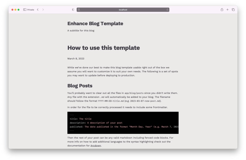
For reference, here’s the design of our blog template as it appears out of the box:

By default, the blog template uses just two colors: one light, and one dark. In the light theme, the light color maps to the blog’s background, while the dark color maps to the typography; in the dark theme, this mapping is reversed. You can pick whatever values you’d like for these two colors as a first step towards making your blog your own.
To do this, open the styleguide.json file at the root of the project. You’ll see a configuration like this:
{
  "base": 16,
  "scale": {
    "ratio": "minorThird",
    "steps": 12
  },
  "properties": {
    "font-body": "Avenir, 'Avenir Next LT Pro', Montserrat, Corbel, 'URW Gothic', source-sans-pro, sans-serif;",
    "font-heading": "Didot, 'Bodoni MT', 'Noto Serif Display', 'URW Palladio L', P052, Sylfaen, serif;",
    "color-dark": "hsl(204deg 30% 30%)",
    "color-light": "hsl(260deg 30% 94%)"
  },
  "queries": {
    "lg": "48em"
  }
}
The properties we’re looking for here are color-light and color-dark.
To start crafting a brutalist look for this blog, I’m going to choose some more ‘severe’ swatches for these two colors, while staying away from pure black and white in order to add some depth. I’m also going to make sure my choice of colors have sufficient contrast between them, to ensure my blog remains legible for as many users as possible.
For my dark swatch, I’ve chosen a very dark and muted violet; for my light swatch, a slightly warm and muted off white. When used together, these two colors produce a WCAG contrast ratio of 10.8, which takes us into the AAA or ‘enhanced’ rating — in other words, more than enough contrast to keep text legible. Aesthetically, the subtle contrast between the two muted hues (violet and orange) will add some depth and personality to the design. Here’s the design after changing these colors:

Now let’s update the typography. Brutalist graphic design traditionally makes use of sans serif typography — or more specifically, grotesque typefaces. Further along in this article, we’ll look at implementing web fonts, but for now, we’ll stick to system fonts. Thanks to the useful website Modern Font Stacks, I’ve got a Neo Grotesque themed system font stack ready to go, so I’ll update both my font-body and font-heading settings with this stack:
{
  "properties": {
    "font-body": "Inter, Roboto, 'Helvetica Neue', 'Arial Nova', 'Nimbus Sans', Arial, sans-serif;",
    "font-heading": "Inter, Roboto, 'Helvetica Neue', 'Arial Nova', 'Nimbus Sans', Arial, sans-serif;"
  },
}
To add to the utilitarian look, I’m also going to change the alignment of the site header and the individual article headers. To do this, I’ll first remove the instances of the text-center class in the file app/elements/site-header.mjs. Then, to change the alignment of article headers, I’ll remove the same class from the file app/pages/posts/$$.mjs, specifically from the <h1> and <p> elements which render the article title and publication date respectively.
Because we’re using system fonts, the results of this change may vary depending on your operating system, but here’s how the template (specifically the post page) looks now on my machine:

Finally, I’m going to change the code syntax theme to be a little less vibrant, so it will better match the overall look of the blog. I’ll grab a different theme from HighlightJS’s themes collection on Unpkg, and then drop the raw CSS into the public/css directory in my project to save an external network request. Lastly, I’ll update the link to this stylesheet in the app/head.mjs file. That gives us:

In the next section, we’ll start making a few more substantial changes. If you’d like to review all the code changes I’ve made in this first section, you can view them all in this single commit in the example repo on GitHub.
Using web fonts
It’s time to add a bit more personality to this design. As Oliver Reichenstein famously wrote, web design is 95% typography, so I’m going to start with that.
The first thing I’ll do is choose a typeface that will complement the design language I’m going for — which I’ve decided is the excellent (and open source) Work Sans. A bonus here is that Work Sans is available as a variable web font, so I’ll only need two web font files (one regular, one italic) to be able to work with all the available styles of Work Sans.
After downloading the font files from Google Fonts, I’ll drop the two variable web font files into my public directory:
public/
├── css/
└── fonts/
         ├── WorkSans.woff2
         └── WorkSansItalic.woff2
Then, to make these fonts available to the browser, I’ll add some CSS to the public/css/global.css stylesheet:
@font-face {
  font-family: 'Work Sans';
  src: url('/_public/fonts/WorkSans.woff2') format('woff2-variations');
  font-weight: 100 900;
}

@font-face {
  font-family: 'Work Sans';
  src: url('/_public/fonts/WorkSansItalic.woff2') format('woff2-variations');
  font-weight: 100 900;
  font-style: italic;
}
(Note we use the /_public route in the URL to take advantage of automatic fingerprinting of the files.)
Next, I’ll add the typeface to my font stacks in the styleguide:
{
  "properties": {
    "font-body": "'Work Sans', Inter, Roboto, 'Helvetica Neue', 'Arial Nova', 'Nimbus Sans', Arial, sans-serif;",
    "font-heading": "'Work Sans', Inter, Roboto, 'Helvetica Neue', 'Arial Nova', 'Nimbus Sans', Arial, sans-serif;"
  }
}
That’s it! My blog is now typeset in Work Sans:
For a summary of these changes, check out this commit.
Updating the site header
Next, I’ll update the site header to give the top of each page a little more character. I’ve decided I’d like the site header to have its own full width background color.
To get started with this, I’ll open the file located at /app/elements/site-layout.mjs, where the general page layout template lives. By default, the site header is nested within the site-container element to keep all the pages’ contents horizontally aligned, but to give the site header its own full width background, I’ll need to pull the header out of that container, and place the header’s contents back into a site container of its own.
With these changes, the site-layout.mjs file will now look like this (note site-header is now adjacent to site-container, whereas it was nested within it before):
export default function SiteLayout ({ html }) {
  return html`
    <site-header></site-header>
    <site-container class='pl0 pr0 pl4-lg pr4-lg'>
        <slot></slot>
      <site-footer></site-footer>
    </site-container>
  `
}
Within the /app/elements/site-header.mjs file, I’ll now add a site-container element, making sure to keep the same horizontal padding classes from the instance in site-layout.mjs:
export default function SiteHeader ({ html }) {
  return html`
    <header>
      <site-container class='pl0 pr0 pl4-lg pr4-lg'>
        <h1 class='text2 text4-lg font-heading font-bold tracking-1 pt4 pt6-lg pb0 pb2-lg'>
          <a href='/' class='no-underline'>
            Enhance Blog Template
          </a>
        </h1>
        <p class='font-body pb4 pb6-lg'>
          A subtitle for this blog
        </p>
      </site-container>
    </header>
  `
}
Now, I’ll add some scoped element styles to this component to change its background color. Scoped element styles mean that any styles I write within this component will only be applied to this component (and its descendants) — which means, for example, that I can use bare element selectors without fear of other elements with the same selector changing outside of this component.
To demonstrate, I’ll use the header element selector and change its background color:
export default function SiteHeader ({ html }) {
  return html`
    <style>
      header {
        background-color: hsla(0deg 0% 0% / 10%);
      }
    </style>
    <header>
      …
    </header>
  `
}
The site header now has its own background color — a slightly darker shade of the main background color. If you inspect the header element in your dev tools, you’ll notice that the element selector has been prepended with the name of the component it’s been declared in, making the full selector site-header header. This prevents those header styles from leaking outside of this component (although it’s not very common to have more than one header on a given page, but the point stands).

This looks great for the light theme, but I’ll need to write some styles for the blog’s dark theme as well. To do that, I’ll use the prefers-color-scheme media query and switch the background from a transparent black to a transparent white:
export default function SiteHeader ({ html }) {
  return html`
    <style>
      header {
        background-color: hsla(0deg 0% 0% / 10%);
      }

      @media (prefers-color-scheme: dark) {
        header {
            background-color: hsla(0deg 0% 100% / 10%);
        }
      }
    </style>
    <header>
      …
    </header>
  `
}
Now I’ve got the header covered for the dark theme as well:
For a summary of these changes, see the associated commit.
Updating table styles
The last thing I’ll do is use Enhance’s built in utility class system to update the way tables are rendered.
Included in our blog template, you’ll find a post titled Element Styling Reference. This post contains some of the most commonly used HTML elements for blog posts, to give you an overview of the elements you might want to consider writing your own styles for. You’ll find an example of a table near the bottom of that post:

This table’s a little cramped for my taste, so I’m going to start by adding some padding to its cells.
In this instance, because the blog’s posts are written in Markdown, and Markdown features special syntax for tables, I can take advantage of the included Arcdown plugin to attach my choice of classes to various HTML elements automatically during the conversion from Markdown to HTML.
To do this, I’ll open the file /app/lib/markdown-class-mappings.mjs. This file exports a JavaScript object where each key represents an HTML element’s name; the value of each key is an array of strings, with each string containing a valid class name from our utility system. You’ll see that many of the common elements already have classes attached to them by default:
export default {
  h2: ['text2', 'text4-lg', 'font-heading', 'tracking-1', 'font-bold', 'mb0', 'mt4', 'leading1'],
  h3: ['text1', 'text2-lg', 'font-heading', 'tracking-1', 'font-bold', 'mb0', 'mt4', 'leading1'],
  h4: ['text0', 'text1-lg', 'font-heading', 'tracking-1', 'font-bold', 'mb0', 'mt4', 'leading1'],
  p: ['mt-1', 'mb0'],
  …
}
To add some extra padding to my table cells, I’ll use both the th (table header cell) and td (table data cell) tags, attaching the p-2 class (short for ‘padding, -2 scale index’).
export default {
  …
  th: ['p-2'],
  td: ['p-2],
  …
}
Now my table’s cells will be nicely padded out, giving some breathing room between each entry:

The last thing I’ll do for this table is apply a background color to the entire element, to visually separate it from its surrounding content. I’ve decided I’d like to use the same semitransparent background colors I used on the site header, so the first thing I’ll do is redefine those colors as CSS custom properties. This will allow me to easily reuse these colors without worrying about making a typo (and, if I want to change these colors down the road, I’ll only have to update the custom property definition).
I’ll define this custom property in the global.css file we used earlier. A good convention is to write your custom properties at the very top of your stylesheet, which is what I’ll do now:
:root {
    --white-a10: hsla(0deg 0% 100% / 10%);
    --black-a10: hsla(0deg 0% 0% / 10%);
}
I’ll then go back and update my styles in site-header.mjs to use these custom properties:
export default function SiteHeader ({ html }) {
  return html`
    <style>
      header {
        background-color: var(--black-a10);
      }

      @media (prefers-color-scheme: dark) {
        header {
          background-color: var(--white-a10);
        }
      }
    </style>
    …
Finally, in the same global.css file, I’ll add these as background colors for the table element (since we haven’t defined any classes using this color):
table {
    background-color: var(--black-a10);
}

@media (prefers-color-scheme: dark) {
    background-color: var(--white-a10);
}
Now my table’s looking a little more distinct:

One thing’s still bothering me, though: those table cells being center aligned (which is most browsers’ default styling) makes it hard to scan the rows of text. I’ll fix this by adding one more rule block to my global.css file:
th,
td {
    vertical-align: top;
}
This ensures all content in my table head and data cells will be aligned to the top of the cell, making multiple lines of text much easier to read:

To view these changes, check out the commit.
That’s a wrap!
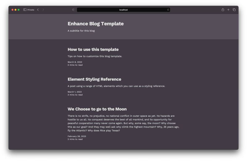
And there you have it! In just four simple commits, we’ve gone from this:

…to this:

This is, of course, just the start of what you can do once you start customizing your blog’s styles. We’re really looking forward to seeing what you come up with, so be sure to share your work on the Enhance Discord!
Until then, here’s to a big, happy return to blogging. Get started by cloning the Enhance blog template, or dive into the full source code from this article.
See you on the blogosphere!

Top comments (0)