
CSS brings out the beauty of HTML elements. CSS rules enable the specification of various properties like colour, font, margin, padding and other properties for HTML elements. Units for the respective properties can be defined and set, hence the term CSS Unit is used to describe the values of the respective properties.
Building responsive sites requires specifying values that can adapt or be scaled for the different CSS properties. There are different ways to add values to properties but two stand out amongst the rest in relation to the parent and html elements.
Adaptability is a major component while building responsive websites, the ability to scale HTML elements up and down easily and across multiple screens is greatly desired. With easy manipulation of HTML through CSS units, its easy to create adaptive and responsive designs using rem and em which are scalable CSS units. CSS units can also be called values.
Well be exploring the basics of CSS units, understanding em and rem units, how they work and their use case.
Introduction
To style HTML elements, simply apply a CSS properties-value pair to the HTML elements. The property-value relationship is known as a CSS declaration.
There are various types of units which can be applied to CSS declarations and those units affect the scalability, adaptability, responsiveness and accessibility of elements.
Adaptability and scalability apply mostly, if not entirely to length units of CSS properties which are; weight, height, length, margin, padding and font size. These units can either be absolute or relative.
Absolute units are fixed. They are the standard unit and they do not depend on other units and neither are they relative to anything. The only example is px
Relative units on the other hand are relative to something else, they are not fixed. They might be relative to their parent or root elements, browser default, device and others. Examples include; em, rem, vhand vw. They are scalable and responsive unlike the rigid and fixed px, These properties make them preferred for web development eliminating the need for massive coding of media queries for various devices.
rem units
Rem is a CSS unit relative to the font size of the root element. remstands for root em. The default font size for modern browsers is 16px. Rem is calculated relative to the font size of root elements which in most cases are browsers default but the default can also be set by setting the font size of the root. So, 1rem is 16px using the browser default.
Rem units are very scalable and are compatible with CSS properties that accept length as a value.
Since rem value is directly dependent on the root element, it doesnt change throughout your code no matter where its used. 1remremains 1 rem, unlike emwhich well discuss later.
Lets write a simple code:
We will analyze the correlation between parent-sibling relationships and rem implications.
Create an index.html file
<!DOCTYPE html>
<html lang="en">
<head>
    <style>
        html {
            font-size: 30px;
        }
        .container {
            display: flex;
            align-items: center;
            background-color: aquamarine;
            height: 100vh;
            width: 100wh;
        }
        .parent-rem {
            font-size: 20px;
        }
        .child-rem {
            font-size: 1rem;
        }
    </style>
    <title>Scalability</title>
</head>
<body>
    <div class="container">
    <div class="parent-rem">
        This is the parent rem
        <div class="child-rem">
            This is the child rem
            <div class="child-rem">
                This is the second child rem
            </div>
        </div>
    </div>
</div>

</body>
</html>

The remvalue responds only to the root value, which is font-size given to the HTML element. Since rem unit is only dependent on the root value which is set at 30px, the child element which is set to 1 rem takes the value of 30pxinstead of 20px , which is the value of its parent element.
em units
While the rem unit depends on the root element or browser default, the em unit is directly dependent on its parent element. The font-size of the parent element determines the childs em value.
Using em increases versatility in code, enabling children elements adapt to the relative sizes of their parent element. However, it is advisable to refrain from declaring font sizes anywhere apart from the root element.
The ability of em units to scale with respect to its parent element makes it ideal for responsive design, especially when building layouts, navbars and side menus.
Lets look at an example code of em units and its inheritance property
<!DOCTYPE html>
<html lang="en">
<head>
    <style>
        html {
            font-size: 30px;
        }
        .container {
            display: flex;
            align-items: center;
            justify-content: center;
            background-color: aquamarine;
            height: 100vh;
            width: 100wh;
        }
        .parent-em {
            font-size: 20px;
        }
        .child-em {
            font-size: 2em;
        }
    </style>
    <title>Scalability</title>
</head>
<body>
    <div class="container">
    <div class="parent-em">
        This is the parent em
        <div class="child-em">
            This is the child em
            <div class="child-em">
                This is the second child em
            </div>
        </div>
    </div>
</div>

</body>
</html>
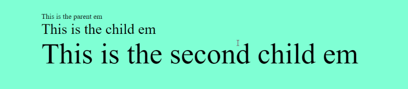
em units scale according to the parent element, each individual div situated inside another div assumes a child-parent relationship and the font size is inherited, in our code, the first child em has a value of 2em which is 2*20 = 40px. The second child em assumes a parent-child relationship with the child em div. The second child em which is also 2rem is bigger than the child rem , this is because the child rem assumes a value of 40px according to its em value which was inherited from its own parent element. So, the base value em is 40px, making our second child em font size which is 2em 80px relative to its parent(child em ).
Problems associated with using em units
The problem associated with em units is its inheritance property which can lead to multiple multiplication or division of relative sizes. em should be used when modularity is required with its parent having a rem unit rather than a pxunit, any pxunit should be declared in the root element. This will ensure better responsiveness and scalability compared to when a rigid size is declared.
rem units have few problems and is the preferred unit by modern libraries and websites.
Apply and Scale
There are various use cases and applications of rem and em size unit that enable the building of highly responsive and scalable web apps, some of them are:
When designing, to ensure consistent sizes and spacing use
rem, while media queries should useem.When creating elements that function based on users' perceptions use
remotherwise, useemfor elements that rely on the relative size of their parent element.For easily accessible and customizable websites, use
reminstead of the rigidpxunit.emunits should only be used when modularity and precision are desired and required.
Libraries using rem
Currently, rem units are preferred for modern UI kits and CSS libraries. Some of them include:
Bootstrap 5
Tailwind CSS
Conclusion
rem and em units are scalable units and are very useful when building responsive websites that adapt to all screen sizes, they have universal support by major browsers and are used by major libraries and UI kits.
Their use cases differ but they can prove quite useful when applied correctly. This article provides use cases that can be helpful while using the units. Happy coding!

Top comments (0)