You can grab the code here https://stackblitz.com/edit/flexboxcssinjs
Box
All HTML elements can be considered as boxes. In CSS, the term "box model" is used when talking about design and layout.
The CSS box model is essentially a box that wraps around every HTML element. It consists of: margins, borders, padding, and the actual content. The image below illustrates the box model
In every design system that I made, Box component is the first component that I developed.
We uses Angular and emotionJS (CSS-in-JS) for code example.
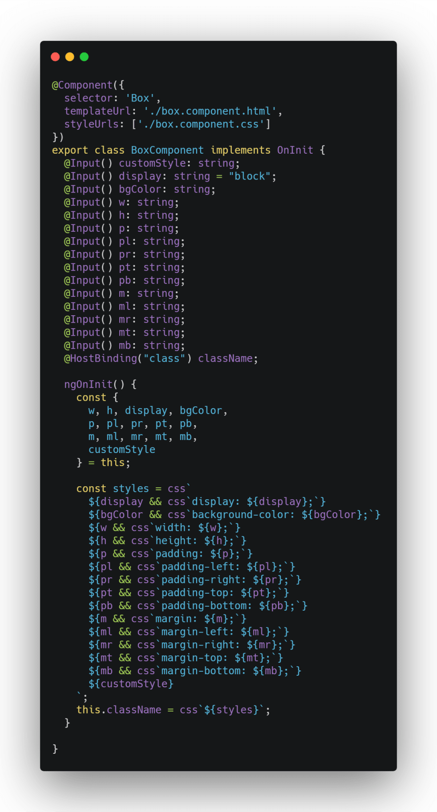
Box component code (snippet version)
The Box component can be implemented as simple as this:
<Box p="20px 20px" ml="10px" mr="10px" w="200px" h="auto">
 Content
</Box>
Please note that we are not using brackets [rule]="value" as we are expecting literal string.
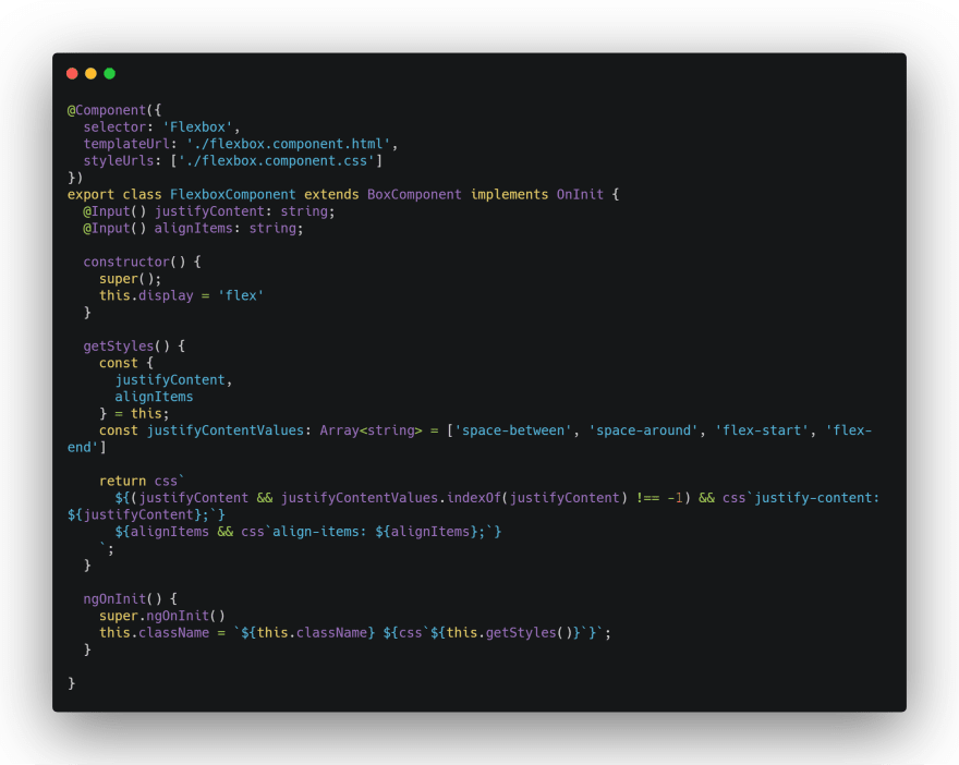
And we can extend the Box to create other component e.g Flexbox
By using Flexbox component, creating a flexbox is not an issue anymore
<Flexbox w="100vw" justifyContent="space-between">
  <Box w="50px" h="50px" bgColor="rebeccapurple">
  </Box>
  <Box w="50px" h="50px" bgColor="rebeccapurple">
  </Box>
  <Box w="50px" h="50px" bgColor="rebeccapurple">
  </Box>
</Flexbox>
We can also do a checking on the value and helps developer to identify the typo (me myself is not kind of person who remember all the rule values)
Here is an example how to add simple validation on values.
In above example we check the value of justifyContent and only if its a valid value, the justifyContent rule added into style.
Box component can be Base component to other components e.g. Semantic Components like section, header, article, nav and many more...
Semantic components
class SectionComponent extends BoxComponent {}

class HeaderComponent extends BoxComponent {}

class ArticleComponent extends BoxComponent {}

class NavComponent extends BoxComponent {}
Summary
Abstracting the Box component as a Base component will make our life easier because all the components of HTML can be considered as a boxes. Like Box component, all the HTML elements (boxes) is consists of:
- Content The content of the box, where text and images appear
- Padding Clears an area around the content. The padding is transparent
- Border A border that goes around the padding and content
- Margin Clears an area outside the border. The margin is transparent
By extending the Box component, all mentioned above have been covered.


Top comments (0)