Patterns of coding is part of programming, though, it is getting better than the days of IE4, and trending gimmicks are phasing out much faster than they used to (clamp width is now supported on all browsers, really? I just read about it months ago, and it was not!).
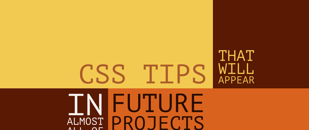
Here are six CSS tips, that have become ever more present in every project I create, the "centering-content-in-a-box" kind of tips.
1. Color contrast function
Deciding the foreground based on the background used to be a no-brainer, then we had to deal with a more dynamic way to decide the foreground, with the introduction of CSS frameworks, and libraries.
According to WCAG (Web Content Accessibility Guide), the perfect ratio for contrast is 4.5 (AA), or 7 (AAA). To see how that affects each color, use Chrome DevTools contrast checker.
You can use Javascript: found this formula on CSS-Tricks website, which returns the best foreground color, for a given background color:
var rgb = [255, 0, 0];
function setForegroundColor() {
  var sum = Math.round(((parseInt(rgb[0]) * 299) + (parseInt(rgb[1]) * 587) + (parseInt(rgb[2]) * 114)) / 1000); return (sum > 128) ? 'black' : 'white';
}
LESS has its own function contrast():
.myclass {
  background-color: red;
  color:contrast(red,#242424,#ffffff,43%);
}
And it is in draft, as it appears: color-contrast on MDN
So now you know why blue, has always been the best choice for link colors on white backgrounds:
2. Breaking hidden overflow for positioned children
The rule is simple, if you have an element with overflow: hidden, and a child with position: absolute, in order to break free from the parent overflow restriction, remove all position: relative from its way to the parent. Absolutely positioned elements ignore the overflow property otherwise.
Here is a screenshot of absolutely positioned checkboxes, inside an auto overflown element. Now, make the checkboxes transparent with opacity: 0, and you will get yourself a stubborn bug. The body will show a vertical scrollbar even if the content of the page is small.

Notice the scrollbar that appears on the body of the result panel:
3. Animate and retain the last value after animation ends.
When starting an animation, you want the animation to end and keep its last value as the current one.
.animatedprop {
  animation-fill-mode: forwards;
}
4. Declare an html component as a non-dom component.
This is very useful in custom components, or when you have a wrapping element, that has a "flex-box" layout for example. That element is ignored in the stack of the DOM if you use
.ignoreme {
  display: contents;
}
I hope this becomes supported by.. oh wait let me check caniuse, oh look at that, it is now supported by all browsers! This is how fast technology is nowadays.
5. Clip the lines to a specific number of lines.
Like you would do with ellipses, except for lines. Use (widely supported):
p {
  display: -webkit-box;
  -webkit-box-orient: vertical;
  -webkit-line-clamp: 3;
  overflow: hidden;
}
6. Scroll HTML smoothly
When changing the location of the scrollbar by clicking on a named anchor on the same page. I believe this should be the default because you rarely ever need to scroll the browser unless you mean it to be smooth.
html {
    scroll-behavior: smooth;
}
Resources
- CSS Variables + calc() + rgb() = Enforcing High Contrast Colors
- LESSCSS contrast
- Contrast checker
- How to make absolute positioned elements overlap their overflow hidden parent
- MDN: animation-fill-mode
- Display: Contents Is Not a CSS Reset
- MDN: -webkit-line-clamp
- MDN: scroll-behavior
Originally appeared on Sekrab Garage


Top comments (0)