Last week, AWS Amplify Studio went into general availability, and with that announcement came some really exciting new features. I wanted to use this opportunity to show you five new things you can do with Amplify Studio.
I work on the team that builds AWS Amplify Studio, and I'd love you're feedback as you build with it!
1. Workflow Bindings
You can add different actions to your UI components with Amplify Studio. You could change a card's color slightly on hover, perform CRUD actions on your data models, or even perform authentication actions like signing out.
Select the element you want to add an action to, then set the prop with the event you want to listen for - exactly the same as you would do in React. Then choose what action you want to take upon the user performing that action.
2. User attribute bindings
Frequently, you'll want to display user information on a UI, for example having "welcome, username" when someone signs in or having their user info displayed on each page so the user knows which account is signed in. You can do this in Amplify Studio by enabling auth and then, in the UI Builder, selecting user attributes to display.
3. Search, pagination, and filtering on collections
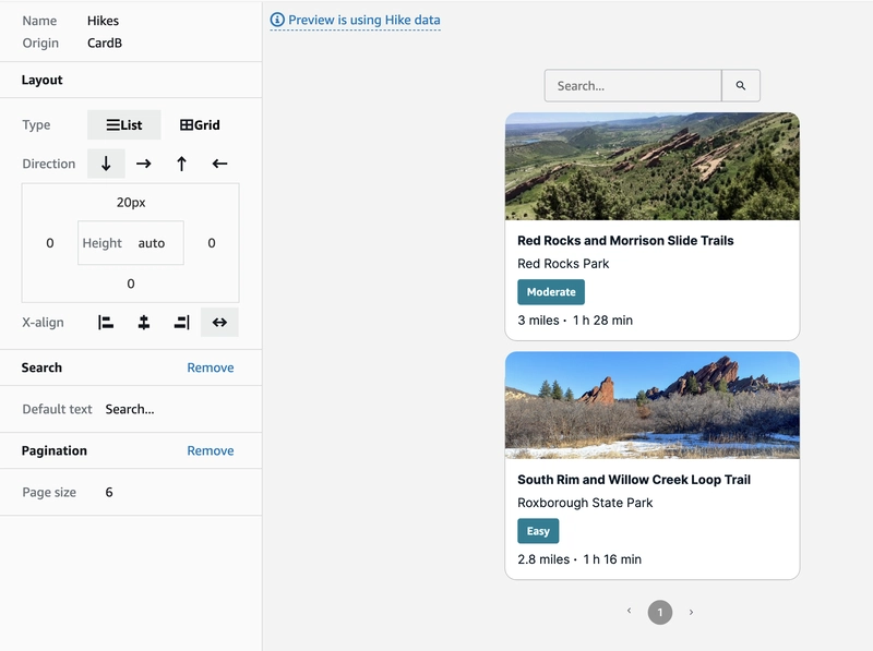
Within Amplify Studio, you can create collections to make list views of your data. Now, you can further control what data is displayed and how. You can add filters and sorts to subset your data and set sort conditions.
You can also add pagination and search components so that users can find what they need and so the UI is manageable.
4. Override experience
The developer experience for overrides has been re-written -- with Amplify Studio human-readable React code is generated, and it's important that developers are able to change what they need to in code. You can pass an overrides object to a Studio-generated component and use the Figma component name to access the exact child element you'd like to modify.
<CardB overrides={{"Text Group": { fontWeight: 'bold' }}} />
If you'd like to modify the items within a collection, you can do that too. Add the prop overrideItems to the collection and pass it a function with two arguments, item which contains the data model instance for the component, and index.
<Hikes overrideItems={(item, index) => {
  if (item.difficulty === 'easy') {
    return { overrides: { 'Button' : { backgroundColor: 'green' }}}
  } else if (item.difficulty === 'difficult') {
    return { overrides: { 'Button' : { backgroundColor: 'darkGrey' }}}
  }
}}/>
5. Figma theme plugin
You can use the AWS Amplify Theme Editor to theme your application. Add color palettes, spacing, font sizes custom to your brand to all the components in clicks.
Conclusion
You can get started with Amplify Studio from with in the Amplify Console. If you'd like to checkout an end to end tutorial, here are a few to choose from:
We'd love to hear your feedback as you build with Studio!


Top comments (1)
It doesn't yet compile the code to TypeScript or?