
Content of Table:
- Introduce
- Create a Copy of the Design Project
- Create an Amplify Project
- Setup a Next.js Project
- Pull Components from Amplify
- Bind Data to the Components
- Build the Website Pages
- Create a Checkout Flow
- Create User Accounts
- Authenticate the Customers
- Conclusion
1. Create a Copy of the Design Project
Objectives
In this lab, you will learn how to:
- Kick off a design project using the Amplify template
- Theme the design to your taste
Creating the Project Design
We need to make a copy of this design file to get started. The design was created by cloning the official AWS Amplify UI template and adding a different theme.

We can see the design was created, you can zoom to show clearly :

Even though we’ll use the customized design file for this project, let’s also see how to use the official UI library for future projects.
1.So, in the Figma community, search for AWS Amplify UI Kit and open the kit maintained by the AWS Amplify Team.

2.Choose figma name AWS Amplify UI Kit of AWS Amplify.

3.Click the Get a copy button to create a copy of the AWS Amplify UI project into our Figma account.

The AWS Amplify project contains the following pages:
A readme: describes the UI project.
Primitives: like buttons and form controls that make up the component.
My Components: these are reusable components composed of primitives that we can drop on our website.
Examples: this page shows how to use the components.
Editing the Project design theme
We can change the default theme of the official UI template; to do that, we need to install the AWS Amplify theme editor from the Figma community page.
1.Let's search Amplify themefor the AWS Amplify and open it, click the plugin tab and click try it out it.

2.Click Primitives and Press the command + / keyboard keys to bring up the Figma command palette back to the Figma project.

3.Let's click Component for the AWS theme editor and open it, navigate to the components tab and search for button.primary. And set up the color (you can choose like picture). Then click Save.

4.When save, we should see that we updated the color of the button on the primitives' page.


Note
Amplify recommends that we don't change the primitives directly; the components' artboards are locked to prevent accidentally changing the Components.
The primitives have a one-to-one mapping with the AWS Amplify React UI library, which we'll use when pulling the component into our react project. Changing the primitives will make it fall out of sync with the React UI library.
Amplify will always give us an object containing the themes we are using. We can then pass it to the React UI library to customize it.
On the components page, you should see that all button colors have been updated accordingly, the same thing on the example page

The Design We'll Use
Instead of Official Amplify UI Kit in this project, we'll use an already customized one that suits our membership website. The following is what was edited:
- On the Primitives page - the button color was changed to orange and the background color to dark blue, etc.
- The Components page - utilizes the customized theme and creates the following components:
The Hero component.
The testimony component.
The story component
The Nav Component and the Footer component.
- On the Examples page - a complete website was built using the components. The website includes a landing page and a paywall-protected page.
What's Next?
In the next lesson, you will learn how to setup an Amplify project.
2. Create an Amplify Project
Objectives
In this lab, you will learn how to:
Create an Amplify project
Setup authentication
Add data model
Generate fake data for your model
Import the components from Figma
Creating an Amplify Project
Log in to the AWS console, or create an account here. Search for AWS Amplify from the search bar and select it from the list of services.

Click Get Start

Next, click on the Get Start in item Build an app.

Give a name membership-website to the application and click the Confirm deployment button.

Wait to setting up

After the deployment process, click on the Launch studio button to launch a staging studio in a new tab.


In the Amplify studio, we'll add authentication to the project, model a database and deploy it, add contents to the database, and import UI components from Figma using the UI builder.
Adding Authentication
Navigate to the authentication tab since we need only signed-in users to access our content. The login mechanism stays the same; then, in configuring the sign-up section, click the password protection setting and make the password as strong or weak as possible.
Uncheck all other checkboxes except the Include lowercase characters checkbox and click Deploy to deploy the authentication.

Next click in Confirm deployment

This deployment can take a few minutes

If successfully it will show

Creating Data Model
Navigate to the data section and create the following data models:

Testimonial - this will have the id, name, avatar, and testimony fields.

Post - this will have the id, title, body, and description fields and also a readTime field with the type of integer.

After creating the models and adding fields click the Save and Deploy button to deploy the database.


Adding Content to the Data Model
Add this page we will see

Navigate to the content section, select either the Testimonial or the Post table from the select table dropdown, and click on Auto-generate seed data.


For the Testimonial table, set rows to 6, add constraints like in the below and click the Generate data button:

After generating the data, we can then update the avatar fields with desired avatar URLs.

Set the rows to 10 for the Post table, add constraints, and click the Generate data button to seed the table.


Importing UI Components from Figma
We'll import the customized design from Figma into Amplify Studio, grab the URL from Figma, and navigate the UI Library tab.

Next, click the Get Started button and paste the Figma design URL in the input field and click on Continue.


After successfully importing the Figma components, click on Accept all changes.


Next, click on Accept all to accept all the imported components.

Now, we have all the components in the Amplify project the same way they are in Figma.
What's Next?
In the next lesson, we'll setup a Next.js project.
3. Setup a Next.js Project
Objectives
In this lab, you will learn how to:
- Setup a Next.js project
Setting Up a Next.js Application
To create a new Next.js application, let's run the following commands in our terminal:
npx create-next-app membership-website

After creating the application, we'll navigate into the project directory with the command below:
cd membership-website

Next, install the following dependencies:
aws-amplify - to give us access to the amplify SDK
@aws-amplify/ui-react - this dependency has a one-to-one mapping with the primitive's page in our Figma UI design.
@fontsource/inter - so we can tweak the fonts of our project.
The command below will install the above dependencies:
npm install aws-amplify @aws-amplify/ui-react @fontsource/inter

A few final steps:
- Create a
reset.cssfile inside the styles folder in the root directory.

- Copy the
globals.cssproperties and paste it inside the reset.css file.

- Delete the styles in the globals.css and add a background color of
#091B2Ato the body.

What's Next?
In the next lesson, pull all the UI components and data model from Figma into the new Next.js project.
4. Pull Components from Amplify
Objectives
In this lab, you will learn how to:
Pull components and model from Amplify
Test the components
Pulling Components from AWS Amplify
To pull Amplify components down to the Next.js application, we should have the AWS Command Line Interface installed in the local machine and authorized.
Install the AWS CLI with the following command:
npm install -g @aws-amplify/cli

Click on Local setup instructions, copy the pull command and run it in the terminal in the Studio.
Next, authorize the Amplify CLI and follow the prompts below to pull the components, the data models, the authentication and other Amplify settings.


AWS will add the following folders to the Next.js application.
vscode - this houses some AWS to VSCode configurations
amplify - this contains AWS backend configurations.
models - this houses the model schemas
ui-components - this is the most important for our project. It includes all of our Figma designs/components.
Next, we'll import Amplify configurations and wrap the Next.js application with it. To do this, update the _app.js file with the following snippets:

import "../styles/globals.css";
import { Amplify } from "aws-amplify";
import { studioTheme } from "../ui-components";
import { AmplifyProvider } from "@aws-amplify/ui-react";
import "@aws-amplify/ui-react/styles.css";
import "@fontsource/inter";
import "../styles/reset.css";

import awsconfig from "../aws-exports";
Amplify.configure(awsconfig);

function MyApp({ Component, pageProps }) {
  return (
    <AmplifyProvider theme={studioTheme}>
      <Component {...pageProps} />
    </AmplifyProvider>
  );
}
export default MyApp;
In the snippets above, we did the following:
Imported Amplify from aws-amplify, studioTheme from ui-components, and AmplifyProvider from @aws-amplify/ui-react.
Imported awsconfig from "../aws-exports" and used it to configure Amplify.
Wrapped the Components with the AmplifyProvider and passed the studioTheme as the theme prop.
We've successfully connected the AWS backend environment with our Next.js application. To test things out, let's import a component from the ui-components folder in the index.js file like in the below:
import React from "react";
import { Hero } from "../ui-components";
import { View } from "@aws-amplify/ui-react";

function index() {
  return (
    <View>
      <Hero />
    </View>
  );
}
export default index;

Here, we imported the Hero component and View, like a wrapper div that wraps elements.
Next, run the following command to start the development server:
npm run dev #to start the dev server

Next.js will start a development environment at http://localhost:3000 in the browser; our application would look just like expected:

What's Next?
In the next lesson, you'll learn how to bind data to the components.
5. Bind Data to the Components
Objectives
In this lab, you will learn how to:
Bind data to the components
Bind events to the components
Binding data to Components
To breathe life into the components, we'll be binding data and events to them in the Amplify Studio. We'll start with the Nav component.
Click on the UI Library tab, click on the Nav and click on configure button to bind data and events to the Nav component.

Next, in configure dialog, click on the component's root (Nav) and click Add prop. We'll create the following top-level props and consume them in the elements with the Nav component.

username: this prop will receive the user names on the website.
authText: this prop will display the sign-in or sign-out buttons depending on the user authorization.
avatar: this will handle the user avatar.
handleAuth: this will handle the authorization event.

In the Nav component, we want to hide the username if there's no user, so select the user element and click on the Set prop button; beside the child properties.

Select a display from the list of props, click on the three vertical dots beside it, click on add conditional and add conditions like in the below:


For the avatar text, select it, click on the Set text label button and set the label to the avatar, and for the user name, select it and set its label to the username.

For the button, select it, click on Set an onClick action, select the onClick prop and set its value to handleAuth. Also, click on Set prop, select label prop, and set the value to authText.

For the Hero component, we'll create a top-level prop handleClick and set its type to an Event handler. Select the Button element and set its onClick prop to the handleClick we created above.

We'll create two top-level props for the Persuade component, handleClick, and banner, then set their types to the Event handler and String.

Next, select the Button element, select the onClick prop and set it to the handleClick we created. Select the Banner element, select the src prop and set it to the banner prop we created.

For the Testimony component, we'll bind data a bit differently; unlike the earlier components, we'll be binding data provisioned in our database to the Testimony component.
Click on the Testimony Component and click on configure, select the Component's root and click on Add prop, Create a top-level prop testimonyModel, and set its type to Testimonial data model. All the elements of the Testimony Component will have access to the rows in the Testimonial table.

Now, let's set the Testimony Component elements to different rows of the Testimonial data model.
- Select the image element, click on Set prop, select the src prop and set it to testimonyModel.avatar.

- Select the Author element, click on Set prop, select the label prop and set it to testimonyModel.name.

- Select the Testimony text element, click on Set prop, select the label prop and set it to testimonyModel.testimony.

Next, click on Create collection to generate cards for the total number of records in the Testimonial data table. Change the display to Grid on the collection page and set the column to three.


Next, navigate back to UI Library; let's repeat the process for the Story Component just like we did for the Testimony Component.

Now, select the Story Component, click the configure button, select the Component's root, and click on Add prop. Create a top-level prop postModel and set it to the Post data model.

To bind postModel data to the Story Component elements, we'll select:
-
Banner element, set its src prop to any static image.(You can choose
https://loremflickr.com/320/240?lock=212this image)

- Click on Set prop and set the label prop to postModel.title for the title element.

- Description element and set its text label prop to postModel.description.

-
ReadTime element and set its label prop to postModel.readTime; also, we'll concatenate a string
mins read..

Next, click the Create collection button, name the collection Stories. In the collection page, set the display to Grid and the column to 3, then add a padding 10px round the box.


What's Next?
In the next lesson, you'll learn how to build the complete website using the components.
6. Build the Website pages
Objectives
In this lab, you will learn how to:
Use the components to build the website
Build the Website
First, run the following command to pull the data binding changes we made into the Next.js project.
amplify pull

Next, create a components folder; inside it, create a Layout.js file with the following snippets:

//components/Layout.js
import React from "react";
import { View } from "@aws-amplify/ui-react";
import { Nav } from "../ui-components";
function Layout({ children, authText, handleClick, username }) {
  return (
    <View width="1200px" marginLeft="auto" marginRight="auto">
      <Nav
        marginTop={"20px"}
        handleAuth={handleClick}
        authText={authText}
        username={username}
        avatar={username.split("")[0].toUpperCase()}
      />
      {children}
    </View>
  );
}
export default Layout;
In the snippets above, we:
Imported View from "@aws-amplify/ui-react" and Nav from ui-components.
Rendered View as a wrapper div for the Nav component and the children prop.
Rendered the Nav component and passed some layout props to it.
Next, modify the index.js file like the below:
//pages/index.js
import React from "react";
import { Flex, View } from "@aws-amplify/ui-react";
import { Footer, Hero, Persuade, Testimonies } from "../ui-components";
import Layout from "../components/Layout";
function index() {
  return (
    <Layout handleClick={() => {}} authText="Sign Up" username="none">
      <View marginBottom="135px">
        <Hero handleClick={() => {}} />
      </View>
      <View>
        <Testimonies />
      </View>
      <Flex justifyContent={"center"}>
        <Persuade banner="https://i.imgur.com/MxbD3N4.png" />
      </Flex>
      <View marginTop="50px" marginBottom="50px">
        <Footer />
      </View>
    </Layout>
  );
}
export default index;
In the snippets above, we:
Imported Flex and View from "@aws-amplify/ui-react" and Hero, Persuade, Testimonies, and Footer components from ui-components.
Imported Layout.js from the components directory, rendered it and passed handleClick, authText, and username props.
Used View and Flex and rendered our components within the Layout.js wrapper component. Notice that the username component is not visible in the Nav. That is because we passed none as to its value.
Next, let's create a post page where we will render the Stories component; inside the pages directory, create a post.js file with the following snippets:

//pages/post.js
import React from "react";
import { Heading, Text, View } from "@aws-amplify/ui-react";
import Layout from "../components/Layout";
import { Footer, Stories } from "../ui-components";
function Post() {
  return (
    <Layout
      handleClick={() => {}}
      authText="Sign Out"
      username={"christian@hotmail.com".split("@")[0]}
    >
      <View marginTop="50px" marginBottom="30px">
        <Heading level={2}>Welcome to our backstage</Heading>
        <Text marginTop="20px">
          Discover stories,thinking, and expertise from writers on any top{" "}
        </Text>
      </View>
      <Stories />
      <View marginTop="50px" marginBottom="50px">
        <Footer />
      </View>
    </Layout>
  );
}
export default Post;
In the snippets above, we did the following:
Imported Heading and Text components to format our texts and View component to wrap the Text and other components.
Imported the Layout.js components, rendered them, and implemented the post page inside it.
If we navigate to /post in the browser, we would see our post page with the stories component in it. To navigate to the post page from the landing page, let's update the index.js with the below snippets:
//pages/index.js
//other imports here
import { useRouter } from "next/router";
function index() {
  const router = useRouter();
  return (
    <Layout
      handleClick={() => {
        router.push("/post");
      }}
      authText="Sign Up"
      username="none"
    >
      //other components implementations here
    </Layout>
  );
}
export default index;

Here, we imported useRouter from "next/router" and created a constant router with the useRouter() function, and then updated the handleClick. When we click on the Sign-Up button on the landing page, we'll be redirected to the post page.


What's Next?
In the next lesson, you'll learn how to create a checkout fow with Stripe.
7. Create a Checkout Flow
Objectives
In this lab, you will learn how to:
Setup stripe
Create a checkout flow
Test checkout
Creating a Checkout flow with Stripe
First, sign in to Stripe or create an account here; click on the Settings icon from the dashboard, click on the Checkout and Payment Links, and create a Company name.


Next, scroll down and Enable client-only integration.

Next, navigate to the Products tab and create a product like in the below:


Save the product and grab the product price id; we’ll use it later to implement the checkout.

Next, grab the publishable key from the home page and let’s implement the checkout.

Next, install the Stripe client SDK with the following command:
npm install @stripe/stripe-js

Now, let's implement the checkout so that when a user clicks on the Become a Member button in the Hero Component, we will redirect the user to the Stripe checkout page to subscribe.
Let's update the index.js file with the following snippets:
//pages/index.js
//other imports here
import { loadStripe } from "@stripe/stripe-js";
function index() {
  // router here

  async function handleClick() {
    const stripe = await loadStripe(
      "pk_test_51L4jXPKdTSV8bg8w0fz0kimSG031Xoc5jeB4gXeGCt8x7mASfkAYLQzmJSdYNTbQtNIdeHUnJin1xprNw3958ump00e9nhhn9v"
    );
    const { error } = await stripe.redirectToCheckout({
      lineItems: [{ price: "price_1L4lEGKdTSV8bg8wWWfunlGh", quantity: 1 }],
      mode: "subscription",
      successUrl: "http://localhost:3000/post",
      cancelUrl: "http://localhost:3000/cancel",
    });
  }
  return (
    <Layout
      //handleClick here
      authText="Sign Up"
      username="none"
    >
      <View marginBottom="135px">
        <Hero handleClick={handleClick} />
      </View>
      //other components here
    </Layout>
  );
}
export default index;
In the snippets above, we:
Imported loadStripe from "@stripe/stripe-js" and used the publishable key and price to implement the handleClick function.
Provided the success and canceled redirect URLs.
Passed the handleClick function to the Hero Component.
When users click on the Become a Member button, we'll redirect them to the Stripe checkout page.
To test things out, click the button, enter the Stripe test card details, and on successful subscription, we'll be redirected to the post page, as we specified in the handleClick function.


What's Next?
In the next lesson, you'll learn how to create accounts for users after they make payment.
8. Create User Accounts
Objectives
In this lab, you will learn how to:
Setup a Stripe webhook
Create a serverless function for the webhook
Create user accounts
Creating a User Account
The idea here is when a user subscribes, we'll get the user details from Stripe and create an account for the user. We'll create a webhook that Stripe will call on a successful subscription to achieve this. First, run the following command and follow the prompt.
amplify add api


Choose the following options to complete the process:
Next, navigate into the membershipwebsite5dcac801 file we created above with the following command:
cd amplify/backend/function/membershipwebsite5dcac801/src

Now, install the aws-sdk and Stripe with the command below:
npm install aws-sdk stripe

Next, navigate into this amplify/backend/function/membershipwebsite5dcac801/src directory and update the app.js file with the following snippets:

const express = require("express");
const bodyParser = require("body-parser");
const awsServerlessExpressMiddleware = require("aws-serverless-express/middleware");
const aws = require("aws-sdk");
// declare a new express app
const app = express();
app.use(
  bodyParser.json({
    verify: function (res, req, buf) {
      req.rawBody = buf.toString();
    },
  })
);
app.use(awsServerlessExpressMiddleware.eventContext());
// Enable CORS for all methods
app.use(function (req, res, next) {
  res.header("Access-Control-Allow-Origin", "*");
  res.header("Access-Control-Allow-Headers", "*");
  next();
});
const getStripeKey = async () => {
  const { Parameters } = await new aws.SSM()
    .getParameters({
      Names: ["stripe_key"].map((secretName) => process.env[secretName]),
      WithDecryption: true,
    })
    .promise();
  return Parameters[0].Value;
};
  // post method
app.post("/webhook", async function (req, res) {
  const stripeKey = await getStripeKey();
  const stripe = require("stripe")(stripeKey);
  const customer = await stripe.customers.retrieve(
    req.body.data.object.customer
  );
  const userEmail = customer.email;
  const cognito = new aws.CognitoIdentityServiceProvider({
    apiVersion: "2016-04-18",
  });
  cognito.adminCreateUser(
    {
      UserPoolId: process.env.AUTH_MEMBERSHIPWEBSITE_USERPOOLID,
      Username: userEmail,
      DesiredDeliveryMediums: ["EMAIL"],
      UserAttributes: [
        {
          Name: "email",
          Value: userEmail,
        },
      ],
      ValidationData: [
        {
          Name: "email",
          Value: userEmail,
        },
      ],
    },
    function (err, data) {
      if (err) {
        console.log(err);
      } else {
        console.log(data);
      }
    }
  );
});
app.listen(3000, function () {
  console.log("App started");
});
module.exports = app;
Most snippets above were generated when we followed the amplify add api command prompts, and we added the following:
Imported the aws-sdk using the require function
Added the verify option to the bodyParser function and set it to an anonymous function.
-
Implemented the post route and did the following:
- Created the stripeKey constant and set to the getStripeKey() function.
- Imported stripe using the Node.js require function and added the stripeKey.
- Retrieved the customer detail using the stripe instance and set the userEmail to customer email. cognito, called the adminCreateUser() function, and created the user.
- We passed an anonymous function as a second parameter to the route.
When a user subscribes again, we'll get an email with the user email as username and a generated temporal password. Also, if we inspect the Stripe webhook, we will see the user details.


If successfully, we will see the email

What's Next?
In the next lesson, you'll learn how to protect the website from unauthorized customers.
9. Authenticate the Customers
Objectives
In this lab, you will learn how to:
Create UI for authentication
Protect the customer area from unauthorized access
Authenticating Users
We want to protect the post page so the only signed users can access it; let's update the post.js file with the following snippets:
//pages/post.js
//other imports here
import {Authenticator,Flex,Heading,Text,useTheme,View,} from "@aws-amplify/ui-react";
import { Footer, Logo, Stories } from "../ui-components";
function Post() {

const authComponents = {
    Header() {
      const { tokens } = useTheme();
      return (
        <Flex
          justifyContent={"center"}
          direction="column"
          paddingTop={tokens.space.xxxl}
          paddingBottom={tokens.space.xxl}
        >
          <Logo />
        </Flex>
      );
    },
  };

  return (
    <Authenticator components={authComponents} hideSignUp={true}>
      {({ signOut, user }) => (
        <Layout
          handleClick={() => signOut()}
          authText="Sign Out"
          username={user.attributes.email.split("@")[0]}
        >
          // other components here
        </Layout>
      )}
    </Authenticator>
  );
}
export default Post;
In the snippets above, we:
Imported Authenticator, useTheme, and Flex from "@aws-amplify/ui-react" and imported Logo from "ui-components."
Created authComponent object, created a Header() function inside it, destructured tokens from the useTheme() function, and used Flex to render the Logo component.
Wrapped the Layout with Authenticator and passed authComponent to its components prop.
Passed the signOut function to the Layout handleClick event and updated the username value with the user parameter.
Click Sign Up, when the page pops up like this

Copy Your temporary password from your email and change your password

When you re-enter the site, you will have to re-verify your information

Check your email


And you have done the customer authentication part.

10. Conclusion
In this lab, you learned how to:
- Theme a design in Figma for your AWS Amplify project
- Create Amplify projects
- Convert convert components in Figam to React code
- Integrate Stripe with your AWS Amplify project
- Protect your website with authentication
If you're looking to learn more about Amplify, head to our docs and join our Discord community.

Latest comments (2)
Hi, I'm using Next.js v13.4.12. and got a problem in the step when we do :
The problem is :
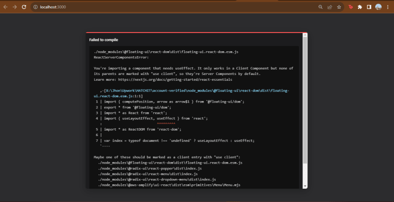
Is related with "use client" but I alredy used it on the root component and didn't work. Any tips? Thanks!
you need
"use client";
at the top of the file