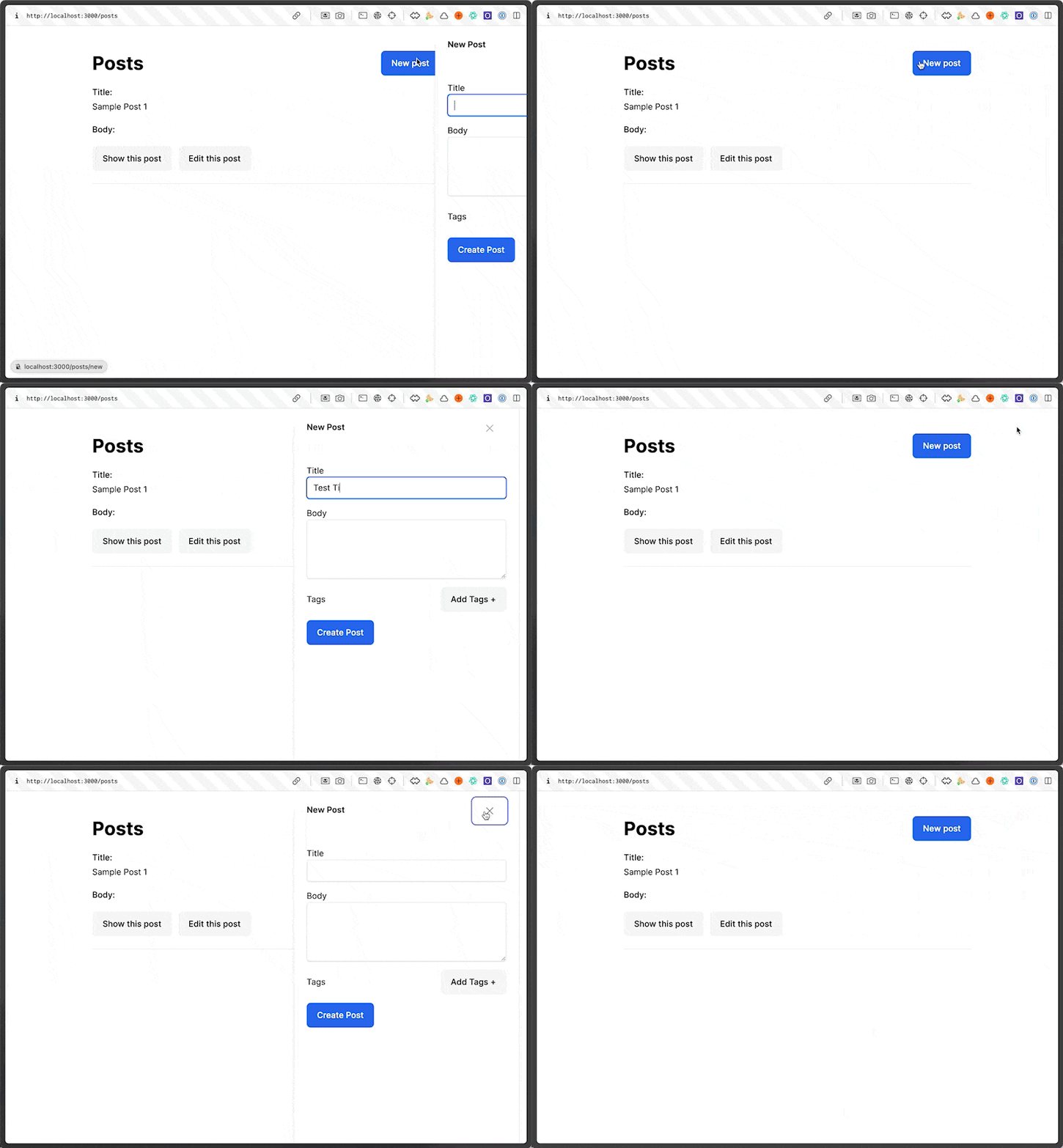
Another common UI pattern is a slide over. This is a modal that slides in from the side of the screen.
It's really easy it turns out to implement this with a Turbo Frame. Let's do it.
Step 1: The Slide Over Turbo Frame
First, we need to create a Turbo Frame that will be the slide over. We'll call it slide-over and we'll put it at the bottom of the post index page.
app/views/posts/index.html.erb
<div class="w-full"> <% if notice.present? %> <p class="inline-block px-3 py-2 mb-5 font-medium text-green-500 rounded-lg bg-green-50" id="notice"><%= notice %></p> <% end %> <div class="flex items-center justify-between"> <h1 class="text-4xl font-bold">Posts</h1> <%= link_to "New post", new_post_path %> </div> <div id="posts" class="min-w-full"> <%= render @posts %> </div></div><!-- This will be empty when the page loads --><%= turbo_frame_tag "slide-over" %>
We've basically create a frame or a slot that the eventual slide over will occupy on the dom the second that frame is given a URL to load content from.
We want to trigger that frame to load when we click on the new post button. So let's give that button the target of the slide-over turbo frame.
<%= link_to "New post", new_post_path, class: "btn btn-primary", data: {turbo_frame: "slide-over"} %>
Simple enough. When we click on that button now, it will change the source of the slide-over turbo frame and essentially load whatever HTML is the response to /posts/new.
The next step is to turn that into the slide over.
Step 2: The Slide Over
<%= turbo_frame_tag "slide-over" do %> <div aria-labelledby="slide-over-title" role="dialog" aria-modal="true"> <div class="backdrop animate-fade-in"></div> <section> <div class="absolute inset-0 overflow-hidden"> <div class="fixed inset-y-0 right-0 flex max-w-full pl-10 pointer-events-none"> <div class="w-screen max-w-md pointer-events-auto"> <div class="flex flex-col h-full py-6 overflow-y-scroll bg-white shadow-xl"> <div class="px-4 sm:px-6"> <div class="flex items-start justify-between"> <h2 class="text-base font-semibold leading-6 text-gray-900" id="slide-over-title">New Post</h2> <div class="flex items-center ml-3 h-7"> <button type="button" data-action="remove#remove slide-over#slideOut" class="relative text-gray-400 bg-white rounded-md hover:text-gray-500 focus:outline-none focus:ring-2 focus:ring-indigo-500 focus:ring-offset-2"> <span class="absolute -inset-2.5"></span> <span class="sr-only">Close panel</span> <svg class="w-6 h-6" fill="none" viewBox="0 0 24 24" stroke-width="1.5" stroke="currentColor" aria-hidden="true"> <path stroke-linecap="round" stroke-linejoin="round" d="M6 18L18 6M6 6l12 12" /> </svg> </button> </div> </div> </div> <section> <%= render "form", post: @post %> </section> </div> </div> </div> </div> </div> </div><% end %>
We're putting a basic tailwind slide over as the content for the slide-over turbo frame. Within there is the new post form.
With that, clicking on the new post button will display the slide over but without any of the fancy animations. Let's add that by building a quick stimulus controller.
Step 3: Slide Over Animations
What we want to do is bind the slide over to a stimulus controller so that we can say when the controller connects, which will happen upon the injection of the slide over html into the DOM, trigger the animation classes.
First, let's bind the slide over to a stimulus controller.
<%= turbo_frame_tag "slide-over" do %> <div aria-labelledby="slide-over-title" role="dialog" aria-modal="true" data-controller="slide-over"> <!-- The rest of the slide over --> </div><% end %>
By giving that div the data-controller attribute of slide-over stimulus will look for a slide_over_controller.js file and controller. So let's build that so that it triggers animations upon connecting to it's DOM.
app/javascript/controllers/slide_over_controller.js
import { Controller } from "@hotwired/stimulus";export default class extends Controller { connect() { console.log("The Slide Over has Appeared"); }}
Now, when we click on the new post button, we should see that log in the console.
The next step is to create a target for the animation classes, the DOM element that we want to apply the animations to.
<%= turbo_frame_tag "slide-over" do %> <div aria-labelledby="slide-over-title" role="dialog" aria-modal="true" data-controller="slide-over remove" data-remove-target="element"> <div class="backdrop animate-fade-in"></div> <section> <div class="absolute inset-0 overflow-hidden"> <div class="fixed inset-y-0 right-0 flex max-w-full pl-10 pointer-events-none"> <!-- This element should be the target --> <div class="w-screen max-w-md pointer-events-auto" data-slide-over-target="slideOver"> <div class="flex flex-col h-full py-6 overflow-y-scroll bg-white shadow-xl"> <div class="px-4 sm:px-6"> <div class="flex items-start justify-between"> <h2 class="text-base font-semibold leading-6 text-gray-900" id="slide-over-title">New Post</h2> <div class="flex items-center ml-3 h-7"> <button type="button" class="relative text-gray-400 bg-white rounded-md hover:text-gray-500 focus:outline-none focus:ring-2 focus:ring-indigo-500 focus:ring-offset-2" data-action="remove#remove slide-over#slideOut"> <span class="absolute -inset-2.5"></span> <span class="sr-only">Close panel</span> <svg class="w-6 h-6" fill="none" viewBox="0 0 24 24" stroke-width="1.5" stroke="currentColor" aria-hidden="true"> <path stroke-linecap="round" stroke-linejoin="round" d="M6 18L18 6M6 6l12 12" /> </svg> </button> </div> </div> </div> <section> <%= render "form", post: @post %> </section> </div> </div> </div> </div> </div> </div><% end %>
We can add that target to the stimulus controller and add the animation classes to it upon connection.
app/javascript/controllers/slide_over_controller.js
import { Controller } from "@hotwired/stimulus";export default class extends Controller { static targets = ["slideOver"]; connect() { this.slideOverTarget.classList.add("translate-x-full"); setTimeout(() => { this.slideOverTarget.classList.remove("translate-x-full"); this.slideOverTarget.classList.add( "transform", "transition", "ease-in-out", "duration-300", "sm:duration-700", "translate-x-0" ); }, 100); } slideOut() { this.slideOverTarget.classList.remove("translate-x-0"); this.slideOverTarget.classList.add( "transform", "transition", "ease-in-out", "duration-300", "sm:duration-700", "translate-x-full" ); }}
Now, when we click on the new post button, the slide over will slide in from the right. And when we click on the close button, it will slide out.
That's it!


Top comments (0)