Welcome to Part 11 of the COVIDiary project! If you’re just joining us or missed a post, here’s what we’ve done so far:
- Part 1: Project Introduction
- Part 2: Initial Setup
- Part 3: Building the Database
- Part 4: Frontend Setup
- Part 4.5: Database Fixes
- Part 5: Backend Routing
- Part 6: Formatting Data
- Part 7: A Little More Action
- Part 8: Make the Connection
- Part 9: UX Design
- Part 10: Our First Component
This week, we’re creating a simple Header component. We aren’t getting into the nitty-gritty of adding auth just yet. Today’s goal is to get the basic layout of our Header. Before we begin, run yarn start in your terminal to open your application in the browser.
Stub the Component
Create a new file in your src/components folder called Header.js. Add a simple functional component.
import React from 'react';

const Header = () => {
  return (
    <div>
      COVIDiary
    </div>
  );
};

export default Header;
Import the Header
Let’s add our Header to App.js.
In src/App.js:
import Header from './components/Header';
Just after the opening <div> In the render() section, add our component:
<Header />
You can remove all the default React code if you’d like. I moved it into a main tag so I had a placeholder between my header and footer.
<main>
  <img src={logo} className="App-logo" alt="logo" />
  <p>
    Edit <code>src/App.js</code> and save to reload.
  </p>
  <a className="App-link" href="https://reactjs.org" target="_blank" rel="noopener noreferrer">
    Learn React
  </a>
</main>
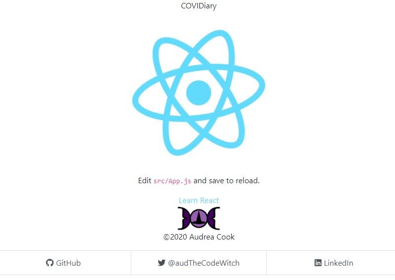
Right now, your project will look something like this:
Fill in the Details
Let’s start to format our header to match our wireframe sketch. From here on out, we’re working in components/Header.js.
For our header, we will be using React-Bootstrap’s NavBar and Nav components. To begin, import the components at the top of your file:
import Navbar from "react-bootstrap/Navbar";
import Nav from "react-bootstrap/Nav";
Now, let’s replace our div with NavBar. We’ll pass it props to adjust the styling.
<Navbar expand='md' bg='dark' variant='dark' as='header'>
  {/*expand - breakpoint at which hamburger menu expands*/}
  {/*bg - sets background color*/}
  {/*variant - use dark color scheme for dark bg*/}
  {/*as - converts default <div> tag to <header> tag*/}
</Navbar>
Within our Navbar, let’s put our site’s name on the left. You could also use a logo here, if you had one. We’ll have this element link to our root page.
<Navbar.Brand href="/">COVIDiary</Navbar.Brand>
We also want to make sure our Navbar is responsive so it will adapt when users adjust their screen sizes.
<Navbar.Toggle aria-controls="responsive-navbar-nav"/>
Finally, let’s add the main navigation links. We want them to collapse into a hamburger menu on smaller screens, so we will wrap them in a <Navbar.Collapse> component. Note the id and className come straight from the React-Bootstrap documentation.
<Navbar.Collapse id="responsive-navbar-nav">
  <Nav className="ml-auto" as='nav'>
  {/*ml-auto - aligns nav links to the right of the container*/}
    <Nav.Link href="/about">About</Nav.Link>
    <Nav.Link href="/register">Register</Nav.Link>
  </Nav>
</Navbar.Collapse>
Our basic header is complete! Here it is on medium and larger screens:
Here is the hamburger menu on small screens:
And here is the expanded hamburger menu:
Coming Up
Now that we’ve got our Header component, we’re ready to get into some more complicated aspects of our front end!


Top comments (0)