Visual developers would know that designing a customized Bubble app can be a long and tedious process. But don’t worry, it doesn’t necessarily have to be that time-consuming!
By simply pre-setting styles in your Bubble app, you can automatically apply your global design choices to elements while you put them on your pages.
Let’s look at how you could go about doing that.
Part 1: How do Styles in Bubble help With Faster App Development?
Part 2: Pre-setting Styles in Bubble
Part 3: Using Styles Step by Step
Part 4: Final Guideline!
Let's begin! 🚀
Part 1: How do Styles in Bubble help With Faster App Development?👩💻
Bubble lets you set some general styles for your elements, which leads to a faster design process. It’s very easy to use and makes your app development way faster.
If you’ve noticed, each new Bubble application you start comes with a set of default pre-set styles.
But, we all know Bubble’s default styles aren’t the best, but there’s a nice way to modify them globally and apply them to all your elements. Pre-setting styles will let you organize your app design more cleanly.
You’ll only need to modify the style once for all the elements to be restyled accordingly. The good part is that it can also save some space in your app, which leads to more quick loads as the styling data is shared by all elements that use a similar style.

Part 2: Pre-setting Styles in Bubble 💭
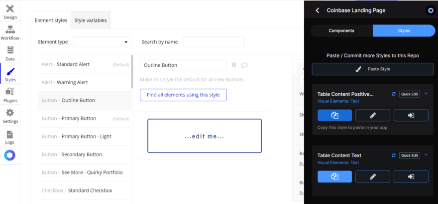
The Styles tab is where you can edit the various global styles in your app. Editing styles are very similar to editing element formatting from the Property Editor — only here, you only need to do it once.
You can define as many styles as you want and apply more different styles to different instances of the same type of element.
When you name them in a way that’s easy to read, you can pick the style that you need for each element quickly.
➡️For example, in case you’re setting up multiple CTA Buttons in your app, you can set the CTA Button style in your Style tab and just assign it to a button element each time you want to create a CTA Button. Easy!
You can define a style in the Styles list by clicking on ‘New Style' or from the style dropdown on an element’s property editor itself.
📝 Note - Remember that when you do so from an element, the current properties of that element will be used as a base for all of the newly created styles. This is particularly useful in visual development when you find yourself using the same design for a few elements but haven’t thought about setting a style yet.
Finally, there are some important things to know about applying & removing styles -
On one hand, as you apply a style to an element, its current properties will be deleted. On the other hand, as you remove a style from an element, the original properties of the style will be copied to that element.
Therefore, when you remove a style from a button for example, you can modify it’s appearance, without affecting the style. To revert back to the earlier style, simply assign it from the dropdown in the property editor. This is very effective and you can always undo such changes.
Where to find good Style options 🤔
If you’re looking for Styles to apply in your Bubble app, I would recommend checking out the Public Styles on Atomic Fusion — these are Styles created and shared by members of our community.
Using Conditions
Don’t worry about the conflict between conditions anymore! It’s possible for you to overwrite a condition that is included in a style at the element level. If the same property is modified, between a style’s condition and an element’s condition, the condition at the element level will win.
Keep in mind that styles are just for the appearance of the element which also includes any appearance changes that happen under conditions. So, you can add conditions to styles but, they’re only related to appearance properties. Nothing involving elements, input values, or workflows.
Part 3: Using Styles Step by Step🪜
Anytime you add an element to the page, the Bubble usually applies a default style that comes with your application. It’s typically labeled as “Standard Button” or “Standard Text”. You can easily change the style from the Styles dropdown on the element’s property editor.
There you can see the Bubble app presets and access/assign any styles that you create -
1. Remove the Default Style 🛑
You can create styles in a couple of different ways. First, you’ll need to remove the default that has been applied or if another style of yours has been applied. Then, the property editor understands that you want to assign ‘inline’ or individual styles to that element and a couple of more styling options will normally appear for you.

Now, you can change the color, font size, text format, etc. You can also search by name to find and edit an existing style. Simply type the name of an existing style, such as “Standard Alert,” in the Styles dropdown to find and edit it.
2. Apply Theme 🧑💻
Secondly, you can add a visual identity to your application. Bubble offers some themes to choose from including Standard, Dark Theme, Material Design, TODC Bootstrap, Twitter Bootstrap, or Dark, Flat, or Rounded UI.
Applying one of these themes to your app will overwrite your bubble app’s predefined styles with various colors, angles, etc. It will help you find a visual identity for your visual development.

3. Choose The Element Type
Choose a type from the dropdown list, like Alert, Group, or Repeating Group. So that you can return the existing styles for that element later.
4. Make This Style The Default 👯
When you create a new style, any new elements of this type will automatically come up with this style rather than the predefined styles that come with your app if you select this. You can assign a default style for each type of element.

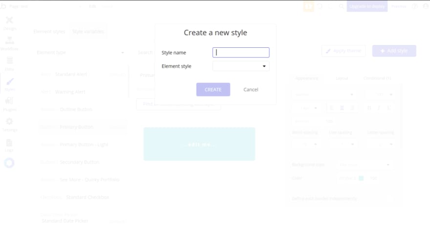
5. Add a Style 💃
When you finished designing your new style, you can go back to the style dropdown at the very bottom of the element’s property editor and create a new style right from there. Remember to give it a name that is as descriptive as possible so you know exactly what you’re selecting.
Moreover, when you’re creating a style, you can even change elements that would be applied.
You’ll need to choose a name and element type, such as “Custom Alert” for “Alerts.” Once you define this style’s properties, you can simply apply this style throughout your bubble app in that element’s property editor section. You can also copy styles and inline formatting from existing elements on your page and set them to other elements.
If you’re using Atomic Fusion, you can even copy styles from your Repositories or Forked Styles and paste them right into your Styles tab. That’s a great way to organize Styles across projects.
Part 4: Final Guideline!🗒️
Of course, you have your entire style section of your editor to manage everything from all styles to all element types. I highly recommend you use styles in your visual development.
Not only it will make your app cleaner and more optimized on while rendering but it also keeps you moving through your design a lot faster.
You are giving bubble app less work to do by applying single styles to multiple elements rather than giving every single thing its own inline appearance properties. It will keep your application more uniform and consistent, while allowing you to easily make styling changes to the UI across your app. 💃
We hope this helps you build your application faster! 🚀
Check out Atomic Fusion- The Bubble Developer Hub to create, save and share styles, designs and code snippets with other visual developers easily.
Coming up next - How To Turn Your Bubble io no code App into a Mobile App in Less Than 5 Minutes


Top comments (1)
We recommend starting to use Bubble with a learning mindset, instead of jumping directly to building and expecting to have an app that works. love problem solution wazifa