
TLDR;
Adding real-time collaboration to your web app doesn’t have to be hard. In this guide, we’ll show you how we built Google Sheets-style live commenting using Velt SDK.
Features include:
Real-time comments directly on table cells (just like Google Sheets).
Seamless sync and presence tracking without complex backend work.
A dynamic UI built with Tanstack Table and Next.js.
By the end, you’ll have the foundation to create collaborative, engaging tools. You can take it further by adding reactions, notifications or user roles.
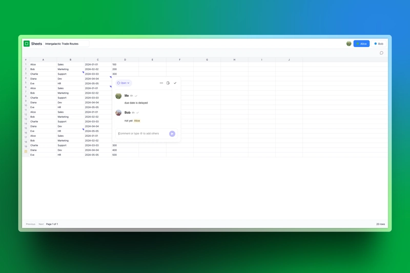
Here is a preview of what you will build:
Let’s dive in! 🚀

Introduction
Real-time features make any platform feel alive and collaborative. One of the most impactful is live commenting, where users can share feedback or chat instantly on shared documents or resources. It’s a simple way to boost engagement, keep conversations flowing, and help teams stay in sync.
For editors or project owners, it’s also a chance to interact more directly with collaborators and make teamwork smoother.
But building a system like this from scratch isn’t easy, you’ll need to manage real-time UI updates, user presence tracking and efficient data handling. In this guide, I’ll show you how to use Velt SDK to handle all of that and build a live commenting feature with a Google Sheets-style collaborative experience.
In this guide, you’ll learn how to add live commenting to a Google Sheets-style application built with Tanstack React Tables. We’ll integrate Velt Comments to allow users to leave popover comments directly on table cells - just like in Google Sheets.
Here’s what we’ll walk through:
Setting up a React Tables frontend using Next.js and React Tables
Adding live comments to the app with Velt Comments
Challenges of Building Real-Time Collaboration
Modern web development has grown increasingly complex. We’ve moved from simple HTML, CSS, and JavaScript to large-scale systems with demanding features. Real-time collaboration, once a niche requirement, now requires extensive planning and technical workarounds.
Many developers assume complex systems must be built from scratch. While this may seem efficient at first, it often leads to rigid architectures that become harder to maintain over time.
Frontend
Real-time syncing, like in Google Sheets, involves complex state management, polling, and WebSockets.
UI elements such as live comments, version tracking and real-time cursors must feel seamless and intuitive.
Performance optimization is critical to prevent lag, requiring efficient DOM updates and asset loading strategies.
Backend
Handling concurrent users requires database optimization, load balancing, and distributed systems.
Ensuring data consistency demands sophisticated algorithms like Operational Transform (OT) or Conflict-Free Replicated Data Types (CRDTs).
Preventing downtime and data loss requires a 24/7 infrastructure with redundancy and failover mechanisms.
How Velt SDK Simplifies this Process?
Velt SDK is designed to embed powerful collaborative features like commenting and recording functionalities into SaaS products without too much manual coding. If you’re a builder inspired by collaborative giants like Google Docs and Figma, Velt will enable you to add features such as inline comments, live reactions, real-time presence indicators inside your app without extensive development overhead.
The Velt SDK offers:
Pre-built UI Components: Ready-to-use features like live commenting and real-time cursors.
Cross-Platform Compatibility: Ensures seamless operation across various browsers and devices.
Robust Infrastructure: Manages WebSocket connections, scalability, and data synchronization.
Scalability and Reliability: Provides uptime guarantees and a global server network.
By leveraging Velt, developers can efficiently incorporate advanced collaboration tools, allowing them to focus on enhancing their core product offerings.
Prerequisites
Before we dive into building our collaborative spreadsheet, let’s set up the development environment using a pre-built starter template. This template provides a minimal foundation, allowing us to focus on integrating real-time collaboration step by step.
What’s in the Starter Template?
The starter template includes:
A simplified
SpreadsheetPagethat provides a basic layout with placeholder content.A
Headercomponent with essential UI elements like the document title and user switcher.Routing setup to navigate between different spreadsheets.
What we are going to add:
Throughout the article, we will integrate features like live user presence, a powerful table and live comments.
Setting up the project:
-
Clone the repository
git@github.com:Studio1HQ/google-sheets.git cd google-sheets -
Install dependencies and start development server
pnpm install pnpm dev -
Open the app in your browser and navigate to:
http://localhost:3000
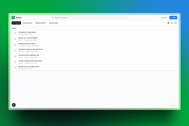
You should see a basic page with:
A list of available sheets – Each sheet represents a structured dataset you can open.
A search bar or navigation options – Helps you quickly find a specific sheet.
Static User indicators – Shows user we will use to test Velt collab features since we are not adding authentication to this setup.
Document ID – A unique identifier for reference.
When you click on a sheet, you’ll be taken to a new dynamic page displaying its content:
This is our starting point. In the next sections, we’ll progressively add real-time functionality, turning this simple interface into a fully collaborative experience.
Section 1: Adding TanStack React Interactive Table
In this section, you will change the simple Spreadsheetpage.tsx from the simple structure to a fully interactive Tanstack React Table designed in a google sheets style with editable cells and pagination.
Tan-stack uses some necessary imports that are essential for functionality such as table rendering, pagination and input handling:
Setting Up the Required Imports
import React, { useRef, useEffect, useState } from "react";
import {
  Table,
  ColumnDef,
  useReactTable,
  getCoreRowModel,
  getPaginationRowModel,
  flexRender,
  RowData,
} from "@tanstack/react-table";
import { useParams, useSearchParams } from "next/navigation";
import { useSkipper } from "@/lib/hooks";
import { debounce } from "lodash";
import { Cell, getColumnLabel, range } from "@/lib/sheetData";
Extending @tanstack/react-table for Data Updates
You need to extend @tanstack/react-table to allow inline cell editing. Add the following type extension just below the imports we have added.
declare module "@tanstack/react-table" {
  interface TableMeta<TData extends RowData> {
    updateData: (rowIndex: number, columnId: string, value: Cell) => void;
  }
}
Implementing the Editable Cell Component
The EditableCell component allows users to edit cell values inline. This component manages focus state and updates the table when changes are made.
This should also be added just below the extended type.
function EditableCell<TData extends Record<string, Cell>>({
  getValue,
  row,
  column,
  table,
}: {
  getValue: () => unknown;
  row: { index: number };
  column: { id: string };
  table: Table<TData>;
}) {
  const initialValue = (getValue() as Cell)?.value || "";
  const [value, setValue] = useState(initialValue);

  const onBlur = () => {
    table.options.meta?.updateData(
      row.index,
      column.id,
      value as unknown as Cell
    );
  };

  useEffect(() => {
    setValue(initialValue);
  }, [initialValue]);

  return (
    <div className="relative w-full h-full">
      <input
        value={value as string}
        onChange={(e) => setValue(e.target.value)}
        onBlur={onBlur}
        className="w-full h-full border-none focus:outline-none bg-transparent px-1 py-0"
      />
    </div>
  );
}
Configuring the Spreadsheet Table Component Logic
This is the upper part in our react component where we usually define logic like hooks, state, ref etc.
We will add:
Constants: Define important settings for the spreadsheet:
-
COLUMNS_COUNT: Number of columns. -
CELL_WIDTH: Fixed width for each cell.
const COLUMNS_COUNT = 10;
const CELL_WIDTH = 600;
Refs and Hooks: Set up necessary references and routing hooks:
const searchParams = useSearchParams();
const urlTitle = searchParams.get("title");

const measureRef = useRef<HTMLSpanElement>(null);
const gridRef = useRef<HTMLDivElement>(null);
const inputRef = useRef<HTMLInputElement>(null);
Default Column Definition: Configure the default column settings with the editable cell:
const defaultColumn: Partial<ColumnDef<Record<string, Cell>>> = {
cell: (props) => <EditableCell<Record<string, Cell>> {...props} />,
size: CELL_WIDTH,
};
Column Definitions:
- Uses
range(COLUMNS_COUNT)to dynamically create column headers (A, B, C...). - Each column has a fixed width.
const columns = React.useMemo<ColumnDef<Record<string, Cell>>[]>(() => {
      return range(COLUMNS_COUNT).map((i) => {
        const columnLabel = getColumnLabel(i);
        return {
          accessorKey: columnLabel,
          header: () => <div className="text-center">{columnLabel}</div>,
          size: CELL_WIDTH,
        };
      });
}, []);
State Management: Three state variables
-
data: Holds spreadsheet rows. -
filename: Stores spreadsheet title. -
autoResetPageIndex: Used to manage page updates.
const [data, setData] = useState(initialData);
const [filename, setFilename] = useState(initialTitle);
const [autoResetPageIndex, skipAutoResetPageIndex] = useSkipper();
Title Sync with URL
useEffect(() => {
if (urlTitle) {
setFilename(urlTitle);
}
}, [urlTitle, setFilename]);
Implement Data Update Handling
This function:
- Updates the row data dynamically.
- Uses
debounceto avoid unnecessary re-renders.
const updateData = debounce(
      (rowIndex: number, columnId: string, value: Cell) => {
        skipAutoResetPageIndex();
        setData((old) =>
          old.map((row, index) => {
            if (index === rowIndex) {
              return {
                ...old[rowIndex]!,
                [columnId]: value as Cell,
              } as Record<string, Cell>;
            }
            return row;
          })
        );
      },
      300
);
The Table Instance: This is the core of the table functionality:
- Uses
useReactTable()to create a table instance. - Sets up pagination and core row models.
- Links
updateDatato the table meta.
const table = useReactTable({
    data,
    columns,
    defaultColumn,
    getCoreRowModel: getCoreRowModel(),
    getPaginationRowModel: getPaginationRowModel(),
      initialState: {
        pagination: {
          pageSize: 20,
        },
      },
      autoResetPageIndex,
      meta: {
        updateData,
      },
      debugTable: true,
      debugHeaders: true,
      debugColumns: true,
    });
Rendering the Table UI
Finally, add the JSX to render the complete spreadsheet interface, including headers, row numbers, and pagination controls
Finally, add the JSX to render the complete spreadsheet interface, including headers, row numbers, and pagination controls:
return (
  <div className="h-screen w-screen flex flex-col bg-white text-xs">
    <Header
      type="sheets"
      measureRef={measureRef}
      filename={urlTitle || filename}
      inputRef={inputRef}
      setFilename={setFilename}
      handleTitleFocus={handleTitleFocus}
    />

    <div className="flex border-b border-gray-200 sticky top-0 bg-gray-100 z-10">
      <div className="w-10 flex items-center justify-center border-r border-gray-200 bg-gray-100 text-gray-500">
        #
      </div>
      <div className="flex-1 overflow-x-auto">
        <div className="flex">
          {table.getFlatHeaders().map((header) => (
            <div
              key={header.id}
              style={{ width: `${header.getSize()}px` }}
              className="border-r border-gray-200 h-6 flex items-center justify-center bg-gray-100 text-gray-700 font-medium"
            >
              {flexRender(
                header.column.columnDef.header,
                header.getContext()
              )}
            </div>
          ))}
          <div className="w-full h-6 bg-gray-100"></div>
        </div>
      </div>
    </div>

    <div className="flex-1 overflow-auto" ref={gridRef}>
      <div className="flex">
        <div className="w-10 sticky left-0 bg-gray-100 z-10">
          {table.getRowModel().rows.map((row, i) => (
            <div
              key={row.id}
              className="h-6 border-b border-r border-gray-200 flex items-center justify-center text-gray-500"
            >
              {table.getState().pagination.pageIndex *
                table.getState().pagination.pageSize +
                i +
                1}
            </div>
          ))}
        </div>
        <div className="flex-1 overflow-x-auto">
          <div>
            {table.getRowModel().rows.map((row) => (
              <div key={row.id} className="flex border-b border-gray-200">
                {row.getVisibleCells().map((cell) => (
                  <div
                    key={cell.id}
                    style={{ width: `${cell.column.getSize()}px` }}
                    className="border-r border-gray-200 h-6 overflow-hidden"
                  >
                    {flexRender(
                      cell.column.columnDef.cell,
                      cell.getContext()
                    )}
                  </div>
                ))}
                <div className="w-full h-6"></div>
              </div>
            ))}
          </div>
        </div>
      </div>
    </div>

    <div className="border-t border-gray-200 py-2 px-4 flex items-center justify-between bg-gray-50">
      <div className="flex items-center gap-2">
        <button
          className="border rounded p-1 text-xs disabled:opacity-50"
          onClick={() => table.previousPage()}
          disabled={!table.getCanPreviousPage()}
        >
          Previous
        </button>
        <button
          className="border rounded p-1 text-xs disabled:opacity-50"
          onClick={() => table.nextPage()}
          disabled={!table.getCanNextPage()}
        >
          Next
        </button>
        <span className="text-xs">
          Page {table.getState().pagination.pageIndex + 1} of{" "}
          {table.getPageCount()}
        </span>
      </div>
      <span className="text-xs">{table.getRowModel().rows.length} rows</span>
    </div>
  </div>
);

Section 2: Add Live Commenting and User Identification with Velt.
In this section, we will enhance our google sheets sample by adding Velt features
Install and Configure Velt SDK.
Velt requires an API key to function. Create a .env.development.local file at the root of your Next.js project and Add your Velt API key which you can obtain from Velt’s Console Dashboard
NEXT_PUBLIC_VELT_ID=your-velt-api-key-here
Important Notes on Using the Velt API Key
The free-tier API key works only for local development. Velt automatically includes
http://localhost:3000in the allowed domains.To interact with live preview of your app, add your domain (e.g.,
yourapp.com,*.yourapp.com) in the Velt Console under API Keys or Settings.If deploying without updating the allowed domains, the Velt SDK will fail to initialize, and features like comments and presence will not function.
To add domains, log in to the Velt Console, navigate to API Keys or Project Settings, find the Allowed Domains section, add your production domain, and save.
Test on localhost first, then verify domain settings before going live to prevent disruptions.
Add Required Imports to Root Layout file
"
use client": Marks this as a Client Component since Velt requires client-side functionality.VeltProvider: The Velt context provider to enable collaboration features.
"use client";
import { VeltProvider } from "@veltdev/react";
Wrap the Layout with VeltProvider
Modify the RootLayout component to wrap its content with VeltProvider. Update the return statement like this:
export default function RootLayout({
  children,
}: Readonly<{
  children: React.ReactNode;
}>) {
  return (
    <html lang="en">
      <body
        className={`${geistSans.variable} ${geistMono.variable} antialiased`}
      >
        <VeltProvider apiKey={process.env.NEXT_PUBLIC_VELT_ID || ""}>
          {children}
        </VeltProvider>
      </body>
    </html>
  );
}
Integrate Velt User Identification in the Header
In this section, we'll enhance the Header component by integrating Velt's user identification system. This will sync user data with Velt for collaboration features. We'll update imports and add logic to identify users.
-
Adding Velt Imports Update the imports in your Header component to include Velt's hooks and components. Add the following lines to the existing imports:
import { useVeltClient, VeltPresence } from "@veltdev/react"; -
Accessing the Velt Client
Inside the Header component, use the useVeltClient hook to get the Velt client instance:
This allows us to interact with Velt's API to identify users.
const { client } = useVeltClient(); -
Identifying Users with Velt
Add a useEffect hook to sync the current user from your user-store with Velt's system. This ensures Velt recognizes the active user for future collaboration features. Insert this code after the existing useEffect for user login:
useEffect(() => {
  if (!client || !user) return;
  const veltUser = {
    userId: user.uid,
    organizationId: user.organizationId,
    name: user.displayName,
    email: user.email,
    photoUrl: user.photoURL,
    color: user.colorCode,
    textColor: user.textColor,
  };
  client.identify(veltUser);
}, [client, user]);
Final: Add Velt Comments to the Spreadsheet
In this section, we'll enhance the SpreadsheetPage component by integrating Velt's commenting system. This allows users to add comments to specific cells and the document as a whole, enhancing collaboration. We'll explain the new additions step-by-step.
import {
  VeltComments,
  VeltCommentTool,
  VeltCommentBubble,
  useSetDocument,
} from "@veltdev/react";
VeltComments: The main commenting component that manages the comment UI (e.g., sidebar or popover).VeltCommentTool: A toolbar button for initiating comments.VeltCommentBubble: A UI element that appears near a cell to show or add comments.useSetDocument: A hook to set the current document context for Velt.VeltComments: The main commenting component that manages the comment UI (e.g., sidebar or popover).VeltCommentTool: A toolbar button for initiating comments.useSetDocument: A hook to set the current document context for Velt.
Update SpreadsheetPage Logic
In this section we add some routing logic to access the id from the URL and register the current spreadsheet with Velt using its id and filename. This ensures comments are scoped to the correct document
useSetDocument(id, { documentName: filename });
Add Commenting UI to the JSX
Now, we integrate Velt’s commenting components into the spreadsheet layout:
-
Document-Wide Comments
Add it to the top of the JSX, to enable a popover-style comment interface for the entire document.
<VeltComments popoverMode={true} /> -
Comment Tool
Add this below the
Header, this provides document -level comments, styled to align right in a toolbar-like section.
<div className="flex justify-end px-4 py-1 bg-gray-50 border-b border-gray-200"> <VeltCommentTool /> </div> -
Single Comment Tool: In the table JSX above, we should add a unique id for every cell in our table
data-velt-target-comment-element-id={*cell*.id}as an attribute on each element you want to add comments on. Now, when you click on theComment Tooland click on the target element, it will attach aPopovercomment to the elements.Edit the section where we have a single cell and include the id like this:
{row.getVisibleCells().map((cell) => (
  <div
    key={cell.id}
    data-velt-target-comment-element-id={cell.id}
    style={{ width: `${cell.column.getSize()}px` }}
    className="border-r border-gray-200 h-6 overflow-hidden"
  >
    {flexRender(
      cell.column.columnDef.cell,
      cell.getContext()
    )}
  </div>
))}
After this step, your app is now ready to be used with full functionality.

Demo
Check the app we have built so far in action:
Next Steps and Conclusion
With Velt integrated, your sheets app is now fully collaborative with real-time features. Each workspace is tied to a unique organization, supporting multiple users and documents. Teammates can comment directly on specific cells, just like in Google Sheets.
Enhance this App with more Velt features:
Velt goes beyond basic commenting. You will also get:
In-App Notifications: Use
<VeltNotifications />to alert users about cell updates, new comments, or document changes.Recorder: Add
<VeltRecorder />for users to attach audio, video, or screen recordings to comments.Reactions: Implement
<VeltReactions />on cells or comments for quick feedback.Presence & Cursors: Reintroduce
<VeltPresence />and<VeltCursors />to show active users and their locations in the spreadsheet.Live State Sync: Keep cell data synchronized across users in real time.
View Analytics: Track spreadsheet views with
<VeltViewAnalytics />.
You can explore all of Velt’s features here
If your app already has a commenting system, Velt provides backend APIs to seamlessly migrate existing comments. This ensures a smooth transition without losing historical data. The integration process is flexible, allowing you to sync past comments with Velt’s real-time infrastructure while keeping your authentication system intact. Try Velt SDK and build a more scalable apps with advance collaborative features!
Thank you for reading🙏!
Resources
For more advanced customization, follow the official Velt UI guide:
🔗 Explore the complete source code on GitHub
Or try the live demo and test the real-time commenting across multiple tabs
If you found this article useful, share it with your peers and community.
If You ❤️ My Content! Connect Me on Twitter
Check SaaS Tools I Use 👉🏼Access here!
I am open to collaborating on Blog Articles and Guest Posts🫱🏼🫲🏼 📅Contact Here


Top comments (6)
Great Write-up
Appreciate your support Arindam!
Interesting to read
Thankyou
helpful
thankyou