What is UX? What is UI? What Makes for Good UX/UI?
When you’re scrolling through your favorite app or browsing a website, every smooth interaction, every moment of intuitive understanding, is thanks to the magic of UX and UI design. If you’ve ever wondered why some apps just feel better to use than others, you’re noticing the difference between good and bad UX/UI. Let’s break down what UX and UI mean, explore how they differ, and learn what it takes to make each of them great.

What is UX?
User Experience (UX) refers to a user’s overall experience when interacting with a product. UX design focuses on the journey a user takes to achieve a goal and aims to make that journey smooth, intuitive, and pleasant.

Here, JavaScript validates the form input before it’s submitted. This UX-friendly approach prevents user frustration and ensures smoother interactions by catching errors early.

“User Experience encompasses all aspects of the end-user’s interaction with the company, its services, and its products.”
-Don Norman, Cognitive Scientist & UX Architect source
Good UX considers a few key factors:
✅ Usability: How easy can users accomplish their goals?
♿ Accessibility: Can people of all abilities use the product?
😊 Satisfaction: Does the interaction leave users feeling positive?
User Journey Flowchart:
Homepage ➔ Search Product ➔ Product Details ➔ Add to Cart ➔ Checkout ➔ Confirmation
This shows the steps a user takes from visiting a site to successfully making a purchase. It emphasizes the core concept of UX: designing for a seamless experience.
What is UI?
User Interface (UI) focuses on the visual design and interactive elements that users interact with. It’s all about the look and feel, the layout, color scheme, typography, and icons that guide users through the interface. UI aims to make an interface appealing and aligned with the brand’s personality while remaining functional and easy to navigate.
“UI is the saddle, the stirrups, & the reins. UX is the feeling you get being able to ride the horse.”
– Dain Miller. source
Elements of UI include:
🎨 Color Scheme: Colors can influence emotions, set the tone, and improve navigation.
✏️ Typography: Fonts impact readability and convey brand personality.
🖼️ Icons & Graphics: Enhance usability by providing visual cues.
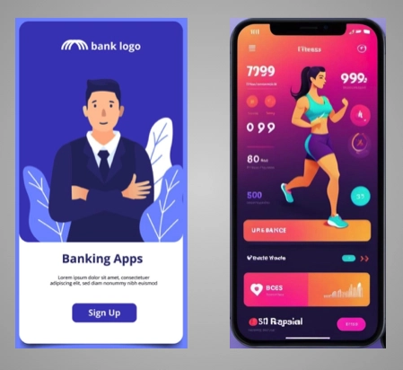
For example, a financial app like a mobile banking platform may use a straightforward layout with calming colors and professional fonts to convey trustworthiness. Meanwhile, a fitness app might choose vibrant colors and dynamic fonts to inspire energy and motivation.
Key Differences Between UX and UI
To clarify the difference between these closely related fields:
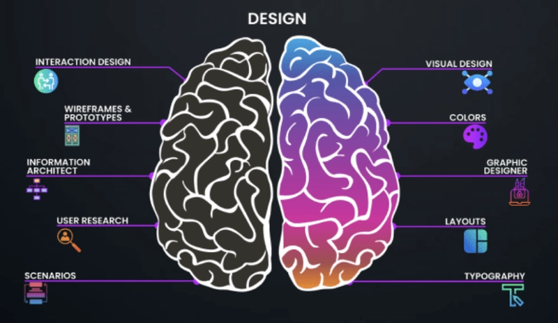
• UX is the structural design of the journey, aiming for ease of use and functionality.
• UI is the visual design that enhances the experience with appealing aesthetics and clear layouts.
What Makes for Good UX/UI?
Creating a product that delivers both a positive user experience and an attractive interface requires a combination of empathy, consistency, accessibility, and adaptability.
1. Empathy for the User
Designers must consider their users' needs, challenges, and preferences. User research, such as interviews, surveys, and usability testing, helps uncover what users truly need. Understanding users' pain points can drive design decisions that solve real problems.
2. Consistency
Consistency in UX/UI ensures that users don't have to relearn navigation on each screen. Using similar button styles, icons, and layouts helps users predict what actions will be done, reducing confusion and frustration.
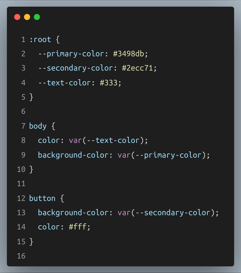 CSS variables enable you to define colors once and reuse them across multiple elements, promoting UI consistency. Since the colors are defined in a single place, changing the color scheme becomes easy.
3. Accessibility
Designing for accessibility means ensuring that everyone, including people with disabilities, can use the product. For example, adding descriptive alternative text for images, designing with high contrast for readability, and allowing keyboard navigation are accessibility essentials.
 This snippet shows a simple but important aspect of accessible design: always include alternative text for images.
4. Responsiveness
Users expect products to work on all devices, whether on a laptop, tablet, or phone. A responsive design ensures that layouts, buttons, and text adapts to any screen size.

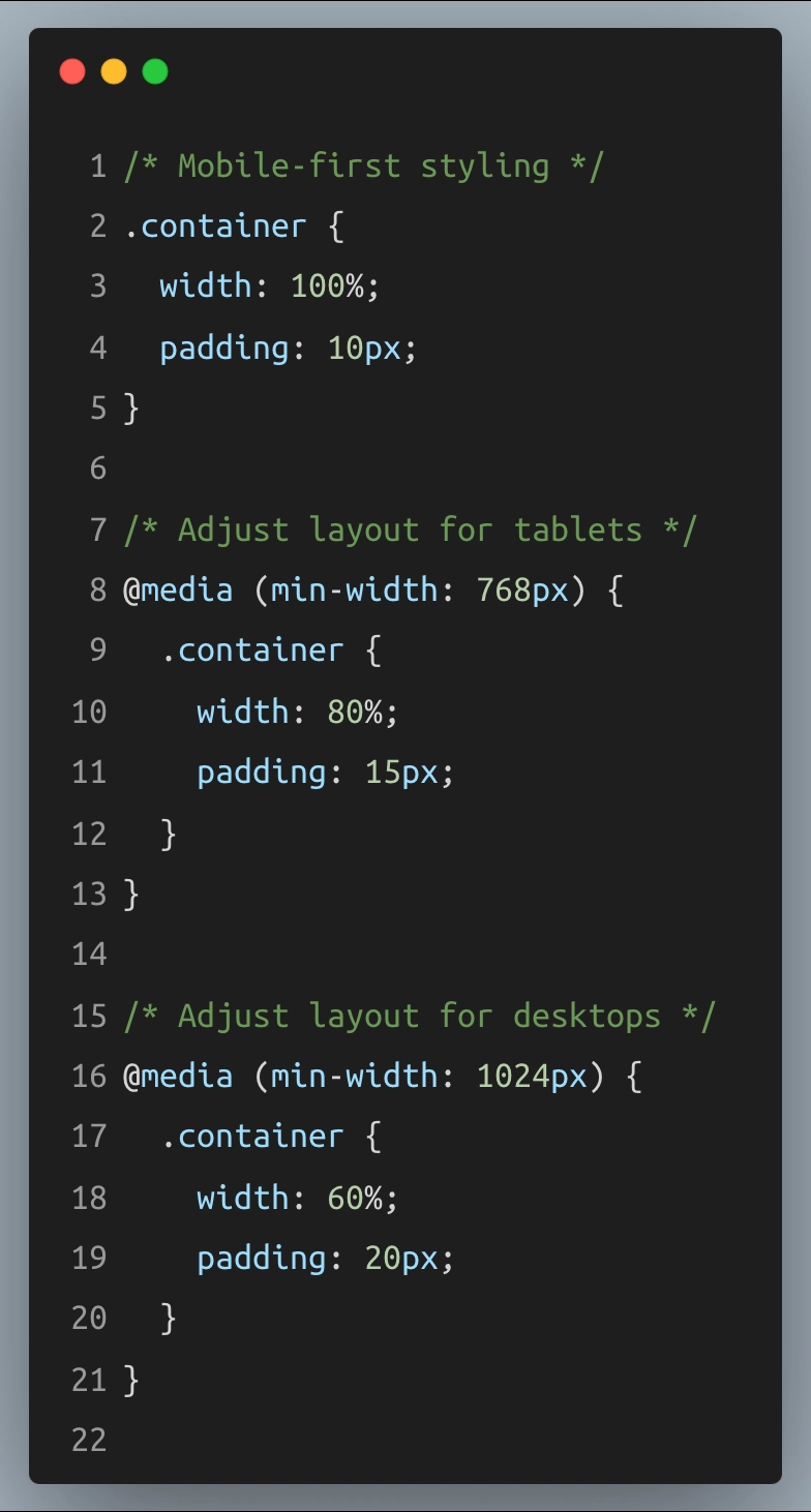 This CSS snippet shows responsive design in action, resizing the .container width and padding for different screen sizes. It enhances UX by ensuring a consistent layout across devices.
Example of Good UX/UI in Practice: Instagram
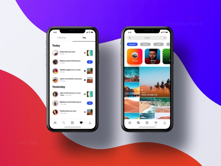 One standout example of a product with robust UX/UI is Instagram. The app combines a simple, visually appealing interface with an intuitive user experience:
• The app's consistent design, including icons and layouts, ensures that users can easily post, view, and interact with content.
• Minimal clutter lets the photos shine, which aligns with the app's goal of focusing on visual content.
• Interactive elements like Stories and Reels add engagement while maintaining ease of use.
Instagram's design balances the demands of aesthetics (UI) with smooth usability (UX), resulting in a positive experience for users worldwide.
Conclusion
UX and UI are two sides of the same coin, each essential to creating a product that users enjoy and understand. UX designs the journey, ensuring that users can achieve their goals, while UI brings beauty, clarity, and personality to the interface. Mastering the balance between UX and UI helps designers create apps and websites that look good and feel great to use.
With an understanding of UX and UI fundamentals, you can think more critically about the digital products you use daily. Next time you open an app or browse a site, consider the choices for each interaction, button, and color. And who knows? You may be inspired to start designing your own!


Top comments (0)