Images constitute a large portion of the page weights of a lot of Web pages. They make our pages more enjoyable to look at, but can also hurt our page load times especially when they have large file sizes or when there are a lot of them on the page, not to mention that they can unnecessarily consume our users’ bandwidths. One way to deal with these concerns is to lazyload our images.

Lazyloading means that we load our images only when they are going to be visible in the page. For example, an image located somewhere near the end of a long article doesn’t need to be loaded until the user actually scrolls it into view.
We can implement our own lazyloading functionality with JavaScript using some modern Web APIs (such as the Intersection Observer API), or use an image lazyloading library like lazysizes by aFarkas. What I like about this library is that it is very easy to start using it, and is performant while being packed with tons of amazing features.
Example Web page
Let’s create an example Web page with an image which we want to lazyload later on with lazysizes. Our example page is going to have the following markup:
<p>Lorem ipsum dolor sit amet...</p>
<!-- 9 more lorem ipsum paragraphs -->

<img src="image.jpg" alt="Sample Image">

<!-- 3 more lorem ipsum paragraphs -->
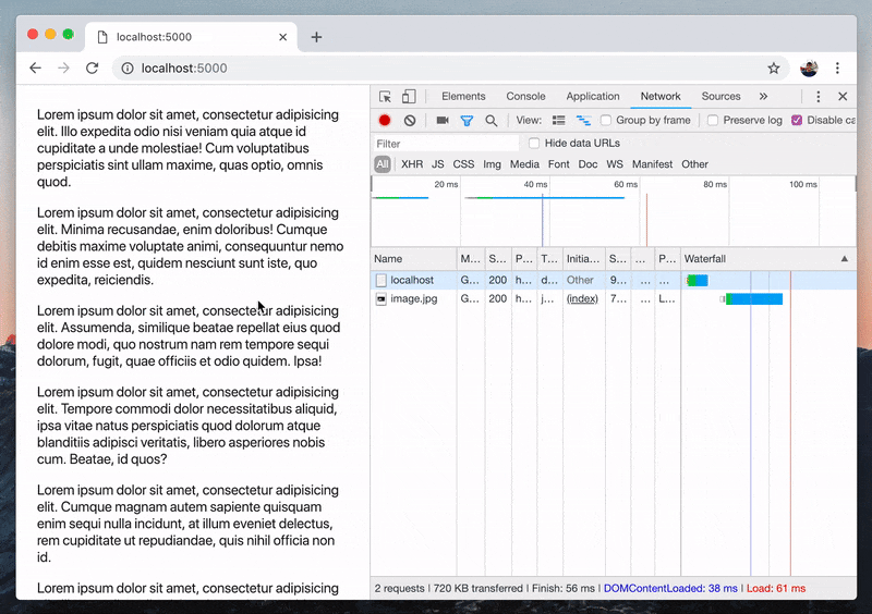
Notice from DevTools’ Network tab that the image has already been loaded since the page has loaded. Let’s try to change that to only load it when it is about to scroll into view using lazysizes.
Basic usage
To start using lazysizes, the first thing we need to do is load the lazysizes JavaScript file:
<script src="http://afarkas.github.io/lazysizes/lazysizes.min.js"></script>
It can also be installed via npm (npm install lazysizes) or bower (bower install lazysizes).
Second, we modify the img tags that we want to lazyload to:
- Use
data-srcattribute instead ofsrc, and - Add
lazyloadas one of its classes
<!-- Before: -->
<img src="image.jpg" alt="Sample Image">

<!-- After: -->
<img data-src="image.jpg" class="lazyload" alt="Sample Image">
And the result?
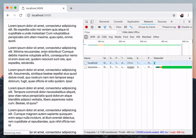
Notice from DevTools’ Network tab how the image is only loaded once it’s about to be scrolled into view. Awesome!
Lazyload responsive images
We can serve responsive images on the Web using the srcset attribute on the img element or using the picture element. This allows us to serve an appropriately-sized image to our users depending on their screen sizes.
One really cool feature of lazysizes that I really like is its ability to lazyload these responsive images without any additional configuration. All we have to do is to replace the srcset attribute with data-srcset.
<!-- Before: -->
<img
    srcset="
        image-100.jpg 100w,
        image-300.jpg 300w"
    src="image.jpg"
    alt="Responsive Image"
>

<-- After: -->
<img
    data-srcset="
        image-100.jpg 100w,
        image-300.jpg 300w"
    data-src="image.jpg"
    alt="Responsive Image"
>
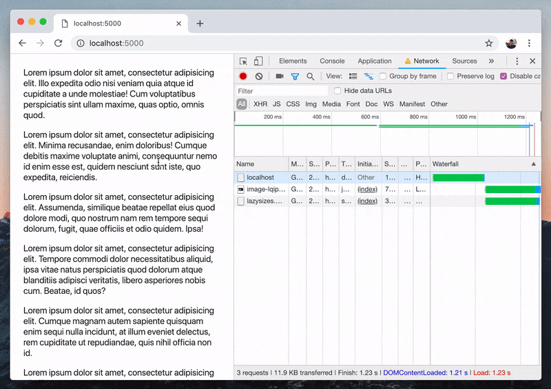
Use a low-quality image placeholder
One potential concern with our lazyloaded images at this point is that when the user’s network connection is slow, it will still take a long time for the images to show up, leaving us with a blank space in our page.
We can address this by displaying a small-sized, low-quality image as a placeholder until the actual image finishes loading. Because of its very small size, this placeholder image will load very quickly, giving the user an idea of what the actual image is going to look like. To do that, we add the placeholder image as the src attribute of the img tag.
<img
    data-srcset="
        image-100.jpg 100w,
        image-300.jpg 300w"
    data-src="image.jpg"
    src="image-lqip.jpg"  <!-- eg a 20px-wide image -->
    width="300"
    height="200"
    alt="Responsive Image"
>
Adding the width and height attributes makes the small-sized image take up the space of the actual image. This can also be done via CSS.
Summary
So far we’ve looked at how to use lazysizes to lazyload images for basic use cases. With the changes we’ve made, users will get to download the images in our page only when necessary. As a result, our page loads faster since it doesn’t need to wait for the large image to finish loading. We also keep the users from unnecessarily consuming their bandwidths on images that they’re not going to see yet.
However, we’ve only scratched the surface of what lazysizes offers. It offers much more features and different configurations and other patterns of how it can be used for more advanced use cases, so definitely check out the library’s documentation for those, and let’s all make our Web experiences better together by lazyloading our images.
This article was originally posted on my personal blog. View original article.
Thanks for reading this article! Feel free to leave your comments and let me know what you think. I also write other articles and make demos about cool Web stuff. You can check them out on my blog and on my GitHub profile. Have a great day! 🦔

Top comments (4)
Thanks for this! Was playing with another lazyload library earlier. Thanks to your clear explanation and gifs, you convinced me that is even easier to use!
Hey, I'm glad you found it useful, thank you very much! 🙂
And if I upload the images with Markdown, how can I fix it? 🙈
With Markdown you can still write HTML to load the images with custom classes, e.g.