Hello, world! Often we are developing a full-stack web application, we usually start from the backend, focusing on the main bugs and issues of it. Then we move onto the front-end stuff; perhaps a taste of React would do.
But ever thought about how other web apps look much nicer than yours? Well, my tip is to find inspirations like that. But remember that the UI plays a major role in making a good impression on your web apps' users - so it should be as good as any web apps of 2021, and soon as in 2022.

So, you need inspiration? - Here you go! I've gathered a few trends of 2021 to include in your web app to make it look cooler.
1. Usage of box-shadow in CSS (Neumorphism)
Shadows became an important aspect of web UI in 2020. they make the web components look like they are floating, which makes it more interactive with the user.
But NEVER use shadows in a contrast way, having sharp edges and black fill. This will have an adverse effect on the user, and I, as any user, hates the way it looks like. Here is a picture depicting what I mean:

Instead, I would suggest something like this:

Note: You don't have to do this yourself! There are millions of apps out there that can do this for you - I would consider this or maybe this, or you can even copy the values of the CSS's shadow property from other cool web apps like Programiz, via the developer tools in your browser.
So, shadows should me smooth, attractive and hyper realistic; they are there for impressing the user and not for scaring them out.
Then comes these topics:
2. Usage of JavaScript for animations and better user interactivity:
Yes, it's amazing! JavaScript is one of the best ways by which you can improve user interactivity and can do a lot to increase the business productivity. It's so cool that you can use it for any kind of web designing - at least one library would be there, meant for the purpose of doing so.
3. Translucency on the web - Glassmorphism:
Ok, now I wouldn't recommend mixing up glassmorphism with neumorphism - that would be a mess. But glassmorphism alone is a robust way to design your app, where each element is given a particular translucency with a bit of blurred background to resemble glass. 
4. Image formats - JPEG, PNG, WEBP OR SVG?
Image formats should be chosen wisely - JPEG for photographs, PNG for icons, SVG for animations and icons, WEBP as a better alternative for both PNG and JPEG, GIF for images containing multiple frames (animated clips), and many more.

5. Code obfuscation
Now, I wouldn't put this topic in "web trends", but it's worth a glance, as it can save a number of lives.
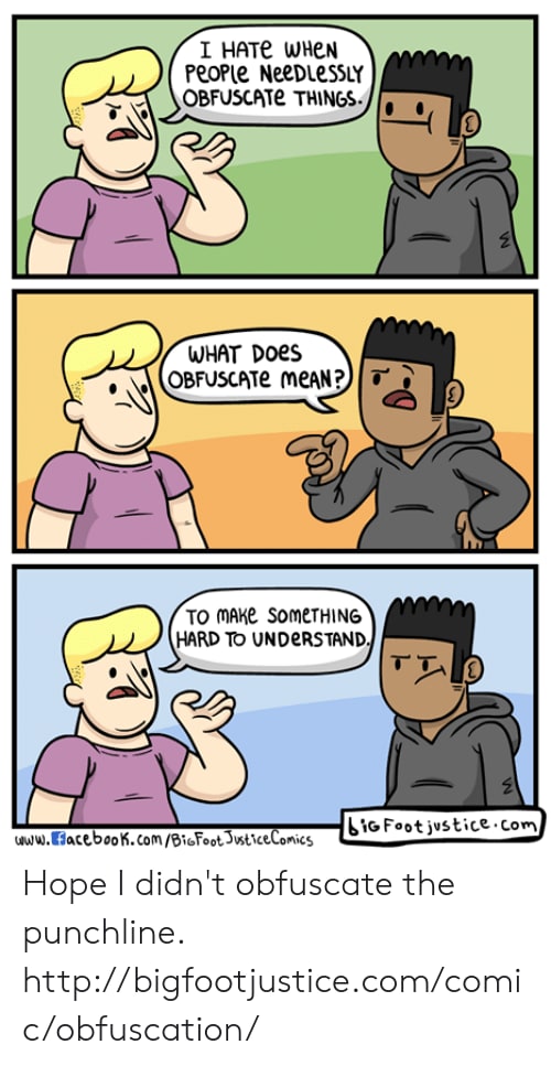
Code obfuscation is a way by which you deliberately make your code look ugly with the help of an obfuscator. This is done to make sure that no one (including yourself!) steals any code from your web app's front-end via the Developer tools of the browser, so that you can easily monetize with your app and no one will be able to get the source code (unless you are building an open source software!) .
Conclusion
In short, web is an ever-increasing plethora of wonders - do it the best way, and you too can create wonders with it. I hope the techniques and tools mentioned above played at least a minor role in your development career - Thanks for reading!


Top comments (0)