
Introduction
As competing cogs in one of the fastest-growing industries within the technology sector, data analysis companies are constantly vying for ways to transform raw SQL queries into impactful visualizations faster and more reliably. Suffice to say, visualization is quite an in-demand skill in today's increasingly-complex world of data. While this may sound trivial to outsiders, analysts know this is often anything but straightforward.
Data analysts and software engineers spend time trawling and filtering multiple data sources before getting data ready for the moment of truth—visualizing it. Data visualizations are the culmination of all data crunching work—they're supposed to take long numeric lists and complicated KPIs and present them in an intuitive, easy-to-understand way. That is, if you choose the right visualization tool for your data.
This presents a potential problem. Since the quality of data visualizations is generally contingent upon the tool used to create them, how can we make sure we’re choosing the right visualization tool for our data? Is our goal to compare values or analyze a trend? What's the best way to visualize your data so that it is easy to extract insights?
In this article, we will demonstrate how any data-focused team or individual can use Arctype as an SQL tool to filter, source, and intuitively visualize data, thereby providing greater insight into the proposed data. The best part? We’ll do it using a real Covid-19 dataset.
Note: This article is not introductory, and so it assumes that you're already familiar with any database such as Postgres or MySQL.
The Importance of Data Visualization
Data visualization positively affect an organization's decision-making process with interactive visual representations of data. Businesses can now recognize patterns more quickly because they can interpret data in graphical or pictorial forms. Here are some more specific ways that data visualization can benefit an organization:
- Correlations in Relationships: Without data visualization, it is challenging to identify the correlations that might exist between independent variables. By making sense of those independent variables, we can make better business decisions.
- Examining the Market: Data visualization takes information from different markets to give us better insights about audiences—not only on which to focus, but also which to avoid. We get a clearer picture of the opportunities within these markets by displaying relevant data on charts and graphs.
- Risk and Reward: Looking at value and risk metrics without visualizations requires greater expertise because spreadsheets full of numbers are inherently more difficult to interpret. Once information is visualized, we can easily then pinpoint areas that may or may not require action.
- Reacting to the Market: The ability to obtain information quickly and easily with data displayed clearly on a functional dashboard allows businesses to act and respond to findings swiftly, thereby helping them to avoid making mistakes.
- Trends over Time: While this seems like an obvious use of data visualization, it is also one of the most practical applications. It's impossible to make predictions without having the necessary information from the past and present. Trends over time tell us where we have been and where we can potentially go.
-
Frequency: Closely related to trends over time is frequency. Examining the rate or how often customers purchase and when they buy gives us a better feel for how potential new customers might act and react to different marketing and customer acquisition strategies.
# Turn SQL Query Results into Charts
In this article, we're going to harness the awesomeness of Arctype. Arctype supports all kinds of charts—from bar and line to more specialized types like heat maps and even pie charts. It also has the feature that enables you to easily convert your chart into a table, and vice versa. To make this process less daunting, we will break it down to different steps. Now, let's get down to the fun stuff! 💪🏻
## Step 1: Getting Started with Arctype
For the purpose of this guide, we are going to analyze and visualize a Coronavirus-related dataset that is publicly available on Arctype. To get started, we’ll need to both download and sign up for Arctype. After logging in, we’ll select the demo workspace and choose
Covid DBas our Data Source. Initially, the view panel should look like this:

Step 2: Using SQL Queries to Source Chart Data
First, click the create a new query button. Arctype will automatically open an SQL editor tab for our newly-created query. First, let’s check out the top 10 most-populous cities in the dataset. For this, we can run a query like:
SELECT * FROM us_cities order by us_cities.population DESC LIMIT 10
This is what our results should look like:

Step 3: Create a Chart Visualization for SQL Query Results
Now that we have been able to query our preferred table (us_cities), let’s start displaying charts for different query results.
To achieve this, first select chart from the toolbar at the top of the query view.

In the right sidebar, select your desired chart type from the list, then drag columns to represent the x and y-axis of your chart.

Note: x and y-axis both represent columns from your query results.
Use a Bar Chart to Visualize Covid-19 Cases by State
Let's look at the states with the top 10 highest Covid-19 cases in the US on a specified date and make a bar chart.
SELECT
  us_cities.state,
  SUM(us_confirmed_cases.num_cases) as "Cases"
FROM
  us_confirmed_cases
  RIGHT JOIN us_cities ON us_cities.id = us_confirmed_cases.city_id
WHERE {{input_date}} = to_char(us_confirmed_cases.date, 'yyyy-mm-dd')
GROUP BY us_cities.state
ORDER BY
  SUM(us_confirmed_cases.num_cases) DESC LIMIT 30;
As you can see, we are creating a query variable called ‘input_date’, which will introduce an input box in the right sidebar. Here, you’ll need to input a date in ‘yyyy-mm-dd’ format so that the query can return results. For this example, I’ve chosen December 15, 2020—the middle of the month during which the most infections were recorded in the United States.

After inputting a date, and then following the steps above to create a bar chart, this is what our data looks like:

NOTE: In order to display longer state names (such as Pennsylvania), the x-axis labels need to be vertical
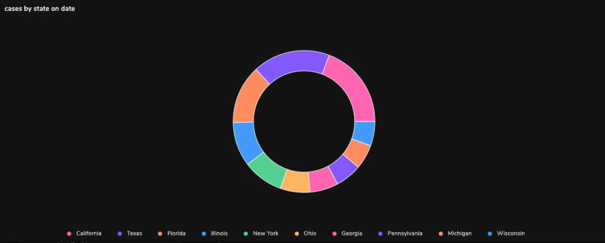
Breaking Down Covid-19 Cases by State Using Pie and Doughnut Charts
Using the results from our the above bar chart example query, here's what it would look like if we changed the chart type to a pie chart:

Quite similarly, we can create a doughnut chart for these results:
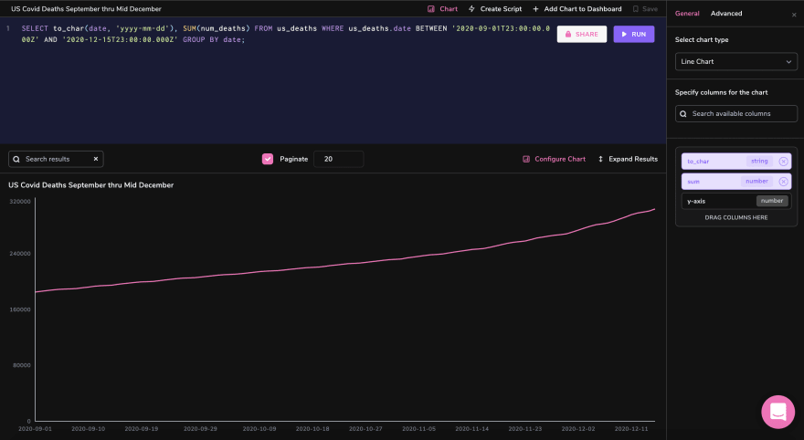
Tracking Covid-19 Deaths over Time Using a Line Chart
Let’s look at how the total deaths attributed to Covid-19 in the US increased between September 1st and December 15th, 2020. This query should give us the data:
SELECT
  to_char(date, 'yyyy-mm-dd'),
  SUM(num_deaths)
FROM
  us_deaths
WHERE
  us_deaths.date BETWEEN '2020-09-01T23:00:00.000Z'
  AND '2020-12-15T23:00:00.000Z'
GROUP BY
  date;
Now, simply select ‘Line Chart’ from the chart type, drag our date column to the x-axis, and our SUM() column to the y-axis:
Build a Heat Map to Visualize Daily Covid-19 Deaths in G20 Countries
Heat maps are perhaps the most robust and dynamic visualizations currently offered in the Arctype client. Because these charts tend to really shine in large 3D datasets, let’s build one that records new Covid-19 deaths by date in each G20 country. To do this, we’ll need a query that looks something like this:
SELECT
  global_states.country,
  to_char(global_deaths.date, 'mm-dd-yyyy') AS date,
  SUM(global_deaths.num_deaths) - COALESCE(
    LAG(SUM(global_deaths.num_deaths)) OVER (
      PARTITION BY global_states.country
      ORDER BY
        to_char(global_deaths.date, 'mm-dd-yyyy')
    ),
    0
  ) AS new_deaths
FROM
  global_deaths
  RIGHT JOIN global_states ON global_states.id = global_deaths.state_id
WHERE
  global_states.country IN(
      'Argentina','Australia','Brazil','Canada',
      'China','France','Germany','India',
      'Indonesia','Italy','Japan','Korea, South',
      'Mexico','Russia','Saudi Arabia','South Africa',
      'Turkey','United Kingdom','US'
      ) AND
  global_deaths.date BETWEEN '2020-03-15T23:00:00.000Z'
  AND '2020-05-01T23:00:00.000Z'
GROUP BY
  to_char(global_deaths.date, 'mm-dd-yyyy'),
  global_states.country
ORDER BY
  to_char(global_deaths.date, 'mm-dd-yyyy'),
  global_states.country OFFSET 19;
Before we look at the heat map from these results, let’s explain this (rather complicated) query. As you may have noticed, the num_deaths column in global_deaths is cumulative. This means that in order to find new deaths on a given day, we need to subtract the previous day’s total. We still need to use SUM() because some countries are divided by region or province and thus take up multiple rows. Additionally, because of limited screen real-estate, we’ve filtered our selection down to a 46-day timeframe (March 15th - May 1st). Finally, because our LAG() function assumes all deaths cumulative before the start date to be new deaths for that day, we need to offset our results by 19 (the number of countries in the G20, sans-EU).
Phew! With that out of the way, let’s get down to the heat map! We’ll put dates on the x-axis, countries on the y-axis, and death counts on the z-axis. Here’s what it looks like:

As you can probably tell, the data in this heat map visualization would be nearly impossible to interpret in raw form, but displayed like this, it becomes quite easy to spot trends and anomalies.
Conclusion
Database visualization is paramount in ensuring the intuitive display of all data sets. This concise article looks at how you could easily visualize your datasets, maximizing Arctype’s chart functionality to explore the far-reaching effects of Covid-19.
Resources
- Connecting to a database - Arctype
- Importing a CSV - Arctype
- Working with charts - Arctype
- Importance, Purpose, and Benefit of Data Visualization Tools - SlashBI

Top comments (0)