
Real-world data is messy and chaotic. Unlike the well-curated academic datasets available online, it takes a lot of time to even make a real-world dataset ready for analysis. While the latter comes with challenges, it is also the one that replicates an industrial scenario. Therefore, practicing on such datasets can help you excel in the real world.
Today, we’ll talk about the 5 best publicly available datasets for you to practice your skills on!
If you are into museums like me, you’d love the first one on the list.
Datasets
The Museum of Modern Art (MoMA) Collection
The Museum of Modern Art Collection includes metadata on all sorts of visual expressions such as painting, architecture, or design. It contains more than 130,000 records and has information on each work including the title, artist, dimensions, etc.
The collection includes two datasets - ‘Artist’ and ‘Artwork’ available in both CSV and JSON formats. The data can either be forked or downloaded directly from the GitHub page. However, the dataset has incomplete information and should only be used for research purposes. That is why it’s the perfect candidate as it resembles a real-world scenario where data is often missing.
To begin with, we can explore the Artists Dataset.
SELECT nationality, COUNT(nationality) as "Number of Artists"
FROM artists
GROUP BY nationality
ORDER BY COUNT(nationality) DESC LIMIT 10
I am grouping the artists by their nationality and limiting the results to the Top 10 countries. By configuring the “Chart” option in the Arctype Environment, we get a vertical Bar Chart that looks like this:
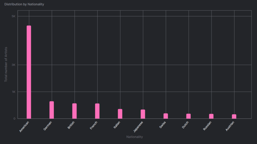
This is a trivial example to get started with the dataset. You can do so much with SQL and Data Visualization with the help of Arctype. For instance, grouping by gender with the help of the “gender” field and time-series analysis of artwork from the “start_date” and “end_date” attributes.
Note that because of its large size, the dataset is versioned using the Git Large File Storage (LFS) extension. To make use of the data, the LFS extension is a prerequisite.
But don’t worry! If you’re looking for a relatively smaller dataset to get started instantly, the next one will make your list.
Covid Dataset
The Covid-19 Dataset is a time-series data based on the daily cases reported in the United States. It is sourced from the files released by the New York Times. The collection contains both the historical and live data which gets updated often. The data is again subdivided into 57 states and 3000+ counties.
In addition to the columns present in the historical dataset, the live files also record the following:
- cases: The total number of cases including confirmed and probable cases.
- deaths: The total number of deaths including confirmed and probable deaths.
- confirmed_cases: Laboratory confirmed cases only.
- confirmed_deaths: Laboratory confirmed deaths only.
- probable_cases: The number of probable cases only.
- probable_deaths: The number of probable deaths only.
But why use the live data collection if it is ever-changing and prone to inconsistencies? Because that’s what a real-world scenario looks like. You can’t always have every information about every attribute. That is why this dataset serves you right.
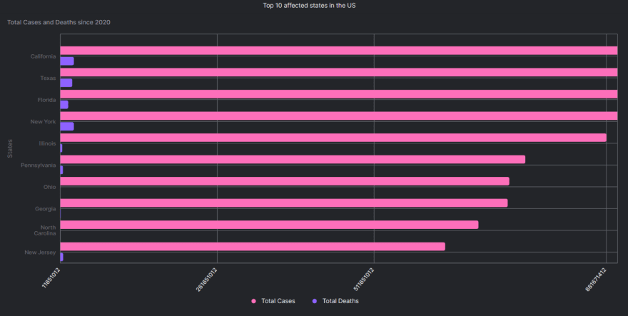
For starters, we can find out what are the topmost affected states in the country.
SELECT
    SUM(cases) as 'Total Cases',
    state as 'State',
    SUM(deaths) as 'Total Deaths'
FROM us_states
GROUP BY state
ORDER BY SUM(cases) DESC
LIMIT 10
I am limiting my result to the top 10 states, you can choose more by altering the ‘LIMIT’ command.
If you are familiar with the Arctype Environment, you’d notice that it gives you an option of selecting a ‘Chart’ when a query is executed successfully. I chose the ‘Horizontal Bar Chart’ option with:
- X-axis: Total Cases, Total Deaths
- Y-axis: State
After adding the ‘Title’ using the ‘Configure Chart’ option, my final output looks like this -
How about you try the following queries yourself?
-
Plotting the trend of -
Confirmed cases
Confirmed deaths
The most affected counties in the most affected states
Great. It’s time to move on to my favorite category.
IMDB Movie Dataset
They say work won’t seem like work if you are passionate about it. So, I brought some pop-culture content to it.
The next dataset on the list is a collection of Ruby and Shell scripts that scrap data from the IMDB website and export it into a nicely formatted CSV file. I, now, have an excuse as to why some movie references live in my head rent-free.
But why do you need these scripts if IMDB already makes all the data available for customers? Well, the IMDB Datasets are raw and subdivided into several text files. The Ruby scripts store all this information into a single CSV file making it easier to analyze. The approach also ensures that we have access to the latest data with fields such as:
- Title
- Year
- Budget
- Length
- Rating
- Votes
- Distribution of votes
- MPAA Rating
- Genre
But wait, the benefits don’t just end here. To make your life easier, the GitHub page also provides an SQL script to define this table with the fields mentioned above.
Tip: Although SQL is universal, familiarizing yourself with different dialects can help you save some time with those syntax errors.
Now that you can put your movie buff to good use, let’s move on to the next dataset.
Sunshine Duration by City
What does an Indian living in Sendai miss the most? Food and sunshine. Unfortunately, I cannot find the latter at a supermarket. What I can do, though, is analyze it.
The Sunshine Duration Dataset is inspired by the dynamic list of cities sorted by the duration of sunlight received in hours per year. This extensive list contains the data of 381 cities from 139 countries and is again subdivided by months.
But why should we care about how much sunlight does a city get? Because ‘sunshine hour’ is a climatological indicator that can help us measure patterns and changes for a particular location on Earth.
Since the data is sourced from Wikipedia and is ever-changing, it is far from complete. But the same thing also makes it a realistic dataset to get your hands dirty on.
For instance, with the help of the Country to Continent Dataset, we can group the cities by continent and visualize the pattern in different geographical locations. To begin with, I found this Kaggle Notebook particularly insightful.
Coming back to our discussion about food, the next dataset deserves a corn-y introduction.
Cereal Price Changes
The Cereal Price Dataset contains the price information of wheat, rice, and corn spanning over three decades. Starting from February 1992 until January 2022, this dataset gets updated every month.
But that’s not it. What makes this dataset even more special is that it takes into account the inflation rate which many of us forget when visualizing time-series data. Each row in the dataset has the following fields:
- Year
- Month
- Price of wheat per ton
- Price of rice per ton
- Price of corn per ton
- Inflation Rate
- Modern price of wheat per ton (after taking inflation into account)
- Modern price of rice per ton
- Modern price of corn per ton
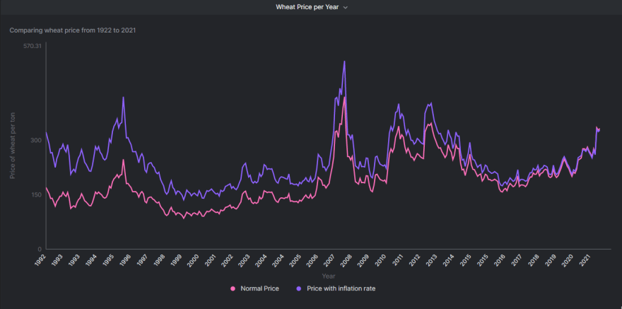
Looking at the dataset, the first thing my analytical brain wants to explore is the price pattern with time. Let’s do that. I’ll start with the wheat prices excluding the current year (2022) because we do not have complete data for that.
My SQL query looks like -
SELECT
    year,
    price_wheat_ton AS 'Normal Price',
    price_wheat_ton_infl AS 'Price with inflation rate'
FROM rice_wheat_corn_prices
WHERE year!=2022
To visualize the results, I am plotting a ‘Line Chart’ using the Arctype’s ‘Chart’ option. The fields for X-axis and Y-axis are as follows:
- X-axis: Year
- Y-axis: Normal Price, Price with inflation rate
My final graph looks like this -
Go ahead. Experiment with the rice and corn prices as well.
If you found this dataset useful, how about you check a similar one on Coffee, Rice, and Beef Prices by the same author?
Conclusion
We understand that mastering a language can take years. Through this article, we tried to give you a taste of what the world out there looks like. From museums to food, we covered a wide range indeed.
We also listed some basic SQL queries for you to get started but there is so much you can do with SQL. Let this only be the beginning of your data science journey.

Top comments (0)