This is a continuation of my previous article on fundamentals of data analysis using R. You can access all the code used in both articles from my Github repo.
In this section, various visually appealing graphs are showcased, such as 3D plots, level plots, contour plots, interactive plots, and parallel coordinates.
Scatter Plot
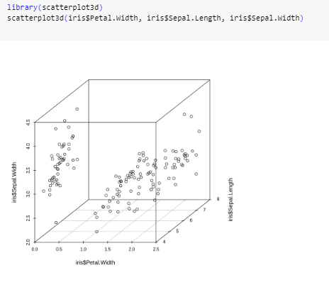
We begin by creating a 3D scatter plot using the scatterplot3d package.
Heatmaps
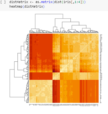
A heat map is a visual representation of a two-dimensional data matrix, which can be created using the heatmap() function in R. The following code demonstrates how to calculate the similarity between various flowers in the iris data using dist() and subsequently visualize it as a heat map.
Level Plots
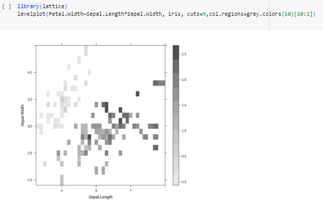
A level plot is a type of graphical representation that displays the variation in a two-dimensional dataset using contour-like regions or color gradients. To generate a level plot, you can utilize the levelplot() function available in the lattice package. The grey.colors() function can be used to create a vector of gamma-corrected gray colors. Alternatively, you can use the rainbow() function, which generates a vector of continuous colors.
Contour Plots
A contour plot is a graphical representation that illustrates the variation of a two-dimensional dataset by displaying lines or regions of constant values, often used to visualize continuous data or functions. You can create contour plots in R using the contour() and filled.contour() functions from the graphics package, or by utilizing the contourplot() function available in the lattice package.
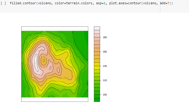
To interpret the above contour plot, you can examine the lines or regions of constant values, which represent the levels or contours of the data. The contour lines indicate areas of similar values, with closer lines indicating a steeper change in the underlying data. The spacing between contour lines can provide insights into the data's gradient or rate of change. Additionally, the colors or shading used in a filled contour plot further indicate the magnitude or intensity of the data values.
Surface Plots
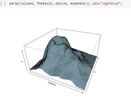
An alternative method to visualize a numerical matrix is by using a 3D surface plot, which can be created using the persp() function.
Parallel Cordinates
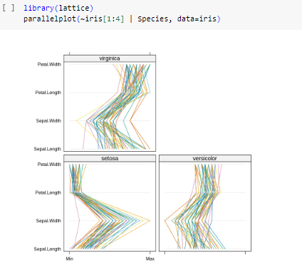
Parallel coordinates also offer an effective means of visualizing multidimensional data, and you can generate a parallel coordinates plot using the parcoord() function from the MASS package, or by utilizing the parallelplot() function available in the lattice package.
Save Charts into Files
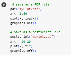
If you generate numerous graphs during data exploration, it is advisable to save them as files. R offers several functions for this purpose. Below are examples of saving charts as PDF and PS files using pdf() and postscript() respectively. Additionally, you can generate picture files in BMP, JPEG, PNG, and TIFF formats using bmp(), jpeg(), png(), and tiff() respectively. Remember to close the files (or graphics devices) by using graphics.off() or dev.off() after plotting.
Summary
I hope you had as much fun reading this as I did creating the content. Remember to install packages before imprting them using the library() method. Shoutout to Zhao's 'R and Data Mining' Textbook, wouldn't have done this without you!




Top comments (0)