A table is one of the most common UIs used to display data. Depending on the table, we usually have to add features to query and manipulate the data (e.g. a search bar). However, as tables are widely used to display data, having to copy/paste the same chunk of code of a table to generate another one with other features can be painful.
Since we're using React, there should be a better way to solve this problem. This is exactly what we will do in this article. We will leverage the power of React components to create a reusable Table component that offers features while staying flexible.
For that, the Table component has to meet the following requirement:
- Properly display data, while giving the possibility to customise the way the data is being displayed
- Support a theming system
- Be styled according to the user's wishes, while allowing them to overwrite any kind of pre-added styling
- Support any kind of additional feature, such as configuring the table's density
The aim of the article is to present that component by showing how to build it and how to add features while keeping the component flexible and close to the original html table.
Building the table component
File Setup
First things first, we have to set up a couple of things:
1- index.js: simulates how the user can use the table. This is where we call the table component to use.
import React from "react";
import ReactDOM from "react-dom";

import Table from "./Table/Table";

import "./styles.css";

function App() {
  ...
  return (
    <div className="App">
      <Table ... />
    </div>
  );
}

const rootElement = document.getElementById("root");
ReactDOM.render(<App />, rootElement);
2- Table.js: the actual component. It consists of a simple a functional component receiving some props and returning a table, as well as other functional table components representing the header, the table data and the table row. This file will not be seen by the user as it represents the logic behind the table component.
import React from "react";

export default function Table(props) {
  return <table {...props} />;
}

Table.TH = function TH(props) {
  return <th {...props} />;
};

Table.TR = function TR(props) {
  return <tr {...props} />;
};

Table.TD = function TD(props) {
  return <td {...props} />;
};
3- stylesheet.css: simulates how the user can style the table. This is where we can add my own styling to the table component.
.App {
  font-family: sans-serif;
  text-align: center;
}
Now that we've set up our files, let's think how to display the table data.
Feature #1: making a table that acts exactly like the html table.
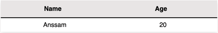
Let's say you want to display the following data:
There are two ways of doing it:
1- Using the Table exported components
The user can use Table.TR, Table.TD and Table.TH to create this table like so:
function App() {
  ...
  return (
    <div className="App">
      <Table>
        <thead>
           <Table.TR>
             <Table.TH>Name</Table.TH>
             <Table.TH>Age</Table.TH>
           </Table.TR>
        </thead>
        <tbody>
           <Table.TR>
             <Table.TD>Anssam</Table.TD>
             <Table.TD>20</Table.TD>
           </Table.TR>
        </tbody>
      </Table>
    </div>
  );
}
The advantage here is that the user can add icons, images, tables… to customise the rows.
2- Using a data prop object
Say the user only wishes to display some "raw text data" to the table. In this case, the user has to simply pass their data as a prop to the table component as such:
function App() {
  const data = [
    {
      Name: "Anssam",
      Age: "20"
    }
  ];

  return (
    <div className="App">
      <Table data={data}/>
    </div>
  );
}
And the data will be automatically displayed!
Ok, but how does that work?
Notice the structure of the data object:
const [data = [{Name: "Anssam", Age: "20"}];
It is an array of objects, each representing a table row. The keys of the object are the columns, as in the table headers, and the values are the data at some row at that specific column.
Our table component has the data that the user wishes to display, so let's first try to extract the headers of the table from that data.
a) Headers
Remember the structure of our data prop object? We can extract the headers from the keys of any element in that data prop. To do so, we simply need to use the Object.keys(SOME_DATA_ELEMENT) function to return an array of the object's keys, as in, the table headers.
Let's use the first object of the data array to get the headers.
const firstRow = props.data[0];
const headers = Object.keys(firstRow);
headers is an array containing the headers of the table. However, this is not what we wish to render: we want two th header elements, each containing the header of a column. It's time to use our Table.TH component!
const headerComponents = headers.map(el => <Table.TH>{el}</Table.TH>);
And now, we can just wrap them in a Table.TR component and ask our table functional component to render them as such:
export default function Table({ children, ...props }) {
const firstRow = props.data[0];
const headers = Object.keys(firstRow);
const headerComponents = headers.map(el => <Table.TH>{el}</Table.TH>);
  return (
    <table {...props}>
            <Table.TR>
              {headers.map(el => (
                <Table.TH>{el}</Table.TH>
              ))}
            </Table.TR>
    </table>
  );
}
b) Table body data
Now let's look at how to render the table data, as in, the rows in the body of the table. Before diving into that, let's try to get an idea as to how we can render the data of the following table:
We already have our headers from part a), but now we need a row with the values "Anssam" and "20":
<tr>
  <td>Anssam</td>
  <td>20</td>
</tr>
Quick reminder on the structure of the data prop object:
[{Name: "Anssam", Age: "21"}]
Looking at our data prop, we can directly extract the values of a specific row using the function Object.values(SOME_DATA_ELEMENT). This function returns an array of values (e.g ["Anssam", "20"]). We also know that we have to render a row for each element in the data prop, and to do so we use the SOME_ARRAY.map(SOME_FUNCTION) function to go through each element:
const rows = props.data.map(el => (
    <Table.TR>
      {Object.values(el).map(el => (
        <Table.TD>{el}</Table.TD>
      ))}
    </Table.TR>
  ));
And now we can just add that to our table render function to get the following:
export default function Table({ children, ...props }) {
  ....
  const rows = props.data.map(el => (
    <Table.TR>
      {Object.values(el).map(el => (
        <Table.TD>{el}</Table.TD>
      ))}
    </Table.TR>
  ));
  return (
    <table {...props}>
      ....
          <tbody>{rows}</tbody>
    </table>
  );
}
Youhou 🎉! We are done with simply displaying the data into the table :) Let's try style it!
Feature #2: adding styles to our table and making it "styles customisable"
Say the user wishes to make the styling of table component dependent on its state. One way of doing that would be to add conditional CSS class names and calling them depending on what state the component is in.
However, this can be boiler-plate and decrease readability.
For that reason, we need to use a tool that can support dynamic styling, like styled-components! styled-components utilises tagged template literals to style our components. It keeps track of which components are rendered on a page and injects their styles.
1- We first set up a styled.js file containing all the styling per component as such:
export const Table = styled.table`
  table-layout: fixed;
  ...
  width: 100%;
  display: table;
`;
Note: Notice the styled.table? This is basically to say that our const
Tableis basically a table dom element. If we wished for it to be a div, we would do styled.div.
2- We then attribute that styling to our component as such:
export default function Table({ children, ...props }) {
  return (
    <Styled.Table {...props}>
         ...
    </Styled.Table>
  );
}
As you can see, the styling is directly tied to the component, so we don't need to introduce class names, or go through countless CSS files to check with class name is used for which component.
Wait… what if someone adds the Table component to their project and wishes to overwrite the styling?
They can customise it themselves! The Table component supports any kind of styling that the user wishes to add. So the user can overwrite the pre-existent styling with their own stylesheet using normal CSS, styled-components, Sass…
Feature #3: adding themes
Now let's add a pre-built theming system that the user can use for styling the table. We'll do two simple themes: dark and light.

To do so, the user just has to chose between "DARK" and "LIGHT" for the values of the theme in the theme prop as such:
function App() {
 ...
  return (
    <div className="App">
      <Table
        ...
        theme={Table.THEME.LIGHT}
      />
    </div>
  );
}
How does that work?
First, we create our THEME variable as such:
Table.THEME = {
  DARK: "dark",
  LIGHT: "light"
};
We then dynamically style the Table component according to the theme prop using styled-components.
I won't go over the styling of every component, so let's take a look at the styling of our header elements. Say we want to change the background of the headers depending on the theme; we want the background to be black for a 'dark' theme, and white for a 'light' theme. To do so, we pass the theme as a prop to the Styled.TH component.
We can then read that prop in our TH component in the styled.js file, and return a different styling according to the theme prop as such:
export const TH = styled.th`
  background-color: ${props => {
    return props.theme === "dark" ? "#212529" : "#e8e5e5fa";
  }};
  ...
  border-bottom-color: ${props => {
    return props.theme === "dark" ? "#dee2e6" : "black";
  }};
  color: ${props => {
     return props.theme === "dark" ? "white" : "black";
    }
  }};
`;
But how did get the theme prop?
Remember the parent Table component receives that props from the user. We also know that the theme prop is an important prop for all of the embedded Table.TH, Table.TR and Table.TD components, as we may wish to edit their styles according to the selected theme. This means that we have to have our theme prop as a global data. To do so, we define a context, say themeContext, representing the theme as such:
//for passing the theme to all of the components
const themeContext = React.createContext();
We wrap our entire table with our themeContext.Provider component:
export default function Table({ children, ...props }) {
  return (
    <Styled.Table {...props}>
      <themeContext.Provider value={props.theme}>
        ...
      </themeContext.Provider>
    </Styled.Table>
  );
}
Then read that theme value from the context in our Table.TH component using the useContext hook as such:
Table.TH = function TH({ children, ...props }) {
  const theme = React.useContext(themeContext);
  return (
    <Styled.TH {...props} theme={theme}>
      {children}
    </Styled.TH>
  );
};
And we can use that logic for the rest of our theme styling! 🎉
Feature #4: Display density
Yet another cool feature the table supports is the ability to configure the density.
function App() {
  return (
    <div className="App">
      <Table
        ...
        density={Table.DENSITY.HIGH}
      />
    </div>
  );
}
Table density user choiceJust like the two pre-built themes, the user is restricted to choose between three options: low, average and high density.
Table.DENSITY = {
  LOW: "low",
  AVERAGE: "avg",
  HIGH: "high"
};
Each option edits the style of a component according to the prop passed to the table: in this case, the Table's height changes according to the density prop:
export const Table = styled.table`
  ...
  height: ${props => {
    switch (props.density) {
      case "low":
        return "130px";
      case "avg":
        return "90px";
      case "high":
        return "5px";
      default:
        return "50vh";
    }
  }};
`;
And now we have our last feature done! 🎉 You can checkout all we've done here.
Conclusion
Now you can:
- Use this table as you like! Customise it as you like.
- Make your own reusable component to win some time whenever you're working on a project
Notice: I hope this article was helpful, or that you gained something from it! My brothers and I are learning more about React and publish articles every month. Follow me on twitter @anssam_ghezala to get in touch! :)

Top comments (6)
Hi, I like your post. Would you be willing to collaborate on a react project?
Hi, thank you! What are the details of the project? Can you DM me on twitter?
Thank you! Glad to know you enjoyed the article :) Which languages do you use ? Why do you not intend on learning js if you don’t mind me asking?
Hey, Anssam, how can I get in contact with you, please?
Hi! You can message me on Twitter! I put my twitter at the end of the article :)
How to add event for each table data