JavaScript Image Carousel - Laying down the foundation.
This is Phase One of a Two-phase project where we build a fully responsive image carousel for mobile and desktop.
Phase Two is coming soon.
Browse our Teachable courses.
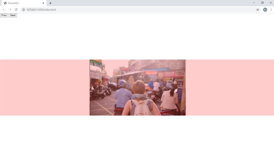
We'll start by putting all of our elements on screen.
We have 7 elements to work with:
- a button for moving right (BUTTON)
- a button for moving left (BUTTON)
- a view port (DIV)
- an images container (DIV)
- a "card" which we'll use to hold the image (DIV)
- the actual image (IMG)
- a touch area that we'll use to determine whether or not the user is allowed to scroll the carousel (DIV)

Now we need to center everything on screen.
We'll use a combination of absolute positions and transforms.
Now that everything is centered, we need to order the cards from left to right.
We write a simple function that determines the middle card of our deck and moves the cards to the left of that middle to the left and the cards to the right of that middle to the right.

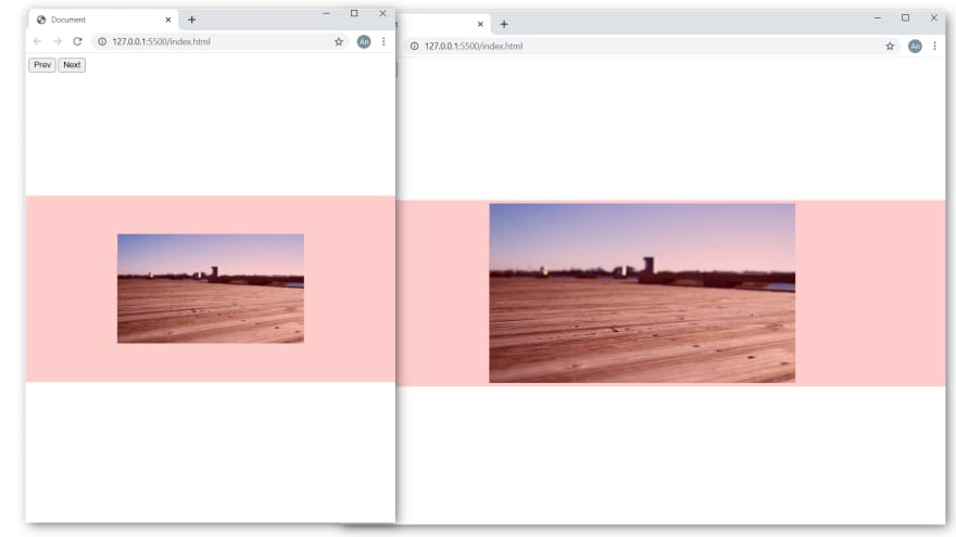
Let's discuss RESPONSIVE.
To make our carousel responsive, we need to resize our view port based on percentages and not hard pixel units.
So we'll just pick 50% and calculate a hard pixel count based on the width of the user's browser window; then we'll run this code in a resize window event listener.
window.addEventListener('resize', () => {
    img_width_as_percentage = 50;

    new_width =
        /Android|webOS|iPhone|iPad|iPod|BlackBerry|IEMobile|Opera Mini/i.test(navigator.userAgent) ?
        (img_width_as_percentage / 100) * screen.width :
        (img_width_as_percentage / 100) * window.innerWidth;

    view_port.style.width = `${new_width}px`;
});
Now that we have our resize code, every time we resize the browser window, our carousel resizes.
We have our elements laid out and ready to go.
You can get the source files here
In the next phase, we'll start moving this thing with touch, button, and wheel navigation.
If you want a more in-depth guide, check out my full video tutorial on YouTube, An Object Is A.
The Ultimate JavaScript Image Carousel/Slider (3 types of navigation; Fully responsive) | Phase 1

Top comments (0)