Spotify Chrome Extension - UX and Animation
This is Phase Four of a multi-phase project where we build a Spotify Chrome Extension powered by ReactJS that allows us to control the user's Spotify session
Phase One can be found here.
This tutorial assumes you know how Google Chrome Extensions work. Learn more here.
Right off the bat, we need to install another package to help us with transitions.
>> npm install --save react-transition-group
We have two components that use this new package the Player and OptionsPage components.
We'll start with the open_close button for our 'Player'.
CSSTransition works by wrapping an HTML element in a DIV element.
This wrapper DIV then has CSS classes added and removed from it.
Those CSS classes have pre-defined names (defined by **React Transition Group**).
You, however, define the animations.
Those class names are:
.chrome-ext-flip-appear
.chrome-ext-flip-appear-active
.chrome-ext-flip-appear-done
.chrome-ext-flip-enter
.chrome-ext-flip-enter-active
.chrome-ext-flip-enter-done
.chrome-ext-flip-exit
.chrome-ext-flip-exit-active
.chrome-ext-flip-exit-done
The basic breakdown is this:
there are three total states: appear, enter, and exit
-
each state has three modes:
- start - simply the state name, so appear, enter, or exit
- this is the value the animation starts at, ex. opacity at 0
- active
- this is the value the animation leads to, ex. opacity at 0.8
- done
- this is the value you leave the animation at, ex. opacity at 0.8 (the animation can lead to a different place than the end if you want)
So in our Player component, we simply wrap the entire component in a CSSTransition component and feed it our custom CSS.
// Player.js
<CSSTransition ... classNames="chrome-ext-flip">
    ...
</CSSTransition>

// player_styles.css
...
.chrome-ext-flip-enter {
    transform: translateY(0%);
}

.chrome-ext-flip-enter-active {
    transform: translateY(100%);
    transition: transform 1000ms;
}

.chrome-ext-flip-enter-done {
    transform: translateY(100%);
}
...
Note:
When we want the player to close or enter into its pocket, we start at a Y of 0% then transition to a Y of 100% which puts the Player off-screen; we then finish at a Y of 100% to keep it off-screen.
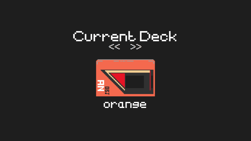
Let's handle the unload and load for the 'OptionsPage'.
For this page we don't wrap our entire component in a CSSTransition.
We just want to move the image of the Deck.
So we only wrap our Deck component in the CSSTransition.
...
</div>
<div className="chrome-ext-options_content">
    <CSSTransition
        ...
        classNames={my_context.direction ? 'chrome-ext-slide-next' : 'chrome-ext-slide-prev'}>
        <Deck />
    </CSSTransition>
</div>
<div ref={ref_id => options_deck_type = ref_id} className="chrome-ext-deck_type">{my_context.current_deck}</div>
...
Note:
The class we're attaching to our transition changes based on if the user is selecting the next or previous deck.
The buttons for 'next' and 'previous' track don't require a transition library.
If the user clicks next or previous, we simply show them our loading cassette gif. To do this we just switch the state of newTrack to true, wait for the gif to animate, then switch newTrack back to false.
next_track = () => {
    this.setState(_state => {
        return {
            newTrack: true,
            isPlaying: false,
        }
    }, () => {
        setTimeout(() => {
            this.setState({ newTrack: false, isPlaying: true });
        }, 400);
    });
}
The 'play'/'pause' button is easy.
Very simple, when the user clicks on the play/pause button, we flip the isPlaying variable in our state.
This flip will trigger the animation of our Ticker.
start_pause = () => {
    this.setState(_state => {
        return {
            isPlaying: !_state.isPlaying
        }
    });
}
Finally, animating our 'Ticker'.
It's much too complicated to put into words, but in short we use an animation loop using requestAnimationFrame().
We take a string and move it left until it scrolls out of view, then place it to the right to create the illusion of infinite scrolling.
For more a more involved tutorial, see the video below.
In the next phase we're going to do some actual Chrome Extension coding.
We'll get the backend logic done, connect to the Spotify API, and build our routes to control the Spotify player.
You can find the source files for this Phase here.
If you want a more in-depth guide, check out my full video tutorial on YouTube, An Object Is A.
Build a Cyberpunk 2077-inspired Spotify Controller - Phase 4


Top comments (0)