A Cyberpunk 2077-inspired React-Chrome Extension
This is Phase One of a multi-phase project where we build a React-Chrome Extension that allows us to control the user’s Spotify session.
Understand how Google Chrome Extensions work:
Understand how ReactJS-Chrome Extensions work:

Build a Chrome Extension Using ReactJS
an-object-is-a ・ Sep 26 '20 ・ 6 min read
This whole app is structured to mimic a cassette player.
All of the assets we’re developing have a ratio of 1.6.
the width of an asset is 1.6 times larger than the height
However you choose to develop your own assets, keep that proportion.
I’m using a site called pixelartcss.com
It allows you to create pixel art and export into different formats:
- CSS code
- gif
- png
I won’t be using the CSS code export function. It doesn’t scale properly.
I won’t be using the gif export function. It’s much easier to create and edit gifs in a different program; I’ll be using GIMP.
I’m simply going to create the asset in pixelartcss and export to pngs.
Let’s start by creating a cassette player.
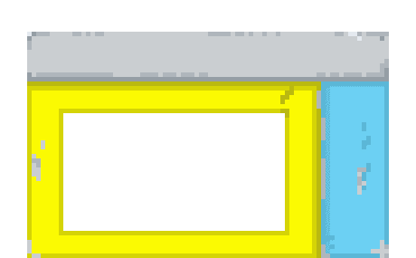
I found the sweet spot for the pixelartcss canvas to be 80x50 for a closed cassette player.

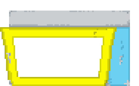
You can bump the canvas up to 92x57 to make room for an
opened cassette player.

This gives us enough pixels to add detail, but not too many that we’re spending all day coloring things in.
However you want to design your player is up to you, just make sure you use the full width and height of your canvas on the closed player, then bump up the dimensions to 92x57 and go to work on the opened player.
Don’t include any buttons you want to be functional. We’ll do that in the HTML later.
Make sure to export these files as pngs when you’re done.
After you’re done your decks, do the same for your cassettes.
Same proportions, 1.6.
I found 72x45 to work best.
Now that we have our images, we’re gonna do a bunch of scaling.
Open up your favorite image editor.
We’re gonna be working on a 320x550 canvas.
The added height gives us room for the animation.
We’ll start with the closed player; scale it to 320x200 and copy it over to the canvas.
Do the same for the opened player; scale it to 320x200 and copy it over.
For our cassette, this is where you have to play with different scaling.
Depending on how you created your player, the scale and where you position the cassette will change.
Once you’re happy with the alignment of these three items
we’ll start creating the gifs.
The loading gif is just three duplicate images with the cassette rotated differently each time.
When you’re ready to export to a gif, I found a 100ms frame rate to work best.

The playing gif is just two images with the different states of the cassette alternating.
When you’re ready to export to a gif, I found a 150ms frame rate works best.
Even though you’re not using all of the space on top, export at 320x550 anyways.

Moving on to the pause gif.
Depending on what you want to do when your deck is paused, it’s going to be a static or animated gif.
Just make sure the cassette isn’t spinning; make sure to export that at 320x550 as well.

The default image of your deck is next.

This is going to be used for the options page when the user chooses their player.
Just take a closed deck; no cassette and export it at 320x200 not 320x550.
So we have all of the visual assets created for our project.
 an-object-is-a
/
project-1-spotify-controller-phase1
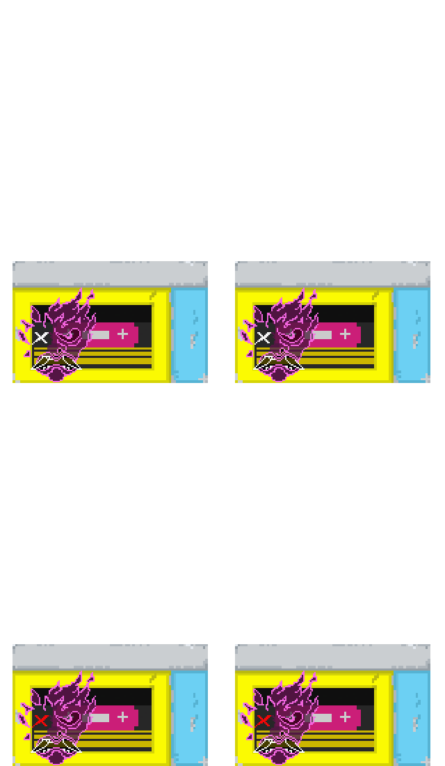
All of the art assets used for the project.
In the next phase we’re going to construct the UI and UX using ReactJS.
Build a Cyberpunk 2077-inspired Spotify Controller — Phase 1 | React-Chrome Extension


Top comments (0)