If you’ve ever worked with Google Maps, you know it’s powerful — but it can get expensive quickly, especially as your app scales. That’s why I turned to Mapbox, a robust, cost-effective alternative with stunning visuals, rich features, and great developer tools.
In this post, I’ll walk you through how I built a modern mapping application using Mapbox GL JS, the latest Next.js, shadcn/ui components, and Tailwind CSS. This stack allows you to create a sleek, responsive, and customizable mapping experience with features like:
- 📍 Dynamic markers
- 💬 Custom popups
- 🌗 Dark/light theme support
- ⚙️ Shared map state with React context
- 🧩 Reusable, clean component design
Prerequisites
Before we begin, make sure you have:
- A Mapbox account and API key
- Node.js and npm/yarn installed
- Basic knowledge of React, Next.js, and Tailwind CSS
Project Setup
Let's start by setting up a new Next.js project with Tailwind CSS and shadcn/ui.
npx create-next-app@latest mapbox-nextjs
cd mapbox-nextjs
When prompted, select:
- TypeScript: Yes
- ESLint: Yes
- Tailwind CSS: Yes
- App Router: Yes
- Import aliases: Yes (default: @/*)
Next, let's install shadcn/ui and the required dependencies:
npx shadcn@latest init
Now, let's install Mapbox GL JS:
npm install mapbox-gl
Setting Up Environment Variables
Create a .env.local file in your project root and add your Mapbox token:
NEXT_PUBLIC_MAPBOX_TOKEN=your_mapbox_token_here
NEXT_PUBLIC_MAPBOX_SESSION_TOKEN=your_session_token_here
Project Structure (Simplified)
src/
├── app/
│   ├── layout.tsx
│   └── page.tsx                 ← Map rendering entry point
├── components/
│   ├── location-marker.tsx      ← Marker component
│   ├── location-popup.tsx       ← Popup component
│   ├── map/                     ← Core map UI features
│   │   ├── map-marker.tsx       ← Resusable markers
│   │   ├── map-popup.tsx        ← Resusable popup logic
│   │   ├── map-controls.tsx     ← Zoom/rotation controls
│   │   ├── map-styles.tsx       ← Dark/light mode styles
│   │   └── map-search.tsx       ← Autocomplete & geocoding
│   └── ui/                      ← shadcn/ui components
├── context/
│   └── map-context.ts           ← Shared map state
├── lib/
│   └── mapbox/
│       ├── provider.tsx         ← Map lifecycle & theme-aware setup
│       └── utils.tsx            ← Utilities: center calc, types, icons, etc.
Creating the Map Context
First, let's create a context to manage our Mapbox instance. This will allow us to access the map from any component in our application.
// map-context.ts
import { createContext, useContext } from "react";

interface MapContextType {
  map: mapboxgl.Map;
}

export const MapContext = createContext<MapContextType | null>(null);

export function useMap() {
  const context = useContext(MapContext);
  if (!context) {
    throw new Error("useMap must be used within a MapProvider");
  }
  return context;
}
Building the Map Provider
Next, let's create a Map Provider component that initializes the Mapbox map and provides it to our application through the context.
// lib/mapbox/provider.tsx

"use client";

import React, { useEffect, useRef, useState } from "react";
import mapboxgl from "mapbox-gl";
import "mapbox-gl/dist/mapbox-gl.css";

import { MapContext } from "@/context/map-context";

mapboxgl.accessToken = process.env.NEXT_PUBLIC_MAPBOX_TOKEN!;

type MapComponentProps = {
  mapContainerRef: React.RefObject<HTMLDivElement | null>;
  initialViewState: {
    longitude: number;
    latitude: number;
    zoom: number;
  };
  children?: React.ReactNode;
};

export default function MapProvider({
  mapContainerRef,
  initialViewState,
  children,
}: MapComponentProps) {
  const map = useRef<mapboxgl.Map | null>(null);
  const [loaded, setLoaded] = useState(false);

  useEffect(() => {
    if (!mapContainerRef.current || map.current) return;

    map.current = new mapboxgl.Map({
      container: mapContainerRef.current,
      style: "mapbox://styles/mapbox/standard",
      center: [initialViewState.longitude, initialViewState.latitude],
      zoom: initialViewState.zoom,
      attributionControl: false,
      logoPosition: "bottom-right",
    });

    map.current.on("load", () => {
      setLoaded(true);
    });

    return () => {
      if (map.current) {
        map.current.remove();
        map.current = null;
      }
    };
  }, [initialViewState, mapContainerRef]);

  return (
    <div className="z-[1000]">
      <MapContext.Provider value={{ map: map.current! }}>
        {children}
      </MapContext.Provider>
      {!loaded && (
        <div className="absolute inset-0 flex items-center justify-center bg-background/80 z-[1000]">
          <div className="text-lg font-medium">Loading map...</div>
        </div>
      )}
    </div>
  );
}
Creating Map Components
Now, let's build the core map components that will enhance our map's functionality.
1. Custom Marker Component
// components/map/map-marker.tsx

"use client";

import mapboxgl, { MarkerOptions } from "mapbox-gl";
import React, { useEffect, useRef } from "react";

import { useMap } from "@/context/map-context";
import { LocationFeature } from "@/lib/mapbox/utils";

type Props = {
  longitude: number;
  latitude: number;
  data: any;
  onHover?: ({
    isHovered,
    position,
    marker,
    data,
  }: {
    isHovered: boolean;
    position: { longitude: number; latitude: number };
    marker: mapboxgl.Marker;
    data: LocationFeature;
  }) => void;
  onClick?: ({
    position,
    marker,
    data,
  }: {
    position: { longitude: number; latitude: number };
    marker: mapboxgl.Marker;
    data: LocationFeature;
  }) => void;
  children?: React.ReactNode;
} & MarkerOptions;

export default function Marker({
  children,
  latitude,
  longitude,
  data,
  onHover,
  onClick,
  ...props
}: Props) {
  const { map } = useMap();
  const markerRef = useRef<HTMLDivElement | null>(null);
  let marker: mapboxgl.Marker | null = null;

  const handleHover = (isHovered: boolean) => {
    if (onHover && marker) {
      onHover({
        isHovered,
        position: { longitude, latitude },
        marker,
        data,
      });
    }
  };

  const handleClick = () => {
    if (onClick && marker) {
      onClick({
        position: { longitude, latitude },
        marker,
        data,
      });
    }
  };

  useEffect(() => {
    const markerEl = markerRef.current;
    if (!map || !markerEl) return;

    const handleMouseEnter = () => handleHover(true);
    const handleMouseLeave = () => handleHover(false);

    // Add event listeners
    markerEl.addEventListener("mouseenter", handleMouseEnter);
    markerEl.addEventListener("mouseleave", handleMouseLeave);
    markerEl.addEventListener("click", handleClick);

    // Marker options
    const options = {
      element: markerEl,
      ...props,
    };

    marker = new mapboxgl.Marker(options)
      .setLngLat([longitude, latitude])
      .addTo(map);

    return () => {
      // Cleanup on unmount
      if (marker) marker.remove();
      if (markerEl) {
        markerEl.removeEventListener("mouseenter", handleMouseEnter);
        markerEl.removeEventListener("mouseleave", handleMouseLeave);
        markerEl.removeEventListener("click", handleClick);
      }
    };
  }, [map, longitude, latitude, props]);

  return (
    <div>
      <div ref={markerRef}>{children}</div>
    </div>
  );
}
2. Custom Popup Component
// components/map/map-popup.tsx

"use client";

import { useMap } from "@/context/map-context";
import mapboxgl from "mapbox-gl";
import { useCallback, useEffect, useMemo } from "react";
import { createPortal } from "react-dom";

type PopupProps = {
  children: React.ReactNode;
  latitude?: number;
  longitude?: number;
  onClose?: () => void;
  marker?: mapboxgl.Marker;
} & mapboxgl.PopupOptions;

export default function Popup({
  latitude,
  longitude,
  children,
  marker,
  onClose,
  className,
  ...props
}: PopupProps) {
  const { map } = useMap();

  const container = useMemo(() => {
    return document.createElement("div");
  }, []);

  const handleClose = useCallback(() => {
    onClose?.();
  }, [onClose]);

  useEffect(() => {
    if (!map) return;

    const popupOptions: mapboxgl.PopupOptions = {
      ...props,
      className: `mapboxgl-custom-popup ${className ?? ""}`,
    };

    const popup = new mapboxgl.Popup(popupOptions)
      .setDOMContent(container)
      .setMaxWidth("none");

    popup.on("close", handleClose);

    if (marker) {
      const currentPopup = marker.getPopup();
      if (currentPopup) {
        currentPopup.remove();
      }

      marker.setPopup(popup);

      marker.togglePopup();
    } else if (latitude !== undefined && longitude !== undefined) {
      popup.setLngLat([longitude, latitude]).addTo(map);
    }

    return () => {
      popup.off("close", handleClose);
      popup.remove();

      if (marker && marker.getPopup()) {
        marker.setPopup(null);
      }
    };
  }, [
    map,
    marker,
    latitude,
    longitude,
    props,
    className,
    container,
    handleClose,
  ]);

  return createPortal(children, container);
}
3. Map Controls Component
// components/map/map-controls.tsx

import React from "react";
import { PlusIcon, MinusIcon } from "lucide-react";

import { useMap } from "@/context/map-context";
import { Button } from "../ui/button";

export default function MapCotrols() {
  const { map } = useMap();

  const zoomIn = () => {
    map?.zoomIn();
  };

  const zoomOut = () => {
    map?.zoomOut();
  };

  return (
    <aside className="absolute bottom-8 right-4 z-10 bg-background p-2 rounded-lg shadow-lg flex flex-col gap-2">
      <Button variant="ghost" size="icon" onClick={zoomIn}>
        <PlusIcon className="w-5 h-5" />
        <span className="sr-only">Zoom in</span>
      </Button>
      <Button variant="ghost" size="icon" onClick={zoomOut}>
        <MinusIcon className="w-5 h-5" />
        <span className="sr-only">Zoom out</span>
      </Button>
    </aside>
  );
}
4. Map Styles Component
// components/map/map-styles.tsx

"use client";

import React, { useEffect, useState } from "react";
import {
  MapIcon,
  MoonIcon,
  SatelliteIcon,
  SunIcon,
  TreesIcon,
} from "lucide-react";
import { useTheme } from "next-themes";

import { useMap } from "@/context/map-context";
import { Tabs, TabsList, TabsTrigger } from "../ui/tabs";

type StyleOption = {
  id: string;
  label: string;
  icon: React.ReactNode;
};

const STYLE_OPTIONS: StyleOption[] = [
  {
    id: "streets-v12",
    label: "Map",
    icon: <MapIcon className="w-5 h-5" />,
  },
  {
    id: "satellite-streets-v12",
    label: "Satellite",
    icon: <SatelliteIcon className="w-5 h-5" />,
  },
  {
    id: "outdoors-v12",
    label: "Terrain",
    icon: <TreesIcon className="w-5 h-5" />,
  },

  {
    id: "light-v11",
    label: "Light",
    icon: <SunIcon className="w-5 h-5" />,
  },
  {
    id: "dark-v11",
    label: "Dark",
    icon: <MoonIcon className="w-5 h-5" />,
  },
];

export default function MapStyles() {
  const { map } = useMap();
  const { setTheme } = useTheme();
  const [activeStyle, setActiveStyle] = useState("streets-v12");

  const handleChange = (value: string) => {
    if (!map) return;
    map.setStyle(`mapbox://styles/mapbox/${value}`);
    setActiveStyle(value);
  };

  useEffect(() => {
    if (activeStyle === "dark-v11") {
      setTheme("dark");
    } else setTheme("light");
  }, [activeStyle]);

  return (
    <aside className="absolute bottom-4 left-4 z-10">
      <Tabs value={activeStyle} onValueChange={handleChange}>
        <TabsList className="bg-background shadow-lg">
          {STYLE_OPTIONS.map((style) => (
            <TabsTrigger
              key={style.id}
              value={style.id}
              className="data-[state=active]:bg-primary data-[state=active]:text-primary-foreground text-sm flex items-center sm:px-3 sm:py-1.5"
            >
              {style.icon}
              <span className="hidden sm:inline">{style.label}</span>
            </TabsTrigger>
          ))}
        </TabsList>
      </Tabs>
    </aside>
  );
}
Implementing Search Functionality
Let's add a search feature that allows users to find locations on the map.
1. Define Location Types and Icons
// lib/mapbox/utils.tsx

import {
  Coffee,
  Utensils,
  ShoppingBag,
  Hotel,
  Dumbbell,
  Landmark,
  Store,
  Banknote,
  GraduationCap,
  Shirt,
  Stethoscope,
  Home,
} from "lucide-react";

export const iconMap: { [key: string]: React.ReactNode } = {
  café: <Coffee className="h-5 w-5" />,
  cafe: <Coffee className="h-5 w-5" />,
  coffee: <Coffee className="h-5 w-5" />,
  restaurant: <Utensils className="h-5 w-5" />,
  food: <Utensils className="h-5 w-5" />,
  hotel: <Hotel className="h-5 w-5" />,
  lodging: <Hotel className="h-5 w-5" />,
  gym: <Dumbbell className="h-5 w-5" />,
  bank: <Banknote className="h-5 w-5" />,
  shopping: <ShoppingBag className="h-5 w-5" />,
  store: <Store className="h-5 w-5" />,
  government: <Landmark className="h-5 w-5" />,
  school: <GraduationCap className="h-5 w-5" />,
  hospital: <Stethoscope className="h-5 w-5" />,
  clothing: <Shirt className="h-5 w-5" />,
  home: <Home className="h-5 w-5" />,
};

export type LocationSuggestion = {
  mapbox_id: string;
  name: string;
  place_formatted: string;
  maki?: string;
};

export type LocationFeature = {
  type: "Feature";
  geometry: {
    type: "Point";
    coordinates: [number, number];
  };
  properties: {
    name: string;
    name_preferred?: string;
    mapbox_id: string;
    feature_type: string;
    address?: string;
    full_address?: string;
    place_formatted?: string;
    context: {
      country?: {
        name: string;
        country_code: string;
        country_code_alpha_3: string;
      };
      region?: {
        name: string;
        region_code: string;
        region_code_full: string;
      };
      postcode?: { name: string };
      district?: { name: string };
      place?: { name: string };
      locality?: { name: string };
      neighborhood?: { name: string };
      address?: {
        name: string;
        address_number?: string;
        street_name?: string;
      };
      street?: { name: string };
    };
    coordinates: {
      latitude: number;
      longitude: number;
      accuracy?: string;
      routable_points?: {
        name: string;
        latitude: number;
        longitude: number;
        note?: string;
      }[];
    };
    language?: string;
    maki?: string;
    poi_category?: string[];
    poi_category_ids?: string[];
    brand?: string[];
    brand_id?: string[];
    external_ids?: Record<string, string>;
    metadata?: Record<string, unknown>;
    bbox?: [number, number, number, number];
    operational_status?: string;
  };
};
2. Implement the Search Component
// components/map/map-search.tsx

"use client";

import {
  Command,
  CommandInput,
  CommandList,
  CommandEmpty,
  CommandGroup,
  CommandItem,
} from "@/components/ui/command";
import { Loader2, MapPin, X } from "lucide-react";
import { useState, useEffect } from "react";

import { useDebounce } from "@/hooks/useDebounce";
import { useMap } from "@/context/map-context";
import { cn } from "@/lib/utils";
import {
  iconMap,
  LocationFeature,
  LocationSuggestion,
} from "@/lib/mapbox/utils";
import { LocationMarker } from "../location-marker";
import { LocationPopup } from "../location-popup";

export default function MapSearch() {
  const { map } = useMap();
  const [query, setQuery] = useState("");
  const [displayValue, setDisplayValue] = useState("");
  const [results, setResults] = useState<LocationSuggestion[]>([]);
  const [isSearching, setIsSearching] = useState(false);
  const [isOpen, setIsOpen] = useState(false);
  const [selectedLocation, setSelectedLocation] =
    useState<LocationFeature | null>(null);
  const [selectedLocations, setSelectedLocations] = useState<LocationFeature[]>(
    []
  );
  const debouncedQuery = useDebounce(query, 400);

  useEffect(() => {
    if (!debouncedQuery.trim()) {
      setResults([]);
      setIsOpen(false);
      return;
    }

    const searchLocations = async () => {
      setIsSearching(true);
      setIsOpen(true);

      try {
        const res = await fetch(
          `https://api.mapbox.com/search/searchbox/v1/suggest?q=${encodeURIComponent(
            debouncedQuery
          )}&access_token=${
            process.env.NEXT_PUBLIC_MAPBOX_TOKEN
          }&session_token=${
            process.env.NEXT_PUBLIC_MAPBOX_SESSION_TOKEN
          }&country=US&limit=5&proximity=-122.4194,37.7749`
        );

        const data = await res.json();
        setResults(data.suggestions ?? []);
      } catch (err) {
        console.error("Geocoding error:", err);
        setResults([]);
      } finally {
        setIsSearching(false);
      }
    };

    searchLocations();
  }, [debouncedQuery]);

  // Handle input change
  const handleInputChange = (value: string) => {
    setQuery(value);
    setDisplayValue(value);
  };

  // Handle location selection
  const handleSelect = async (suggestion: LocationSuggestion) => {
    try {
      setIsSearching(true);

      const res = await fetch(
        `https://api.mapbox.com/search/searchbox/v1/retrieve/${suggestion.mapbox_id}?access_token=${process.env.NEXT_PUBLIC_MAPBOX_TOKEN}&session_token=${process.env.NEXT_PUBLIC_MAPBOX_SESSION_TOKEN}`
      );

      const data = await res.json();
      const featuresData = data?.features;

      if (map && featuresData?.length > 0) {
        const coordinates = featuresData[0]?.geometry?.coordinates;

        map.flyTo({
          center: coordinates,
          zoom: 14,
          speed: 4,
          duration: 1000,
          essential: true,
        });

        setDisplayValue(suggestion.name);

        setSelectedLocations(featuresData);
        setSelectedLocation(featuresData[0]);

        setResults([]);
        setIsOpen(false);
      }
    } catch (err) {
      console.error("Retrieve error:", err);
    } finally {
      setIsSearching(false);
    }
  };

  // Clear search
  const clearSearch = () => {
    setQuery("");
    setDisplayValue("");
    setResults([]);
    setIsOpen(false);
    setSelectedLocation(null);
    setSelectedLocations([]);
  };

  return (
    <>
      <section className="absolute top-4 left-1/2 sm:left-4 z-10 w-[90vw] sm:w-[350px] -translate-x-1/2 sm:translate-x-0 rounded-lg shadow-lg">
        <Command className="rounded-lg">
          <div
            className={cn(
              "w-full flex items-center justify-between px-3 gap-1",
              isOpen && "border-b"
            )}
          >
            <CommandInput
              placeholder="Search locations..."
              value={displayValue}
              onValueChange={handleInputChange}
              className="flex-1"
            />
            {displayValue && !isSearching && (
              <X
                className="size-4 shrink-0 text-muted-foreground cursor-pointer hover:text-foreground transition-colors"
                onClick={clearSearch}
              />
            )}
            {isSearching && (
              <Loader2 className="size-4 shrink-0 text-primary animate-spin" />
            )}
          </div>

          {isOpen && (
            <CommandList className="max-h-60 overflow-y-auto">
              {!query.trim() || isSearching ? null : results.length === 0 ? (
                <CommandEmpty className="py-6 text-center">
                  <div className="flex flex-col items-center justify-center space-y-1">
                    <p className="text-sm font-medium">No locations found</p>
                    <p className="text-xs text-muted-foreground">
                      Try a different search term
                    </p>
                  </div>
                </CommandEmpty>
              ) : (
                <CommandGroup>
                  {results.map((location) => (
                    <CommandItem
                      key={location.mapbox_id}
                      onSelect={() => handleSelect(location)}
                      value={`${location.name} ${location.place_formatted} ${location.mapbox_id}`}
                      className="flex items-center py-3 px-2 cursor-pointer hover:bg-accent rounded-md"
                    >
                      <div className="flex items-center space-x-2">
                        <div className="bg-primary/10 p-1.5 rounded-full">
                          {location.maki && iconMap[location.maki] ? (
                            iconMap[location.maki]
                          ) : (
                            <MapPin className="h-4 w-4 text-primary" />
                          )}
                        </div>
                        <div className="flex flex-col">
                          <span className="text-sm font-medium truncate max-w-[270px]">
                            {location.name}
                          </span>
                          <span className="text-xs text-muted-foreground truncate max-w-[270px]">
                            {location.place_formatted}
                          </span>
                        </div>
                      </div>
                    </CommandItem>
                  ))}
                </CommandGroup>
              )}
            </CommandList>
          )}
        </Command>
      </section>

      {selectedLocations.map((location) => (
        <LocationMarker
          key={location.properties.mapbox_id}
          location={location}
          onHover={(data) => setSelectedLocation(data)}
        />
      ))}

      {selectedLocation && (
        <LocationPopup
          location={selectedLocation}
          onClose={() => setSelectedLocation(null)}
        />
      )}
    </>
  );
}
Creating Location Marker and Popup Components
Let's create components for displaying location markers and popups on the map.
1. Location Marker Component
// components/location-marker.tsx

import { MapPin } from "lucide-react";

import { LocationFeature } from "@/lib/mapbox/utils";
import Marker from "./map/map-marker";

interface LocationMarkerProps {
  location: LocationFeature;
  onHover: (data: LocationFeature) => void;
}

export function LocationMarker({ location, onHover }: LocationMarkerProps) {
  return (
    <Marker
      longitude={location.geometry.coordinates[0]}
      latitude={location.geometry.coordinates[1]}
      data={location}
      onHover={({ data }) => {
        onHover(data);
      }}
    >
      <div className="rounded-full flex items-center justify-center transform transition-all duration-200 bg-rose-500 text-white shadow-lg size-8 cursor-pointer hover:scale-110">
        <MapPin className="stroke-[2.5px] size-4.5" />
      </div>
    </Marker>
  );
}
2. Location Popup Component
// components/location-popup.tsx

import { LocationFeature, iconMap } from "@/lib/mapbox/utils";
import { cn } from "@/lib/utils";
import {
  LocateIcon,
  MapPin,
  Navigation,
  Star,
  ExternalLink,
} from "lucide-react";

import { Button } from "./ui/button";
import Popup from "./map/map-popup";
import { Badge } from "./ui/badge";
import { Separator } from "./ui/separator";

type LocationPopupProps = {
  location: LocationFeature;
  onClose?: () => void;
};
export function LocationPopup({ location, onClose }: LocationPopupProps) {
  if (!location) return null;

  const { properties, geometry } = location;

  const name = properties?.name || "Unknown Location";
  const address = properties?.full_address || properties?.address || "";
  const categories = properties?.poi_category || [];
  const brand = properties?.brand?.[0] || "";
  const status = properties?.operational_status || "";
  const maki = properties?.maki || "";

  const lat = geometry?.coordinates?.[1] || properties?.coordinates?.latitude;
  const lng = geometry?.coordinates?.[0] || properties?.coordinates?.longitude;

  const getIcon = () => {
    const allKeys = [maki, ...(categories || [])];

    for (const key of allKeys) {
      const lower = key?.toLowerCase();
      if (iconMap[lower]) return iconMap[lower];
    }

    return <LocateIcon className="h-5 w-5" />;
  };

  return (
    <Popup
      latitude={lat}
      longitude={lng}
      onClose={onClose}
      offset={15}
      closeButton={true}
      closeOnClick={false}
      className="location-popup"
      focusAfterOpen={false}
    >
      <div className="w-[300px] sm:w-[350px]">
        <div className="flex items-start gap-3">
          <div className="bg-rose-500/10 p-2 rounded-full shrink-0">
            {getIcon()}
          </div>
          <div className="flex-1 min-w-0">
            <div className="flex items-center justify-between gap-1">
              <h3 className="font-medium text-base truncate">{name}</h3>
              {status && (
                <Badge
                  variant={status === "active" ? "outline" : "secondary"}
                  className={cn(
                    "text-xs",
                    status === "active" ? "border-green-500 text-green-600" : ""
                  )}
                >
                  {status === "active" ? "Open" : status}
                </Badge>
              )}
            </div>
            {brand && brand !== name && (
              <p className="text-sm font-medium text-muted-foreground">
                {brand}
              </p>
            )}
            {address && (
              <p className="text-sm text-muted-foreground truncate mt-1">
                <MapPin className="h-3 w-3 inline mr-1 opacity-70" />
                {address}
              </p>
            )}
          </div>
        </div>

        {categories.length > 0 && (
          <div className="mt-3 flex flex-wrap gap-1 max-w-full">
            {categories.slice(0, 3).map((category, index) => (
              <Badge
                key={index}
                variant="secondary"
                className="text-xs capitalize truncate max-w-[100px]"
              >
                {category}
              </Badge>
            ))}
            {categories.length > 3 && (
              <Badge variant="secondary" className="text-xs">
                +{categories.length - 3} more
              </Badge>
            )}
          </div>
        )}

        <Separator className="my-3" />

        <div className="grid grid-cols-2 gap-2">
          <Button
            variant="outline"
            size="sm"
            className="flex items-center justify-center"
            onClick={() => {
              window.open(
                `https://www.google.com/maps/dir/?api=1&destination=${lat},${lng}`,
                "_blank"
              );
            }}
          >
            <Navigation className="h-4 w-4 mr-1.5" />
            Directions
          </Button>

          <Button
            variant="outline"
            size="sm"
            className="flex items-center justify-center"
            onClick={() => {
              console.log("Saved location:", location);
            }}
          >
            <Star className="h-4 w-4 mr-1.5" />
            Save
          </Button>

          {properties?.external_ids?.website && (
            <Button
              variant="outline"
              size="sm"
              className="col-span-2 flex items-center justify-center mt-1"
              onClick={() => {
                window.open(properties.external_ids?.website, "_blank");
              }}
            >
              <ExternalLink className="h-4 w-4 mr-1.5" />
              Visit Website
            </Button>
          )}
        </div>

        <div className="mt-3 pt-2 border-t text-xs text-muted-foreground">
          <div className="flex justify-between items-center">
            <span className="truncate max-w-[170px]">
              ID: {properties?.mapbox_id?.substring(0, 8)}...
            </span>
            <span className="text-right">
              {lat.toFixed(4)}, {lng.toFixed(4)}
            </span>
          </div>
        </div>
      </div>
    </Popup>
  );
}
Styling the Map with Tailwind CSS
Let's add custom styles for our Mapbox popups using Tailwind CSS. Add these styles to your globals.css file:
/* app/globals.css */

/* Custom Mapbox Popup Styling */
.mapboxgl-custom-popup .mapboxgl-popup-content {
  @apply bg-card text-card-foreground p-5 rounded-lg;
}

.mapboxgl-custom-popup .mapboxgl-popup-close-button {
  font-size: 22px;
  padding: 0 6px;
  right: 0;
  top: 0;
}

.mapboxgl-custom-popup .mapboxgl-popup-close-button:hover {
  background-color: transparent;
}

.mapboxgl-popup-anchor-top .mapboxgl-popup-tip {
  border-bottom-color: var(--card);
  border-top-color: transparent;
  border-left-color: transparent;
  border-right-color: transparent;
}

.mapboxgl-popup-anchor-bottom .mapboxgl-popup-tip {
  border-top-color: var(--card);
  border-bottom-color: transparent;
  border-left-color: transparent;
  border-right-color: transparent;
}

.mapboxgl-popup-anchor-left .mapboxgl-popup-tip {
  border-right-color: var(--card);
  border-top-color: transparent;
  border-bottom-color: transparent;
  border-left-color: transparent;
}

.mapboxgl-popup-anchor-right .mapboxgl-popup-tip {
  border-left-color: var(--card);
  border-top-color: transparent;
  border-bottom-color: transparent;
  border-right-color: transparent;
}


.dark .mapboxgl-popup-anchor-top .mapboxgl-popup-tip {
  border-bottom-color: var(--card);
}
.dark .mapboxgl-popup-anchor-bottom .mapboxgl-popup-tip {
  border-top-color: var(--card);
}
.dark .mapboxgl-popup-anchor-left .mapboxgl-popup-tip {
  border-right-color: var(--card);
}
.dark .mapboxgl-popup-anchor-right .mapboxgl-popup-tip {
  border-left-color: var(--card);
}
Putting It All Together
Now that we have all the components in place, let's update our main page to use them:
// app/page.tsx

import { useRef } from "react";

import MapProvider from "@/lib/mapbox/provider";
import MapStyles from "@/components/map/map-styles";
import MapCotrols from "@/components/map/map-controls";
import MapSearch from "@/components/map/map-search";

export default function Home() {
  const mapContainerRef = useRef<HTMLDivElement | null>(null);

  return (
    <div className="w-screen h-screen">
      <div
        id="map-container"
        ref={mapContainerRef}
        className="absolute inset-0 h-full w-full"
      />

      <MapProvider
        mapContainerRef={mapContainerRef}
        initialViewState={{
          longitude: -122.4194,
          latitude: 37.7749,
          zoom: 10,
        }}
      >
        <MapSearch />
        <MapCotrols />
        <MapStyles />
      </MapProvider>
    </div>
  );
}
Key Features and Benefits
- Modular Architecture: The application is built with a modular architecture, making it easy to maintain, extend and scale.
- Responsive Design: The UI is fully responsive, working well on both desktop and mobile devices.
- Dark Mode Support: The application supports dark mode, with the map style automatically switching to match the theme.
- Custom Markers and Popups: We've created custom markers and popups that match our application's design.
- Search Functionality: Users can search for locations and see them on the map.
- Map Controls: Users can zoom in and out, and switch between different map styles.
- Accessibility: The application is built with accessibility in mind, with proper ARIA attributes and keyboard navigation.
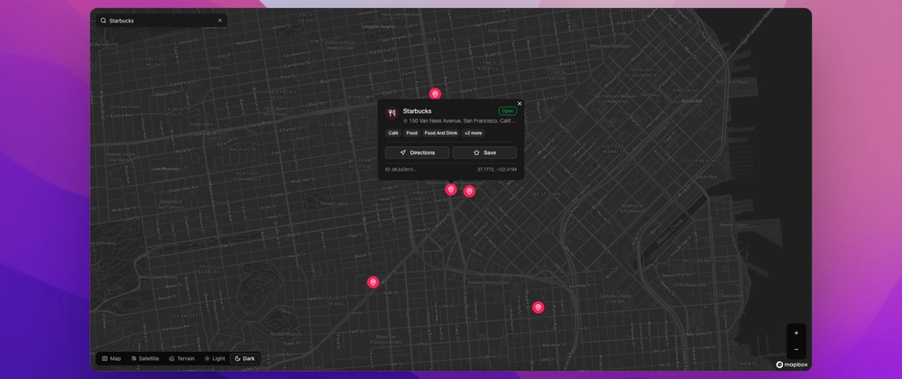
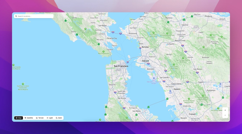
Result Preview
What You Can Add Next
- 📦 Marker clustering
- 📍 User geolocation
- 🧭 Route directions
- 📊 Heatmaps or data overlays
- 🧪 Unit tests for map logic
Final Thoughts
This architecture balances power and clarity. Mapbox handles the interactive magic, while Next.js and shadcn/ui deliver a beautiful, modern developer experience. With a clean separation of logic, reusable components, and context for state, you’re ready to build production-ready mapping tools.


Top comments (0)