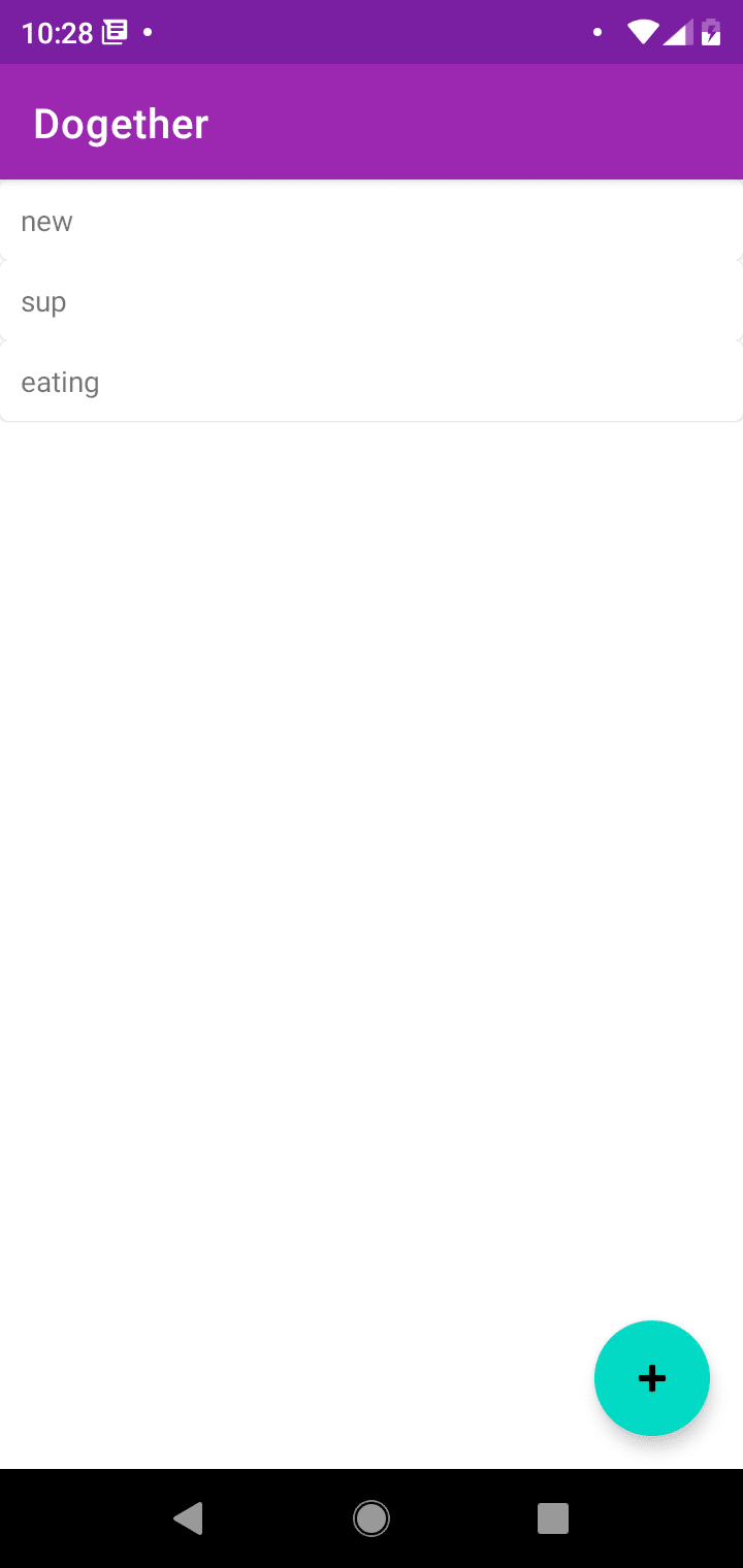
This scene is usually what you end up with if you added a material card with no additional styling.
Scroll past the images to see how to bring the card in line with your expectations.
| Expectation | Reality |
|---|---|
 |
 |
All that's needed for a card to really look like a card, is the minHeight and margins (top, left and right only because if you add bottom, the top and bottom margins both apply between cards and that space increases).
Add this to your styles.xml
    <style name="SensibleDefaultsMaterialCard" parent="Widget.MaterialComponents.CardView">
        <item name="android:layout_marginLeft">@dimen/mtrl_card_spacing</item>
        <item name="android:layout_marginTop">@dimen/mtrl_card_spacing</item>
        <item name="android:layout_marginRight">@dimen/mtrl_card_spacing</item>
        <item name="android:minHeight">200dp</item>
    </style>
Note: I know the mtrl_card_spacing is private, if you'd like you could move the 8dp out into your own value but I think this value should've been either public or actually applied to the card and then it could remain private. So I choose to use it directly.
Then we apply the styles to the MaterialCardView the important part here is style="@style/SensibleDefaultsMaterialCard" where the style is applied to the MaterialCardView.
<?xml version="1.0" encoding="utf-8"?>
<layout xmlns:android="http://schemas.android.com/apk/res/android"
    xmlns:tools="http://schemas.android.com/tools">

    <data>

        <variable
            name="goalData"
            type="com.aniketkadam.dogether.goals.GoalWithMetadata" />
    </data>

    <com.google.android.material.card.MaterialCardView
        style="@style/SensibleDefaultsMaterialCard"
        android:layout_width="match_parent"
        android:layout_height="wrap_content">

        <TextView
            android:layout_width="wrap_content"
            android:layout_height="wrap_content"
            android:text="@{goalData.goal.name}"
            tools:text="Some Goal Name" />
    </com.google.android.material.card.MaterialCardView>


</layout>
Other layout issues:
Another problem you may encounter is that when setting padding, it doesn't apply. I'm investigating why this is, and in the meantime I'll be padding the padding to the view directly or another wrapper layout if there's more than one view inside it.


Top comments (1)
Annoying that it doesn't allow to set the padding through
Widget.MaterialComponents.CardView. If you have any update on why this happens or what's the way to get at it, please share.Edit: I just found out that you'll need to set
contentPaddinginstead ofandroid:padding, and that's what is to it. The takeaway is that if a property is not applying to the cardview, try to find out a more specific property. For example, the background-color doesn't get applied if you go this route:<item name="android:background">@color/whateverColor</item>To get this working, you have
cardBackgroundColor, a rather more specific property...<item name="cardBackgroundColor">@color/whateverColor</item>I hope it helps someone. Thanks.