
Front-end engineers are responsible for translating visual designs into working code for the web. The target that we aim for is a faithful translation of source design files into code. The holy grail would be to put a screenshot of the design and a screenshot of the accompanying final product side-by-side and be unable to tell which was which.
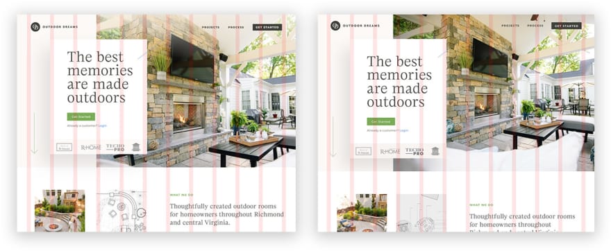
Above are screenshots of the design file for Outdoor Dreams alongside the final browser build (with the front-end visual grid turned on). Are you able to tell which one is from the browser and which one is from Sketch?
As front-end engineers, to varying degrees, we often miss the mark. Sometimes it's because the designs themselves were unfeasible — lacking in consistency and not lending themselves to being faithfully reproduced within a given project’s budget. Other times it’s because we set ourselves up for failure by allowing guesswork to enter our process through poor architecture. It's time to level up.
Evolution of the digital design ecosystem
The tooling available to digital designers has evolved by leaps and bounds over the past several years. We’ve gone from the dark days of using print-focused design tools such as Adobe Photoshop to create web layouts to witnessing an explosion of digital-native design tools in the form of Sketch, Adobe XD, Figma and more. Beyond that, the design language of the web itself has evolved — more and more designers are breaking the bounds of what audiences have come to expect from layouts on the web.
There was a time as an engineer where you’d be safe to assume a design would map to a 12-column grid and any number of off-the-shelf CSS grid systems would suit your needs. 12-columns has been historically considered an ideal number of columns to work with due to 12 being such a highly divisible number. Many tools emerged onto the scene under the assumption that whatever you wanted to build could be suitably done with 12 columns.
In present-day, however, designers have declared “conventional wisdom be damned!” and the days of the 12-column one-size-fits-all layout system are gone.
Good! More power to them. It’s time to rethink our preconceived limitations for layout on the web and allow it to mature into the editorial design-forward platform we all know it’s capable of being. As front-end engineers, it’s our responsibility to rise to the challenge and ensure that we’re equipping ourselves to hit the mark being set for us by our designer colleagues. But how do we remove the guesswork and give ourselves the tooling necessary to faithfully reproduce the designs we are tasked with developing?
A flawed process
The current standards for a typical front-end development process are not ideal. We reference design files as we write our code — comparing the designs and the browser results side-by-side via visual inspection. This process involves tinkering with the design file to get the exact measurements you need, writing the code to produce those measurements in the browser, and then comparing the results visually to confirm they look correct — or at least correct within tolerable approximation. We spend a large amount of our time adjusting our code to accurately represent provided designs but when it's time to verify the results we do so via error-prone visual inspection.
This sucks. It's time to level up our process so that we can produce better results. “Good enough” isn't good enough.
The designs we reference are painstakingly produced with a precise grid and visual overlays to assist the designer. In the browser, the absence of those helpful visual indicators means that small imperfections often go overlooked (or worse, ignored). Why don’t we bring those visual indicators into the browser as part of our engineering process so that we can better hit the mark of 1:1 parity between design and front-end development? It’s a good question and one that we’re actively addressing at Braid.
Now you see it
Our answer is this: Precisely recreate the visual grid overlay in the browser and use a system that enforces it. The designer you’re collaborating with deliberately configured the grid, intentionally adhered to it, at times tastefully deviated from it, and a part of their soul withers if you completely ignore it. Give yourself the advantage of removing the guesswork. See for yourself when you've faithfully reproduced a design.
To assist our own team with this we authored Griddle, an open-source set of .scss functions and mixins that allow engineers to configure a flexible visual grid system for their projects. Griddle comes out of the box with a Vue component that adds a visual overlay to your project in the browser.

In short (read the readme.md for the long version), Griddle aspires to make minimal assumptions about your grid system. Your designer provided you with a 14-column grid with a 72px / 32px column-to-gutter ratio at the largest breakpoint? No problem. Configure your overrides for Griddle in your own .scss files using the layout information found in the source design file.
Once installed and configured, you'll be able to toggle the Griddle overlay in your project (control + shift + L) revealing an identical set of visual column indicators in your browser as the ones seen in your design program. You can try it out in a few different configurations here, here, or on our own site here if you want to see it in action for yourself.
Conclusion
By equipping ourselves with the same visual grid overlay being used by our designer colleagues we remove almost all of the guesswork inherent to visual side-by-side inspection.
Griddle itself is nothing magical, it’s a fixed-position overlay being calculated with some basic math from your provided configuration. Use it, or write your own. But no matter what you do, ensure that you’re taking steps to set yourself up for success. Rise to the occasion and aspire to faithfully reproduce the work being entrusted to us as front-end engineers. 1:1 is the target, and in many cases, there’s no reason to not hit that mark.
Oh, and in case you’re curious, in the comparison screenshot at the beginning of the article, the browser version is on the left. 🙂

Top comments (0)