Imagine the following – pretty common – scenario:
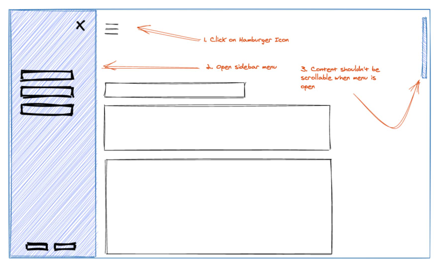
You have some kind of UI where you open up a sidebar by clicking on a Hamburger icon. The sidebar is positioned above the actual UI components. So far, nothing special 🎉 The case hits you when you have a lot of components within the actual view so that the browser does what it is really good in, scrolling.
So the question is, how to temporarily deactivate scrolling when the sidebar has been opened?
A 🍔, please.
Before diving into the solution space, let's set the foundation and define the actual Hamburger component. This component is responsible for handling the sidebar visibility.
import { useState, FunctionComponent } from "react";

export const Hamburger: FunctionComponent = () => {
  const [ isSidebarVisible, setIsSidebarVisible ] = useState(false);

  const onClick = () =>
    setIsSidebarVisible(!isMenuOpen);

  return (
    <a href="#" onClick={onClick}>🍔</a>
  );
};
This is only the component for the visibility state handling of the sidebar – the Hamburger icon. The actual sidebar gets displayed via React Portals. I have omitted the usage of Portals here for reasons of simplicity.
Now, where we have the actual state in place, we can utilize that information for toggling whether the viewport scrolling should be active or not.
Meet the <Scrollbar /> component
One of my favorite aspects about styled-components is the paradigm of using encapsulated components for creating visual representations. But you don't need to stop there, you can utilize it for controlling global behavior as well. The following snippet shows you how to define a component which controls the global scrollbar by using styled-component's own createGlobalStyle mechanism:
type Props = {
  deactivated?: boolean
}

export const Scrollbar = createGlobalStyle<Props>`
  body {
    overflow: ${props => props.deactivated ? "hidden" : "auto"};
  }
`;
With this component in place, we can now deactivate the global scrollbar via <Scrollbar deactivated /> and activate it by rendering just <Scrollbar />.
Using the <Scrollbar />
Back to our <Hamburger /> component. Integrating the scrollbar component is quite easy:
import { useState, FunctionComponent } from "react";

const Hamburger: FunctionComponent = () => {
  const [ isSidebarVisible, setIsSidebarVisible ] = useState(false);

  const onClick = () =>
    setIsSidebarVisible(!isSidebarVisible);

  return (
    <>
      <Scrollbar deactivated={isSidebarVisible} />

      <a href="#" onClick={onClick}>🍔</a>
    </>
  );
};
Now whenever the sidebar has been opened, this state indicates that the scrollbar should be deactivated and vice versa 🥳
Conclusion
Although the solution demonstrates quite a nice declarative solution, please take it with a grain of salt. Encapsulating global behavior should be used sparsely. When using such an encapsulation in different places of your code base, this certain areas gets hard to maintain over time as you might loose track of them. Even with this word of caution, there are cases, like the described scenario, where it might be quite handy to wrap global behavior in a component and use it conditionally.
Demo
A full example can be found here: conditional-scrollbar.

Top comments (1)
Great. I get to know about dynamic styling with styled components