Github recently introduced a way to customize your profile and add a little Readme to it. This update has made the dev community very happy and excited. A lot of developers took the opportunity to use this blank canvas to showcase their creative side and leveraged it to market their personal brand. I have been coming across a lot of tweets from developers sharing their cool Readmes'. So I decided to put together a list of all the Readmes' that I personally found interesting/inspiring.
By the way, if you want to add a Readme to your own profile, you just have to create a repository with the same name as your Github account and add README.md. Github will then display the content of this file on your profile.
I have categorized the profile Readmes' into 3 categories - Cool & Nerdy, Eye-catching & Creative, and Fun & Playful. These are just some of them that caught my attention, but there might be many more that I haven't come across. Feel free to add the links in the comments and I will update them.
Cool & Nerdy
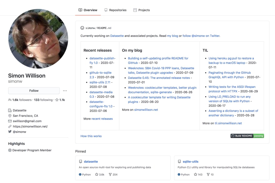
Simon Willson's Readme is the self-updating Readme. It's a simple 3 column index of links that he wants people to checkout. This includes links to his recent releases, blog posts, and links to his TIL repository (pretty inspiring).
He even wrote a pretty detailed blog post about how he created this self-updating Readme.
II. anuraghazra (@anuraghazra)
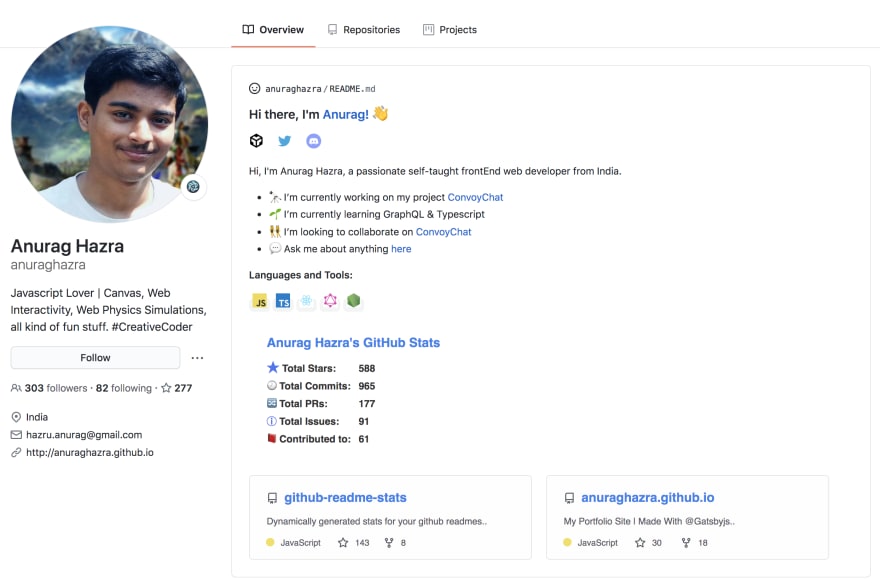
This is another example of a self-updating Readme. Along with all the relevant information about himself, Anurag has added a section with his Github stats. This section is powered by Github's API and it dynamically updates the stats based on your Github activity.
He has even open-sourced it 👏. So go check it out and feel free to use it in your own Readme.
III. timburgan
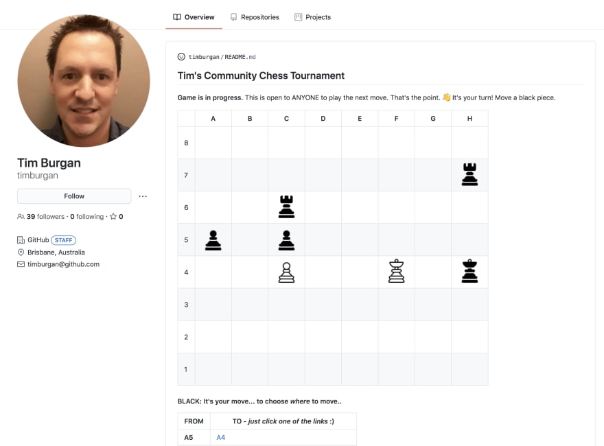
You can now play a Chess Tournament with Tim Burgan on his Github profile. If you love chess, go ahead and challenge yourself. Pretty cool idea. The most interactive Readme that I have seen.
IV. sorxrob
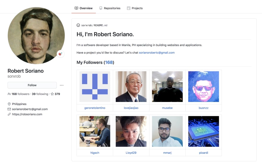
Another brilliant Readme! This Github Profile Readme brings Github one step close to becoming a social network. It is Friendster inspired, randomly displays eight followers using Github Actions, and is updated every hour.
Eye-catching & Creative
These developers found creative ways to leverage the space and display their necessary information. A good way to showcase your personal brand.
V. JacksonBates (@JacksonBates)
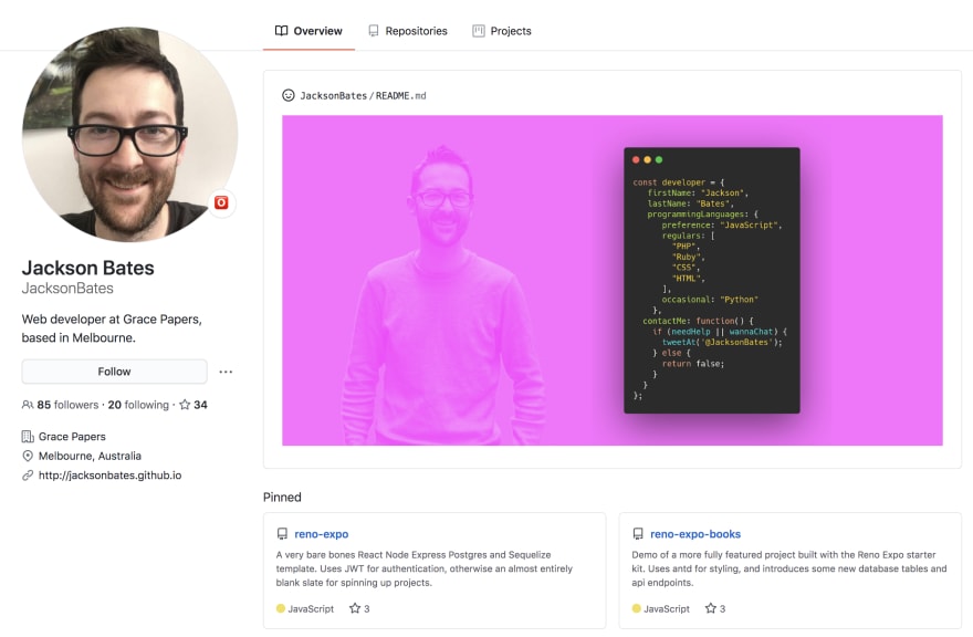
This Readme is eye-catching and speaks to the developer. All the relevant information is creatively displayed as a code snippet. Simple, creative, and functional.
VI. WaylonWalker (@WaylonWalker)
This Readme is a mix of all the right things when it comes to communicating the personal brand - eye-catching banner, relevant social links, and a good bio.
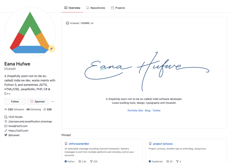
This is a perfect example of a simple and minimalist Readme that attracts attention. All the relevant links are symmetrically laid out and overall pleasing to an eye.
VIII. jlengstorf (@jlengstorf)
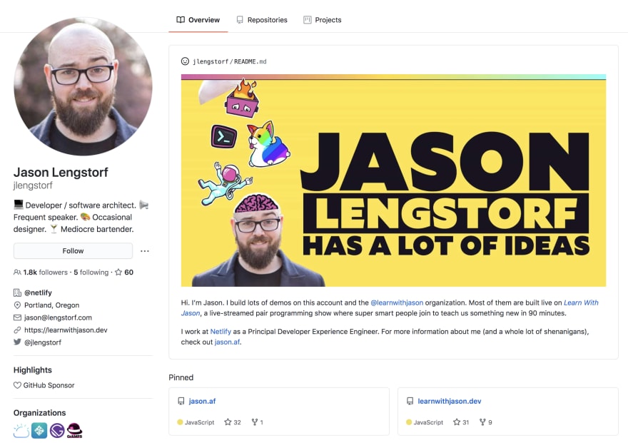
This Readme stood out to me as it feels like a perfect balance of playful personality and a professional bio that communicates all the relevant information.
Fun & Playful
Time for some fun and playful readmes'...
This is such a perfect placement of the two images. Great imagination!
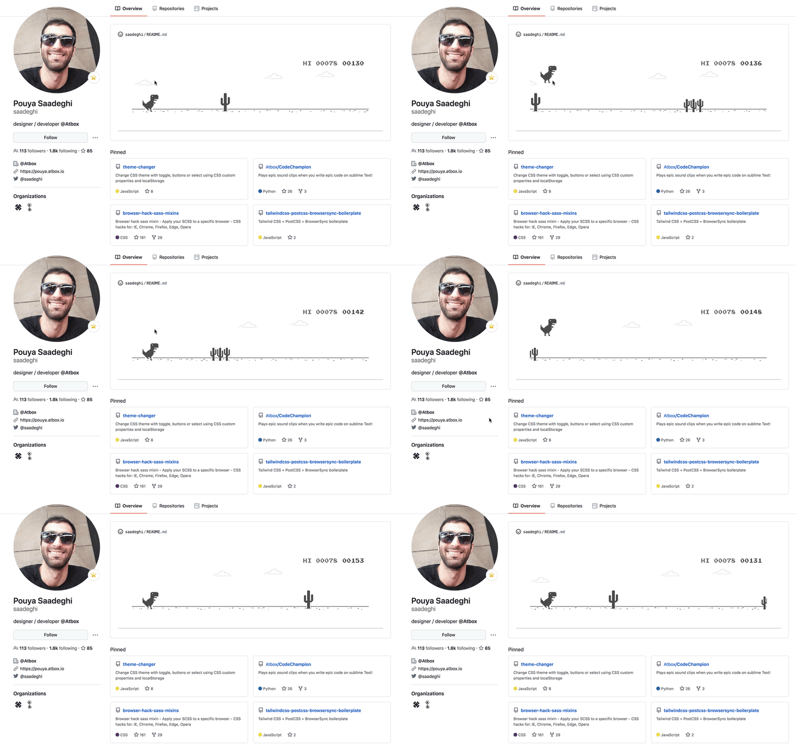
We have all seen this dinosaur that we dread so much, but it makes for an excellent gif that we can all identify with.
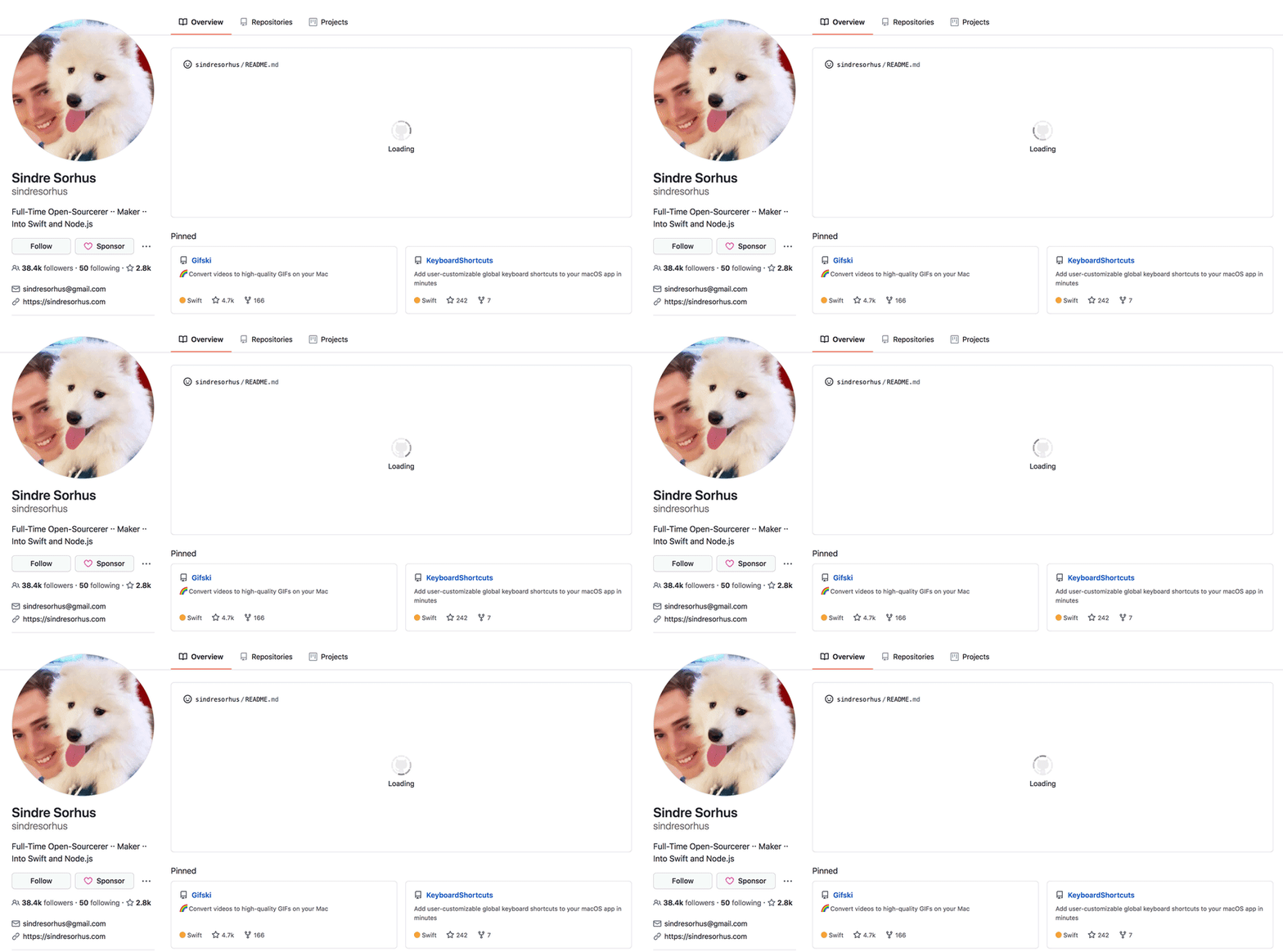
XI. sindresorhus (@sindresorhus)
Wait for it! When I first opened this profile, I seriously thought it is loading something and I will soon get to see something magical. Good one!
If you come across any cool profile Readmes', please feel free to add the links in the comments. I hope to keep this list updated.





Top comments (3)
Nice collection. Thank you for sharing this, Ansar!
I am glad that you like it. ☺️
You might take a look to my github profile? github.com/warengonzaga/ let me know what you think.