If you've found this article useful, consider donating.
This article was originally published on my blog.
So recently I had to use the <footer> tag for a website I was building. To be honest, in all of my web development projects that I've made so far, I've never had the need to use the footer. That was until last week.
What's the big deal? It's just a footer tag that you include before closing out the body tag right? Sure, but the problem with footers is that by default, they don't stay at the bottom. Let me explain.
If your body tag were to contain the following:
your footer would be pushed all the way to the top. This happens because there isn't enough content to fill up the page and push the footer down.
For the most part, if your website has enough content to fill up the page, your footer should be pushed down to the bottom. However, on bigger screens, this might still be an issue.
So, how do we keep that pesky footer at the bottom? Well, today I'll be showcasing three solutions to this problem. The first and simplest solution is using flexbox, the second solution is using grid, and the final solution is using a wrapper. Alright, let's get started.
Flex Solution
First, the simplest, and in my opinion, the best solution, using flexbox. I'd say this is the simplest because it isn't that much code to write and it's simple to understand.
This is what our HTML looks like:
The HTML is going to look pretty much the same for all of these solutions, I'll be sure to point out the differences along the way.
Very briefly, in our <body>, we have a <header>, a <main>, and a <footer>. Inside our <main>, we have a <p> that just holds some lorem ipsum text.
This is what our CSS looks like:
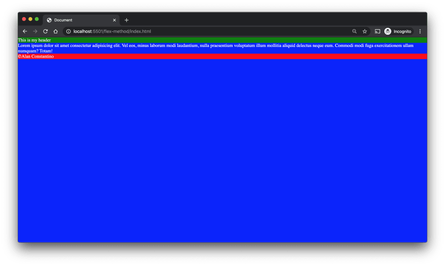
Again very briefly, I remove all the padding and margin for everything. Our body is displayed as flex, has a 'flex-direction' of column, its minimum height is 100vh or 100 viewport height, and its background color is blue. As for the header, I just colored it green. Finally, I gave the footer a background color of red and I set its top margin to auto. This is important because, without this, the footer wouldn't stay at the bottom.
Now our footer looks something like this:

Let me explain how this works. We set our <body> to be displayed as a flex column and set its minimum height to be the full size of the viewport height. You can think of the <body> as a container that expands for the full height of the page. Now by setting our <footer>'s top margin to auto, we're essentially telling it to stay at the bottom of the <body> container. And that's how you use CSS flex to keep the footer at the bottom.
Grid Solution
Let's move on to the second solution, using CSS grid. Now I don't know about you but I don't like grid. I'd much rather use flexbox, but, as much as I hate to admit it, sometimes there is just no avoiding it.
The HTML code will be exactly the same as for the flex solution, the only thing that will differ will be the CSS link tag.
The CSS for the grid solution looks something like this:
Just like before, we first remove all the padding and margin for everything. Then we make the html height 100% and I made all the text color white. Next, our body has a minimum height of 100% and is displayed as a grid with 3 rows and has a background color of blue. Those rows will be the header, main, and the footer. The header has a background color of green and will start and end in the first row of the three that we defined for the grid. Finally, our footer will have a background color of red and will start and end at the third row of our grid.
Now let me explain how this works. In the body, we define three rows, the first and last are of size 'auto' while the row in the middle is a set size of 1fr. We use 'auto' for the first and last rows so they only take up the space they need.
We then set our header to be the first row of the grid keeping it at the top while setting our footer to the last row in our grid keeping it at the bottom. That's it!

You could manually define main to be in the second row like the following:
main {

  grid-row-start: 2;

  grid-row-end: 2;

}
but I just didn't do that.
Wrapper Solution
Finally, we have reached our last solution which is using a wrapper. The HTML for this solution is as follows:
The only difference here is that we use a <div> as a wrapper to wrap our <header> and our <main> tags. We also give the <div> a class of "wrapper."
The CSS for the wrapper solution is the following:
Just like before, we first remove all the padding and margin from everything. Then we assign background colors to the header, main, and footer. The header is green, the main is blue, and the footer is red. Now, we must define both the html and the body as a height of 100%. Next, we make a class called "wrapper" and give it a minimum height of 100%. Now, this is where things get a little... gross.
In main, we give it a bottom padding of 30px, this will be the size of the footer. Now in our footer, we give it a height of 30px and a top margin of -30px.
Let me explain why it needs to be done this way. So our main has a bottom padding of 30px. This is so that when there is enough content on the screen, it doesn't overflow into our footer like so:

The height of the footer should also be the same height as the bottom padding for our main, 30px. This should also be applied to the top margin but as a negative, if not then you end up with something like this:

You can see that there is a space towards the bottom of the screen in between our <main> and our <footer> and that's definitely not what we want. That's why we apply the top margin as a negative while making sure it's the same size as the <footer> height and the bottom padding of <main>. Now the footer should be displayed properly:

There we go, much better.
Conclusion
In conclusion, there are many ways to keep the footer at the bottom, however, in this article, I just mentioned three, the flex way, the grid way, and finally the wrapper way.
All of these solutions are great but the best one, in my opinion, is the flex one. It's easy to implement and you don't have to deal with a grid or a wrapper. The grid solution may be best for when you can't use flexbox or you’re stuck using a grid, while the wrapper solution may be best for when you already know how big the size of the footer is going to be.
You should keep these solutions in mind when thinking about how you're going to keep that pesky footer at the bottom of the page. You should choose the solution that best fits your needs.
You can check out the full code here.
Thanks for reading and have a good one!


Top comments (2)
I'm a grid fan. Tx for post.
No problem, glad it helped!