
Source code to this tutorial is found here
Custom modal in react
A custom modal was implemented on this repo. Its quite easy with only few lines of code.
Available Scripts
In the project directory, you can run:
npm start to start the project
Runs the app in the development mode.
Open http://localhost:3000 to view it in the browser.
The page will reload if you make edits.
You will also see any lint errors in the console.
this project was bootstrapped using create react App
Building a modal in react is challenging, most especially for beginners.
The question to ask is why would we want to implement a modal component from scratch instead of relying on the existing react modal component library?
It helps to understand how the modal component works under the hood.
External components tend to increase the overall project size, Building your reusable component ensures you have only what you need in your project i.e. not handling other scenarios that might come with an existing pre-built component which you might not need.
Implementing the Modal component
we create a modal.js file and add the following first
import React from 'react';
import './modal.css';

const Modal = (props) => {
  const { closeModal } = props;
  return (
    <div className="overlay">
      <div className="content">
        { closeicon() }
        {props.children}
      </div>
    </div>
  );
};

export default Modal;
the above is almost all we need to implement the modal component, what I did was to make the content of our modal (div styled as a content) a child of its parent container (div styled as an overlay).
Also, note the children of the modal component would be rendered inside the content div.
Implementing the close icon function:
For the sake of this tutorial I used react font awesome icon.
npm i react-fontawesome
   const closeicon = () => (
    <FontAwesome
    name="times"
    onClick={closeModal}
    style={{
      color: '#000000',
      padding: '10px',
      cursor: 'pointer',
      backgroundColor: 'transparent',
      border: 0,
      position: 'absolute',
      top: '0.3rem',
      right: '0.5rem',
    }}
    />
  );
what I did from above is to create a function that returns a font-awesome icon. I added its onClick property. the value of the onClick property must be passed as props into the modal component.
The for the font awesome icon to be displayed add the following cdn to your public/index.html file
<link rel="stylesheet" href="https://cdnjs.cloudflare.com/ajax/libs/font-awesome/4.7.0/css/font-awesome.min.css">
Note: you can always choose to use an icon within your project and apply the above styling I used for my font-awesome icon and onClick property.
The whole component so far
import React from 'react';
import './modal.css';
import FontAwesome from 'react-fontawesome';

const Modal = (props) => {
  const { closeModal } = props;

  const closeicon = () => (
    <FontAwesome
    name="times"
    onClick={closeModal}
    style={{
      color: '#000000',
      padding: '10px',
      cursor: 'pointer',
      backgroundColor: 'transparent',
      border: 0,
      position: 'absolute',
      top: '0.3rem',
      right: '0.5rem',
    }}
    />
  );

  return (
    <div className="overlay">
      <div className="content">
        { closeicon() }
        {props.children}
      </div>
    </div>
  );
};


export default Modal;
From the above, we can see that closeModal function was passed as props to the modal component.
.overlay {
    position: fixed;
    display: block;
    overflow: auto;
    width: 100%;
    height: 100%;
    top: 0;
    left: 0;
    right: 0;
    bottom: 0;
    background-color: rgba(0,0,0,0.5);
    z-index: 999;
    cursor: pointer;
  }

.content {
        margin: 15% auto;
        background-color: white;
        border-radius: 0.25rem;
        width: 50vw;
        padding: 2rem;
        position: relative;
  }
from the CSS style above, things to note is includes:
- The overlay position property is fixed i.e. it's positioned relative to the viewport.
- The content has 50vw i.e. would occupy 50% width of the viewport.
These properties ensure the modal can scale up or down and be responsive.
Making use of the modal component
import React, { useState } from 'react';
import Modal from './modal/modal';
import './App.css';
function App() {
const [status, setStatus] = useState(false);
return (
<div>
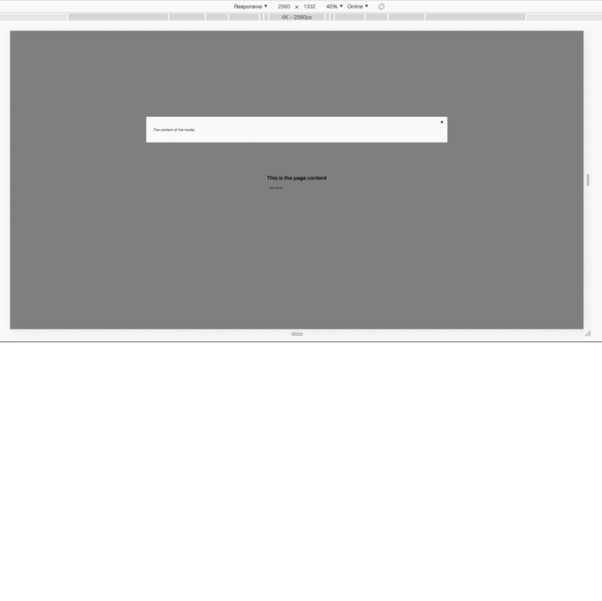
{ status && (<Modal closeModal={() => setStatus(false)}> <p>The content of the modal</p></Modal>)}
<div className="container">
<h2>This is the page content</h2>
<button onClick={() => setStatus(true)}>Open Modal</button>
</div>
</div>
);
}
export default App;
From the above, we rendered the Modal component conditionally.
Onclick of the button it changes the status of the modal and renders the modal component.
The function to close the modal is then passed as props into the Modal component as closeModal.
FINAL OUTPUT

Top comments (2)
The modal is a little shifted to the right.
Flex justify and align can sort this out.
Nice post.
Thanks, actually didn't use flex in my implementation.
did the job.margin: 15% auto; on the content