Last month I wrote some musings on default browser behaviours. When it comes to all the tasks that browsers do for us, the most fundamental is taking a URL, fetching its contents and giving us the results. As part of that process, browsers also show us the URL of the page currently loaded in a tab or window.
But even at this fundamental level, there are some differences from browser to browser.
Safari only shows you the domain name—and any subdomain names—by default. It looks like nice and tidy, but it obfuscates what page you’re on (until you click on the domain name). This is bad.
Chrome shows you the full URL, nice and straightforward. This is neutral.
Firefox, like Chrome, shows you the full URL, but with a subtle difference. The important part of the URL—usually the domain name—is subtly highlighted in a darker shade of grey. This is good.
The reason I say that what it highlights is usually the domain name is because what it actually highlights is eTLD+1.
The what now?
Well, if you’re looking at a page on adactio.com, that’s the important bit. But what if you’re looking at a page on adactio.github.io? The domain name is important, but so is the subdomain.
It turns out there’s a list out there of which sites and top level domains allow registrations like this. This is the list that Firefox is using for its shading behaviour in displaying URLs.
Safari, by the way, does not use this list. These URLs are displayed identically in Safari, the phisherman’s friend:
- example.com
- example.github.io
- github.example.com
Whereas Firefox displays them as:
- example.com
- example.github.io
- github. example.com
I learned all this from Jake on a recent edition of HTTP 203. Nicolas Hoizey has writen a nice little summary.
Jake acknowledges that what Apple is doing is shi … suboptimal, what Firefox is doing is good, and then puts forward an idea for what Chrome could do. (But please note that this is Jake’s personal opinion; not an official proposal from the Chrome team.)
There’s some prior art here. It used to be that, if your SSL certificate included extended validation, the name would be shown in green next to the padlock symbol. So while my website—which uses regular SSL from Let’s Encrypt—would just have a padlock, Medium—which uses EV SSL—would have a padlock and the text “A Medium Corporation”.
Extended validation wasn’t quite the bulletproof verification it was cracked up to be. So browsers don’t use that interface pattern any more.
Jake suggests repurposing this pattern for all URLs. Pull out the important bit—eTLD+1—and show it next to the padlock.
I like this. The full URL is still displayed. This proposal is more of an incremental change. An enhancement that is applied progressively, if you will.
I also like that it builds on existing interface patterns—Firefox’s URL treatment and the deprecated treatment of EV certs. In fact, I think the first step for Chrome should be to match Firefox’s current behaviour, and then go further with something like Jake’s proposal.
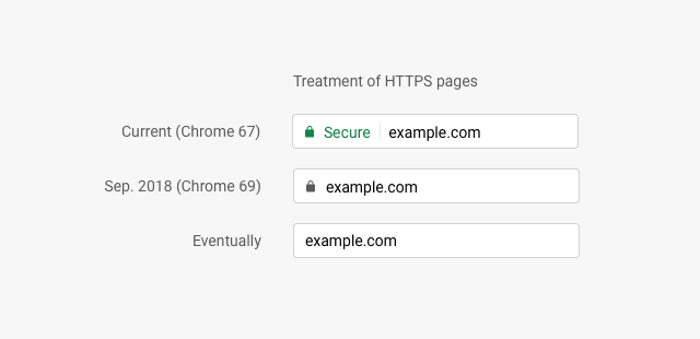
This kind of gradual change was exactly what Chrome did with displaying https and http domains.
Jake mentions this in the video
We’ve already seen that you have to take small steps here, like we did with the
httpschange.
There’s a fascinating episode of the Freakonomics podcast called In Praise of Incrementalism. I’ve huffduffed it.
In Praise of Incrementalism (Ep. 264) - Freakonomics Freakonomics on Huffduffer
I’m a great believer in the HTML design principle, Evolution Not Revolution:
It is better to evolve an existing design rather than throwing it away.
I’d love to see Chrome take the first steps to Jake’s proposal by following Firefox’s lead.
Then again, I’d love it if Chrome followed Firefox’s lead in implementing subgrid.


Top comments (0)