
This tutorial is the fourth and final part of our Camping Spots Finder App UI clone using React Native. In the previous part, we successfully implemented the Settings screen with various UI sections. This tutorial is the continuation of where we left off in the last part. So, it is suggested to go through the previous parts for the overall insight and development of this project.
As mentioned in the previous parts, this tutorial series was inspired by React native real estate template that enables us to build fully functional ready to deploy mobile applications that anyone can use to build their own React Native applications. And, this fourth part is also the continuation of coding implementations and designs from the Youtube video tutorial by React UI Kit for the Camping Spots Finder App clone.
In this final part of our tutorial series, we are going to implement the marker which will show the camping spots in the map view. But first, we have some incomplete business in our settings screen which is to include icons in the group buttons of Type section. Then, we will move to implement the Map marker. After that, we will show the marker on the map based on the header tabs.
So, let us begin!!
Adding Icons to Type section
In this step, we are going to add icons to the group buttons of the Type section in the settings screen. We have imported the required icon package beforehand in the earlier tutorials. Here we are going to use some of the packages which provided us with suitable icons. In the Type section, we just added the Text component containing the text in the group buttons. Now, we are going to add some icons above the Text component. In the first group button, we are going to add two icons from the Foundation and FontAwesome icons package wrapped by View component with an inline style. In the second and third group buttons, we are going to add single icons each using the Foundation icon package in second and FontAwesome in the third. For that, we need to use the code from the following code snippet:
         <View style={styles.section}>
            <View>
              <Text style={styles.title}>Type</Text>
            </View>
            <View style={styles.group}>
             <TouchableOpacity
                style={[styles.button, styles.first, type == 'all' ? styles.active : null]}
                onPress={() => this.setState({ type: 'all' })}
              >
                <View style={{ flexDirection: 'row', }}>
                  <Foundation name="mountains" size={24}  />
                  <FontAwesome name="truck" size={24} />
                </View>
                <Text style={[styles.buttonText, type == 'all' ? styles.activeText : null]}>All</Text>
              </TouchableOpacity>
              <TouchableOpacity
                style={[styles.button, type == 'tent' ? styles.active : null]}
                onPress={() => this.setState({ type: 'tent' })}
              >
                <Foundation name="mountains" size={24}  />
                <Text style={[styles.buttonText, type == 'tent' ? styles.activeText : null]}>Tenting</Text>
              </TouchableOpacity>
              <TouchableOpacity
                style={[styles.button, styles.last, type == 'rv' ? styles.active : null]}
                onPress={() => this.setState({ type: 'rv' })}
              >
                <FontAwesome name="truck" size={24} />
                <Text style={[styles.buttonText, type == 'rv' ? styles.activeText : null]}>RV Camping</Text>
              </TouchableOpacity>
             </View>
          </View>
Hence, we get the following result in the emulator screen:

As we can see, we have got the icons in the group buttons of the Type section. But these icons are not configured with active style. That is why they appear with the default black color. Now, we need to configure these icons with active style so that the button along with its icon changes color when selected.
Switching color based on active Type
Here, we are going to switch the color of icons on the basis of the active button. For that, we need to define a function that handles the active type of the button called activeType(). This activeType() function will take on a key parameter which will be set to selected type when called. This key is then assigned to the type state that we defined in the earlier tutorial. The implementation of the function is provided in the code snippet below:
const activeType = (key) => type === key;
Now, we need to configure the styles in the Type section template based on the activeType() function as shown in the code snippet below:
         <View style={styles.group}>
              <TouchableOpacity
                style={[styles.button, styles.first, activeType('all') ? styles.active : null]}
                onPress={() => this.setState({ type: 'all' })}
              >
                <View style={{ flexDirection: 'row', }}>
                  <Foundation name="mountains" size={24} color={activeType('all') ? '#FFF' : '#FF7657' } />
                  <FontAwesome name="truck" size={24} color={activeType('all') ? '#FFF' : '#FFBA5A' } />
                </View>
                <Text style={[styles.buttonText, activeType('all') ? styles.activeText : null]}>All</Text>
              </TouchableOpacity>
              <TouchableOpacity
                style={[styles.button, activeType('tent') ? styles.active : null]}
                onPress={() => this.setState({ type: 'tent' })}
              >
                <Foundation name="mountains" size={24} color={activeType('tent') ? '#FFF' : '#FF7657'} />
                <Text style={[styles.buttonText, activeType('tent') ? styles.activeText : null]}>Tenting</Text>
              </TouchableOpacity>
              <TouchableOpacity
                style={[styles.button, styles.last, activeType('rv') ? styles.active : null]}
                onPress={() => this.setState({ type: 'rv' })}
              >
                <FontAwesome name="truck" size={24} color={activeType('rv') ? '#FFF' : '#FFBA5A'}/>
                <Text style={[styles.buttonText, activeType('rv') ? styles.activeText : null]}>RV Camping</Text>
              </TouchableOpacity>
            </View>
Therefore, we can see that the icon components that we added have been configured with a color style based on activeType() function. Moreover, all the dynamic styles that will represent the active and inactive state of the button are configured based on activeType() button. This will switch the color of the icon as well as a button when they are active. Hence, we get the following result as shown in the emulator screenshot below:

As we can see, the button along with its icon in the Type section changes color when they are in the active state. Therefore, this completes the overall implementation of the settings screen in our Camping Spots Finder app UI clone.
Now, we are going to move on to our Campings screen again. In the Campings screen, we have already set the MapView component which displays the map based on assigned co-ordinates. Now, we are going to add some markers to the map in order to display the Camping spots on the map. So, let us move to the Campings screen now.
Implementing Map Marker
Now, we are going back to our Campings screen in order to implement the marker in our MapView component. Since we have two camping sites on the list section, we are going to put on two markers on the map which represents their locations. But first, we need to include some addition location coordinate data into our campings array that we defined in earlier tutorials. We are going to include the latitude and longitude value of our camping sites into each object of our campings array as shown in the code snippet below:
const campings = [
      {
        id: 1,
        type: 'rv',
        name: 'Camping Paradise',
        description: 'Popular spot for trekkers.',
        rating: 4.9,
        distance: 2.9,
        price: 'Free',
        image: 'https://images.unsplash.com/photo-1525811902-f2342640856e?fit=crop&w=900&h=600&q=130',
        latlng: {
          latitude: 37.79335,
          longitude: -122.4424,
        }
      },
      {
        id: 2,
        type: 'tent',
        name: 'Lake Florida',
        description: 'This is for all sunset lovers.',
        rating: 4.9,
        distance: 2.9,
        price: 'Free',
        image: 'https://images.unsplash.com/photo-1506535995048-638aa1b62b77?fit=crop&w=900&h=600&q=130',
        latlng: {
          latitude: 37.78865,
          longitude: -122.4324,
        }
      },
    ];
Importing Marker component
Now, we are going to import the Marker component provided by the react-native-maps package. The Marker component is a method provided by MapView component that we imported from the react-native-maps package. Now, we are going to import the Marker component as shown in the code snippet below:
import MapView from 'react-native-maps';
const { Marker } = MapView;
Now, we need to add this Marker component to the MapView component that we defined in earlier tutorials inside the renderMap() method.
Adding Marker
Here, we are going to add the Marker component to the map. For that, the MapView component needs to wrap the Marker component inside the renderMap() method. The Marker component takes the prop coordinate value which we will set to the location values we defined in the campings array. The overall implementation of Marker in the MapView is provided in the code snippet below:
renderMap(){
    return(
      <View style={styles.map}>
          <MapView
            style={{flex: 1, height : height * 0.5, width}}
            initialRegion={{
              latitude: 37.78825,
              longitude: -122.4324,
              latitudeDelta: 0.0922,
              longitudeDelta: 0.0421,
            }}
          >
            {campings.map(marker => (
              <Marker
                key={`marker-${marker.id}`}
                coordinate={marker.latlng}
              />
            ))}
          </MapView>
      </View>
    )
}
Here, we use the map() method which we can apply to any array to iterate through all its items. We need to attach map() function to campings array which will iterate through all the items inside the campings array which in this case are two objects. Then, the map() function will return a Marker template with the coordinate value from the campings array object. The Marker component is assigned a key prop in order to identify each Marker component uniquely.
Hence, we will get the following result in our emulator screen:

As we can see, there are two location marker icons on the map. These location markers represent the location of the two camping sites in our campings array.
Now, we are going to change the location marker icons based on the type of the camping site. Unique marker icons will represent the unique camping sites based on their type.
Changing Marker Icons
Here, we are going to change our location marker icons to unique icons based on the type of camping site on the map. For that, we need to import some addition icon packages to the already imported icons package. Therefore, the icon packages that we need to import are provided in the code snippet below:
import { FontAwesome , Foundation, Ionicons, SimpleLineIcons} from '@expo/vector-icons';
Here, we have included the Foundation Icon package which will we make use of while defining the marker icons according to the type. Now, in the renderMap() method, we are going to define a function called campingMarker() which will return the appropriate marker icon based on the type of camping site. There are two types of camping sites as of now namely ‘rv’ and ‘tent’. The ‘rv’ type is for the RV campings where we can camp with your RV. The ‘tent’ type is for the tent camping where we can build a tent and camp. The implementation of the campingMarker() function is provided in the code snippet below:
renderMap() {
    const campingMarker = ({type}) => (
      <View style={[styles.marker, styles[`${type}Marker`]]}>
        {type === 'rv' ?
          <FontAwesome name="truck" size={18} color="#FFF" />
          : <Foundation name="mountains" size={18} color="#FFF" />
        }
      </View>
    )
Here, the campingMarker() function takes a parameter called type which will represent the type of camping site. And based on the type value, it will return the appropriate marker icon. We can also see some styles bound to the View component inside the function. The required styles are provided in the code snippet below:
 marker: {
    width: 40,
    height: 40,
    borderRadius: 40,
    justifyContent: 'center',
    alignItems: 'center',
    borderWidth: 1,
    borderColor: '#FFF',
  },
  rvMarker: {
    backgroundColor: '#FFBA5A',
  },
  tentMarker: {
    backgroundColor: '#FF7657',
  },
Adding the icon to Marker
Now, we need to call the campingMarker() function inside of the Marker component as shown in the code snippet below:
return(
      <View style={styles.map}>
          <MapView
            style={{flex: 1, height : height * 0.5, width}}
            showsMyLocationButton
            initialRegion={{
              latitude: 37.78825,
              longitude: -122.4324,
              latitudeDelta: 0.0922,
              longitudeDelta: 0.0421,
            }}
          >
            {this.state.campings.map(marker => (
              <Marker
                key={`marker-${marker.id}`}
                coordinate={marker.latlng}
              >
                {campingMarker(marker)}
              </Marker>
            ))}
          </MapView>
      </View>
    )
Here, we have called the campingMarker() method inside the Marker component with a parameter called marker assigned to it. The marker parameter contains a single object in our campings array which represents the whole data of the camping spot.
Note that, we have also included the showsMyLocationButton prop in the MapView component. If showsMyLocationButton is false then, it hides the button to move the map to the current user’s location.
Hence, we get the following result in our emulator screen:

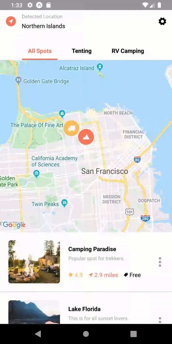
As we can see, we have got the location marker on the screen with unique icons for both ‘rv’ type and ‘tent’ type. Hence, we have successfully completed the implementation of unique Map Marker on the map of our Camping Spot Finder app UI clone.
But wait, it’s not over yet. We need to implement one more thing. That is to change the location markers on the map based on the header tabs that we set up in the first tutorial.
Showing Markers based on header tabs
We might have remembered that we implemented the header tabs section with tab buttons in our first part of this tutorial series. There were three header tab buttons called ‘All Spots’, ‘Tenting’ and ‘RV Camping’ which we can see above in the screenshots of campings screen as well. Now, we need to show those map markers based on these 3 tab buttons. The result should be:
- ‘All Spots’ shows all the camping spots.
- ‘Tenting’ shows all the camping spots with type ‘tent’.
- ‘RV Campings’ shows all the camping spots with type ‘rv’.
For that, we need to define a new state called campings which will be set to the campings array that we defined earlier containing the camping spot object data. The state is to be defined as shown in the code snippet below:
state = {
    active : 'all',
    campings : campings
  }
Now, we need to include the campings array that from the state not from the original variable in the map() function returning Marker component as shown in the code snippet below:
          {this.state.campings.map(marker => (
              <Marker
                key={`marker-${marker.id}`}
                coordinate={marker.latlng}
              >
                {campingMarker(marker)}
              </Marker>
            ))}
Here, the marker icons in the location will change based on the value in the campings state.
Handling the display of markers
Next, we need to handle the display of marker icons based on the header tab buttons. We might have remembered that we have defined the function called handleTab() which takes in the tab key value in order to change the style of the active tab. Now, we need to make some additional configurations to the handleTab() function show that it will handle the change of active tab button style as well as display the appropriate markers in the map. For that, we need to use the code from the following code snippet:
handleTab = (tabKey) => {
    let newCampings = campings;
    if(tabKey != 'all'){
      newCampings = campings.filter(camping => camping.type == tabKey)
    }
    this.setState({ active: tabKey, campings : newCampings});
  }
Here, we have assigned a new variable named newCampings to the original campings array. Then, we have filtered the original campings array using the filter() array function and assigned it to the newCampings variable based on the tabKey value. Now, if the tabKey is not equals to ‘all’ type then the campings array is filtered based on tabKey value and returned to the newCampings array else newCampings array is equal to the original campings array data. Lastly, we assign a change of state using the setState function.
Hence, we will get the following result in our emulator screen:
As we can see, the location markers in the map change as we click on the header tab buttons. Finally, we have successfully completed the implementation of Map Markers in our Camping Spots Finder App UI clone.
Conclusion
This tutorial is the fourth and final part of the Camping Spot Finder App UI clone tutorial series. In this part, we continued from where we left off in the third part of this tutorial series. In the part of the tutorial, we first learned how to add icons to the button and switch the icon styles based on the active button. Then, we got detailed insight on how to implement the Marker component from the react-native-maps package in order to show location marker on the map. We also got to learn how to display a unique icon as a marker on the map. And lastly, we got the guidance on how to change the location markers based on the active tab buttons.
This wraps up this final part of our Camping Spots Finder app UI clone tutorial series. In doing so, we have finally completed the overall tutorial for the cloning of Camping Spots Finder app UI.
Hope you enjoyed this tutorial series!! See you in the next one!!
The post Camping Spots Finder App UI Clone with React Native #4 : Map Marker appeared first on Kriss.
Disclosure
This post includes affiliate links; I may receive compensation if you purchase
products or services from different links provided in this article


Top comments (0)