
This tutorial is the third part of our Camping Spots Finder App UI clone using React Native. In the previous part, we successfully implemented the List section along with the navigation to the settings screen. This tutorial is the continuation of where we left off in the last part. So, it is suggested to go through the previous parts for full-on insight and development of the overall project.
As mentioned in the previous parts, this inspiration for this tutorial series came from React native real estate template that enables us to build fully functional ready to deploy mobile applications that anyone can use to build their own React Native applications. And, this third part is also the continuation of coding implementations and designs from the Youtube video tutorial by React UI Kit for the Camping Spots Finder App clone.
In this third part of this tutorial series, we are going to implement the settings screen with all the required UI sections. The required sections include a header with navigations and group sections with buttons and switch. We have already implemented the navigation to settings screens whose file is Settings.js. First, we are going to configure it then build the settings screen UI, section by section.
So, let us begin!!
Importing required Packages
First of all, we are going to import all the packages that we are going to need in order to implement the overall UI of the settings screen. The packages that we need to import are provided in the code snippet below:
import {React , Component} from 'react''
import {
  ScrollView,
  StyleSheet,
  Text,
  TouchableOpacity,
  View,
  Dimensions,
  SafeAreaView
} from 'react-native';
import { Ionicons, Foundation, FontAwesome } from '@expo/vector-icons';
Here, we import some components from the react-native package. And also import some Icons packages that we are going to use from the vector-icons package provided by the expo.
Configuring Settings file
Here, we are going to implement the base coding template for the settings screen. We also need to make use of Dimensions component in order to initialize the height and width constant to the overall screen dimension. Then, we are going to set up a class called Settings which extends to Component module as shown in the code snippet below:
const { width, height } = Dimensions.get('screen');
class Settings extends React.Component {
  static navigationOptions = {
    header: null,
  };
  render(){
    return (
      <View></View>
    );
  }
}
export default Settings;
Here, the navigationOptions object with header configuration is set to null because we are going to implement a custom header here.
Now, we need to separate the different sections that we need to implement in the settings screen.
Settings up different UI sections of the Settings screen
Here, we are going to set up different UI sections for the settings screen because it will be easy for us to implement one section at a time as we progress. We will use the renderHeader() function as in the Camping screen which will return the custom header template. Then, we will separate the rest of the body section of settings screen inside the render() method of Settings.js file as shown in the code snippet below:
renderHeader(){
    return(
      <View>
        <View style={styles.header}>
          <View style={{flex : 1}}>
            <Text></Text>
          </View>
          <View style={{flex : 1}}>
            <Text>Filter</Text>
          </View>
          <View style={{flex : 1}}>
            <Text></Text>
          </View>
        </View>
      </View>
    )
  }
  render(){
    return (
      <SafeAreaView style={styles.container}>
        {this.renderHeader()}
        <ScrollView style={styles.container}>
          <Text>Sort By</Text>
          <Text>Type</Text>
          <Text>Price</Text>
          <Text>More Options</Text>
        </ScrollView>
      </SafeAreaView>
    );
  }
Here, we have some View components wrapping Text component in our header template inside renderHeader() function. The parent component in our render() function is SafeAreaView which enables us to implement the app screen within the proper boundaries of the device screen. We need to remember that SafeAreaView component only works for the iOS platform. So, in the Android platform, we need to add some additional styles. There are some styles bound to template components as well which is provided in the code snippet below:
const styles = StyleSheet.create({
  container: {
    flex: 1,
    backgroundColor: '#fff',
  },
  header: {
    flexDirection: 'row',
    alignItems: 'center',
    justifyContent: 'center',
    height: height * 0.1,
    width: width,
    paddingHorizontal: 14,
  },
});
Hence, we will get the following result in our emulator screen:

Implementing Header Section
We have already separated a section for the header at the top. In this step, we are going to implement the header section with View components that wrap the icons as well as text with some styles. We are going to implement this in renderHeader() function. The parent View component encloses three child View components. The first child View component has a flex style that wraps the TouchableOpacity component wrapping the Ionicons component with an icon. The second child View component with some inline flex styles will wrap a Text component and the third View component will also wrap a TouchableOpacity component as shown in the code snippet below:
renderHeader(){
    return(
      <View style={styles.header}>
        <View style={{ flex: 1 }}>
          <TouchableOpacity>
            <Ionicons name="md-arrow-back" size={24} />
          </TouchableOpacity>
        </View>
        <View style={{ flex: 1, alignItems: 'center' }}>
          <Text style={styles.title}>Filter</Text>
        </View>
        <View style={{ flex: 1, alignItems: 'flex-end' }}>
          <TouchableOpacity>
            <Ionicons name="ios-search" size={24} />
          </TouchableOpacity>
        </View>
      </View>
    )
  }
Here, we have required Ionicons component with icons and TouchableOpacity component makes them clickable. Since SafeAreaView component does not work in Android platform, we will have to add an additional style as shown in the code snippet below:
header: {
    marginTop : 20,           //in case of android
    flexDirection: 'row',
    alignItems: 'center',
    justifyContent: 'center',
    height: height * 0.1,
    width: width,
    paddingHorizontal: 14,
  },
As a result, we get a custom header in settings screen as shown in the screenshot below:

Adding navigation
Now, we are going to add the navigation back to our Campings screen in the icons that we set up in our header. Since, we have only a Campings screen other that settings screen, we are going to set the navigation to HoCme screen for both the icons. For that, we need to make use of navigate function provided by navigation prop in the onPress event of the TouchableOpacity component wrapping the icons as shown in the code snippet below:
renderHeader(){
    return(
      <View style={styles.header}>
        <View style={{ flex: 1 }}>
          <TouchableOpacity>
            <Ionicons name="md-arrow-back" size={24} onPress={() => this.props.navigation.navigate('Campings')} />
          </TouchableOpacity>
        </View>
        <View style={{ flex: 1, alignItems: 'center' }}>
          <Text style={styles.title}>Filter</Text>
        </View>
        <View style={{ flex: 1, alignItems: 'flex-end' }}>
          <TouchableOpacity>
            <Ionicons name="ios-search" size={24} onPress={() => this.props.navigation.navigate('Campings')} />
          </TouchableOpacity>
        </View>
      </View>
    )
  }
Hence, we will get the following result in our emulator screen:

Therefore, we have successfully completed the implementation of the header section in our settings screen. Now, we move on to the implementation of the body section of the settings screen.
Implementing Settings screen Body Sections
In this step, we are going to implement the different sections of the settings screen body, section by section. We have already separated four body sections in the earlier step in our render() function below the renderHeader() function. The sections that we are going to implement are Sort By, Type, Price, and More Options.
Separating Body Section Headers
Here, we are going to separate different sections for Sort By, Type, Price and More Options with implementing a header text for each one. For that, we are going to add View components inside the ScrollView component of the render() function which will wrap addition two child View components as shown in the code snippet below:
render(){
    return (
      <SafeAreaView style={styles.container}>
        {this.renderHeader()}
        <ScrollView style={styles.container}>
          <View style={styles.section}>
            <View>
              <Text style={styles.title}>Sort By</Text>
            </View>
            <View>
            </View>
          </View>
          <View style={styles.section}>
            <View>
              <Text style={styles.title}>Type</Text>
            </View>
            <View>
            </View>
          </View>
          <View style={styles.section}>
            <View>
              <Text style={styles.title}>Price</Text>
            </View>
            <View>
            </View>
          </View>
          <View style={styles.section}>
            <View>
              <Text style={styles.title}>More Options</Text>
            </View>
            <View>
            </View>
          </View>
        </ScrollView>
      </SafeAreaView>
    );
  }
Here, the View component wrapping the additional two View component has some styles bound to it. The first child View component is for the header text and the second child View component is for the group buttons which we will implement later. We have a Text component with some styles as well as text wrapped by the first View component. The styles that are included in the above code below are provided in the code snippet below:
  section: {
    flexDirection: 'column',
    marginHorizontal: 14,
    marginBottom: 14,
    paddingBottom: 24,
    borderBottomColor: '#EAEAED',
    borderBottomWidth: 1,
  },
  title: {
    fontSize: 18,
    marginVertical: 14,
  },
Hence, we will get the following result in our emulator screen:

Now, we have got different sections of the settings screen UI separated with section headers. Now, we are going to implement the different sections one by one starting with the More Options section.
Implementing the More Options section
Here, we are going to start with the implementation of the More Options section template. In this section, we will have some option text with a switch button on the right-hand side of the screen. So first, we need to import the Switch component from the react-native package as shown in the code snippet below:
import {
  ScrollView,
  StyleSheet,
  Text,
  TouchableOpacity,
  View,
  Dimensions,
  SafeAreaView,
  Switch
} from 'react-native';
Now, we are going to work on the second child View component which is placed below the first child View component containing the section headers. We are going to bind the View component with some styles that wraps the Text component as well as the Switch component as shown in the code snippet below:
          <View style={styles.section}>
            <View>
              <Text style={styles.title}>More Options</Text>
            </View>
            <View>
              <View style={styles.option}>
                <Text style={{ fontWeight: '500', }}>Show spots that are full</Text>
                <Switch/>
              </View>
              <View style={styles.option}>
                <Text style={{ fontWeight: '500', }}>Show only highly rated spots</Text>
                <Switch/>
              </View>
              <View style={styles.option}>
                <Text style={{ fontWeight: '500', }}>Show only Free Spots</Text>
                <Switch/>
              </View>
            </View>
          </View>
Here, the View component and Text component has some styles which is provided in the code snippet below:
option: {
    marginBottom: 14,
    flexDirection: 'row',
    justifyContent: 'space-between',
    alignItems: 'center',
}
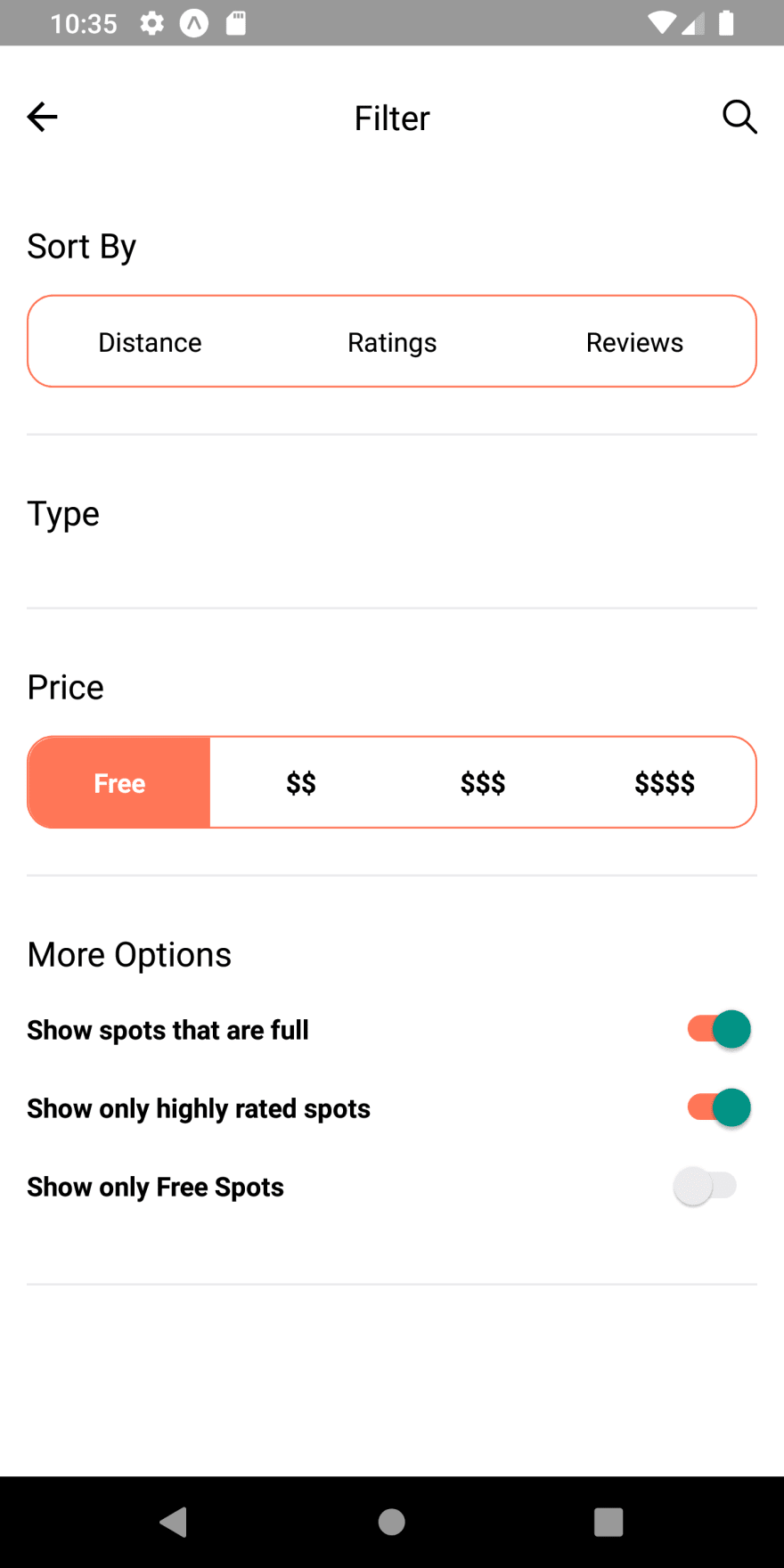
As a result, we get the More Options section with switch buttons as shown in the screenshot below:

As we can see, we have got the text as well as switch buttons at the right. But, these switch buttons do not work yet. We need to configure it with state and props in order to make it work properly.
Configuring Switch buttons
Here, we are going to configure the switch button with the state, props, and events in order to make it work properly. For that, we need to set the state variable for each switch button as shown in the code snippet below:
state = {
    option_full: true,
    option_rated: true,
    option_free: false,
  }
render(){
    const {option_free, option_full, option_rated} = this.state;
Here, we have set three state variables for three switch buttons which are initialized to constants inside the render() function. These three states namely option_full, option_rated and option_free are used to handle the on and off state of switch buttons. The Switch component provides a prop called value which is set to appropriate state value. Then, we need to change the state of each state variables as we click on the switch button as shown in the code snippet below:
          <View style={styles.section}>
            <View>
              <Text style={styles.title}>More Options</Text>
            </View>
            <View>
              <View style={styles.option}>
                <Text style={{ fontWeight: '500', }}>Show spots that are full</Text>
                <Switch
                    value={option_full}
                    trackColor={{false: "#EAEAED", true: "#FF7657"}}
                    onValueChange={() => this.setState({ option_full: !option_full })}
                />
              </View>
              <View style={styles.option}>
                <Text style={{ fontWeight: '500', }}>Show only highly rated spots</Text>
                <Switch
                   value={option_rated}
                   trackColor={{false: "#EAEAED", true: "#FF7657"}}
                   onValueChange={() => this.setState({ option_rated: !option_rated })}
                />
              </View>
              <View style={styles.option}>
                <Text style={{ fontWeight: '500', }}>Show only Free Spots</Text>
                <Switch
                   value={option_free}
                   trackColor={{false: "#EAEAED", true: "#FF7657"}}
                   onValueChange={() => this.setState({ option_free: !option_free })}
                />
              </View>
            </View>
          </View>
Here, the onValueChange event of the Switch component is initialized with a state change method that changes the state every time the switch is clicked. The trackColor prop of the Switch component allows us to configure the color of the switch according to ON or OFF state in reference to a true or false value of the switch.
Hence, we will get the following result in our emulator screen: 
As we can see, we have successfully implemented the More Options section with working switch buttons. Now, we are going to implement the price section of our settings screen body.
Implementing Price Section
Here, we are going to implement the Price section of our settings screen body. In the price section, we will have group buttons with text which will emphasize the price value as in the actual app. We are going to work with the second child View component just below the first child View component containing the price section header.
First, we are going to implement the group buttons. The second child View component is integrated with some styles. Then, it wraps the TouchableOpacity component with some styles which in turn wraps the Text component for button text as shown in the code snippet below:
           <View style={styles.section}>
            <View>
              <Text style={styles.title}>Price</Text>
            </View>
            <View style={styles.group}>
              <TouchableOpacity style={styles.button}>
                <Text>Free</Text>
              </TouchableOpacity>
              <TouchableOpacity style={styles.button}>
                <Text>$$</Text>
              </TouchableOpacity>
              <TouchableOpacity style={styles.button}>
                <Text>$$$</Text>
              </TouchableOpacity>
              <TouchableOpacity style={styles.button}>
                <Text>$$$$</Text>
              </TouchableOpacity>
            </View>
          </View>
The styles which are assigned to View and TouchableOpacity component in above code snippet is provided in the code snippet below:
  group: {
    flexDirection: 'row',
    borderRadius: 14,
    borderWidth: 1,
    borderColor: '#FF7657',
    justifyContent: 'space-between',
  },
  button: {
    flex: 1,
    padding: 14,
    alignContent: 'center',
    alignItems: 'center',
  },
Hence, we get the following result in our emulator screen:

As we can see, we have got the group buttons in the price section. But, these group buttons are not clickable. For that, we need to configure the group button with state variables to set the active group button.
Configuring Active group button for Price section
Here, we are going to configure the group buttons in order to make it clickable and show the active button among the group buttons. For that, we need to set the state called pricewhich will handle the active state of each button in group buttons as shown in the code snippet below:
state = {
    price: 'free',
    option_full: true,
    option_rated: true,
    option_free: false,
  }
render(){
    const {
      option_free,
      option_full,
      option_rated,
      price,
    } = this.state;
Now, we need to set the style to the TouchableOpacity and Text components according to the price state value. Then, we need to change the price state value according to the button that will be clicked. For that, we need to trigger the state change function inside the onPress event of the TouchableOpacity component as shown in the code snippet below:
            <View style={styles.group}>
              <TouchableOpacity
                style={[styles.button, styles.first, price === 'free' ? styles.active : null]}
                onPress={() => this.setState({ price: 'free' })}
              >
                <Text style={[styles.buttonText, price === 'free' ? styles.activeText : null]}>Free</Text>
              </TouchableOpacity>
              <TouchableOpacity
                style={[styles.button, price === '$$' ? styles.active : null]}
                onPress={() => this.setState({ price: '$$' })}
              >
                <Text style={[styles.buttonText, price === '$$' ? styles.activeText : null]}>$$</Text>
              </TouchableOpacity>
              <TouchableOpacity
                style={[styles.button, price === '$$$' ? styles.active : null]}
                onPress={() => this.setState({ price: '$$$' })}
              >
                <Text style={[styles.buttonText, price === '$$$' ? styles.activeText : null]}>$$$</Text>
              </TouchableOpacity>
              <TouchableOpacity
                style={[styles.button, styles.last, price === '$$$$' ? styles.active : null]}
                onPress={() => this.setState({ price: '$$$$' })}
              >
                  <Text style={[styles.buttonText, price === '$$$$' ? styles.activeText : null]}>$$$$</Text>
              </TouchableOpacity>
            </View>
Here, we have an active style for the active button when pressed. The active style is based on the value of the price state. As we click on buttons, the value of price state changes and according to the change in its value, the active button and text style is set to appropriate TouchableOpacity and Text component. The active button and text styles are provided below:
  buttonText: {
    textAlign: 'center',
    fontWeight: '500',
  },
  active: {
    backgroundColor: '#FF7657',
  },
  activeText: {
    color: '#FFF'
  },
  first: {
    borderTopLeftRadius: 13,
    borderBottomLeftRadius: 13,
  },
  last: {
    borderTopRightRadius: 13,
    borderBottomRightRadius: 13,
  },
Hence, we will get the following result in our emulator screen:

As we can see, we have successfully implemented the price section along with working group buttons. Now, we are going to implement the Sort By section which is quite similar to the price section.
Implementing Sort By Section
Here, we are going to implement the Sort By section of our settings screen body. In the Sort By section, we will have group buttons with text which will emphasize the sort by the filter as in the actual app. We are going to work with the second child View component just below the first child View component containing the Sort by section header.
First, we are going to implement the group buttons. The second child View component is integrated with some styles. Then, it wraps the TouchableOpacity component with some styles which in turn wraps the Text component for button text as shown in the code snippet below:
           <View style={styles.section}>
            <View>
              <Text style={styles.title}>Sort By</Text>
            </View>
            <View style={styles.group}>
              <TouchableOpacity style={styles.button}>
                <Text styles={styles.buttonText}>Distance</Text>
              </TouchableOpacity>
              <TouchableOpacity style={styles.button}>
                <Text styles={styles.buttonText}>Ratings</Text>
              </TouchableOpacity>
              <TouchableOpacity style={styles.button}>
                <Text styles={styles.buttonText}>Reviews</Text>
              </TouchableOpacity>
            </View>
          </View>
The styles which are assigned to View and TouchableOpacity component in above code snippet is already available in the styles constant of StyleSheet component.
Hence, we get the following result in our emulator screen:
As we can see, we have got the group buttons in the Sort By section. But, these group buttons are not clickable. For that, we need to configure the group button with state variables to set the active group button.
Configuring Active group button for Sort By section
Here, we are going to configure the group buttons in order to make it clickable and show the active button among the group buttons. For that, we need to set the state called sort which will handle the active state of each button in group buttons as shown in the code snippet:
state = {
    sort: 'distance',
    price: 'free',
    option_full: true,
    option_rated: true,
    option_free: false,
  }
render(){
    const {
      option_free,
      option_full,
      option_rated,
      price,
      sort
    } = this.state;
Now, we need to set the style to the TouchableOpacity and Text components according to the sort state value. Then, we need to change the sort state value according to the button that will be clicked. For that, we need to trigger the state change function inside the onPress event of the TouchableOpacity component as shown in the code snippet below:
            <View style={styles.group}>
              <TouchableOpacity
                style={[styles.button, styles.first, sort === 'distance' ? styles.active : null]}
                onPress={() => this.setState({ sort: 'distance' })}
              >
                <Text style={[styles.buttonText, sort === 'distance' ? styles.activeText : null]}>Distance</Text>
              </TouchableOpacity>
              <TouchableOpacity
                style={[styles.button, sort === 'ratings' ? styles.active : null]}
                onPress={() => this.setState({ sort: 'ratings' })}
              >
                <Text style={[styles.buttonText, sort === 'ratings' ? styles.activeText : null]}>Ratings</Text>
              </TouchableOpacity>
              <TouchableOpacity
                style={[styles.button, styles.last, sort === 'reviews' ? styles.active : null]}
                onPress={() => this.setState({ sort: 'reviews' })}
              >
                <Text style={[styles.buttonText, sort === 'reviews' ? styles.activeText : null]}>Reviews</Text>
              </TouchableOpacity>
            </View>
Here, we have an active style for the active button when pressed. The active style is based on the value of the sort state. As we click on buttons, the value of sort state changes and according to the change in its value, the active button and text style is set to appropriate TouchableOpacity and Text component.
Hence, we will get the following result in our emulator screen:

As we can see, we have successfully implemented the Sort By section along with working group buttons. Now, we are going to implement the Type section which is quite similar to the price and Sort By section.
Implementing Type Section
Here, we are going to implement the Type By section of our settings screen body. In the Type section, we will have group buttons with text which will emphasize the type of landscape in the actual app. We are going to work with the second child View component just below the first child View component containing the Type section header.
First, we are going to implement the group buttons. The second child View component is integrated with some styles. Then, it wraps the TouchableOpacity component with some styles which in turn wraps the Text component for button text as shown in the code snippet below:
          <View style={styles.section}>
            <View>
              <Text style={styles.title}>Type</Text>
            </View>
            <View style={styles.group}>
              <TouchableOpacity style={styles.button}>
                <Text styles={styles.buttonText}>All</Text>
              </TouchableOpacity>
              <TouchableOpacity style={styles.button}>
                <Text styles={styles.buttonText}>Testing</Text>
              </TouchableOpacity>
              <TouchableOpacity style={styles.button}>
                <Text styles={styles.buttonText}>RV Camping</Text>
              </TouchableOpacity>
            </View>
          </View>
The styles which are assigned to View and TouchableOpacity component in above code snippet is already available in the styles constant of StyleSheet component.
Hence, we get the following result in our emulator screen:
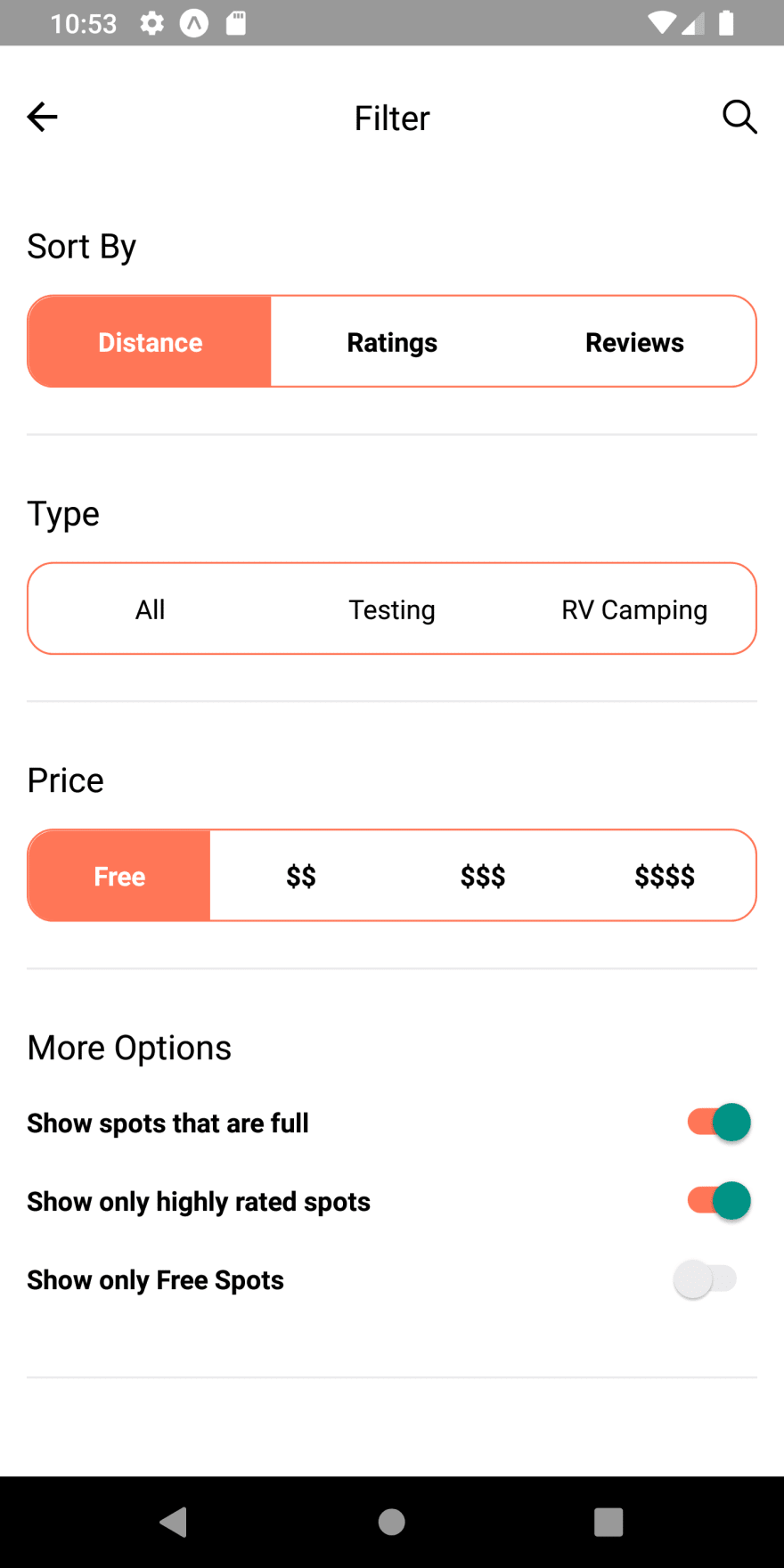
As we can see, we have got the group buttons in the Type section. But, these group buttons are not clickable. For that, we need to configure the group button with state variables to set the active group button.
Configuring Active group button for Type section
Here, we are going to configure the group buttons in order to make it clickable and show the active button among the group buttons. For that, we need to set the state called type which will handle the active state of each button in group buttons as shown in the code snippet:
  state = {
    sort: 'distance',
    type: 'all',
    price: 'free',
    option_full: true,
    option_rated: true,
    option_free: false,
  }
  render(){
    const {
      option_free,
      option_full,
      option_rated,
      price,
      sort,
      type
Now, we need to set the style to the TouchableOpacity and Text components according to the type state value. Then, we need to change the type state value according to the button that will be clicked. For that, we need to trigger the state change function inside the onPress event of the TouchableOpacity component as shown in the code snippet below:
           <View style={styles.group}>
             <TouchableOpacity
                style={[styles.button, styles.first, type == 'all' ? styles.active : null]}
                onPress={() => this.setState({ type: 'all' })}
              >
                <Text style={[styles.buttonText, type == 'all' ? styles.activeText : null]}>All</Text>
              </TouchableOpacity>
              <TouchableOpacity
                style={[styles.button, type == 'tent' ? styles.active : null]}
                onPress={() => this.setState({ type: 'tent' })}
              >
                <Text style={[styles.buttonText, type == 'tent' ? styles.activeText : null]}>Tenting</Text>
              </TouchableOpacity>
              <TouchableOpacity
                style={[styles.button, styles.last, type == 'rv' ? styles.active : null]}
                onPress={() => this.setState({ type: 'rv' })}
              >
                <Text style={[styles.buttonText, type == 'rv' ? styles.activeText : null]}>RV Camping</Text>
              </TouchableOpacity>
            </View>
Here, we have an active style for the active button when pressed. The active style is based on the value of the type state. As we click on buttons, the value of type state changes and according to the change in its value, the active button and text style is set to appropriate TouchableOpacity and Text component.
Hence, we will get the following result in our emulator screen:

As we can see, we have successfully implemented the Type section along with working group buttons.
With this, we have come to an end of this part of our tutorial series to implement the Camping Spots Finder App UI clone. Finally, we have successfully completed the implementation of different sections of settings screen UI.
Conclusion
This tutorial is the third part of the Camping Spot Finder App UI clone tutorial series. In this part, we continued from where we left off in the second part of this tutorial series. In the part of the tutorial, we first learned how to create different UI sections in the app screen. We also learned how to implement the switch buttons using Switch component from the react-native package. And, we also got step by step guidance on how to implement the group buttons and set its active state.
In the next part, we are going to add the icons to the Type section as well as add the marker in our Map View in our Camping Spots Finder App UI clone.
So, Stay Tuned folks!!
The post Camping Spots Finder App UI Clone with React Native #3 : Settings Screen appeared first on Kriss.
Disclosure
This post includes affiliate links; I may receive compensation if you purchase
products or services from different links provided in this article


Top comments (0)