
I joined a new company a few months ago after completing my degree in computer science. Job hunting wasn't a walk in the park but let's leave that story for another day. So I got a hand full of offers after consistently applying and interviewing with a lot of companies, after which I chose one company whose vision is in line with mine. During my onboarding, I was shown the stacks used at the company, I was familiar with all the technologies except one-styled components. I learnt it in a few weeks before I started working on projects. I'd like to say I didn't like it at first but I started falling in love with it after discovering more about it and I'll like to share all I know about this beautiful technology with you.
Prerequisites
To fully understand and enjoy this article, you'll need to have basic knowledge of the following technologies:
- CSS
- TypeScript
- Reactjs
- Nextjs
Let's head straight into it,
Installing Nextjs
npx create-next-app@latest --typescript my-project
Type this out into your vscode terminal and answer the questions that will be asked in the terminal to complete the installation.
After a successful installation, run the command below:
npm run dev
This command will serve the site for you on localhost port 3000, open the site in your browser with this url(http://localhost:3000/).
When you open the site, you'll see some default content on there, follow the following steps to clean up everything.
Delete the styles folder
Go into the file named _app.tsx and delete this line:
import '@/styles/globals.css'Go into the file named index.tsx, clear everthing and add the following code.
import React from 'react'

function Home() {
  return (
    <div>Home</div>
  )
}

export default Home
When you go into your browser after all this, you'll see Home written on the page. This shows you have installed Nextjs and cleaned up all default content, congratulations🎉🎉.
Installing styled-components
Run the following npm commands one after the other to install the necessary packages required for styled-components to work.
npm install styled-components
npm install --save-dev @types/styled-components
npm install --save-dev babel-plugin-styled-components
After a successful installation of the packages, create a file at the root of your application with the name .babelrc and paste the following code into it.
{
  "env": {
    "development": {
      "presets": ["next/babel"],
      "plugins": [
        [
          "styled-components",
          {
            "ssr": true,
            "displayName": true
          }
        ]
      ]
    },
    "production": {
      "presets": ["next/babel"],
      "plugins": [
        [
          "styled-components",
          {
            "ssr": true,
            "displayName": false
          }
        ]
      ]
    }
  }
}
Your first styled-components code
I know that was a lot of setting up we did, now brace yourself up because it's time for us to start using styled-components.
Follow the following steps:
Create a folder called components in your src folder.
Create a file called Paragraph.styled.tsx in the components folder.
In the newly created file, write the following code.
import styled from "styled-components";
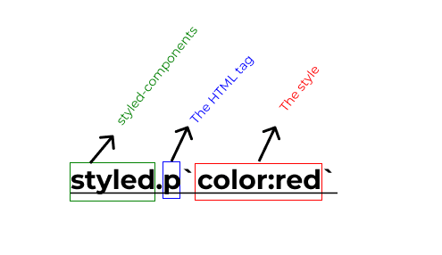
export const Paragraph = styled.p`
color:red`;
Let me explain the code above.
You first import styled-components
Then you initialize a variable that can be exported.
Now you assign the styles to the variable.
After this, let's import this component in the index.tsx file and use it.
Look at the code below.
import { Paragraph } from "@/components/Paragraph.styled";
function Home() {
  return (
    <div>
      <Paragraph>Home</Paragraph>
    </div>
  );
}

export default Home;
We imported the Paragraph component and wrapped it around any text. What actually happens is that: the text will be wrapped in a p tag with all the styled specified in the Paragraph.styled.tsx file.
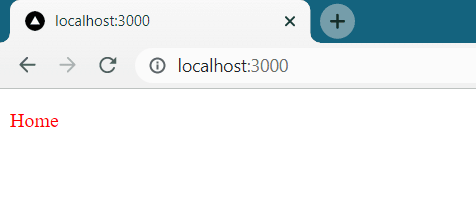
When you go back to your browser, this is what should be displayed. Congratulations, you have written your first styled-component 🎉🎉.
Let's add more styles
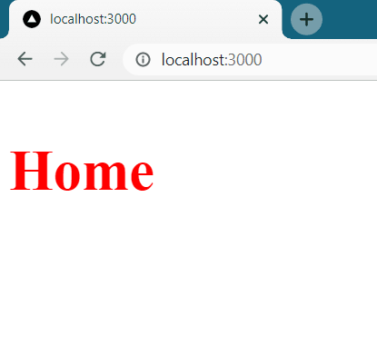
Navigate back into the Paragraph.styled.tsx file and add more styles, look at the codes below.
export const Paragraph = styled.p`
color:red;
font-size:50px;
font-weight:700;
`;
The webpage should look like this after applying these styles.
Let's build a simple image grid.
I strongly believe you have understood the basics of styled-components, now let's build a simple image grid.
First, let's go into the components folder and create a file called ImageGrid.styled.tsx. In this file, write the following code.
import styled from "styled-components";

export const ImageGrid = styled.div`
  display: grid;
  grid-template-columns: repeat(3, 1fr);
  gap: 2rem;
  width: 80%;
  & img {
    width: 100%;
  }
`;
This code is just a div whose children will be displayed in a column grid of threes, now let's put this styles to use.
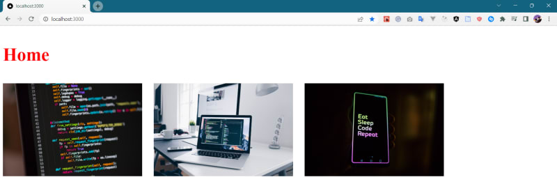
Go into the index.tsx file, import the ImageGrid component and wrap it around the images you want to display as a grid. Your code should look like the one below.
import { Paragraph } from "@/components/Paragraph.styled";
import { ImageGrid } from "@/components/ImgeGrid.styled";
function Home() {
  return (
    <div>
      <Paragraph>Home</Paragraph>
      <ImageGrid>
        <img src="/images/img1.jpg" alt="" />
        <img src="/images/img2.jpg" alt="" />
        <img src="/images/img3.jpg" alt="" />
      </ImageGrid>
    </div>
  );
}

export default Home;
When you are done with this, go to the browser and check the final result, it should look like the image below. Congratulations, you can now go ahead and use styled-components in your projects.
Conclusion
Congratulations on reaching the end of this article, I'm very confident that this has helped you understand the basics of styled-components. I wrote this article for complete beginners as you can see in the title. There are advanced concepts like props, themes, and global styles among others which are covered in another article I wrote (article link).
If you find this article helpful, leave a comment, share it with your friends and follow me for more content.

Top comments (0)