Today I am going to give you a quick tutorial on how to create a hierarchical navigation flyout menu that can go nested deep down across multiple levels.
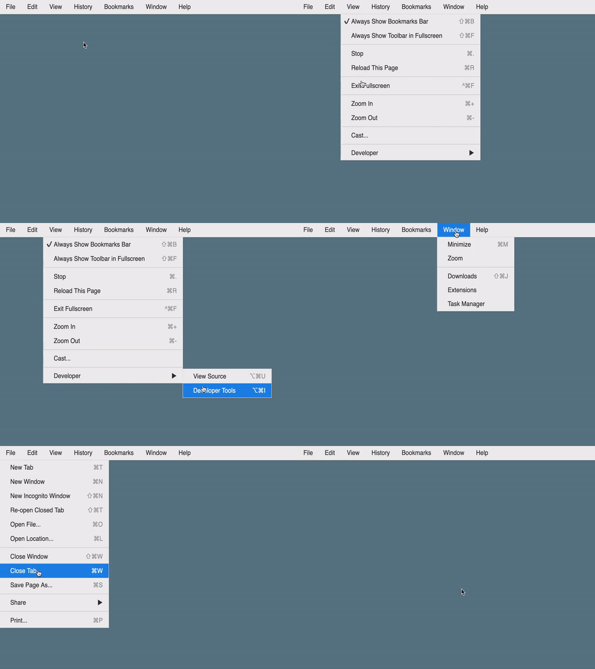
As an inspiration, we’ll start off with a concrete practical use-case of an example menu bar for a desktop application. I’ll pick a subset of the Chrome browser’s menu bar to illustrate this.
We’ll begin with a simple quite look-and-feel, something that goes back to the classic Windows™ theme. Here’s a short animation on how that would look like:
Towards the end, we’ll make it a bit fancier by adding some more styling to give it a MacOS™ like feel.
Impatient? Scroll down below to the Codepen embeds!
The Basics
Let’s start off by understanding what our menu items would typically constitute of. They should have the following properties:
- Label : (required) which is basically the name of the menu item that is displayed
- Target : (optional) a hyperlink that takes the user to a page as a response to clicking on the menu item. We’ll stick to just links right now. Adding more dynamic in-page features would require JavaScript which we’ll stay away from at the moment. It’s something you can always go and easily add later.
- Shortcut : (optional) in our case, displays a keyboard shortcut that could be used for this menu item. For example, “File > New” would be “Cmd + N” (⌘N) on Mac.
- Children : (optional) which refers to the sub-menu for this menu item. Think of our menus and sub-menus in the form of a recursive structure. Visually, a menu item having a sub-menu should also have an arrow icon on it (▶) to indicate that it can expand when hovered.
- Disabled : (optiona), a state indicating if the menu item can be interacted with.
- A conceptual Type parameter? (optional) that could emulate different types of menu items with this. Say, some entries in the list of menus should act as just a separator line.
Note that we could go ahead and add more complex behaviours to our menus. For example, a certain menu could be a Toggle item, and so, would need to have some form of a tick mark (✔) or checkbox associated with it to indicate its on/off state.
We’ll use CSS classes on our HTML markup to indicate such properties and write some clever styling to impart all the corresponding behaviours.
Structuring the HTML
Based on the above, this is how our basic menu HTML should look like:
- A list of menus is defined by an HTML
ulelement, with individual items being the obviousli. - The label and shortcut will be placed as
spanelements with their corresponding CSS classes (labelorshortcut) inside an anchor (a) tag inside theli, so that clicking on it causes the navigation action, as well as be able to provide some UI feedback such as highlighting the menu item on hover. - When a menu item contains a list of sub-menu (children), we’ll put that sub-menu in another
ulelement inside the current menulielement (parent) and so on. To describe that this particular menu item contains a sub-menu and also be able to add some specific styling to make it functional (as well as visual elements like the ▶ indicator), we’ll add thehas-childrenCSS class to this parentli. - For items like the separator , we’ll add a corresponding CSS class called
separatorto theliitem denoting it. - A menu item can be disabled , in which case we’ll add the corresponding
disabledCSS class. It’s job is to make this item non-responsive to pointer events like hover or clicks. - We’ll wrap everything off inside a container HTML
navelement (it’s good to be semantic) and add theflyout-navclass to it for some basic namespacing of the CSS styles that we’ll add.
<nav class="flyout-nav">
    <ul>
        <li>
            <a href="#"><span class="label">File</span></a>
            <ul>
                <li>
                    <a href="#">
                        <span class="label">New Tab</span>
                        <span class="shortcut">⌘T</span>
                    </a>
                </li>
                <li>
                    <a href="#">
                        <span class="label">New Window</span>
                        <span class="shortcut">⌘N</span>
                    </a>
                </li>
                <li class="separator"></li>
                <li class="has-children">
                    <a href="#">
                        <span class="label">Share...</span>
                    </a>
                    <ul>
                        <li>
                            <a href="#">
                                <span class="label">✉️ Email</span>
                            </a>
                        </li>
                        <li>
                            <a href="#">
                                <span class="label">💬 Messages</span>
                            </a>
                        </li>
                    </ul>
                </li>
            </ul>
        </li>
    </ul>
</nav>
Adding behaviours in CSS
I lied. We’ll use SCSS instead.
Jokes aside, here comes the interesting part!
The menu (except the first-level “horizontal bar”), should be hidden by default.
Anything below the first level should only be displayed when the corresponding menu item is hovered upon using the mouse pointer. As you may have already guessed, we’ll heavily rely on the CSS hover pseudo-class for this.
Arranging menu and sub-menu elements
Perhaps the trickiest bit in this whole puzzle is to understand how we make the sub-menu position and align itself with respect to their parent menu item correctly. This is where some knowledge of CSS positioning comes in. Let’s look at that.
There was a reason why we chose to put the sub-menu ul element inside a “parent” li element. Of course, it helps us to logically appropriately put together the markup for our hierarchical content, but it also serves another purpose of allowing us to easily write some CSS to position a child element relative to the position of a parent element. Then we take this concept all the way to the root ul and li elements.
For doing this, we’ll use a combination of absolute positioning and top, left CSS properties that will help us to position a child element relative to its closest non-static positioned ancestor defining the containing block. By non-static, we mean that the CSS position property for an element is not static (which happens by default in the HTML document flow), but instead is one of relative, absolute, fixed or sticky. To make sure of that, we’ll assign the position relative to the li elements with their child ul elements positioned absolute.
.flyout-nav {
    // list of menu items at any level
    ul {
        margin: 0;
        padding: 0;
        position: absolute;
        display: none;
        list-style-type: none;
    }

    // a menu item
    li {
        position: relative;
        display: block;

        // show the next level drop-down on
        // the right at the same height
        &:hover {
            & > ul {
                display: block;
                top: 0;
                left: 100%;
            }
        }
    }
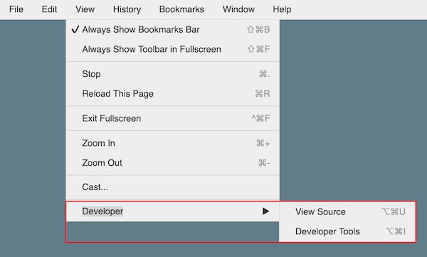
The effect of this is shown in the image below, highlighted in the red box for illustration. Some additional CSS for visual styling has been done in the image to make it look all nice, but the core behaviour is defined by what we have above. This keeps working great to N-levels deep (within limits of practicality).
There’s one exception to this though, which is the first-level list of menu items (File, Edit, View… in our example), whose children menu items need to be positioned below instead of right. To handle that, we add some style overrides to our previous CSS.
.flyout-nav {
    // ... other stuff

    // overrides for first-level behaviour (horizontal bar)
    & > ul {
        display: flex;
        flex-flow: row nowrap;
        justify-content: flex-start;
        align-items: stretch;

        // first-level drop-down should appear
        // below at the same left position
        & > li:hover > ul {
            top: 100%;
            left: 0;
        }
    }
}
Note that using a flex-box here was not imperative, rather just something I did out of choice. You could achieve similar behaviour using other approaches such as a combination of display: block and display: inline-block on the ul and li items as well.
UI polishing
Once we’re done handling the basics of positioning the menu items, we’ll go on about writing some additional styles such as fonts, sizes, colours, backgrounds, shadow and such for making the UI feel all nice and better.
For consistency and reuse, let’s also assume that we have such values defined and shared using a bunch of SCSS variables. Something like…
// variables
$page-bg: #607d8b;
$base-font-size: 16px; // becomes 1rem
$menu-silver: #eee;
$menu-border: #dedede;
$menu-focused: #1e88e5;
$menu-separator: #ccc;
$menu-text-color: #333;
$menu-shortcut-color: #999;
$menu-focused-text-color: #fff;
$menu-text-color-disabled: #999;
$menu-border-width: 1px;
$menu-shadow: 2px 2px 3px -3px $menu-text-color;
$menu-content-padding: 0.5rem 1rem 0.5rem 1.75rem;
$menu-border-radius: 0.5rem;
$menu-top-padding: 0.25rem;
There are some pieces that we’re left adding the appropriate styles and behaviours for. We’ll go over them quickly now.
Anchors, Labels and Shortcuts - the actual visual elements
.flyout-nav {
    // ... other stuff

    li {
        // ... other stuff

        // the menu items - text, shortcut info and hover effect (blue bg)
        a {
            text-decoration: none;
            color: $menu-text-color;
            position: relative;
            display: table;
            width: 100%;

            .label,
            .shortcut {
                display: table-cell;
                padding: $menu-content-padding;
            }

            .shortcut {
                text-align: right;
                color: $menu-shortcut-color;
            }

            label {
                cursor: pointer;
            }

            // for menu items that are toggles
            input[type='checkbox'] {
                display: none;
            }

            input[type='checkbox']:checked + .label {
                &::before {
                    content: '✔️';
                    position: absolute;
                    top: 0;
                    left: 0.25rem;
                    padding: 0.25rem;
                }
            }

            &:hover {
                background: $menu-focused;
                .label,
                .shortcut {
                    color: $menu-focused-text-color;
                }
            }
        }
    }
}
Most of this code is pretty self-explanatory. However, did you notice anything interesting? The bit about input[type='checkbox']?
Toggle Items
For toggles, we use a hidden HTML checkbox element to maintain state (on or off) and style the label with ::before pseudo-element accordingly. We are able to do that using a simple CSS adjacent sibling selector.
The corresponding HTML markup for that menu item would look something like this:
<li>
    <a href="#">
        <input type="checkbox" id="alwaysShowBookmarksBar" checked="true" />
        <label class="label" for="alwaysShowBookmarksBar">Always Show Bookmarks Bar</label>
        <span class="shortcut">⇧⌘B</span>
    </a>
</li>
Separators
.flyout-nav {
    // ... other stuff

    li {
        // ... other stuff

        // the separator item
        &.separator {
            margin-bottom: $menu-top-padding;
            border-bottom: $menu-border-width solid $menu-separator;
            padding-bottom: $menu-top-padding;
        }
    }
}
Disabled
.flyout-nav {
    // ... other stuff

    li {
        // ... other stuff

        // don't let disabled options respond to hover
        // or click and color them different
        &.disabled {
            .label,
            .shortcut {
                color: $menu-text-color-disabled;
            }
            pointer-events: none;
        }
    }
}
CSS pointer-events does the actual trick here. Setting it to none makes it invisible as a target for any pointer events.
Putting it all together…
Now that we’ve gained some understanding of the building blocks, let’s put it all together. Here’s a Codepen link to our multi-level hierarchical flyout navigation menu in action!
Fancier theming
If you are not a fan of the retro Windows look, here’s another version of the same code with some minor tweaks to the CSS to make it look and feel more like MacOS.
What doesn’t work?
There are a few things we haven’t handled. For starters,
- If you’re nitpicky about it, while most of the behaviour works great, a limitation of the deliberate CSS-only approach is that unlike the real-world Windows and MacOS application menus, our menu hides immediately as soon as the pointer goes outside. For more comfortable usage, typically what we’d want to do is wait for a click before hiding (can be always achieved with a bit of JS).
- What if the list of items in a menu is super long? Imagine a bookmarks list as an example. At some point, it might need to be capped into a scrollable view, say at some percentage of the viewport height. At the end of the day, it’s really a choice of the user experience you’re building, but something I wanted to put out there as well.
Hope this was useful.
Cheers!


Top comments (2)
Very well done and it might be used in my WordPress plugin to add a menu to the front.
Thank you. Glad to hear that! By all means!