
Hello there!! Hope you all doing great..
Today i'm gonna post related to "with the help of some diagram you are able to think straight UX research". Originally this one I read on a website USERFOCUS written by DAVID TRAVIS on DEC 3, 2018.
So let's get started.
10 diagrams to help you think straight about UX Research
Some of the problems we work on as UX researchers are simple and are easily solved by getting users in front of our product. But other problems can be complex and it's hard to know how to start solving them. In situations like that, a simple 2x2 diagram can cut through the "what ifs", the "how abouts" and the edge cases and provide a simple way of looking at the problem. Here are 10 examples of 2x2 diagrams to simplify UX research discussions.— DAVID TRAVIS
The problems that we deal with in product development are sometimes multi-factorial and complex. In these situations we can get swept up in discussions of technical issues or business rules and forget the importance of users and their goals. If you find that happening in your next meeting, turn to the whiteboard and try using one of these diagrams to simplify the problem and keep user needs in the forefront of the discussion.
How to decide what user groups to research with first:
When we think of all the different user types for our product or service, it can sometimes seem overwhelming. It's not clear where we should start our research. When I find a team in that position, I sketch out Diagram 1. The vertical axis is the amount we will learn (or expect to learn) by visiting a particular user group. Some user groups will teach us a lot about how they work in the product domain and there are others that we may already know much about. The horizontal axis is how easy or difficult it is to get to that user group. Some groups are simple to find (they may be in the same town as us) whereas others may be difficult to access because of factors like their geographical location or work schedule.
 Diagram 1: A 2x2 plot with the axes,"Amount we will learn" and "Ease of access".
The four quadrants are:
- Ignore: User groups in this quadrant are hard to get to and will teach us little, so we can ignore them.
- Schedule when convenient: User groups in this quadrant are easy to get to but we won't learn much from them. It makes sense to schedule visits to these groups only if you have some spare time between visiting the other groups of users.
- Plan these: We expect to learn a lot from these user groups, but for one reason or another they are hard to get to. We should start planning these visits to ensure we see these groups in the future.
- Start here: These user groups are easy to get to and we expect to learn a lot from them. It makes sense to start our research here as we can get going immediately and provide some real value to the development team.
How to create personas:
A simple way to identify personas from your research is to identify two dimensions that appear of overriding importance in your research and then to group your research participants in the appropriate quadrant. In Diagram 2, I've chosen two dimensions that tend to be of importance on many projects: people's expertise with technology and their knowledge of the domain of interest.
 Diagram 2: A 2x2 plot with the axes,"Technical expertise" and "Domain knowledge".
The four quadrants are:
- Learners: This persona has low technical expertise and little domain knowledge.
- Geeks: This persona has high technical expertise and little domain knowledge.
- Experts: This persona has high technical expertise and high domain knowledge.
- Novices: This persona has low technical expertise and high domain knowledge.
Assuming you have data from field visits, you should be able to create more meaningful dimensions than these. If not, these dimensions often work well to generate assumption personas.
How to identify red routes
A 2x2 plot makes it easy to identify the red routes — the key tasks — that users carry out. In this example, the two dimensions are task frequency (that is, how often users carry out the task) and task importance (that is, how important the task is for users).
 Diagram 3: A 2x2 plot with the axes,"Task frequency" and "Task importance".
The four quadrants are:
- Hidden tasks: These are low frequency, low importance tasks. It doesn't make sense to spend much time researching or optimising these tasks.
- Hygiene tasks: These are high frequency, low importance tasks: the mundane tasks (such as authentication) that users have to complete before doing what they actually want to.
- One-off tasks: These are low frequency, high importance tasks: an example might be software installation or creating an account.
- Red routes: These are high frequency, high importance tasks: we must optimise the usability of these tasks in our system.
How to decide what to fix
On completion of a usability evaluation, the development team needs to prioritise the problems so they know which ones to fix first. Diagram 4 shows a 2x2 diagram that can help here. The two dimensions are "Task frequency" (how often the task is carried out) and "Task difficulty" (how difficult the task is to complete). It makes sense to spend our time focusing on the hard, high frequency tasks.
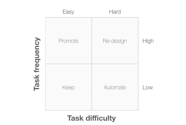 Diagram 4: A 2x2 plot with the axes,"Task frequency" and "Task difficulty".
The four quadrants are:
- Keep: These are low frequency tasks that are easy to complete. We need to make sure that any changes we make don't have a negative effect on these tasks.
- Promote: These are high frequency tasks that are easy to complete: we should encourage marketing to make more of these when describing our product.
- Automate: These are low frequency, difficult tasks. We need to ask if there is a way to automate these tasks so that the system can do them on behalf of the user. If not, a Wizard design pattern might simplify the task for users.
- Re-design: These are high frequency, difficult tasks. Tasks in this quadrant are the ones we need to fix first.
How to choose a UX research method
We can also use a 2x2 diagram to decide what kind of research method we should carry out. Diagram 5 shows a 2x2 diagram with "Type of research method" plotted against "Type of data". With "Type of research method" we can classify research methods into behaviour-based methods, and intention (or opinion) based methods. With "Type of data" we can classify research methods into quantitative ("What is happening?") and qualitative ("Why is it happening?").
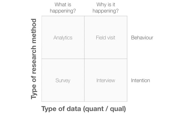 Diagram 5: A 2x2 plot with the axes,"Type of research method" and "Type of data".
In this example, I've placed specific research methods in each quadrant, but these aren't the only methods you can use. Consider these as examples only.
Hope you like the article and will be helpful.
I divide this article into 2 parts because i believe in we have read only a little bit and make that little knowledge crystal clear with the help of practicing.
 Thank you for reading !! So see you all in next one !!!
Good luck keep learning and happy coding!!!

Top comments (1)
Useful post! Here is another good article, especially for beginners: UX Research Methods. The article describes the tasks of conducting UX research, including selecting appropriate research methods, gathering and analyzing user data, and applying insights to inform design decisions and improve user experience.