
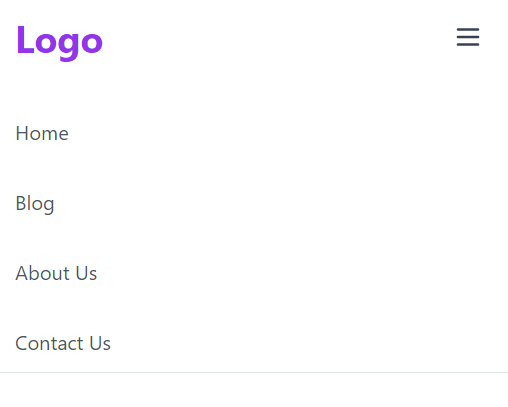
In this tutorial, we will create responsive navbar menu in next js 13 with shadcn ui. First you need to setup next js 13 with shadcn ui project.
Before create responsive navbar in next js 13 with shadcn ui you need to install lucide icon.
npm install lucide-react
- Create next js 13 with shadcn ui responsive navbar with hamburger menu icon using Menu lucide icon. ```react "use client"
import * as React from "react"
import Link from "next/link"
import { Menu } from "lucide-react"
export default function Navbar() {
const [state, setState] = React.useState(false)
const menus = [
{ title: "Home", path: "/your-path" },
{ title: "Blog", path: "/your-path" },
{ title: "About Us", path: "/your-path" },
{ title: "Contact Us", path: "/your-path" },
]
return (
Logo
className="text-gray-700 outline-none p-2 rounded-md focus:border-gray-400 focus:border"
onClick={() => setState(!state)}
>
className={`flex-1 justify-self-center pb-3 mt-8 md:block md:pb-0 md:mt-0 ${
state ? "block" : "hidden"
}`}
>
-
{menus.map((item, idx) => (
- {item.title} ))}
)
}
2.Next js 13 with shadcn ui responsive navbar with search bar using Menu, **Search lucide icon** and **useState hook**.
```react
"use client"
import * as React from "react"
import Link from "next/link"
import { Menu, Search } from "lucide-react"
export default function Navbar() {
const [state, setState] = React.useState(false)
const menus = [
{ title: "Home", path: "/your-path" },
{ title: "Blog", path: "/your-path" },
{ title: "About Us", path: "/your-path" },
{ title: "Contact Us", path: "/your-path" },
]
return (
<nav className="bg-white w-full border-b md:border-0">
<div className="items-center px-4 max-w-screen-xl mx-auto md:flex md:px-8">
<div className="flex items-center justify-between py-3 md:py-5 md:block">
<Link href="/">
<h1 className="text-3xl font-bold text-purple-600">Logo</h1>
</Link>
<div className="md:hidden">
<button
className="text-gray-700 outline-none p-2 rounded-md focus:border-gray-400 focus:border"
onClick={() => setState(!state)}
>
<Menu />
</button>
</div>
</div>
<div
className={`flex-1 justify-self-center pb-3 mt-8 md:block md:pb-0 md:mt-0 ${
state ? "block" : "hidden"
}`}
>
<ul className="justify-center items-center space-y-8 md:flex md:space-x-6 md:space-y-0">
{menus.map((item, idx) => (
<li key={idx} className="text-gray-600 hover:text-indigo-600">
<Link href={item.path}>{item.title}</Link>
</li>
))}
<form className="flex items-center space-x-2 border rounded-md p-2">
<Search className="h-5 w-5 flex-none text-gray-300" />
<input
className="w-full outline-none appearance-none placeholder-gray-500 text-gray-500 sm:w-auto"
type="text"
placeholder="Search"
/>
</form>
</ul>
</div>
</div>
</nav>
)
}

See Also
👉Building a Next.js Hover-Activated Dropdown Menu with Shadcn UI
👉Next.js with Shadcn UI Product Cards Example
👉how to use icon in shadcn ui with next js 13
👉create responsive navbar in next 13 with shadcn ui
👉create footer section in next 13 with shadcn ui
👉Next.js Image File Upload and Preview with Shadcn UI
👉create sidebar in next 13 with shadcn ui
👉how to use skeleton loading next 13 with shadcn ui
👉next 13 with shadcn ui date picker example
👉next 13 with shadcn ui pagination example

Top comments (2)
what is md in md:flex
screen resolution, md stands for 768px I guess, for tablet screens