
Positioning defines where an item stands in relation to others, as simple as that may sound CSS positioning can be a bit tricky to deal with. Taking elements out of their normal document flow by making them sit on top of one another or always remaining in the same place inside the browser viewport is known as CSS positioning. In this article, we will explore the different position properties and how to use them.
Prerequisites: Basic HTML and CSS knowledge
The main aim of the positioning is to override the default behavior of elements in the document flow as described above. In instances where we want to alter the position of elements, create UI elements that float or sits in the same place inside the browser window no matter how much the page is scrolled.
There are a number of positioning properties we can put into effect, to make a specific type of positioning active on an element, we use the position property.
Static Positioning.
This is the default position every element gets. Elements remain stacked in their normal position in the document layout flow, using this property in our CSS won't alter the position of the element. to demonstrate this, we create a div element with a class of "box-1".
<div class="box-1">Static</div>
Now we can add the following CSS properties by referencing the class attribute attached to our div above.
.box-1 {
background-color: #edfcae;
height: 50px;
width: 50px;
}
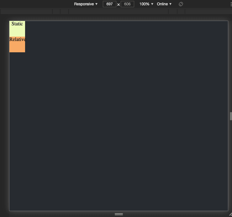
If we peep into our browser, we will see our element sitting pretty at the top left corner like this:
 .
.
Now let's add the static position property to our element below.
.box-1 {
  position: static;
}
If we preview our element in the browser we notice no changes at all, This is cool, as we said before, static positioning is the default behavior!
Relative Positioning.
This is a bit similar to static positioning, except that we can also modify the final position of our element once it has taken its place in the normal layout flow, including allowing elements to overlap one another on our page layout.
Let's go ahead and create another box below
<div class="box-2">Relative</div>
.box-2 {
    background-color: #f5ab57;
    color: #000;
    text-align: center;
    height: 50px;
    width: 50px;
    position: relative;
}
If we preview our browser we can see it's stacked perfectly below our "static" box like this,
so how do we modify the position of our element?. This is where we introduce the top, bottom, left and right properties.
top, bottom, left, and right.
These properties are used alongside position to specify exactly where we want to move the positioned element.
now let's update our CSS below
.box-2 {
    background-color: #f5ab57;
    color: #000;
    text-align: center;
    height: 50px;
    width: 50px;
    position: relative;
    top: 30px;
    left: 100px;
}
The values of these properties can take any available CSS units e.g pixels, rem, em, % e.t.c.
Now if we preview our browser we notice some changes like this
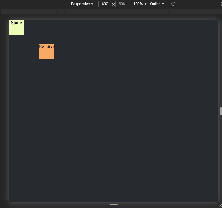
interesting right?. Yeah, by assigning the top and left property to our element we've simply moved our element 30px from the top of its default position and 100px from the left of its default position.
Absolute Positioning.
Absolute positioning gives us a different result entirely, let's try creating another box with position property set to absolute.
<div class="box-3">Absolute</div>
.box-3 {
    background-color: #59b1da;
    color: #fff;
    text-align: center;
    height: 50px;
    width: 120px;
    position: absolute;
}
If we save and refresh, we should notice something like this:

First, we should notice that that the "absolute" box is overlapping the "relative" box, the remaining elements on our web page act as if the absolute box no longer exist, well, in a way this is true. An absolutely positioned element no longer exists in the normal document layout flow. By assigning absolute to the position property of an element it means that we can create isolated UI features that don't interfere with the layout of other elements on our web page, e.g popup information like alerts and prompt e.t.c.
The top, bottom, left and right properties behave in a different way with absolute positioning. Rather than positioning the element based on its relative position within the normal document flow, they specify the distance the element should be from each of the containing element's sides.
.box-3 {
    background-color: #59b1da;
    color: #fff;
    text-align: center;
    height: 50px;
    width: 120px;
    position: absolute;
    top: 40px;
    left: 50px;
}

In this case, we are saying that the absolutely positioned element should sit 40px from the top of the containing element and 50px from the left.
Z-Index
Absolute positioning is great, but there is another thing we haven't considered yet when elements start to overlap, what determines which elements appear on top of which other elements? In the example we've seen so far, we only have one positioned element in the positioning context, and it appears on the top since positioned elements win over non-positioned elements. What about when we have more than one?.
Can we change the stacking order of an element?. Absolutely!, the z-index property allows us to do so. "z-index" is a reference to the z-axis. Web pages also have z-axis, z-index values affect where positioned elements sit on that axis. Positive "z-index" values will move them higher up the stack and negative values move them lower down the stack. By default, positioned elements all have a z-index of auto which is effectively 0.
let's try bringing the "relative" box higher up the stack, by adding the z-index property.
.box-2 {
    background-color: #f5ab57;
    color: #000;
    text-align: center;
    height: 50px;
    width: 50px;
    position: relative;
    top: 30px;
    left: 100px;
    z-index: 1;
}

Excellent!, we now have our relative box higher up the stack. We should note that "z-index" only accepts unitless values, you can't specify that you want an element to be 20 pixels up the z-axis, it doesn't work that way. Using 1 and 2 would give the same effect as 100 and 2000.
In our next episode, we will discuss the fixed and sticky positioning.
Note: You can see the example at this point here


Top comments (0)