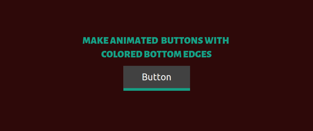
This is an entry level post explaining line by line how to make simple good looking animated buttons using only CSS and HTML.
First, check what we're going to do before diving in the code:
The HTML
<button class="shadow-btn">
  Button
</button>
<button class="border-btn">
  Button
</button>
Basically, the code is telling the browser to display two buttons, and to assign each one to a distinct class to be styled by CSS.
Q: Why not use the <input type="submit"> tag instead of <button>?
A: For my case, I just like the conciseness of <button>, it defaults its type to submit; also it's easier to get when reading a long form full of other <input> tags.
Read a StackOverflow Discussion about the matter.
The CSS
We'll explore the sheet, selector by selector.
-1 :root
:root {
  --main-color: #16a085;
  --transition-time: 0.5s;
}
The :root selector is a CSS pseudo-class. While using HTML, it matches the html selector, except it has a higher specificity.
--main-color and --transition-time are CSS custom properties we can name them ourselves. In this case we're using them as variables (Yes, CSS custom properties are not equivalent to variables, I'll write a post about this later). Since we're using these values multiple times, this helps us later if we want to change them, we'll change them only once, no need to Ctrl+F the CSS to change all occurrences.
-2 button
button {
/* We're selecting every <button> in the document */

  margin: 1px;
  /* We're telling CSS to give 1 pixel of "room" in all directions*/

  border-radius: 0;
  /* We want our buttons to have sharp 90 degrees corners*/

  border: 0;
  /* We want our buttons to have no border, more on this later*/

  padding: 10px 30px;
  /* We want our text to have some space inside the button*/

  background: #414141;
  /* All buttons are to have this dark background*/

  color: white;
  /* Our text will be white*/

 /* Explanation of the remaining 3 lines is just outside of this code block*/
  -webkit-transition-duration: var(--transition-time);

  -moz-transition-duration: var(--transition-time);

  transition-duration: var(--transition-time);

}
So three last lines of this selector code do the same thing, it's just that not all browsers understand transition-duration yet, so we use vendor/browser specific prefixes to have the same functionality cross-browsers and cross-versions.
transition-duration and its sisters tell the browser to take some time to transit between the current state of the element and the future states. The future state in our case is :hover, which is a pseudo-class CSS uses when the user hovers over an element.
In var(--transition-time) we're using the var() function to reference the afore-declared --transition-time custom property. The preceding rule is equivalent to writing transition-duration: 0.5s;.
-3 button:hover
button:hover{
/* We're telling the browser to apply the following rules to any button that gets hovered over by the user*/

  background: var(--main-color);
  /* We're setting the background color to our afore-declared custom property*/

  color: black;
  /* We're setting the text color to black*/
}
The difference between the two styles of buttons lays in the two remaining selectors
-4 .border-btn
.border-btn {
  border-bottom: var(--main-color) 5px solid;
}
We're selecting the elements that have border-btn in their class, and giving them a bottom border of our --main-color, with a 5 pixel width and a solid continuous style. Remember when we gave all our buttons a border of zero? We're overriding that now, thanks to CSS specifity. We're only overriding the bottom border, the rest stay zeroed.
-5 .shadow-btn
.shadow-btn {
  box-shadow: inset 0px -5px var(--main-color);
}
Here, we're making the same thing as before but using the box-shadow property.
We're adding an inset (inside) shadow of 0 pixels in horizontal offset; -5 vertical offset, it's negative so the shadow would be in the bottom; and colored with our --main-color.
-Difference between .shadow-btn and .border-btn
If you look closely at the result, the main resulting difference is the height, the .border-btn is 5px bigger. It's because the border edge thing is located outside the box.
Q: So the shadow is smaller because the shadow edge thing is located inside, why not use the default outer shadow?
A: We can use box-shadow without inset, the .shadow-btn would look exactly the same as the .border-btn, but it will not behave the same way. If you hover over an outer shadow, the browser won't interpret it as hovering the element, it feels awkward. Go and try it on the CodePen!


Latest comments (1)
I did not know about CSS custom properties. I will research it more.
Thanks for the post. I