Table Of Contents
Intro & Prerequisites
Okay, so for today's tutorial, I thought I'd do something in React. If you want to follow along, I recommend that you have some knowledge of React, otherwise some of the stuff might be very confusing to you. And as always there will be a YouTube version of this tutorial, you can find it here :)
This is what we're building today:
Basic Setup
Okay, so a fun thing I thought of doing, is everyone having the same website, but with different color themes.
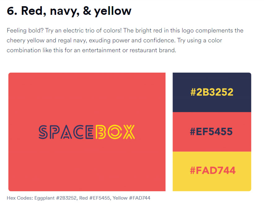
What you're going to do, is open this website. It's basically a blog showcasing 40 different color themes( I always use this website).
What you're going to do now, is open up Random Number Generator, in google and give it a spin. Whichever number you get, will be your color theme. This is what I got:
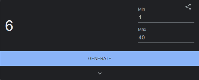
Remember your color theme!
Now open up the folder you want your code to be in, and start your React project, and download the following packages:
npx create-react-app frontend
cd frontend
yarn add hamburger-react react-focus-lock react-icons styled-components
After that, open your code editor, and keep/create the following files:
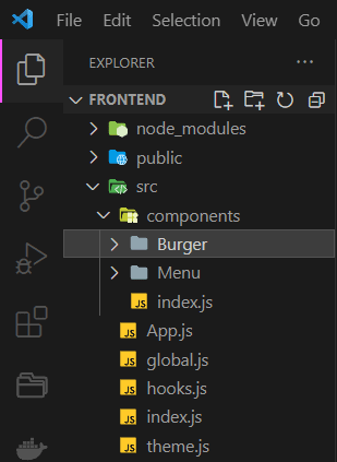
Quick note: The other self-created files will not be needed so feel free to delete them, also we will not be using plain CSS, we will style our components with styled-components.
Now, change the code inside App.js to:
import { ThemeProvider } from "styled-components";
import { GlobalStyles } from "./global";
import { theme } from "./theme";

function App() {
  return (
    <ThemeProvider theme={theme}>
      <GlobalStyles />
      <div class="main-text">
        <h1>Hello World</h1>
      </div>
    </ThemeProvider>
  );
}

export default App;
And the code inside index.js to:
import React from "react";
import ReactDOM from "react-dom/client";

import App from "./App";

const root = ReactDOM.createRoot(document.getElementById("root"));
root.render(
  <React.StrictMode>
    <App />
  </React.StrictMode>
);
Now, inside theme.js define your theme:
export const theme = {
  primaryDark: "#2B3252",
  primaryLight: "#EF5455",
  primaryHover: "#FAD744",

  mobile: "576px",
};
This is where you get to use your color theme. For primaryDark use the darker color in your theme. And for primaryLight use the lighter color. If your theme doesn't have a 3rd color, use #FFFFFF or #000000 for primaryHover.
And now inside global.js define the basic CSS rules:
import { createGlobalStyle } from "styled-components";

export const GlobalStyles = createGlobalStyle`
  html, body {
    margin: 0;
    padding: 0;
  }
  *, *::after, *::before {
    box-sizing: border-box;
  }
  body {
    display: flex;
    justify-content: center;
    align-items: center;

    background: ${({ theme }) => theme.primaryDark};
    color: ${({ theme }) => theme.primaryLight};

    height: 100vh;
    line-height: 1.6;

    font-family: "Roboto", sans-serif;
    font-size: 1.2rem;
    font-weight: normal;
  }
  h1 {
    font-size: 2rem;
    text-align: center;
    text-transform: uppercase;
  }
  div {
    text-align: center;
  }
  small {
    display: block;
  }
  a {
    color: ${({ theme }) => theme.primaryHover};
    text-decoration: none;
  }
  .main-text {
    margin-left: 20rem;
    margin-right: 20rem;
  }
`;
If you have any questions about how we define CSS with styled-components, feel free to ask in the comments!
This is what we're left with:

Creating The Burger
Over at, ./components/Burger create the following files:
-
index.js( we're going to use for importing.) -
Burger.styled.js( we're going to use for styling(CSS)) -
Burger.js( contains all the JSX code)
Inside of index.js write:
export { default } from "./Burger";
Inside of Burger.styled.js write:
import styled from "styled-components";

export const StyledBurger = styled.button`
  position: absolute;
  top: 5%;
  left: 2rem;
  display: flex;
  flex-direction: column;
  justify-content: space-around;
  width: 2rem;
  height: 2rem;
  background: transparent;
  border: none;
  cursor: pointer;
  padding: 0;
  z-index: 10;
  span {
    width: 2rem;
    height: 0.25rem;
    background: ${({ theme, open }) =>
      open ? theme.primaryDark : theme.primaryLight};
    border-radius: 10px;
    transition: all 0.3s linear;
    position: relative;
    transform-origin: 1px;
    :first-child {
      transform: ${({ open }) => (open ? "rotate(45deg)" : "rotate(0)")};
    }
    :nth-child(2) {
      opacity: ${({ open }) => (open ? "0" : "1")};
      transform: ${({ open }) => (open ? "translateX(20px)" : "translateX(0)")};
    }
    :nth-child(3) {
      transform: ${({ open }) => (open ? "rotate(-45deg)" : "rotate(0)")};
    }
  }
`;
Inside of Burger.js, we're going to utilize hamburger-react which we installed earlier. It's a package built just for hamburger menu's. You can learn more about it from the official website.
Now add the following code, inside Burger.js:
import React from "react";
import { bool, func } from "prop-types";

import { Twirl as Hamburger } from "hamburger-react";

import { StyledBurger } from "./Burger.styled";

const Burger = ({ open, setOpen, ...props }) => {
  const isExpanded = open ? true : false;

  return (
    <StyledBurger>
      <Hamburger
        toggled={open}
        toggle={setOpen}
        size={32}
        direction="right"
        duration={0.4}
        distance="lg"
        aria-expanded={isExpanded}
        color={open ? "#2B3252" : "#EF5455"}
      ></Hamburger>
    </StyledBurger>
  );
};

Burger.propTypes = {
  open: bool.isRequired,
  setOpen: func.isRequired,
};

export default Burger;
Quick Note: in the color attribute of <Hamburger> use this formula( since we're using different themes):
color={open? "primaryDarkColor" : "primaryLightColor"}
We're almost done! Inside of ./components/index.js add:
export { default as Burger } from "./Burger";
And inside of App.js write:
import React, { useState } from "react";

import { ThemeProvider } from "styled-components";
import { GlobalStyles } from "./global";
import { theme } from "./theme";

import { Burger } from "./components";

function App() {
  const [open, setOpen] = useState(false);

  return (
    <ThemeProvider theme={theme}>
      <GlobalStyles />

      <Burger open={open} setOpen={setOpen} aria-controls={menuId} />

      <div class="main-text">
        <h1>Hello World!</h1>
      </div>
    </ThemeProvider>
  );
}

export default App;
Now, if you we're to run your app, you'll see a hamburger icon in the top-left corner :)
Creating The Side Menu
Just like the Burger in the Menu folder, create:
-
index.js( we're going to use for importing.) -
Menu.styled.js( we're going to use for styling(CSS)) -
Menu.js( contains all the JSX code)
Inside of index.js add:
export { default } from "./Menu";
Inside of Menu.styled.js add:
import styled from "styled-components";

export const StyledMenu = styled.nav`
  display: flex;
  flex-direction: column;
  justify-content: center;
  background: ${({ theme }) => theme.primaryLight};
  transform: ${({ open }) => (open ? "translateX(0)" : "translateX(-100%)")};
  height: 100vh;
  text-align: left;
  padding: 2rem;
  position: absolute;
  top: 0;
  left: 0;
  transition: transform 0.3s ease-in-out;
  @media (max-width: ${({ theme }) => theme.mobile}) {
    width: 100%;
  }
  a {
    font-size: 2rem;
    text-transform: uppercase;
    padding: 2rem 0;
    font-weight: bold;
    letter-spacing: 0.5rem;
    color: ${({ theme }) => theme.primaryDark};
    text-decoration: none;
    transition: color 0.6s linear;
    @media (max-width: ${({ theme }) => theme.mobile}) {
      font-size: 1.5rem;
      text-align: center;
    }
    &:hover {
      color: ${({ theme }) => theme.primaryHover};
    }
  }
  .icon {
    margin-right: 10px;
  }
`;
And finally inside of Menu.js add:
import React from "react";
import { bool } from "prop-types";

import { AiOutlineFileText } from "react-icons/ai";
import { RiPriceTag3Line, RiContactsBookLine } from "react-icons/ri";
import { StyledMenu } from "./Menu.styled";

const Menu = ({ open, ...props }) => {
  const isHidden = open ? true : false;
  const tabIndex = isHidden ? 0 : -1;

  return (
    <StyledMenu open={open} aria-hidden={!isHidden} {...props}>
      <a href="#" tabIndex={tabIndex}>
        <span aria-hidden="true">
          <AiOutlineFileText className="icon" />
        </span>
        About us
      </a>
      <a href="#" tabIndex={tabIndex}>
        <span aria-hidden="true">
          <RiPriceTag3Line className="icon" />
        </span>
        Pricing
      </a>
      <a href="#" tabIndex={tabIndex}>
        <span aria-hidden="true">
          <RiContactsBookLine className="icon" />
        </span>
        Contact
      </a>
    </StyledMenu>
  );
};

Menu.propTypes = {
  open: bool.isRequired,
};

export default Menu;
And don't forget inside of ./components/index.js add:
...
export { default as Menu } from "./Menu";
And in App.js add:
import React, { useState, useRef } from "react";

import { ThemeProvider } from "styled-components";
import { GlobalStyles } from "./global";
import { theme } from "./theme";

import FocusLock from "react-focus-lock";
import { useOnClickOutside } from "./hooks";

import { Burger, Menu } from "./components";

function App() {
  const [open, setOpen] = useState(false);

  const node = useRef();
  const menuId = "main-menu";

  useOnClickOutside(node, () => setOpen(false));

  return (
    <ThemeProvider theme={theme}>
      <GlobalStyles />
      <Burger open={open} setOpen={setOpen} aria-controls={menuId} />
      <Menu open={open} setOpen={setOpen} id={menuId} />
      <div class="main-text">
        <h1>Hello World</h1>
      </div>
    </ThemeProvider>
  );
}

export default App;
And, we're done! However, there are a couple of finishing touches we could add. If you don't want to do this, it's ok, the side nav works perfectly well like this :)
Finishing Touches
So, the thing I'm talking about, is the fact that if you click outside of the side nav, it won't close. Now, this is ok, if you want the user to click the X icon to close it. However, I don't like that :)
Inside of hooks.js( which we created in the beginning) add:
import { useEffect } from "react";

export const useOnClickOutside = (ref, handler) => {
  useEffect(() => {
    const listener = (event) => {
      if (!ref.current || ref.current.contains(event.target)) {
        return;
      }
      handler(event);
    };
    document.addEventListener("mousedown", listener);

    return () => {
      document.removeEventListener("mousedown", listener);
    };
  }, [ref, handler]);
};
And change the code in App.js to:
import React, { useState, useRef } from "react";

import { ThemeProvider } from "styled-components";
import { GlobalStyles } from "./global";
import { theme } from "./theme";

import FocusLock from "react-focus-lock";
import { useOnClickOutside } from "./hooks";

import { Burger, Menu } from "./components";

function App() {
  const [open, setOpen] = useState(false);

  const node = useRef();
  const menuId = "main-menu";

  useOnClickOutside(node, () => setOpen(false));

  return (
    <ThemeProvider theme={theme}>
      <GlobalStyles />
      <div ref={node}>
        <FocusLock disabled={!open}>
          <Burger open={open} setOpen={setOpen} aria-controls={menuId} />
          <Menu open={open} setOpen={setOpen} id={menuId} />
        </FocusLock>
      </div>
      <div class="main-text">
        <h1>Hello World!</h1>
      </div>
    </ThemeProvider>
  );
}

export default App;
Notice, here we used a couple of things. Firstly we used useRef which is a React hook. You can read more about useRef here. And we used react-focus-lock. Here's the official( I think) documentation.
Now, we're done!
Link to the githubpage.
Hope you enjoyed this. If you liked this, don't forget to follow me.
Links to my socials:

24YoungMamba (Young Mamba) · GitHub
I make websites : ) I can build your website. 24YoungMamba has one repository available. Follow their code on GitHub.
 github.com

Young Mamba – Medium
Read writing from Young Mamba on Medium. I make websites👨💻. Every day, Young Mamba and thousands of other voices read, write, and share important stories on Medium.
 medium.com
Liquid error: internal


Top comments (0)