The word game has gone from dozens of players to hundreds of thousands in a few months. It was created by a software engineer in Brooklyn for his partner.
Today we going to replicate the UI and add some little animations :)
<div id="container"></div>
<div id="restart">
  <div class="restart-letter">S</div>
  <div class="restart-letter">T</div>
  <div class="restart-letter">A</div>
  <div class="restart-letter">R</div>
  <div class="restart-letter">T</div>
</div>
The above HTML code contains a div with an id of "container" and another div with an id of "restart". Within the "restart" div are four more divs, each with a class of "restart-letter".
body,
html {
  background-color: #333;
  margin: 0px;
  height: 100%;
  overflow-x: hidden;
  overflow-y: auto;
}

body {
  display: flex;
  align-items: center;
  justify-content: center;
  flex-direction: column;
}

#container {
  font-size: 30px;
}

#restart {
  padding-top: 10px;
  display: none;
}

#restart:hover .restart-letter{
  border: 2px solid #565758;
}

.restart-letter {
  background: #121213;
  border: 0px solid #565758;
  color: #d7dadc;
  font-family: "Clear Sans", Sans-Serif;
  width: 40px;
  height: 40px;
  font-size: 1.5rem;
  line-height: 1.5rem;
  display: inline-flex;
  justify-content: center;
  align-items: center;
  cursor: pointer;
  box-sizing: border-box;
}

.cell {
  display: inline-block;
}
The background-color and margin properties are applied to the body and html elements to create a solid black background and remove all margins. The height property is set to 100% to ensure that the background covers the entire page, and the overflow-* properties are used to hide any overflow content.
The display property is set to flex on the body element, which will cause all child elements to be displayed in a flexible grid. The align-items and justify-content properties are set to center to evenly distribute the items in the grid. The flex-direction property is set to column, which will cause the grid to be displayed in a vertical column.
The #container element has a font-size of 30px and is displayed inline-flex. This will cause its children to be displayed in a single row, and the justify-content and align-items properties will be applied to them.
The .restart-letter element is given a background and border color, font family, and width. It is also set to display: inline-flex which will cause it to be displayed in a single row with the other elements. The justify-content and align-items properties are also set to center.
import animationManager from "https://assets.codepen.io/278239/animationManager.js";
import animationData from "https://assets.codepen.io/278239/sparta.js";

const container = document.getElementById('container');
const restart = document.getElementById('restart');

animationManager.initialize(container, 6, 5);
animationManager.start(animationData.frames, animationData.animation);
animationManager.onComplete = function() {
  restart.style.display = 'block';
}
restart.addEventListener('click', function() {
  animationManager.restart();
  restart.style.display = 'none';
})
This code imports a few files - the first being https://assets.codepen.io/278239/animationManager.js, which contains the animationManagerfunction. This function is then used to initialize, start, and complete animations. The second file imported is https://assets.codepen.io/278239/sparta.js, which contains the animationData. Finally, a few elements are defined - container and restart. The container is used to hold the animation, and the restart button is used to restart the animation.
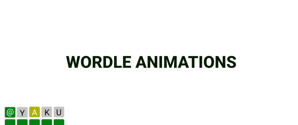
See the Pen
Wordle Animations by Brian Lemba (@yakumwamba)
on CodePen.
If you want to follow me you can do so on git here
Thanks


Top comments (0)