I've been a professional C, Perl, PHP and Python developer.
I'm an ex-sysadmin from the late 20th century.
These days I do more Javascript and CSS and whatnot, and promote UX and accessibility.
The "Final" logo looks bad against it though, so I'd be careful. Maybe you could put the logos against a rectangle with something like padding: 1m; background-color: rgba(0, 0, 0, 0.25);:
The page title could be something better than "Home - Howdy I'm Wuz." for bookmarking and SEO purposes.
Your site doesn't work at different browser widths - anything under 680px is broken:
Fix those points and it'll get a thumbs-up from me :)
Thanks for the note! The Final logo looked better before I updated the gradient, I definitely need to fix that up. Good call on the smaller viewport rendering. I haven't done any sort of SEO optimization on the site - but you are totally right, a better title is a great idea. I need to chunk some time into it and these are all great starting points!
Hmm interesting! I like that as well! I'll have to play around with the layout a bit! Thanks for the notes! Text hierarchy is definitely something that could use some work :D

Mine is very simple (and needs an update), but I love me a good gradient :D
Wuz
Heh, you're not alone there.
The "Final" logo looks bad against it though, so I'd be careful. Maybe you could put the logos against a rectangle with something like
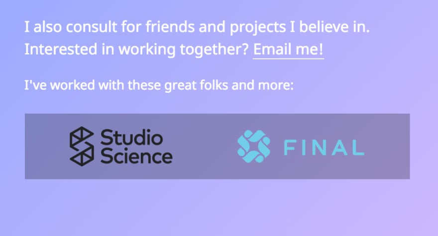
padding: 1m; background-color: rgba(0, 0, 0, 0.25);:The page title could be something better than "Home - Howdy I'm Wuz." for bookmarking and SEO purposes.
Your site doesn't work at different browser widths - anything under 680px is broken:

Fix those points and it'll get a thumbs-up from me :)
Thanks for the note! The Final logo looked better before I updated the gradient, I definitely need to fix that up. Good call on the smaller viewport rendering. I haven't done any sort of SEO optimization on the site - but you are totally right, a better title is a great idea. I need to chunk some time into it and these are all great starting points!
I love the gradient! And your logo! Awesome!
I think I like it in a column instead of side by side. I would also add more hierarchy to the text sizes to emphasize different content!
Hmm interesting! I like that as well! I'll have to play around with the layout a bit! Thanks for the notes! Text hierarchy is definitely something that could use some work :D
That gradient gave me life!! I love it!!!