Material-UI, recently rebranded to simply "MUI", is a powerful library of styled components that can quickly bootstrap a React application to look uniform, clean, and professional. The reasons for MUI's popularity are clear; it is easy to learn and use. Users can get an app quickly styled and save many a CSS-induced headache. However, some criticize MUI for being limitably customizable. This blog will show how to easily override MUI's default styles to give your application the look you want.
How does MUI styling work?
Before learning how to customize our React app, it’s important to get a basic sense of how the MUI standard theme works. Think of MUI's main theme like a giant object that specifies styling for all instances of MUI components. In this object, the default styles are defined for each of MUI's unique components. For example, Typography components will have be rendered with the Roboto font family:

Any Button component will be rendered in all caps and have a ripple effect on click:

And any component involving color will make use of MUI's default color palette. The classic main blue, deep purple, and error red:

A reasonable first step to customization would be to familiarize yourself with MUI’s default theme object and begin playing with properties in a sandbox.
Demo
1. Import React ThemeProvider
For the purposes of this demo, we will be customizing your app's themes globally, by wrapping our entire app with a MUI ThemeProvider. If you wish to customize only certain components, you can wrap specific components with the ThemeProvider or browse MUI's documentation for other ways to customize more granularly.
First, import ThemeProvider and createTheme from MUI. Then, define your theme to override MUI's built-in theme object.
As always, check on the mui website that you have the latest version installed and are importing your MUI elements correctly at the top of your React.js files.

2. Define your color palette
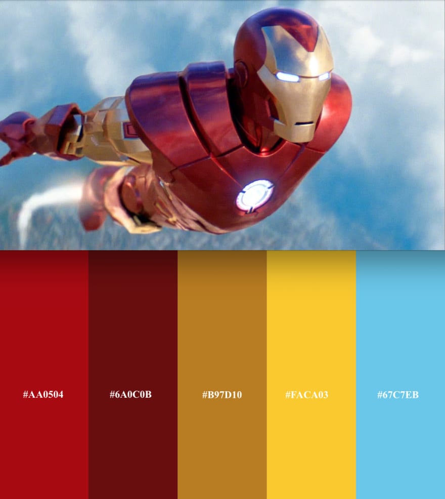
It's finally time to leave that classic MUI blue behind and create your own color palette, perhaps using a palette generator tool like ColorSpace. For learning purposes, let's go with an Iron Man palette.
Define your palette's colors. For our purposes, we will simply define "main" and "dark" shades for our theme's primary and secondary colors.

3. Define your typography.
An easy way to find a font that works for you is to Browse Google fonts and import directly into your index.css file in your app. From there, you can reference the font by its family name.

After implementing our fonts, we can transform a basic login page from MUI's standard look...

...to something worthy of Tony Stark...

Keep going!
There are many ways to give your app it's own identity and feel, from buttons to headers to menubars and animation effects. Take that ThemeProvider and fly with it.


Top comments (0)